Maestro Editor Overview
MaestroThe UI design product. | Form Builder | 23.04This feature was updated in 23.04
Maestro comes with the Maestro editor for creating and managing forms, components, templates, receipts and related assets and libraries. You use this editor to build complex web applications, such as onboarding customer journeys. You visually arrange components within a design by dragging and dropping them and then updating their properties using the central part of the editor - the Wireframe - which is Maestro's WYSIWYG editor.
The Maestro editor allows you to create four types of designs:
- Forms: web applications designed to capture data from applicants.
- Receipts: documents of record that provide organizations and applicants with a reference of their submitted data.
- Templates: used to provide a consistent look and feel to multiple forms and receipts.
- Components: modular building blocks that can be drag and dropped into forms, receipts, and templates.
For more information, see design types.
Open the Maestro Editor
When you view forms, templates, receipts or components in Maestro and want to start working on a selected design, you click Edit Form Version that opens the design in the Design mode in the Maestro editor. This is illustrated below.
The Maestro editor consists of several UI allowing you to perform specific editing and configuration tasks. The editor comes with the default panel structure and layout, which is configured to display one pane on each side of the editor's central window. However, you can use the toolbar functions to change the layout to display more information or less depending on your editing task at hand.
The Maestro editor consists of the following sections:
Screen Header
The screen header displays some useful information, including:
- Product name
- Journey Maestro
- Form name
- Basic Onboarding Form 1
- Version of the form
- 1.0-develop
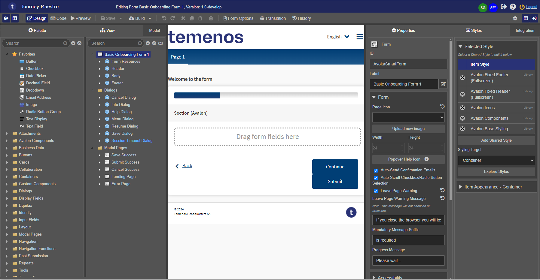
- Users | 23.04 This feature was introduced in 23.04
- Avatars of users who have this design open and whether they have unsaved changes to the design, indicated with the following marks:
- * : a current user (you). In this example, it's the user with the SE* avatar.

- ! : a design has unsaved changes. This feature helps you avoid overriding changes made by another user to a design before changes are saved.
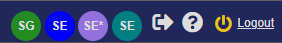
- Multiple users are listed using different colors.
- If you open a same design in different tabs of a browser or different browsers, there will be multiple avatars of the same user shown, for example, SE.

-
Mouse over an avatar to see a full user name and a status of an open design, for example, SG has unsaved changes.
-
Warning If you open a design, which has already been opened by other users, a warning message is displayed. For more information, see Open a Design.

The Screen Header provides you with the following actions:
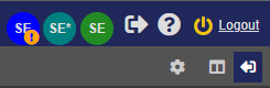
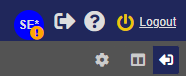
 and - logs you out of the Maestro editor
- - provides you with the same help options as the Maestro Dashboard, plus the addition option - Show Form Details to view more information about an open form, template or receipt.
The is located at the top of the editor. It contains a range of options for interacting with the current design. Most of the options are available for all types of designs, but some options are only available based on the type of design being edited. It has a slightly different layout when you work on a form, a component, or a template, as shown below:
Form


Receipt

Template

Component

For more information, see Design Mode Toolbar.
The provides the following functionality, which you need to efficiently work with Maestro's forms, components, and templates:
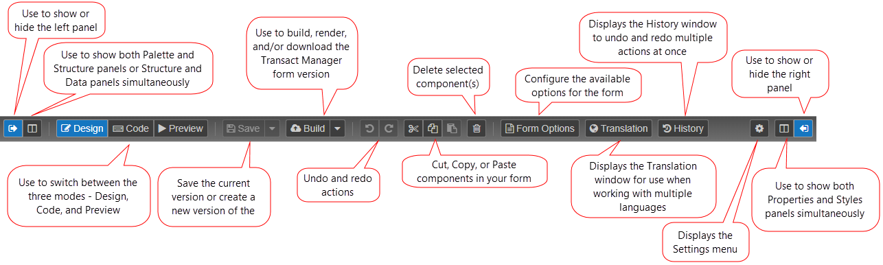
 shows or hides the left panel and
  shows or hides the right panel.
 displays two panes side by side or clear it to show only one pane. This is beneficial for larger screens as you can adjust the size of the panes according to the screen width.
- Design switches to design view in the editor, that is where a form is displayed when you open it from the Maestro Dashboard.
- Code shows the code view in the editor.
- Preview checks how a form will look when it's built.
- Save updates a form's content.
- Save this Version saves the changes to the currently open design version.
- Save as New Version saves the changes as a new design version, which is equivalent to creating a new design version from the Management Dashboard.
- Build a form version.
- Publish a component or publish a template.
- Undo and redo actions, as well as cut, copy and paste of a selected components.
- Delete a selected component.
- Form Options allows you open form configurations when you work with forms.
- Component Options allows you open component configurations when you work with components.
- Brand allows you to select a brand you want to modify while working with a template.
- Translation applies multiple languages to a form.
- History views the history of the asset and undo recent changes made to a form.
- Settings Menu applies various configuration options to a form.
- Close closes an open form.


If you have a larger screen, the four-tab view can be extremely powerful. On the left side, this allows you to drag and drop components from the Palette pane directly onto the form. Many experienced Maestro developers find this a quicker and easier way to add components. You can also double-click the component from Palette for even faster additions.
On the right side, this allows you to view the Properties and Styles panes together, which can also make editing a little faster.
Left Panel
The left panel of the editor includes the following panes:
- Palette pane displays all available components. All listed components are available to be added to a Maestro asset.
- View pane provides a hierarchical structure of the form, which is particularly useful with larger forms, where finding components can be difficult. This pane replaces the Structure pane.
- Model pane displays data models and is used to manage and share domain models. | 18.05 This feature was introduced in 18.05.
- History pane shows a history of every action that has been performed in the current editing session. | 17.10 This feature was removed in 17.10 Use the History button instead.
- Editor pane shows an editable preview of component's properties on the right side of the window.
All panes in the left panel have the following controls:
| Icon | Label | Description |
|---|---|---|
| Search Input | ||
| Expand All | ||
| Collapse All |
Right Panel
The right panel of the editor includes the following panes:
- Properties pane displays the properties and business rules of a selected component. The properties vary depending on a type of the selected component. Some properties can contain rich text content which you can modify using the built-in rich text editor.
- Styles pane provides options to customize the look and feel of a component. It's recommended using a template to create and modify form's styles.
- Integration pane allows you to control the underlying data representation of a selected component. This pane replaces the Data pane. | 17.10 This feature was introduced in 17.10.
Views
The Maestro editor comes with the following views, also called modes, which help you create various Maestro assets:
- Design view is the default view, which is displayed when you open a new asset, and it is where you work with the open form, template, and component.
- Code view allows you to view, create and modify all business rules.
- Preview shows how a form will look when it is built. This is a working preview of the form that allows you to check the added components and some functionality without having to build a form.
Next, learn about the Properties pane.