Properties Pane
MaestroThe UI design product. | Form Builder | 21.05 This feature was updated in 21.05.
The Maestro editor comes with the Properties pane that allows you to check and modify properties of a selected component. This is where you adjust a component's behavior by updating its properties. Different components have different sets of properties, so the Properties pane dynamically shows them as you select each component.
To view and edit component's properties in the Properties pane:
- Open a form or a template in the Maestro editor.
- Select a component and click the Properties tab.
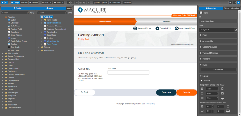
- ID
- Label
- Rules
- Layout
- Find a property you need. Properties are grouped by related settings so you may need to use the arrow to expand the group to see all available options.
- Right-click the property field and select one of the following options:
Note These options are only available when you edit a template.
- Add to Brand Options to add the property to a brand.
- Remove From Brand Options to remove the property from a brand.
Note You can only see this option if the property has been added to the brand.
- Add to Form Options to add the property to Form Options.
- Remove from Form Options to remove the property from Form Options.
Note You can only see this option if the property has been added to Form Options.
- Item - for example, Item: Dropdown
- Property - for example, Property: Add Blank Value
- Click Create Rule to open the Create Rule dialog to choose a business rule to apply.
Note A few specialized components can't have rules added to them, so you won't see the Rules category or any rules displayed in the Properties pane.
- Expand the Layout section to arrange components on the form according to your device's or browser's screen sizes. For more information, see component layout.
- Select the Exclude checkbox to exclude the selected component from the XML as well as from the published form so it won't be present in the HTML form.
- Select the Hide Label to hide or show a component label. Most components should have a label, but sometimes you may want to hide the label from an applicant on a form.
- Select the Label Placement Left checkbox to change label location to the left. For the sake of usability, labels should generally be placed above input fields. This is how Maestro's components are configured by default. You can, however, change the placement of a label to the left of an input field. This is typically done on receipts as a way of saving space. For more information, see component labels.
- Click Save to update the component's changes in the form or the template.

Every component has its own set of unique properties, which you can check here. However, all components have the following common properties:
You can also see the additional information about a selected component:
You have more control over a component's appearance via the Styles pane.
Next, learn about the Styles pane.