Palette Pane
MaestroThe UI design product. | Form Builder | All versions This feature is related to all versions.
The Maestro editor comes with the Palette pane that shows all available components you can use to build Maestro forms for different customer journeys. The components are Native, Custom Native, Shared and Exchange components and they are listed by categories to help you find them easily. The components available to a design depends on the libraries available to that design's project and organization. The receipt design types has access to fewer components, as some components don't make sense to include in flat, uneditable documents.
The Palette pane gets its name from its similarity to an artist's palette that contains a range of distinct colors that are used to create masterful pieces of art.
To view a form in the Palette pane:
- Open a form or a template in the Maestro editor and click the Palette tab.

The first category in the Palette pane is the Favorites category. This is where you can save commonly used components for convenient access. All other categories are ordered alphabetically.
- Find a component you need. Components are grouped by categories according to their functionality. You may need to use the arrow to expand a category to see all available components. Alternatively, type a part of component's name in the search box. Use the down and up arrows to expand and collapse the selected categories.
A design can only access the components included in the libraries available to that design's project and organization. The receipt design types has access to fewer components, as some components don't make sense to include in flat, uneditable documents.
Note The list of displayed components may be different for different customers, or even different projects. This is because the Maestro editor might have been customized.
Note Some components belong to the Deprecated category so they are not shown on the Palette to prevent users from adding them to new forms. However, the deprecated components are still part of the product for backwards compatibility so they will work in forms that contain them.
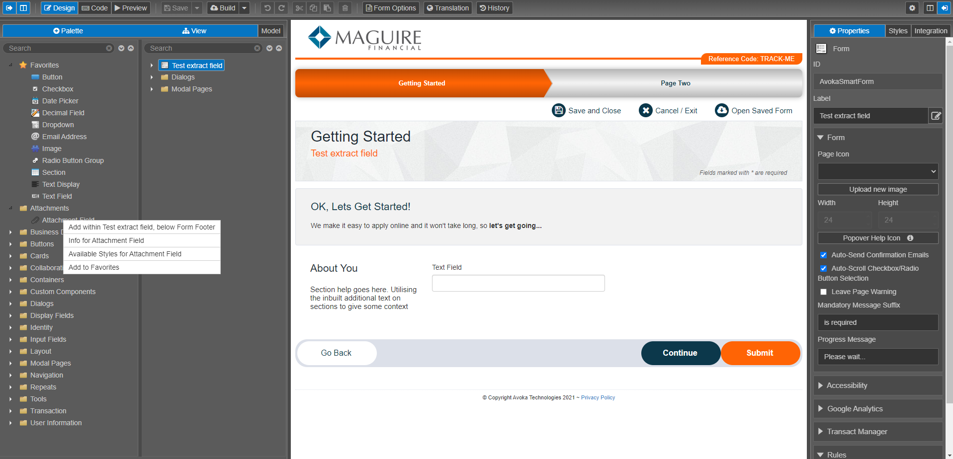
- Right-click the component and select one of the following options:
- Add below [COMPONENT NAME] to add the selected component into the wireframe, below whatever component is selected in the View pane.
- Add within [COMPONENT NAME], below [COMPONENT NAME] to add the selected component into the wireframe as the last child of whatever component is selected in the View pane.
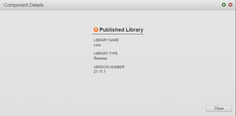
- Info for [COMPONENT NAME] to view the following details of a library the component is published to:
- Library name - core
- Library type - release
- Library version number - a major and minor versions of a library
Note You can see additional details about components and their properties when you start using them in your design.
- Available Styles for [COMPONENT NAME] to view and modify the list of shared styles that the selected component can access to. For more information, see Make a Shared Style Available.
- Add to Favorites to add the regularly used component to the Favorites category for easy access.
- Remove from Favorites to remove the selected component from the Favorites category.
- Exclude from Palette to prevent the component from appearing in the Palette pane. This option is only available while editing a template. A Template Designer can control which components are available to a Form Builder by excluding them from or including them in the Palette.
- Include in Palette to add the component back to the Palette pane, if it has been previously excluded, see the option above.
- Click Save to update the component's changes in the form or the template.
Some of these options are available when right-clicking a component in the View pane.

Next, learn about the view pane.