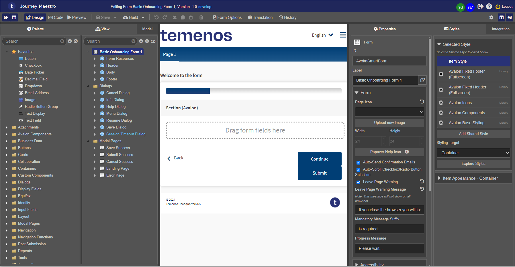
Styles Pane
MaestroThe UI design product. | Form Builder | All versions This feature is related to all versions.
The Maestro editor comes with the Style pane that allows you to modify the appearance of a component. Although a template used in a Maestro form enforces the majority of the styles, you can use this pane to add minimal modifications to the visual look and feel of forms and components.
Form Builders should not use the Styles pane often, if ever. In most cases, Template Designers manage all styling in the template as it can get complicated. You should always speak to the Template Designer before making any styling changes.
For example, you can apply multiple shared styles and item styles to a particular component. What happens if one of these styles defines the label to be red, and another defines it to be blue? What color will be chosen?
The answer is that the styles will be applied in the order that they are defined in the master style-sheet that is maintained by Maestro. Any style setting that is applied after a previous one will overwrite the previous one. You can't control what order the various styles will appear, except that the item style will always override any shared style settings. Maestro comes with the Explore Styles functionality that allows you quickly find out what the effective style of a component is and in which order CSS is arranged.
Styling uses CSS and LESS, so you should be fairly familiar with the concepts to create effective and reusable styles. For more information, see https://www.w3.org/Style/CSS/learning.
To view and edit component's styles in the Style pane:
- Open a design in the Maestro editor and select the Style tab.
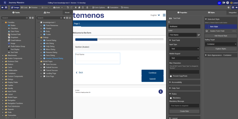
- Find a style you need to modify. Styles are grouped by related settings so you may need to use the arrow to expand the group to see all available options.
- Click Save to update the component's changes in the form or the template.
Main Style pane functionality is described in details below.
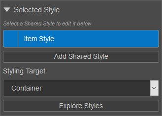
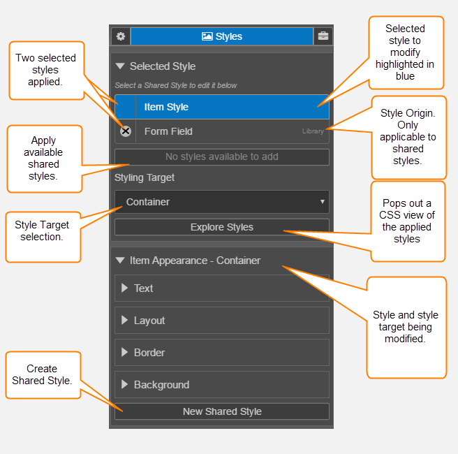
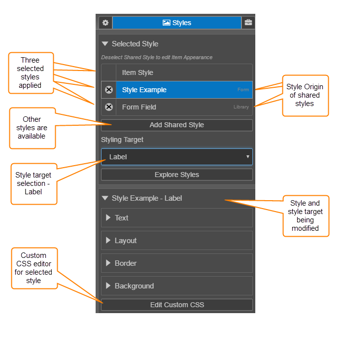
Selected Style
A list of styles applied to the component appears beneath the Selected Style heading.
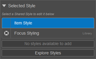
The first style in this list - Item Style - is unique to the selected component and can only be modified via the GUI (using the controls under the Item Appearance - Container heading).
All other styles that appear in this list are shared styles. These are styles that can be used by multiple components and edited as CSSCSS stands for Cascading Styles Sheets and is used to define styles for a Maestro Form, including the design, layout, and variations in the form’s display on different devices and screen sizes. The CSS on a Maestro form is primarily taken care of by the Template Designer. The Template Designer will implement the branding and/or styling of the form’s assets.CSS can be applied to the template of the form, individual components, and any other asset associated with a Maestro form. or via the GUI. You always, however, have more control when editing the CSS file.
Beneath the list of styles, the following options are available:
- Add Shared Style - Add an existing shared style to the component. The styles in this list depend on the available component styles.
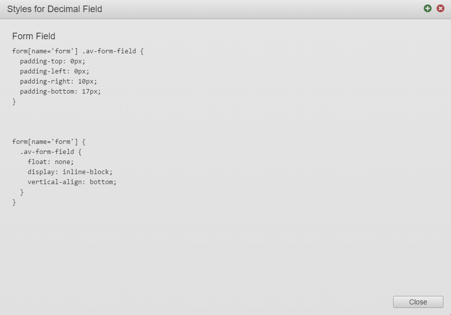
- Explore Styles - View the CSS and LESSLESS is a dynamic preprocessor style sheet language that can be compiled into Cascading Style Sheets (CSS) and run on the client side or server side. for all of the component's styles, which is the effective CSS for the component. This read-only view is especially useful for Template Designers to quickly check what styles are applied to the selected component.

- Apply to Receipt Only - If enabled, the selected style will only be applied to the component when it's rendered within a receipt.
Styling Target
When a component has multiple styling targets, an additional Styling Target property is shown:
This option allows you to adjust the style of an individual part of a component, such as the label of a Text Field component or the input of a Dropdown.
Even the simplest components in Maestro have a reasonable level of complexity. For example, the simple Text Field component consists of three separate parts.
- Label - which is simply a piece of text
- Input - which is the area into which you can type
- Container - which simply groups all elements into one
These separate parts are known as Targets, and you can style each of these separately.
Once you have selected one of these Styling Targets, you can use the Style settings to specify the Styles for each target separately.
For example, the following example shows a Text Field where the Border Style has been set for different targets.
- Container - Border color set to Blue
- Label - Border color set to Red
- Input - Border color set to Yellow
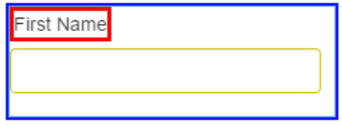
Different types of components will have different targets, and you may need to experiment to understand which target affects which part of the component. Using the border settings, as shown above, can help to identify the different parts of the component. Alternately, you can also look at a form containing that component type in your browser and use the browser "Inspect" function to understand the structure of the component.
Normally, when you click on a component and start modifying its style, you are changing the Item Style, which is the styling for just that one item on the form. This is fine when you want to change the styling of just that one field. However, if you want to create a whole lot of components that all look the same, and you want these to be used consistently, then you need to create a shared style.
Item Appearance - Container

By default, the section that appears beneath the Selected Style section is called Item Appearance - Container. The first part of this heading refers to the currently selected style -- by default, Item Style -- and the second part of the heading refers to the styling target -- by default, the Container target.
If you select a different style from the Selected Style list, or select a different option from the Styling Target dropdown, the name of this section will change.
In addition to this, certain buttons will appear at the bottom of this section when certain conditions are met:
| Label | Description |
|---|---|
| New Shared Style | Appears when an Item Style is selected. |
| Edit Custom CSS | Appears when a Shared Style is selected. For more information, see edit custom CSS. |
| Save to Shared Style | Appears when the selected style has been modified via the GUI. This is often the case for forms that use a template with one or multiple brands. |
| Clear Item Styles | Appears when the selected style has been modified via the GUI. |
The Style Editor has many of the standard CSS properties without needing to understand the details of CSS. It allows you to specify styles using the following four options:
- Text. Allows you to specify attributes of text, including the Font or Typeface, bold, italics and underline orientation (left, center or right), and size and color.
- Layout. Allows you to specify the layout of the element within its bounding rectangle. This includes internal padding, and minimum and maximum heights and widths.
- Border. Allows you to specify the border (if any), style of line, width, and color, and the radius of the corner.
- Background. Allows you to specify the background color, either as a flat color or a blend, or to specify an image. It also allows you to specify the alpha transparency.
These options are always visible.
Text
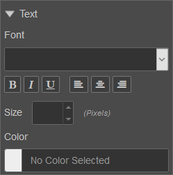
Under the Text heading, the following properties are available for adjusting the text in the selected style:
| Label | Description |
|---|---|
| Font | |
| Size | |
| Color |
Layout
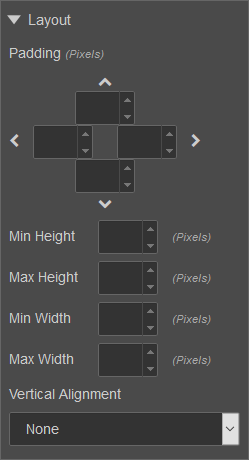
Under the Text heading, the following properties are available for adjusting the layout of the selected style:
| Label | Description |
|---|---|
| Padding | |
| Min Height | |
| Max Height | |
| Min Width | |
| Max Width | |
| Vertical Alignment |
Border
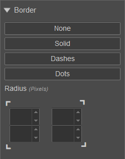
Under the Text heading, the following properties are available for adjusting the border of the selected style:
| Label | Description |
|---|---|
| Type | |
| Radius |
Background
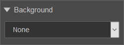
Under the Background heading, there's a dropdown with the following options:
- (EMPTY)
- None
- Solid
- Left to Right
- Top to Bottom
- Image
Depending on which option is selected, different properties will become available that affect the background of the selected style.
By default, the dropdown is empty:
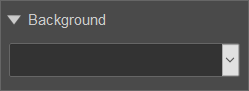
In this state, a background will not be applied to the selected style. If a background has been applied by a different style though, it will continue to appear.
If you select None, any existing background on the selected style will be removed.
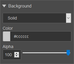
If you select Solid, a solid background color will be applied to the selected style.
The color is defined by two properties:
| Label | Description | Default Value |
|---|---|---|
| Color | #cccccc | |
| Alpha | 100 |
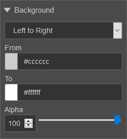
If you select Left to Right, a left-to-right gradient background will be applied to the selected style.
The gradient is defined by three properties:
| Label | Description | Default Value |
|---|---|---|
| From | #cccccc | |
| To | #ffffff | |
| Alpha | 100 |
If you select Top to Bottom, a top-to-bottom gradient background will be applied to the selected style.
The gradient is defined by three properties:
| Label | Description | Default Value |
|---|---|---|
| From | #cccccc | |
| To | #ffffff | |
| Alpha | 100 |

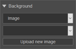
If you select Image, you'll be able to choose a background image from a list or upload a new image.
The example below shows the difference between components with the individual and shared styles applied:
Next, learn about the Integration pane.