View Pane
MaestroThe UI design product. | Form Builder | 24.04This feature was updated in 24.04
The Maestro editor provides the View pane to visualize a selected component in a hierarchical list of the components used in the current design. The component list can be a more efficient way of navigating the structure of a design than working within the Wireframe. The hierarchy you see is determined by the form’s template, so even if a Form Builder does not have permission to make changes to some components, the View pane always displays the dialogs and modal pages. This is handy in navigating through large forms.
The View pane was called the Structure pane prior to | 18.05 This feature was introduced in 18.05.
To view a design in the View pane:
- Open a design, such as a form or a template, in the Maestro editor and click the View tab.
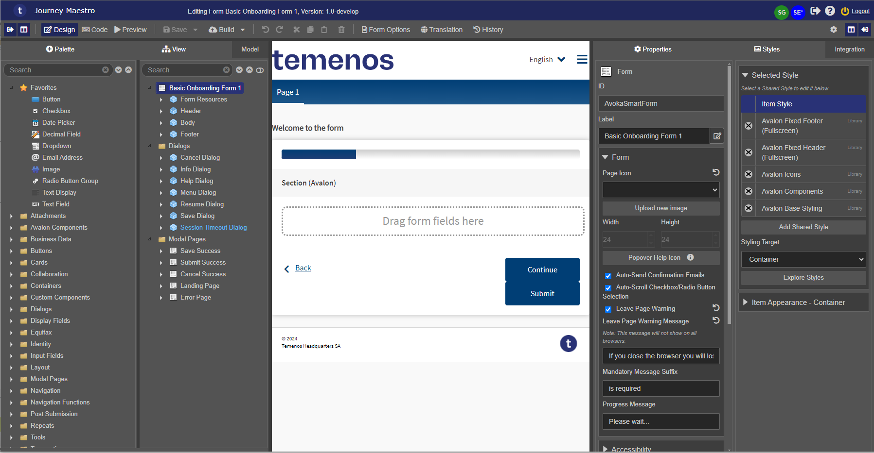
The pane shows the structure of a design as a hierarchical tree of components. At a minimum, all designs have a root node, which is the parent to most other components in a design. In many designs, this root node is a Form component, however, it also depends on the extension points configured in the parent template.
Most design types also have a Dialogs and a Modal Pages directories containing corresponding components that sit outside the normal flow of the form and are therefore located outside of the root node. For more information, see Template's Components.
The table below explains which design types have a Dialogs and/or a Modal Pages directorys:
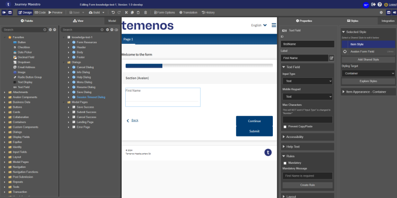
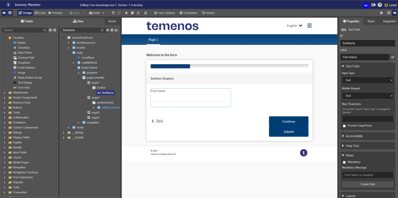
Design Type Dialogs Modal Pages Forms Components Templates Receipts - Expand a component's hierarchy to see its child components. For example, expand knowledge-test-1 > Body > Content > Form > Page 1 > Section (Avalon) > First Name.
- Select each component to see where it is positioned on your page - it will be outlined with a blue box. In this example, select First Name to get it outlined in Section (Avalon). The Maestro editor automatically locates the selected component in the Properties pane. In this case, it's a Text Field component with an ID as
firstName. - Move components from one location to another by dragging and dropping them within the hierarchy.
Note Some component types must be contained within other component types. For example, a Page can't exist underneath a Dropdown. The Editor will prevent you from moving or creating components under the incorrect parent.
- Select multiple components by using the keyboard keys
SHIFT orCTRL and then apply a required operation to the selection, for example, drag and drop them:- To arrange components within the hierarchy, drag and drop them.
- To select multiple, non-sequential components, hold the
CTRL key. - To select multiple, sequential components, hold the
SHIFT key.
- Type a component ID or a label name of a component you are looking for in the component hierarchy and press Enter. Maestro will search the tree of components comprising the design and display the found component in the tree using labels or IDs depending on a toggle button status, which can be one of the following:
- Use Label - default
- Use ID
| 24.04 This feature was introduced in 24.04

- Search by a label or an ID.
- Toggle Use Label or Use ID.
- A component found by its ID.
- Same component outlined in the Wireframe.
- The component's ID shown in the Properties pane.
Toggle Use ID to search with and view the component's hierarchy of component's IDs.
- Right-click a component and select one of the following options:
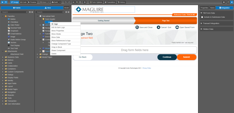
- Info for Item [COMPONENT NAME]: to view details about a library the component is published to and the component's properties.
- Show Properties: to open the Properties pane for the selected component.
- Show Styles: to open the Styles pane for the selected component.
- Show Data: to open the Integration pane for the selected component.
- Show References to [COMPONENT ID]: to view references to the selected component, such as references inside rules or labels.
- Change Component Type: to change the selected component to a different component type.
- Wrap in Block: to create a block component and insert the selected component into the block.
- Set as extension point: to add an extension point to the selected component.
Note This option is shown for templates only.
- Share Component: to publish the selected component
- Apply Shared Styles to every [COMPONENT NAME]: to apply a customized template's component style to all forms using this template.
Note This option is shown for templates only. However, you can apply a shared style to a component at the form level, but it's not a recommended approach.
- Apply Properties to every [COMPONENT NAME]: to apply a customized template's component property to all forms using this template.
Note This option is shown for templates only.
Note This option doesn't apply to an id, label, rules or layout.
- Delete: to remove the selected component.
- Put on Previous Row: to place the selected component at the end of the previous row. The component will be marked with the Line-Through on both sides of the icon. You should use this option to position several components side by side to each other, for example, 2 text fields next to each other.
Note To undo this, drag the component in the design tree to a different position.
- Remove Component Property Overrides: to remove the property override.
Note This option doesn't apply to rules, styles and the property's exclude flag.
Note You can remove component property overrides using the Component and Property Source dialog.
- Set as extension point: to add an extension point to the selected component.
- Add Page Group
- Add Page
- Add Icon Button
- Click Save to update the component's changes in the form or the template.


When editing a template, additional options are available in this menu:
Some options are only available if you right-click specific components:
If you right-click the Dialogs directory, a context menu with an Add Dialog option appears.
If you right-click the Modal Pages directory, a context menu with an Add Modal Page option appears.
Icons
All components have an icon associated with them. These icons are not necessarily unique, but they do make it easier to grasp the structure of a design.
Additional icons are used within the View pane to communicate certain behavior. Depending on come component configuration, layout orientation and level of editability to you, an icon can change its background or have additional elements added to it. The list below summarizes these changes:
| Icon | Label | Description |
|---|---|---|
| Unlocked | An extension point has been set on this component. This icon will only appear while editing a template. | |
| Locked | An extension point is preventing you from configuring this component. | |
|
|
Line-Through | A component is laid side-by-side with the previous component, meaning it is on the same row as a component above it. For more information, see the Put on Previous Row option. |
|
Bright blue text |
A locked down component defined in a form or template, which means you can't add a new field before an existing field inside the component. If you try, the |
|
Dull blue text |
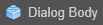
A child of a component. For example, the Address Block - Info component has the Info Block Image and Block components as a children components. This is shown below:
You are not allowed to add a new component to this locked component. |
|
White text |
An open component, which allows you to add a new field before an existing field inside the component. It also indicates that the component has no children in it. |
Next, learn about the Model pane.