Custom Reports View
Journey Analytics
The behavioural analytics tool. |
Analytics User | Latest Version
Latest version 23.04.0 cloud hosted.
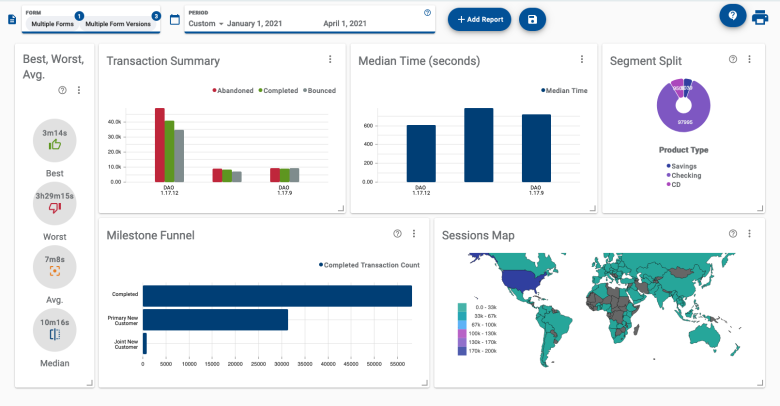
The Journey Analytics Custom Reports View provides a customizable dashboard that makes it
easy to compare the performance of your application versions, across many different metrics in a single view. This
view is empty by default but multiple metrics can be displayed in the form of reports that can be arranged and
resized on the screen.
To display the Custom Reports View:
- Select Custom Reports from the Navigation Panel.
- Select the application and time period to analyze.
- To narrow down the types of transactions reported on, you can also use the Global
Filters panel.
- Click Add Report to select the type of report card you want to display.
- Click and drag the report card into the desired location on the screen. If desired, add more report cards.
- To configure the report card options, click and Configure, then click Apply.
- To delete a report card, click and Delete.
- Use the Save button and dialogue to store the set of reports and their
configuration or to retrieve a saved set of reports.
Customize your view
Use these actions to craft your view:
Add Report button - Use this button to select additional reports to add to the view.
Rearrange reports - Click and drag any report to change its position in the view.
Resize corners - Click and drag the bottom-right corner of any report to resize it in
the view.
Report Configuration - For many reports, additional configuration options are
available to modify how the report is displayed. Click in the top-right corner of
any report to modify its configuration.
Save button - Use this button and dialog to save and retrieve your reports.
Saving a Custom Reports set is currently confined to the browser local storage. So, if you open a new browser
or clear your browser cache, you will not be able to retrieve your saved set of reports.
Available reports
Generally, a report targets a specific metric or type of metrics to provide specific insights into user
behaviour. Refer to the list of examples below for details about how to use each available report.
Best, Worst, Avg - gauge the best, worst and average time taken to
complete applications within the selected scope.
Completion Rate - examine application performance in terms of user
completion for the selected scope in a bar chart.
Duration Summary - compare and sort the best, worst, average, and
median times to complete each version in the selected scope using a table.
Median Time - compare the median time to complete each version in the
selected scope as a bar chart.
Milestone Funnel - compare standard and
custom milestone hit rates for the selected scope with a bar chart.
Section Completion - see completion across sections for the
selected scope using a line graph.
Section Summary - compare and sort by section-level stats for each
version in the selected scope in a table.
Segment Split - discover the breakdown of values of a segment type for all transactions within the selected
scope using a pie chart.
Segment Switch - examine how users traverse values of a segment type for all transactions within the selected
scope using a sankey graph.
Session Map - investigate the number of sessions occurring per country
for the selected scope using a choropleth graph.
Top Fields - compare and sort by field-level stats for each version in
the selected scope in a table.
Transaction Summary - compare Transaction Statuses for the selected scope using this bar chart.
 and Configure, then click Apply.
 and Delete.
 in the top-right corner of
any report to modify its configuration.