Custom Reports View - Segment Switch
Journey Analytics The behavioural analytics tool. | Analytics User | Latest Version Latest version 23.04.0 cloud hosted.
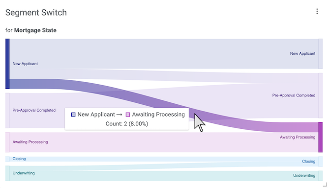
This sankey chart, or flow diagram, highlights how segment values, within a specific segment type, change during transactions. The visualization shows the flow from initial segment values to final segment values for the selected segment type. This chart is used to evaluate and measure improvements for segment switching.
Configuration
Click  to modify the
configuration option.
to modify the
configuration option.
- Segment - Set the segmentation, or segment type, to target. Available options are based on the selected form.
Example Analysis
In the example screenshot, multiple versions are selected via the Scope Selector, so segment data for the entire selection is shown in a single chart. Key takeaways are:
- The chart shows how segment values change over the course of a transaction for the segment type called Mortgage State. The segment type tracks end users' mortgage status throughout the transaction.
- The hover tooltip shows that 8%, or two transactions, began with the New Applicant segment value and then ended the transaction with Awaiting Processing.
- Some user transactions transitioned from New Applicant to Pre-Approval Completed.
- Some user transactions also transitioned from Underwriting to Closing.
This graph suggests that most users start and end the transaction without transitioning through Mortgage Status segment values. Generally, users appear to struggle to advance their status within a single transaction.