Custom Reports View - Completion Rate
Journey Analytics The behavioural analytics tool. | Analytics User | Latest Version Latest version 23.04.0 cloud hosted.
This versatile bar chart shows the rate at which users complete each application version or completion rates over time (by week or by month). Configuration options can be used to aggregate and split the chart in various ways.
Configuration
Click  to modify the
configuration options.
to modify the
configuration options.
- Split By - Toggle how the bars on the chart are grouped. Configure to show completion rates for each device type, form or form version.
- Aggregate By - Toggle how the x-axis is displayed. Select Week or Month to show change over time or use Form Version to view rates for each selected form version.
- Enable Grids - Toggle the grid markings on and off.
- Max Legend Items - Set the maximum number of legend items to display.
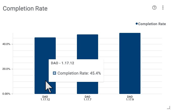
Example Analysis
In the example screenshot, multiple versions are selected via the Scope Selector, so completion rates can be compared across each version. Key takeaways are:
- The hover tooltip, and the Y-axis, shows a completion rate of 45.4% for version 1.17.12.
- Relative to other versions, the user completion rate has slightly decreased in the latest version, 1.17.12.
- Completion rates for the 1.17.9 version were better than any other version.