Custom Reports View - Section Completion
Journey Analytics The behavioural analytics tool. | Analytics User | Latest Version Latest version 23.04.0 cloud hosted.
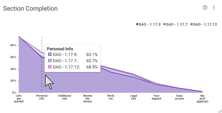
This line chart highlights the rate at which users complete sections. Colored lines are drawn for each selected form version.
The x-axis represents each section (excluding modals and dialogs) and the y-axis and hover tooltip displays the rate of completion. The section sequence is deduced from transaction counts and is ordered across the x-axis from left to right. Use the report configuration to target specific sections. When multiple applications are selected, a line for each version is drawn on the chart.

Configuration
Click  to modify the
configuration options.
- Enable Dot Labels - Toggle display of rates for each section on the chart.
- Sections - Use this option to select which sections show on the chart. By default, all sections will display.
- Max Legend Items - Set the maximum number of legend items to display.
Example Analysis
In the example screenshot, multiple versions are selected via the Scope Selector which causes the chart draw different color trend lines for each version. Key takeaways are:
- As expected, we notice that most users are completing the sections which occur earlier in the journey like Let's get started! and Personal info.
- The least completed section at the end appears to be an optional section, only for joint applications, which would explain the lower number of completions.
- In the hover tooltip, we see the Personal Info section is associated with an increased completion rate of 68.5% for the latest version, 1.17.12.
Optimizations to the Personal info section appear to have led to more user completion for the section. This chart corroborates that those optimizations are working as intended.