The Application Details Screen (22.10 and earlier)
WorkspacesThis topic relates to Journey Workspaces | Workspaces UserIncludes bank staff, helpdesk, relationship managers, and managers | This feature was introduced in the 18.11 releaseThis feature was updated in the 22.10 release
Some of the text and images below may not match what you see in your Journey Workspaces app. This is because the features described are based on a default Journey Workspaces configuration, and your Workspaces app may be configured differently; for example, with your company's branding, with fields for other information, or with a custom layout. Nevertheless, the features described work the same way in every Workspaces app.
Overview
The Application Details Screen, as the name suggests, displays information about an individual application and its associated tasks, and provides features for you to complete the tasks, thereby progress the application through its processing life cycle.
The Details screen is displayed when a user clicks an application or task in an item list on a List screen, and the information displayed is reloaded when the use clicks a task in the application timeline. Application information is displayed in the context of a specific task, being either the first task for a saved application or any selected task for a submitted application. Additional information may also come from another task or the application data.
Each space in the default configuration of the Workspaces portal includes its own Details screen, and all of them share a common layout and a lot of common functionality. However, each Details screen has some differences, and these are identified when discussing each of the spaces separately.
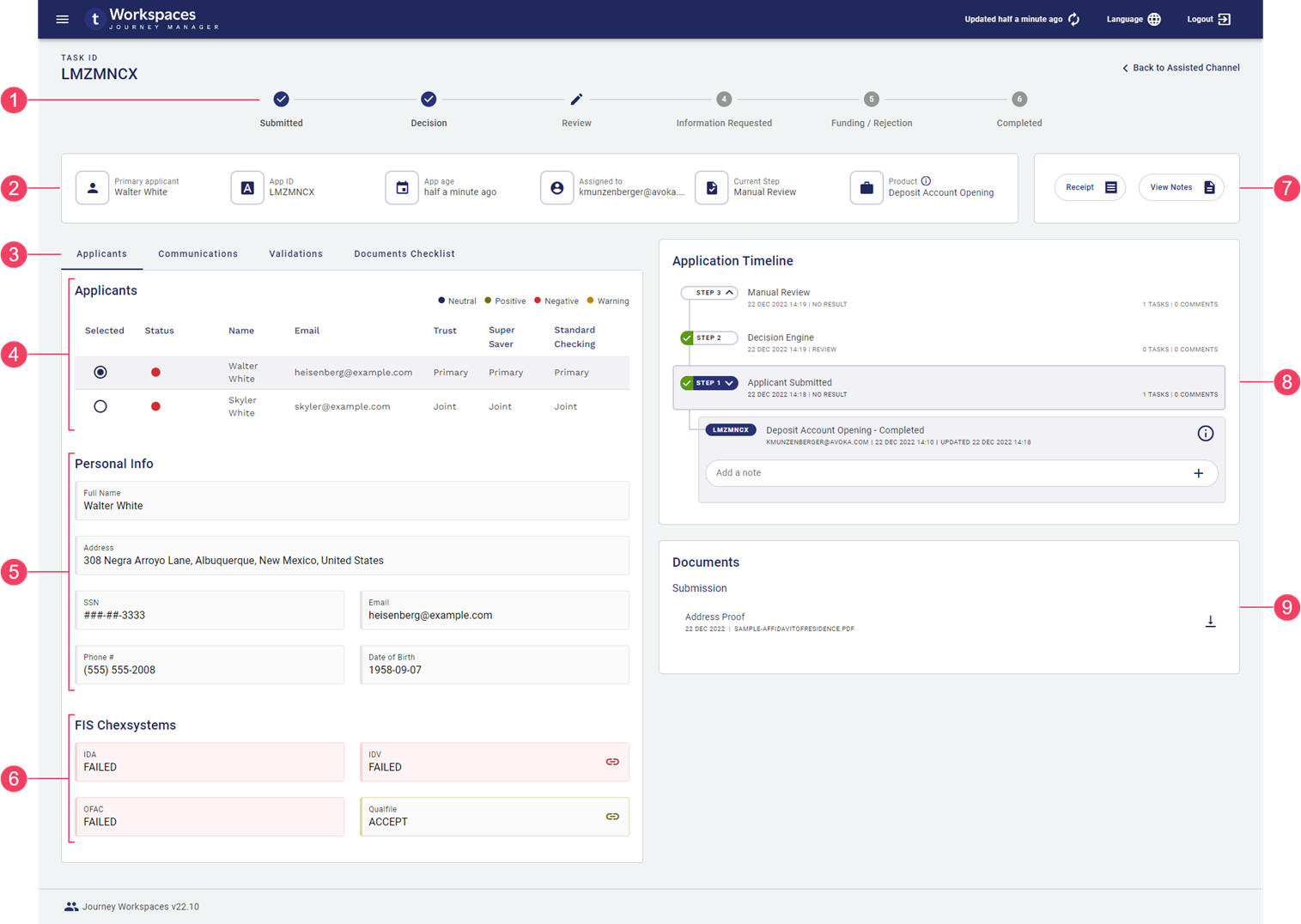
- Progress stepper
- Detail tabs
- Applicants
- Personal Information
- Background checks
- Application actions
- Application timeline
- Documents
Features
The Details screen includes the following features, each of which is contained in a separate tab, card, or card section.
- An optional progress stepper showing a high-level indication of the selected application's progress. By default, this is available for the Helpdesk and Assisted Channel spaces only. This feature was introduced in the 22.10 release
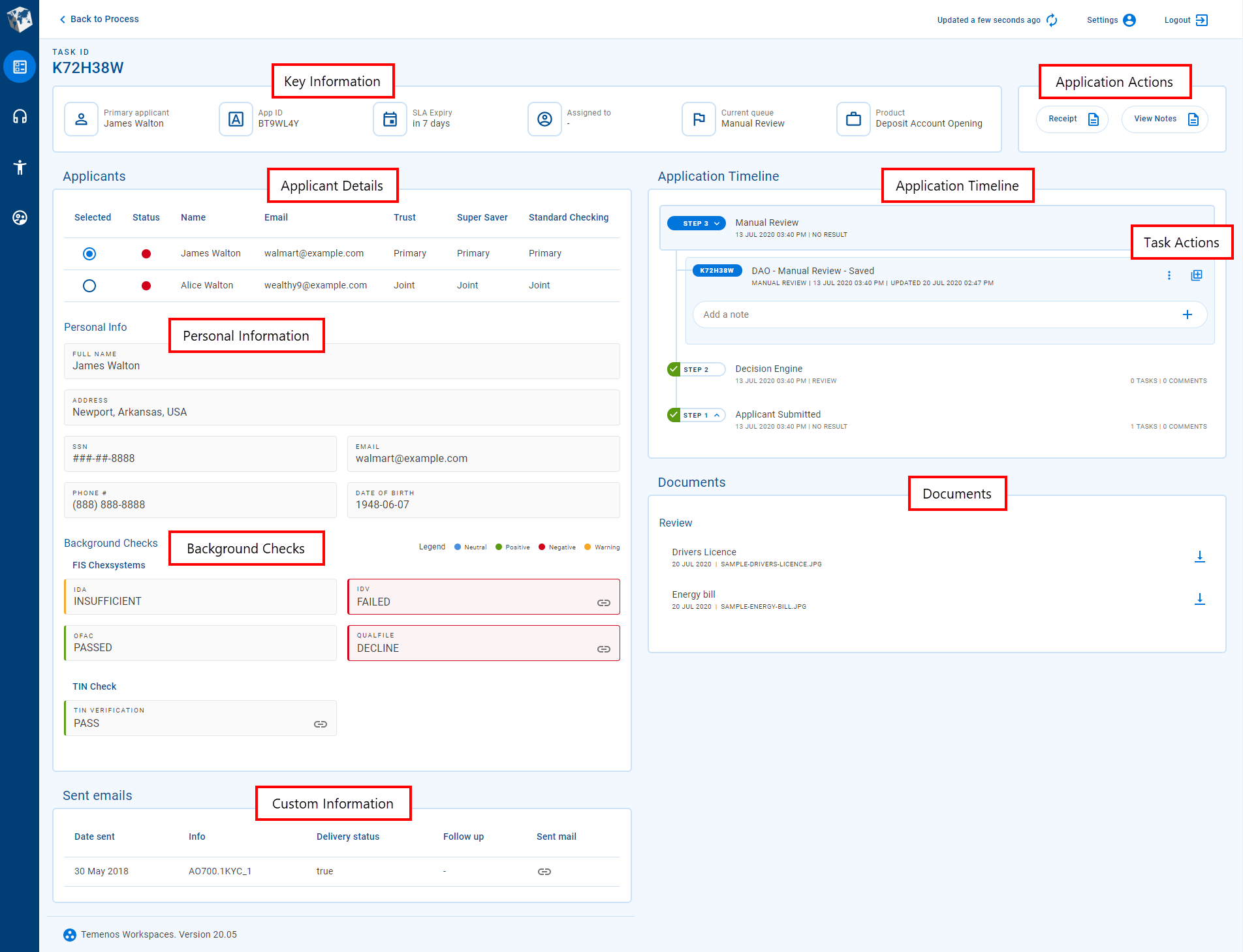
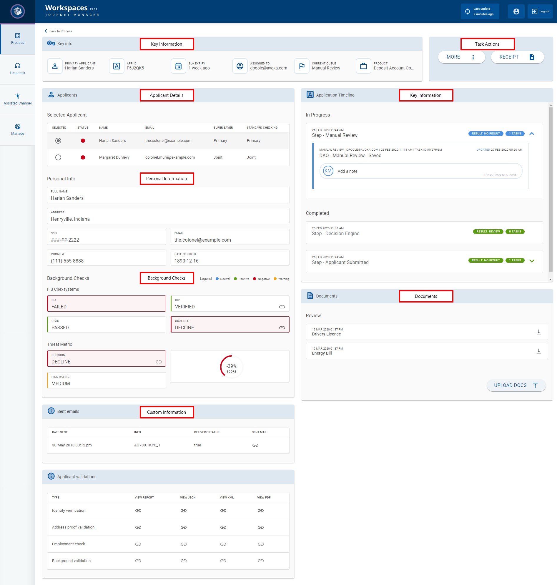
- Key information about the selected application and its tasks.
- A set of standard actions that you can perform at the current stage of the application's life cycle.
- A set of tabs providing access to applicant data and other custom information. This feature was introduced in the 22.10 release
The applicant data, shown on the Applicants tab, includes:- A list of applicants and products from which you can select an applicant to view more details. This feature was introduced in the 19.11 release
- Personal information for the selected applicant, including identity and contact details. This feature was introduced in the 19.11 release
- The outcomes of preconfigured background checks which provide an assessment of a selected applicant's suitability. This feature was introduced in the 19.11 release
- Any other custom information that is not included in the standard cards, or that is presented differently.
- A feature-rich application timeline showing all the steps (tasks) that the application has progressed through, key details, and accompanying notes. Select a step to reload the Details screen in the context of that task. This feature was introduced in the 20.05 release
- A dynamic set of actions that are applicable to the selected task and currently available for you to perform, thereby giving you confidence that you're acting on the right task. This feature was introduced in the 20.05 release
- Attached documents relating to the application. This feature was introduced in the 19.11 release | This feature was updated in the 22.10 release
Data items
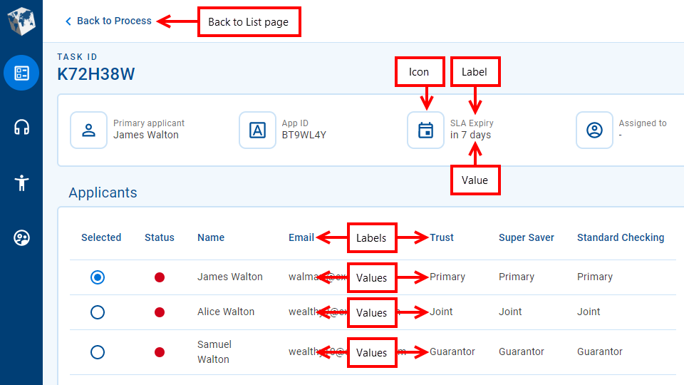
Generally, each information item or data field on the Details screen has a label and a value. The label identifies the specific entity that the field relates to, and the value is the application data corresponding to the label. Sometimes, there may be multiple values for one label; for example, when data is presented in a table.
- Icon
- Label
- Value
- Table labels
- Table values
- Back to List screen
Fields display information of various data types including text (name, email address, some IDs), numbers (phone, SSN), and dates. A date may represent either a specific point in time (date of birth) or a duration (application age).
Numbers and dates can be configured to use a variety of formats. For example:
- Phone numbers can be formatted for the current locality or to accommodate internationalization.
- 9-digit Social Security Numbers are commonly displayed using the format "AAA-GG-SSSS".
- Dates representing a point in time can use either absolute ("1 Jan 2022", "today") or relative ("last Wednesday", "6 days ago") formats.
- Dates representing a duration can use either specific ("7 days, 3 hours, 26 minutes") or approximate ("about 7 days", "last week") formats.
Sometimes a value might be too long to fit in the space available for it; in this case, the value is often truncated and an ellipsis ('…') is appended to indicate that you're not looking at the full value. To see the full value, point your cursor at the truncated value and a tool tip is displayed showing the full value.
By default, values in table columns wrap when they are wider than the column. However, sometimes this behavior is undesirable, and it can be overridden for specific columns via configuration.
To return to the List screen, click the Back to ... link at the top of the screen, or click an item in the .
Progress stepper
The progress stepper is an optional component that presents a high-level overview of application progress against significant milestones in the application life cycle. By default, the progress stepper is available for the Helpdesk and Assisted Channel spaces only. The progress stepper is hidden for saved applications, becoming visible once an application has been submitted.
If you need to see more application processing details, the application timeline shows the exact steps performed.
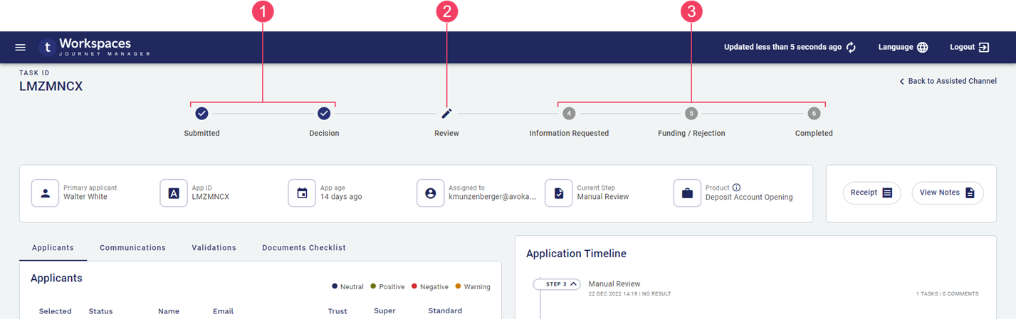
- Completed steps
- Current step
- Pending steps
Current, completed and pending steps are differentiated visually, allowing the user to see the progress of submitted applications at a glance. Steps to the left of the current step are shown as completed even if they were skipped, while steps to the right of the current step are shown as pending even if they have been completed. For example, the following screenshot shows an application that is being reviewed for the second time after requested information has been provided. The progress stepper shows the Information Requested step as pending even though it has been completed because it is to the right of the current step, while the application timeline shows all steps the application has been through; in particular, the two Manual Review steps.
The card displays important application information that's handy for Workspaces staff to have at their fingertips.
- card
- Icon
- Label
- Value
- Tooltip
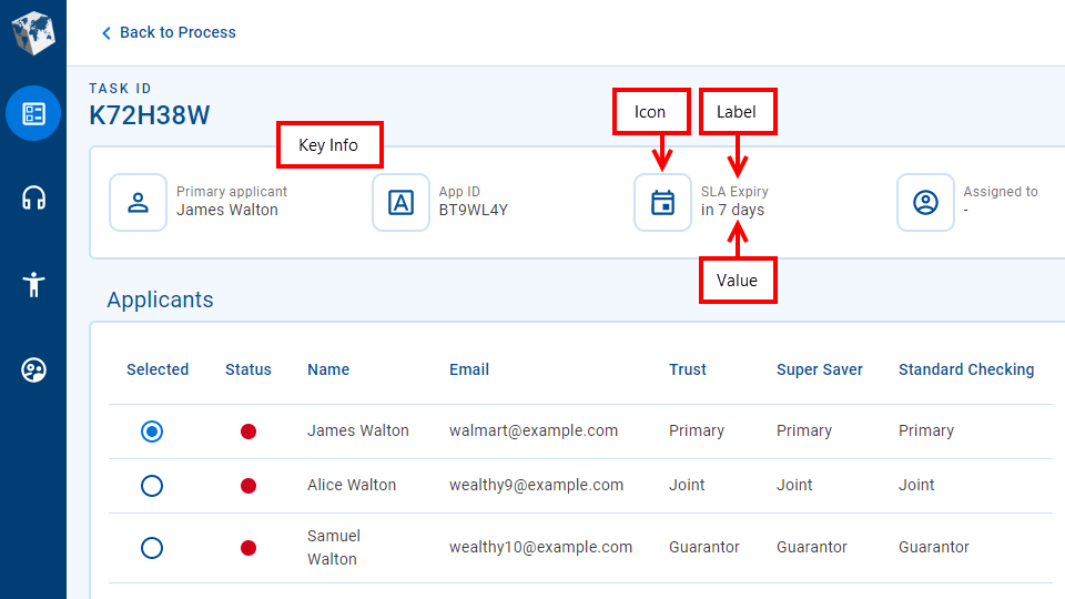
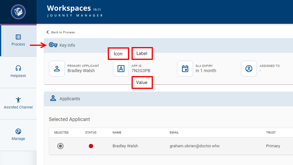
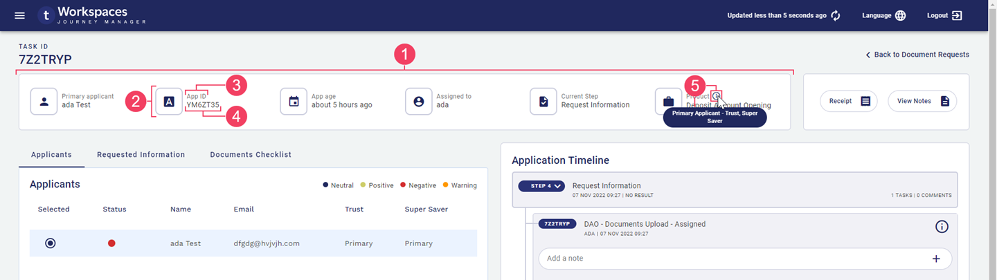
Items on the card have a label and a value as well as an icon that provides a visual representation of the type of entity that the information is related to; for example, a unique identifier (ID), a person or a duration. The card includes between four and six items depending on the width of your browser window. The full width layout accommodates six items but as the width of your browser becomes smaller, items are removed progressively until only four items are displayed.
Each item shows a single value but this can be limiting for some kinds of information. To improve this situation, additional information can be displayed in a tooltip. When available, a tooltip is indicated by a icon. To view the tooltip, point your mouse at the icon. This feature was introduced in the 22.10 release
As an example, say you have an application type covering multiple optional products and you have a Product item. If an application includes multiple products, only the first product is displayed in the Product item. In this scenario, a tooltip could be configured to show all products included in the application.
The value displayed in the Product item may correspond to a form group. If this is the case, the specific form associated with the task is displayed as the Product. | 22.10 This feature was introduced in 22.10.
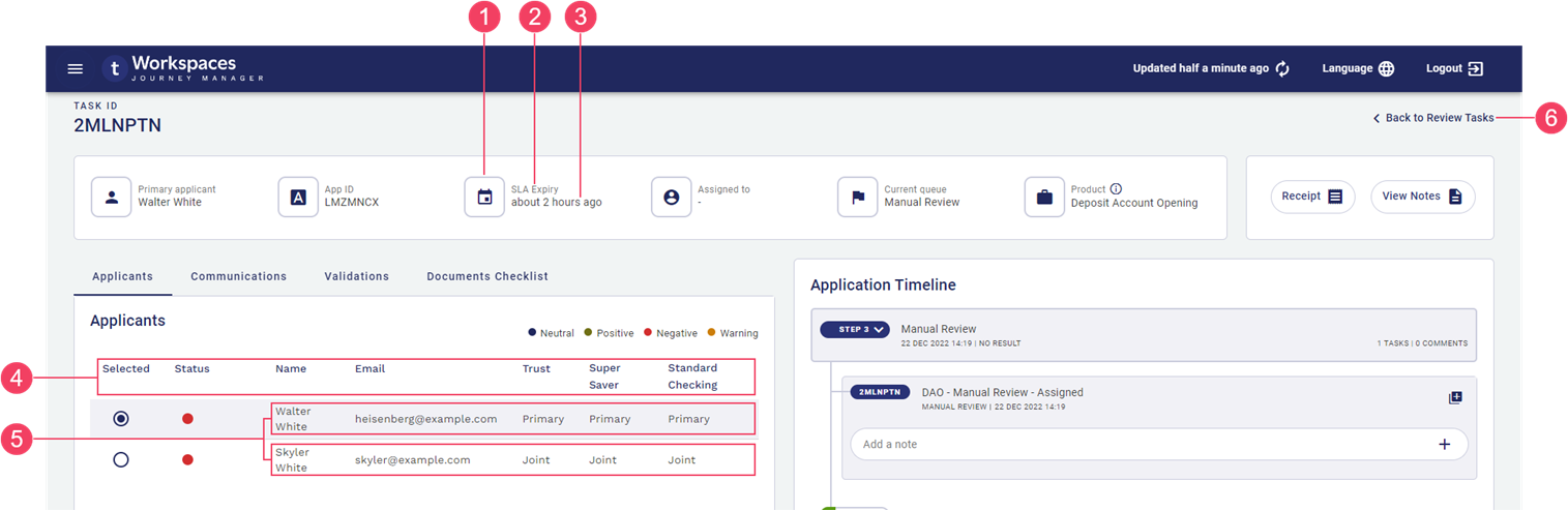
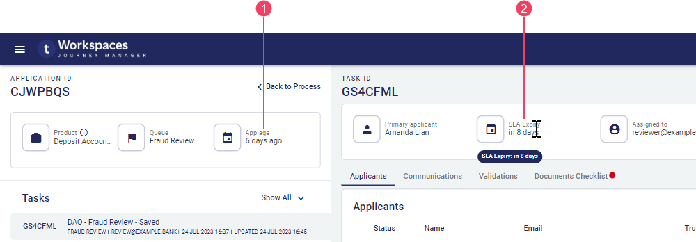
SLA Expiry
Workspaces enables you to monitor the progress of each submitted application against a crucial service indicator, such as an SLA. On the Details screen, SLA Expiry in the shows either how much time remains to complete processing of the application or the elapsed time since the SLA was breached.
- Application Age
- SLA Expiry
Unlike the graphical SLA indicator on the List screen, the SLA Expiry field does not indicate explicitly when an application is in the SLA Warning Period.
While the SLA Expiry field is available in the default configuration of Workspaces, it may not be available in your Workspaces portal or it may appear differently depending upon how your Workspaces portal has been configured.
Actions
Workspaces provides a set of standard actions for working with applications and tasks. All of the standard actions are available in the default configuration. In addition to the standard actions, Workspaces also supports the configuration of custom actions that allow your Workspaces portal to be extended with functionality that is not available in the default configuration.
The labels and tooltips for the standard action types are configurable, so they may be different in your Journey Workspaces portal to what is shown in this documentation.
Standard Actions (20.05 to 22.10)
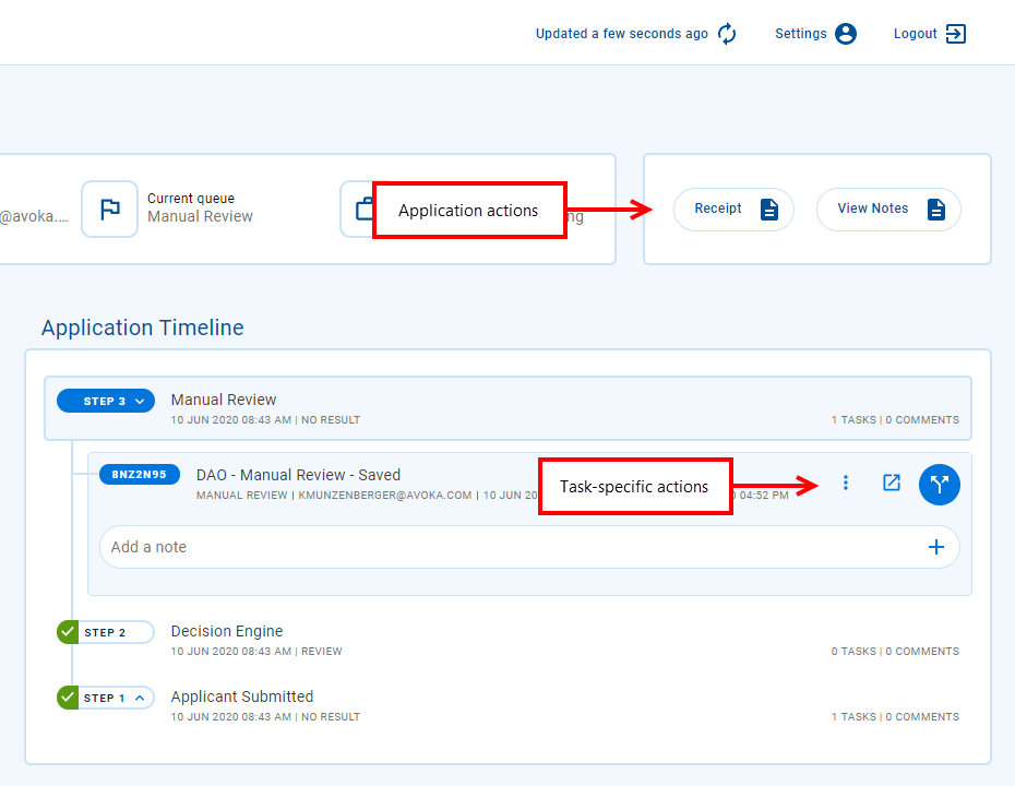
Standard actions can be performed from any Details screen. The way standard actions are made available depends on whether the action relates to an application or a task.
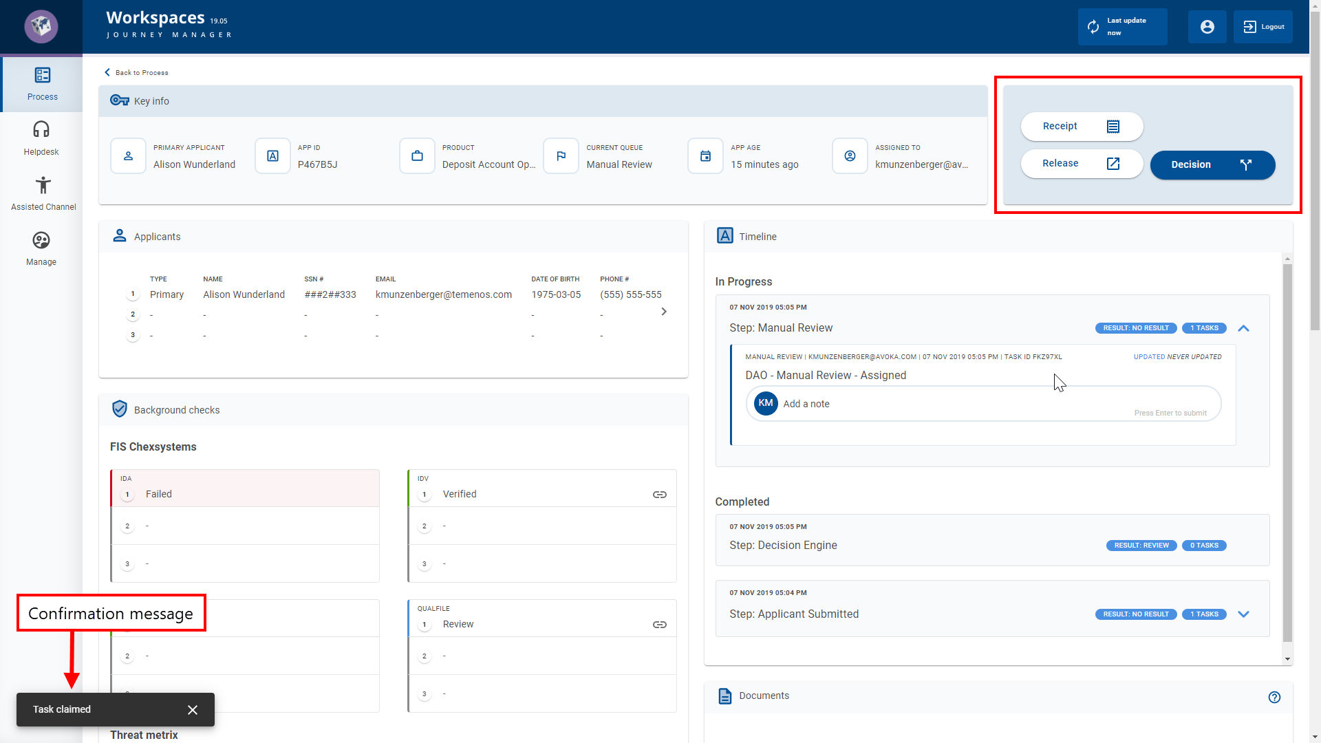
- Application actions are accessed via buttons in the Action panel to the right of the card.
- Task actions are accessed via icon buttons on each task in the application timeline.
You can use the Bulk Action feature to perform multiple actions at once. Bulk actions are available on the Journey Workspaces List screen only. Neither Journey Brokers nor Journey Applicants support bulk actions, nor can they be performed from any Details screen.
Bulk actions are available on the Journey Workspaces List screen only. Neither Journey Brokers nor Journey Applicants support bulk actions, nor can they be performed from any Details screen.
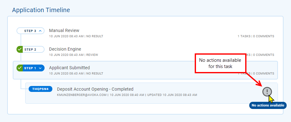
Different actions may be available for each task. This is because the actions that can be performed on a task at any time depend on several factors including the task's current state. For example, the Assign action will be available only for tasks that aren't assigned to a user. If no actions are available for a task, Workspaces indicates this by displaying the icon, instead of the action buttons, with the icon's gray color reinforcing the lack of available actions.
The Receipt and Add Notes actions are always available in the default configuration, and if configured for your Journey Workspacesportal.
To perform a standard action, click the action button corresponding to the desired action. Most standard actions will display a brief message in the bottom-left corner of the screen confirming that your desired action was successful or notifying you that something went wrong.
Standard Actions (19.11 and earlier)
Standard actions can be performed from any Details screen using the buttons in the Action panel to the right of the card.
Different actions may be available for each task. This is because the actions that can be performed on a task at any time depend on several factors including the task's current state. For example, the Assign action will be available only for tasks that aren't assigned to a user.
The Receipt and Add Notes actions are always available in the default configuration, and if configured for your Journey Workspacesportal.
To perform a standard action, click the action button corresponding to the desired action. Most standard actions will display a brief message in the bottom-left corner of the screen confirming that your desired action was successful or notifying you that something went wrong.
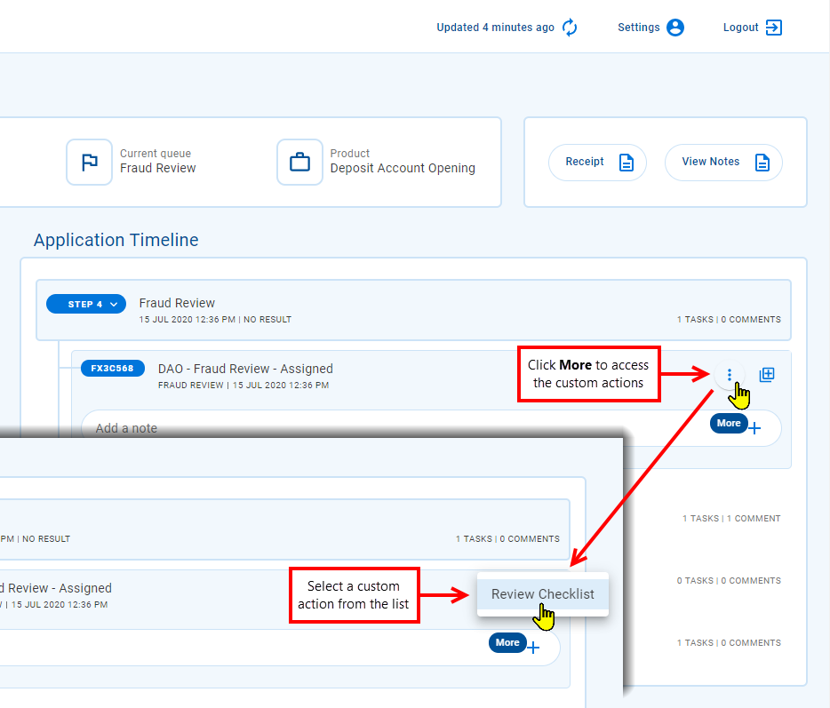
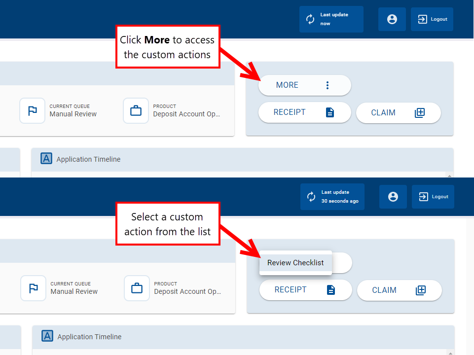
Custom Actions
Custom actions use third-party web services or fluent functions to extend the functionality of your Workspaces portal with features that are not available in the default configuration. Custom actions can be performed from a Details screen only.
There are no custom actions in the default Workspaces configuration. Any available custom actions, and what they do, are specific to your Workspaces portal and are not covered by this documentation.
To perform a custom action, click then select the desired action from the menu. Workspaces triggers the custom functionality in Journey Manager or another back-end system. What happens next depends on the configuration of the custom action, and user interaction may be required. Once the custom behavior is complete, Workspaces refreshes the screen.
Applicant Information
When an applicant fills out an application, they are usually required to provide personal information that serves to identify each applicant uniquely. This personally identifiable information (PIIPersonally Identifiable Information (PII) is information about an individual that can be used to distinguish or trace an individual‘s identity, such as name, social security number, date and place of birth, mother‘s maiden name, or biometric records; and any other information that is linked to an individual.) is often used to perform background checks which are critical in successfully processing the application.
The way applicant information is presented varies for different releases.
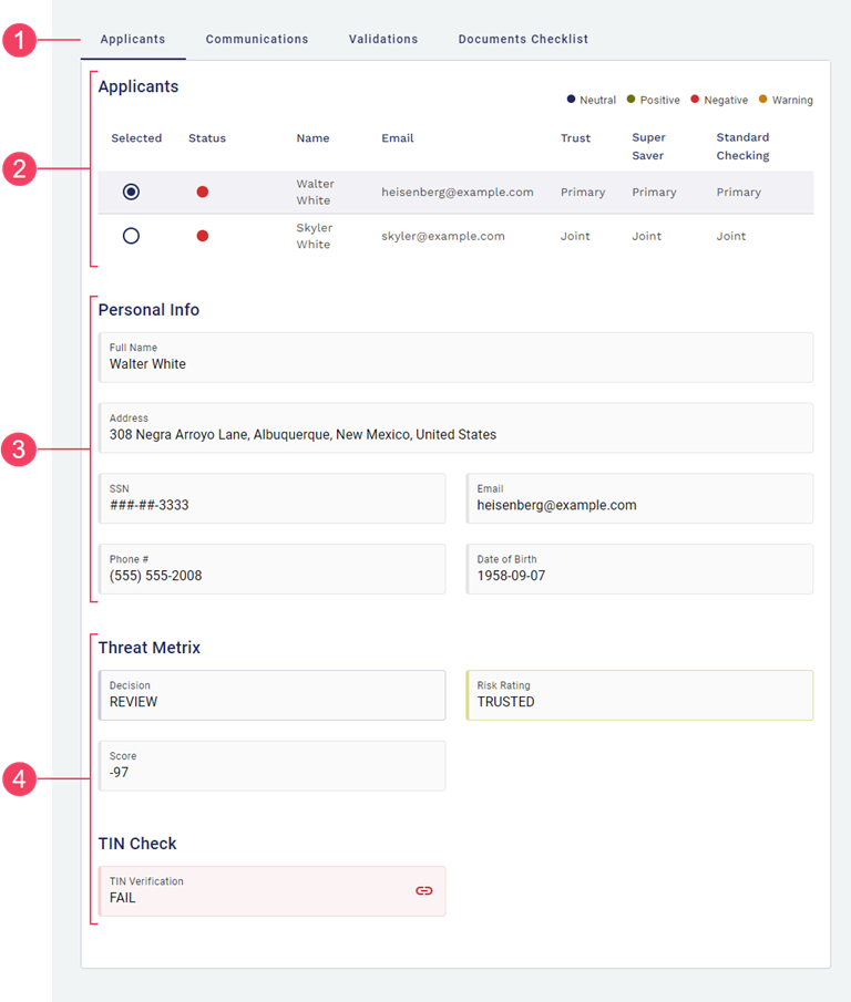
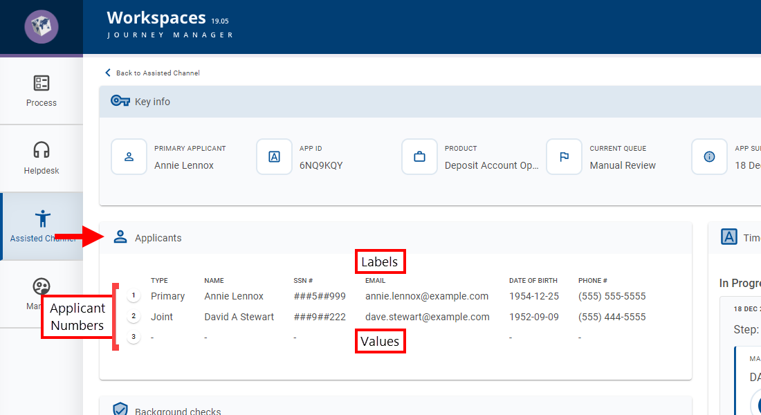
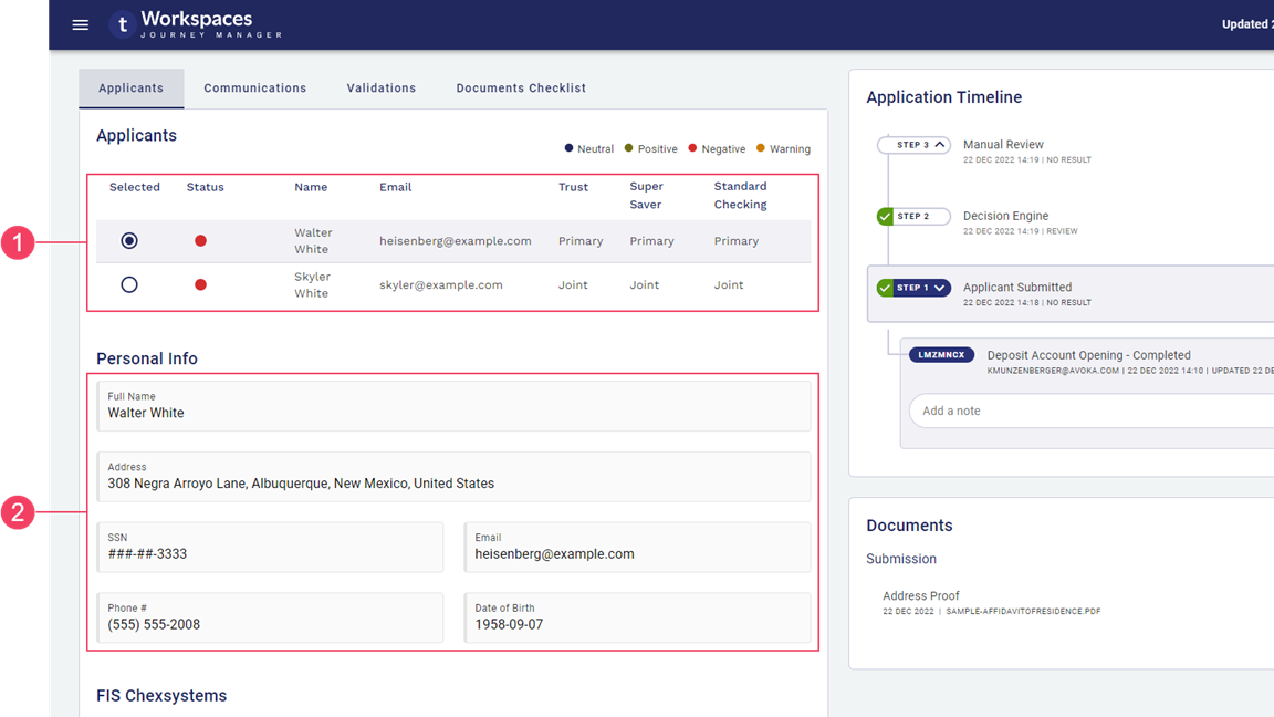
- 22.10: Applicant information is displayed in the Applicants tab. At the top is an Applicants section from which you can select an applicant to see their specific information displayed below in the Personal Info section and the various background check sections.
- 19.11 to 22.04: Applicant information and background checks are displayed for one applicant at a time, and in two separate sections of the Applicants card: Personal Info and Background Checks. These two sections are preceded by a Selected Applicant section containing the list of applicants, from which one applicant can be selected to see their information.
- Prior to 19.11: Applicant information and background checks are displayed in two separate cards, Applicants and Background Checks, and all information for all applicants is displayed simultaneously.
Applicant Information (19.11 to 22.10)
Applicant information is grouped together under the Applicants tab (This feature was introduced in the 22.10 release) or card (prior to 22.10). In the default configuration, applicant information is displayed using the same three-section layout in all spaces:
- Applicants: The list of applicants, with some key applicant-related information. This is where you select an applicant to show more information about them. (Prior to Workspaces 22.10, this section is called Selected Applicant.)
- Personal Info: A read-only view of the selected applicant's personal information, also known as PIIPersonally Identifiable Information (PII) is information about an individual that can be used to distinguish or trace an individual‘s identity, such as name, social security number, date and place of birth, mother‘s maiden name, or biometric records; and any other information that is linked to an individual. .
- Background checks: The outcomes for various checks or verifications relating to the selected applicant.
Background checks are highly configurable. The specific background checks in your Workspaces portal are configured for you by a Journey platform developer and cannot be changed by a Workspaces user.
- Applicants tab
- Applicants section
- Personal Info section
- Background checks sections
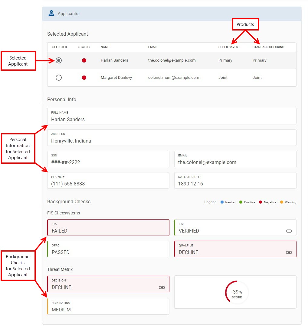
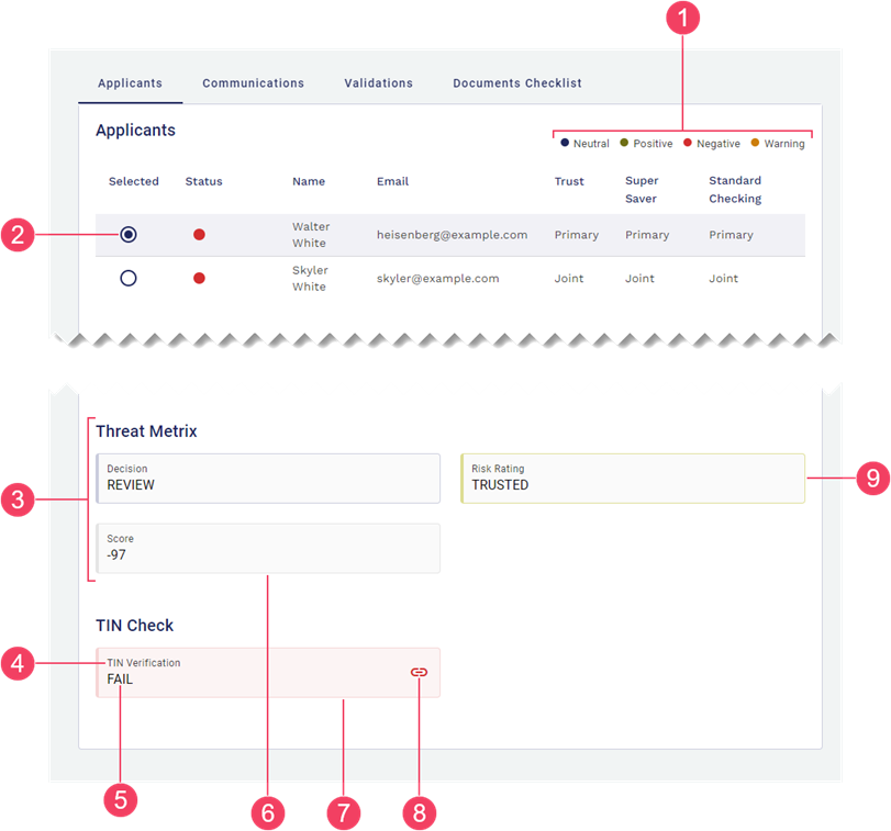
Applicants section
As mentioned above, the Applicants section serves two purposes. In addition to displaying key applicant-related information, you can select an applicant from this section to display their information in the Personal Info section and the various background check sections. (Prior to Workspaces 22.10 all of the background checks were grouped in a section called Background Checks.)
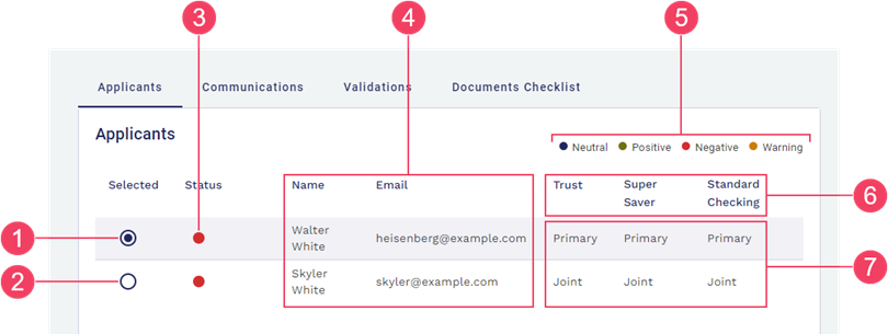
In the default configuration, the key applicant-related information shown for each applicant includes:
- A Selected indicator (radio button) showing which applicant is currently selected.
- A Status indicator (red disc) showing whether any of the background checks require attention when processing the application.
- Applicant identity information (Name, Email).
- A column for each product applied for, showing the relationship of each applicant to each product.
- Selected applicant
- Other applicant (not selected)
- Action required
- Applicant identity information
- Products
- Applicant-Product relationship
- Legend
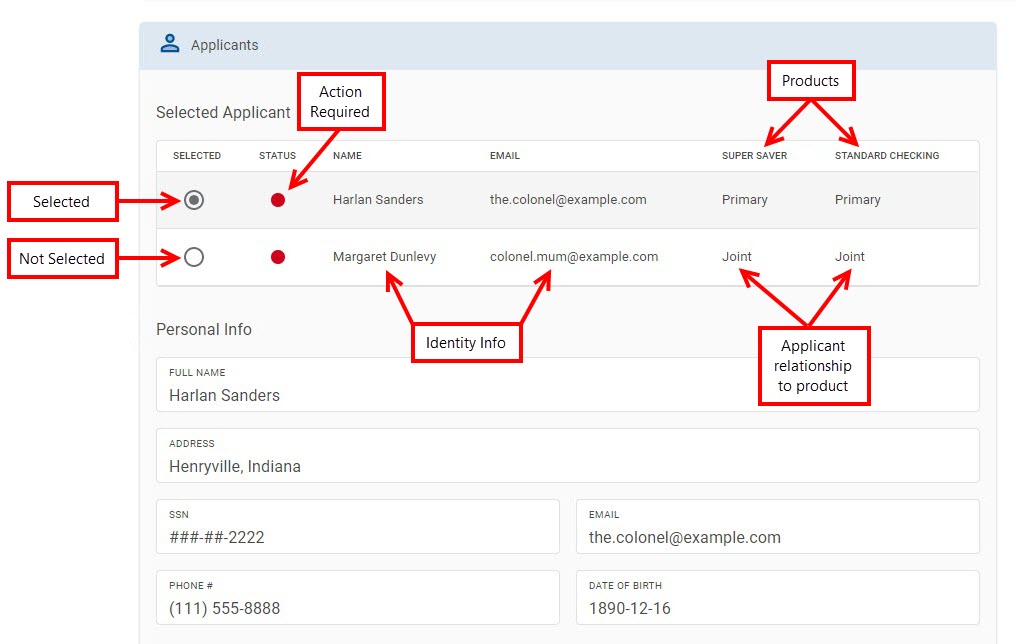
The product columns correspond to the products in the application that were selected by the applicant, and the values in these columns indicate how each applicant relates to each product in the application; for example, whether an applicant is the primary applicant, a joint applicant, or even a guarantor.
The first four columns are fixed (in the default configuration), with only Name and Email being applicant information. Status is a system-generated value based on the results of the applicant's background checks, and Selected reflects a choice made by the Workspaces user. In contrast, the number and names of the product columns may vary from one application to the next as they are determined by selections made by the applicants when completing their application. Similarly, the values displayed in the product columns are also application specific, as they correspond to selections made by the applicants when completing the application.
Personal Info section
Immediately beneath the Applicant (Selected Applicant) section is the Personal Info section. As the name suggests, this section displays personal information (PIIPersonally Identifiable Information (PII) is information about an individual that can be used to distinguish or trace an individual‘s identity, such as name, social security number, date and place of birth, mother‘s maiden name, or biometric records; and any other information that is linked to an individual.) relating to the currently selected applicant. In Workspaces 19.11 to 22.10, personal information is displayed in a grid layout for just one selected applicant, improving the user experience when dealing with applications that include multiple applicants and/or multiple products. Prior to Workspaces 19.11, the personal information for all applicants was displayed simultaneously in a tabular view.
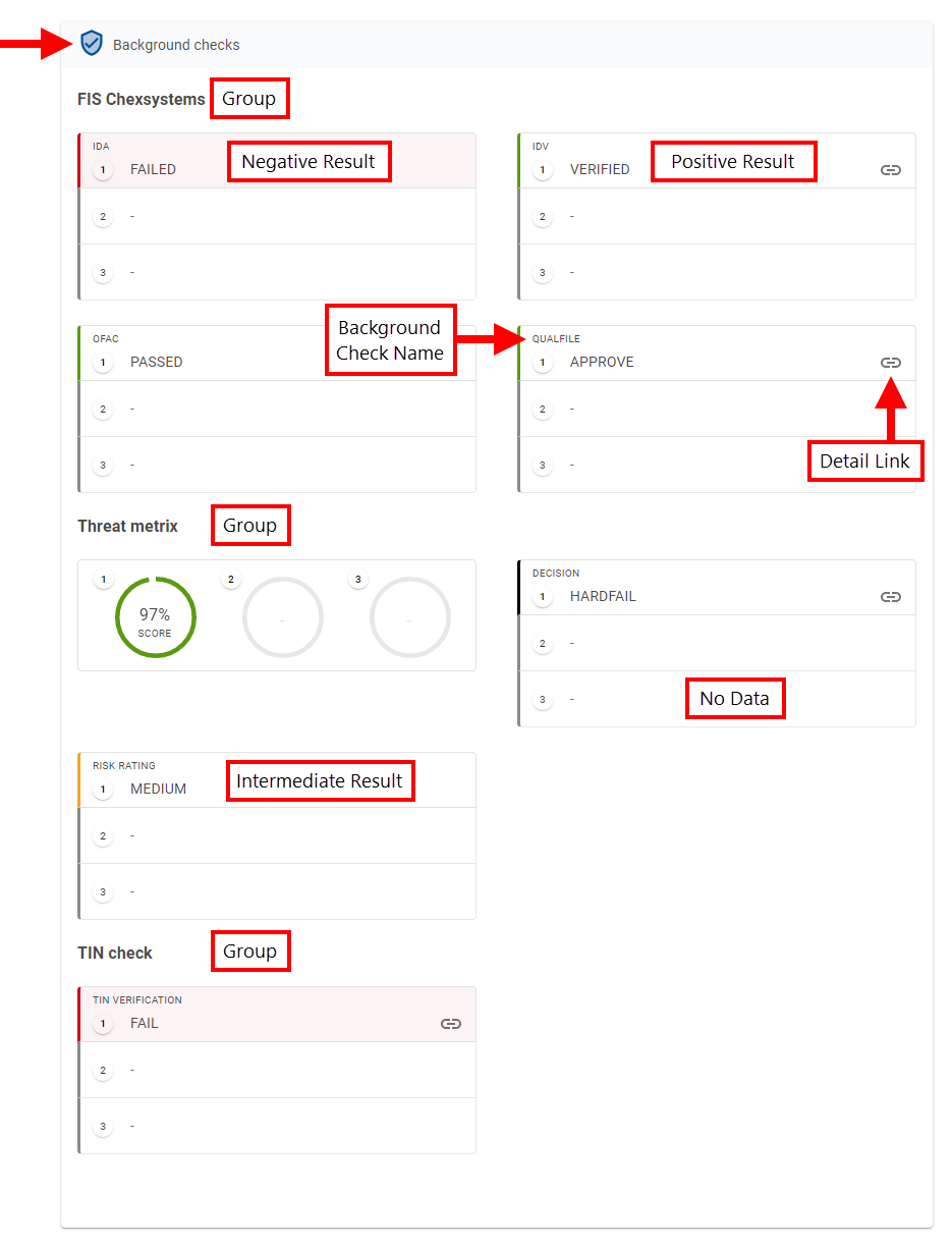
Background checks
The background checks present a read-only view of the outcomes of various checks or verifications relating to the applicantsselected applicant. Examples of checks and verifications that might appear here include identity verification and risk rating. Background checks are displayed in groups, showing the name of each background check and the corresponding result. Any background check for which a result is not available is shown with no data.
- Legend
- Selected applicant
- Background check group
- Background check name
- Background check result
- Neutral outcome
- Negative outcome
- Detail Link
- Positive outcome
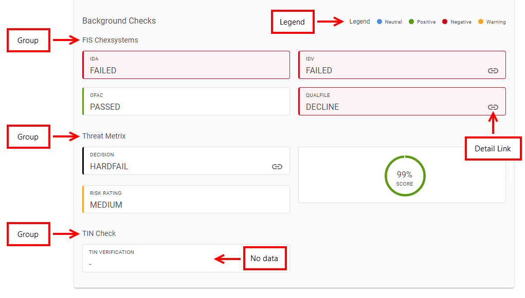
The result of each background check is reinforced through the use of color. Workspaces supports a set of standard colors that can be associated with various results or states. A legend at the top of the Applicants section (22.10) or Background Checks section (prior to 22.10) identifies the principle background check colors and what each color indicates.
The standard colors are listed below, along with suggestions for what they might indicate.
- Green, Light Green: Indicate positive results.
- Red, Black: Indicate negative results.
- Blue: Used for neutral states.
- Orange: Represents intermediate or other states.
Some background checks have additional information associated with them which can be useful to understand how the result was determined. The availability of additional information is indicated by a icon to the right of the result; click the link to view the additional information in a modal window.
Applicant Information (19.05 and earlier)
Applicant Details
The Applicants card displays a brief read-only view of personal information that helps you to identify each applicant.
Personal information, which could include Personally Identifiable Information (PII) such as full name or email address, is displayed for primary and secondary applicants, with each applicant's details shown separately. A minimum of three applicants are shown; if there are less than three applicants, those that are not applicable are shown with no data. Each applicant is identified uniquely by an Applicant Number icon which is used elsewhere on this screen to connect information to a specific applicant.
The number of applicants displayed is configurable. While the default configuration has three applicants, your Workspaces portal may have more (or less).
The specific information items displayed and their arrangement in this card are configured by a Workspaces developer and cannot be changed by a Workspaces user.
Background Checks
The background checks present a read-only view of the outcomes of various checks or verifications relating to the applicantsselected applicant. Examples of checks and verifications that might appear here include identity verification and risk rating.
The background checks are displayed in groups, showing the name of each background check and the corresponding results. Separate results are shown for each applicant. A minimum of three applicants are shown; if there are less than three applicants, those that are not applicable are shown with no data. Applicant Number icons are used to identify the applicant that each background check relates to.
The number of applicants displayed is configurable. While the default configuration has three applicants, your Workspaces portal may have more (or less).
The result of each background check is reinforced through the use of color. Workspaces supports a set of standard colors that can be associated with various results or states.
The standard colors are listed below, along with suggestions for what they might indicate.
- Green, Light Green: Indicate positive results.
- Red, Black: Indicate negative results.
- Blue: Used for neutral states.
- Orange: Represents intermediate or other states.
Some background checks have additional information associated with them which can be useful to understand how the result was determined. The availability of additional information is indicated by a icon to the right of the result; click the link to view the additional information in a modal window.
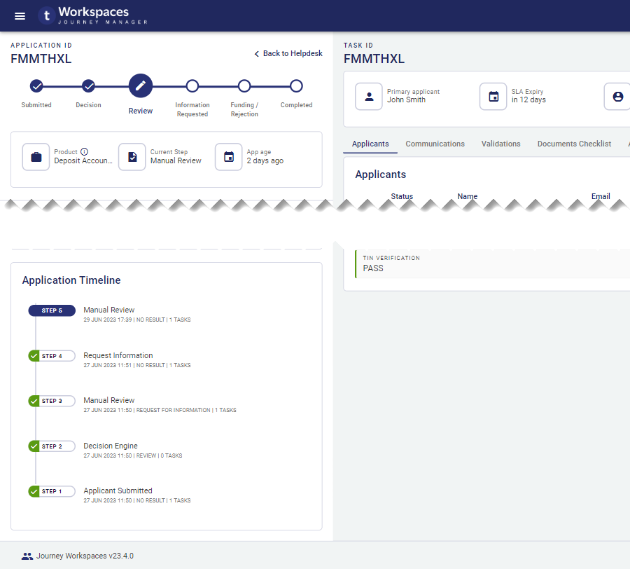
Application timeline
The application timeline displays important information and accompanying notes relating to steps and tasks in the application's history.
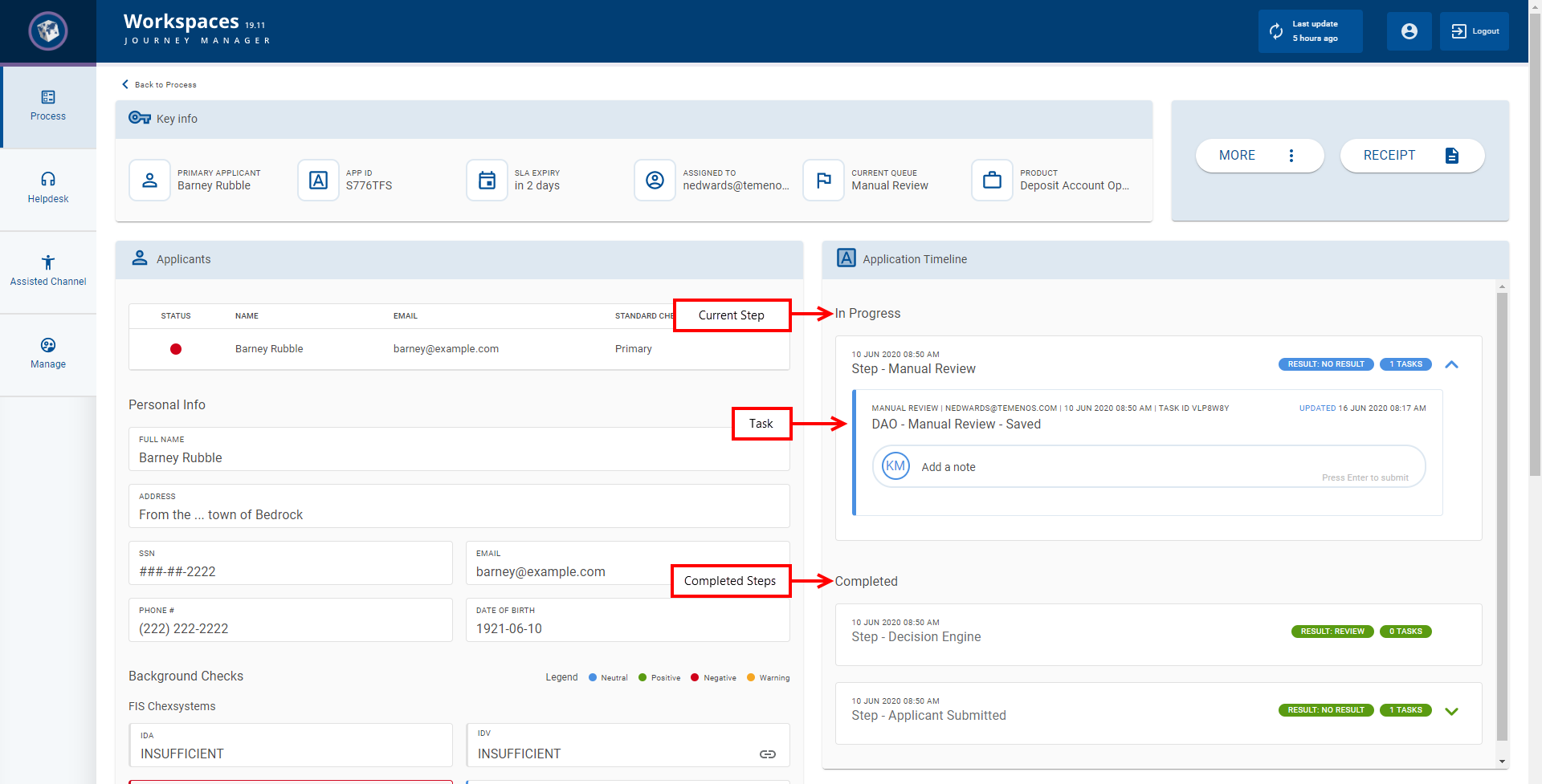
The step that is currently in progress is shown at the top of the application timeline followed by the completed steps listed in order of creation with the oldest step at the bottom.
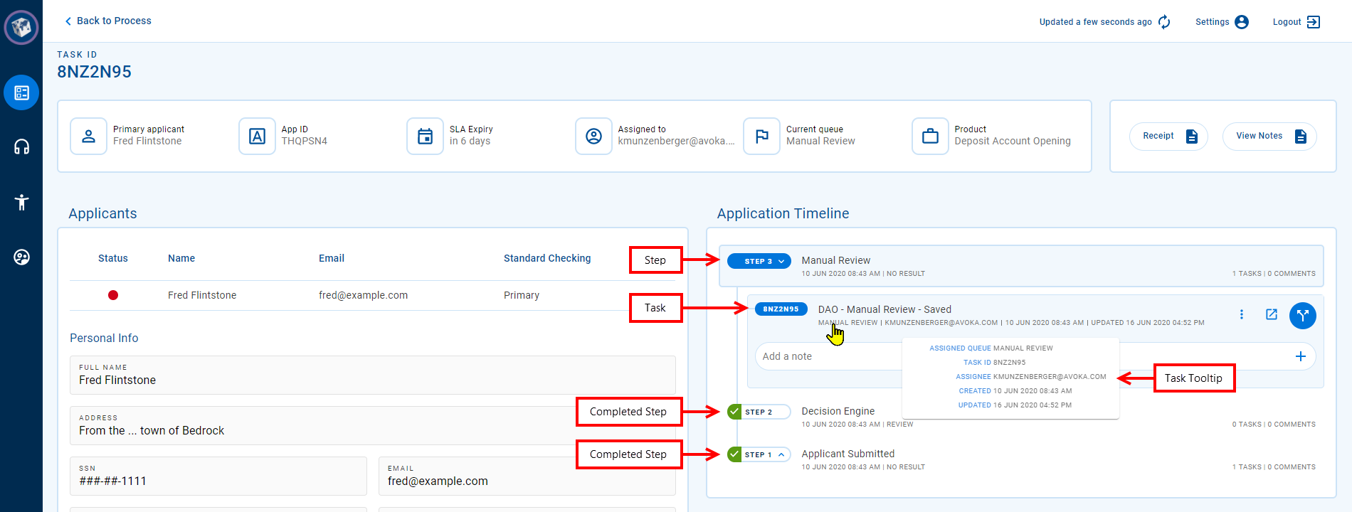
Application timeline (20.05 to 22.10)
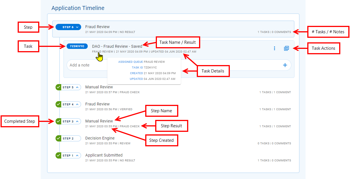
Each step in the application timeline is represented by a separate timeline item which is generally associated with one or more tasks, although a step that is processed automatically by the system may not have any tasks. By default, timeline items appear in a collapsed state, showing summary information relating to the step. However, you can click a timeline item to expand it and reveal more details about the step or task. In fact, the timeline always has just a single step expanded showing all of the tasks associated with the step. As a result, if you click a step to expand it, the previously expanded step will collapse, hiding its tasks. Note that a step that does not have any associated tasks cannot be expanded.
When a step is collapsed, the following details are shown:
- The step name. This may be the same as the name of the queue that the task is or was sourced from, except for the oldest task whose name identifies it as the task that was created when the application was submitted.
- The date/time that the step was created.
- The step's result, or "NO RESULT" if it is not yet determined.
- The number of tasks associated with the step.
- The number of notes made against tasks belonging to the step.
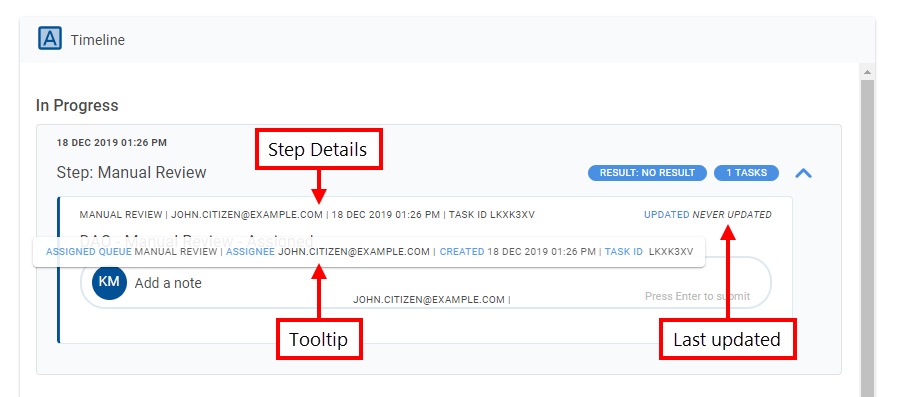
When a step is expanded, you can see the step's tasks, each of which includes the following details:
- The name of the queue that the task is or was sourced from.
- Who the task is or was assigned to (email address).
- The date/time that the task was created.
- The date/time that the task was most recently updated.
- The task ID; this is unique in your Workspaces portal.
This information can also be viewed in a formatted tooltip that appears when you point your cursor at the task.
When a step is expanded, you can select one of its tasks which causes the Details screen to be reloaded, showing the application in the context of the selected task. Selecting a task also reveals the available task-related actions that can be performed on the task, and any notes entered against the task. (If, instead, you want to view all of the notes for all tasks in an application, click View Notes in the Actions panel.) Further, if the step has not been completed, you can enter a note against the selected task to record additional information about the task or its associated step.
The Note field is limited to 2000 characters.
Application timeline (19.11 and earlier)
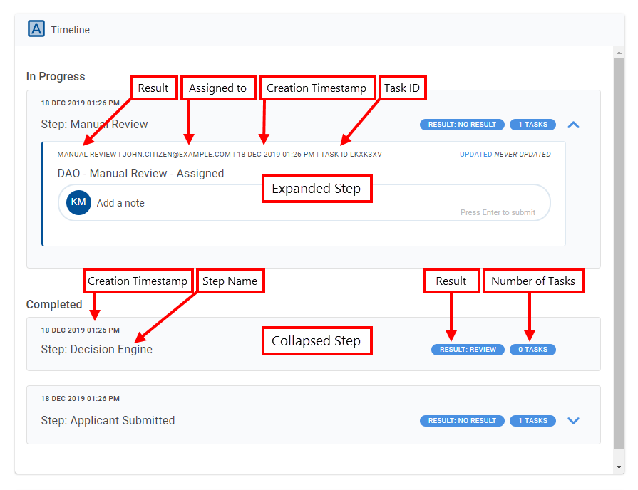
Each step in the application timeline is displayed in a separate Step History card. Each step generally corresponds to a single task associated with the application. Only one step is expanded at any time; clicking a step collapses the step that was open. Initially, all of the completed steps are collapsed with just the step that is in progress expanded, but any step can be expanded to view more information.
When a step is collapsed, the following details are shown:
- The step name. This may be the same as the name of the queue that the task is or was sourced from, except for the oldest task whose name identifies it as the task that was created when the application was submitted.
- The date/time that the step was created.
- The current (In Progress) or final (Completed) result for the step.
- The number of tasks associated with the step.
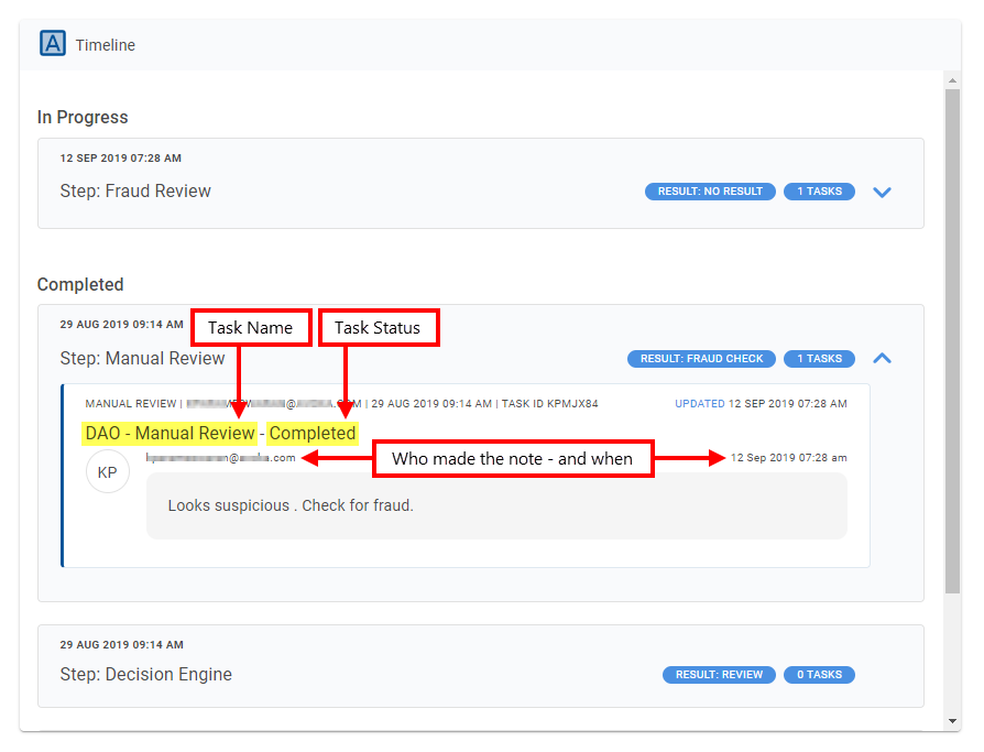
When a step is expanded, you can see the step's task which includes the following details:
- The name of the queue that the task is or was sourced from.
- Who the task is or was assigned to (email address).
- The date/time that the task was created.
- The date/time that the task was most recently updated.
- The task ID; this is unique in your Workspaces portal.
If you point your cursor at these details, a formatted tool tip is displayed with labels identifying what each item is.
To the right of these details, the date/time that the task was last updated is displayed, and beneath them is the task name and status, followed by one or more notes.
While the current (In Progress) step is open, you can record information about the step by entering a note. You can add a note to any task of the step that is in progress. However, notes cannot be entered for older steps that have been completed. To add a note, select a task that has the placeholder text 'Add a note', then type in your note and press Enter. Notes are displayed in the reverse order in which they were made, with the newest notes at the top. Each note identifies the user that added the note (email address) and when the note was added (date/time) above the note's text.
The Note field is limited to 2000 characters.
Documents
The processing of applications often requires that the information entered by applicants be verified against third-party evidence such as a drivers license or an energy bill. Managing the collection of this kind of documentary evidence is handled in Workspaces by the Documents card.
The Documents card provides a read-only view of the documents attached to an application as well as some system-level information relating to each document. Documents are usually uploaded by the applicant while filling out the form and attached to the application, but they may be provided by other means. For example, an application may be at a point where the applicant can no longer access it but needs to provide supporting documentation. In this case, the applicant may have the option to email the document to the person processing the application who then uploads and attaches it to the application.
In Workspaces 19.05 and earlier releases, duplicate documents were not permitted. (Workspaces considers two files to be duplicates if they have the same document title (description), the same file name, or if they are copies of the same file with different file names.) Workspaces 19.11 relaxes this constraint and allows duplicate files to be attached to an application.
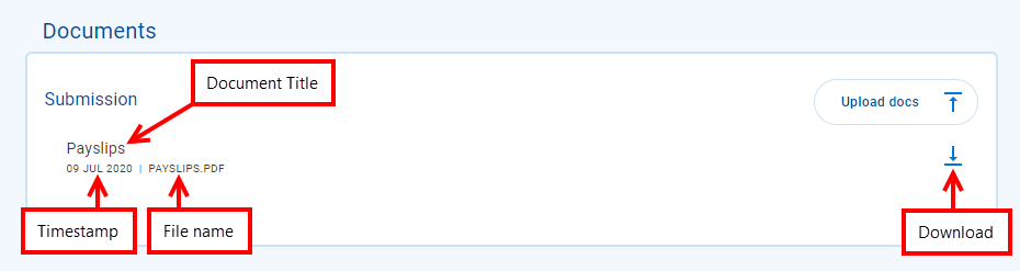
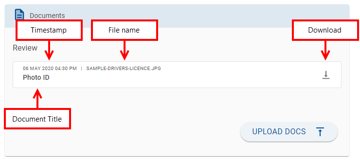
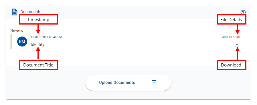
Each item in the Documents card contains the following elements.
- Document title: The document title is entered by the user when uploading a document in Workspaces, or it may be assigned automatically if the document was uploaded by the applicant when filling in and submitting the application. The document title should identify the kind of information in the document file.
- Uploaded timestamp: A timestamp that shows when the document file was uploaded and attached to the application.
- File details: The specific file-level details displayed, and where they appear, depend on your Workspaces version, but may include file name, type or size. The images below show which file details are available for your Workspaces version.
- : Available for supported document types only. On the right-hand side of each document item is an that you can click to view the document in a modal window. Supported document types are: JSON, XML, HTML, PDF, and some image formats (JPEG/JPG, PNG, GIF). This feature was introduced in the 23.10 release
- : Available only if is not available. On the right-hand side of each document item is an icon that you can click to download the document file.
As a Workspaces user, you cannot change the way documents appear on the Documents card. However, you can upload and manage the documents attached to an application.
In Workspaces 19.05 and earlier releases, a circular avatar was displayed on the left-hand side of each document item identifying who uploaded the document. This avatar has been removed in Workspaces 19.11. | 19.11 This feature was updated in 19.11.
Upload a Document
The Upload Docs (Upload Documents in Workspaces 19.05 and earlier) option provides a way for you to attach documents to an application. While you can upload a document in any space, you can only do it from a Details screen, not from a List screen.
In Workspaces 19.05 and earlier releases, you can only upload documents for tasks that are assigned to you. Workspaces 19.11 relaxed this constraint in the default configuration, allowing Workspaces to be configured so that anyone can upload a document to any application, regardless of who it is assigned to.
By default, the option to upload a document is usually available. However, Workspaces can be configured with conditional rules, based on task or application data values, that control whether the document upload option is available.
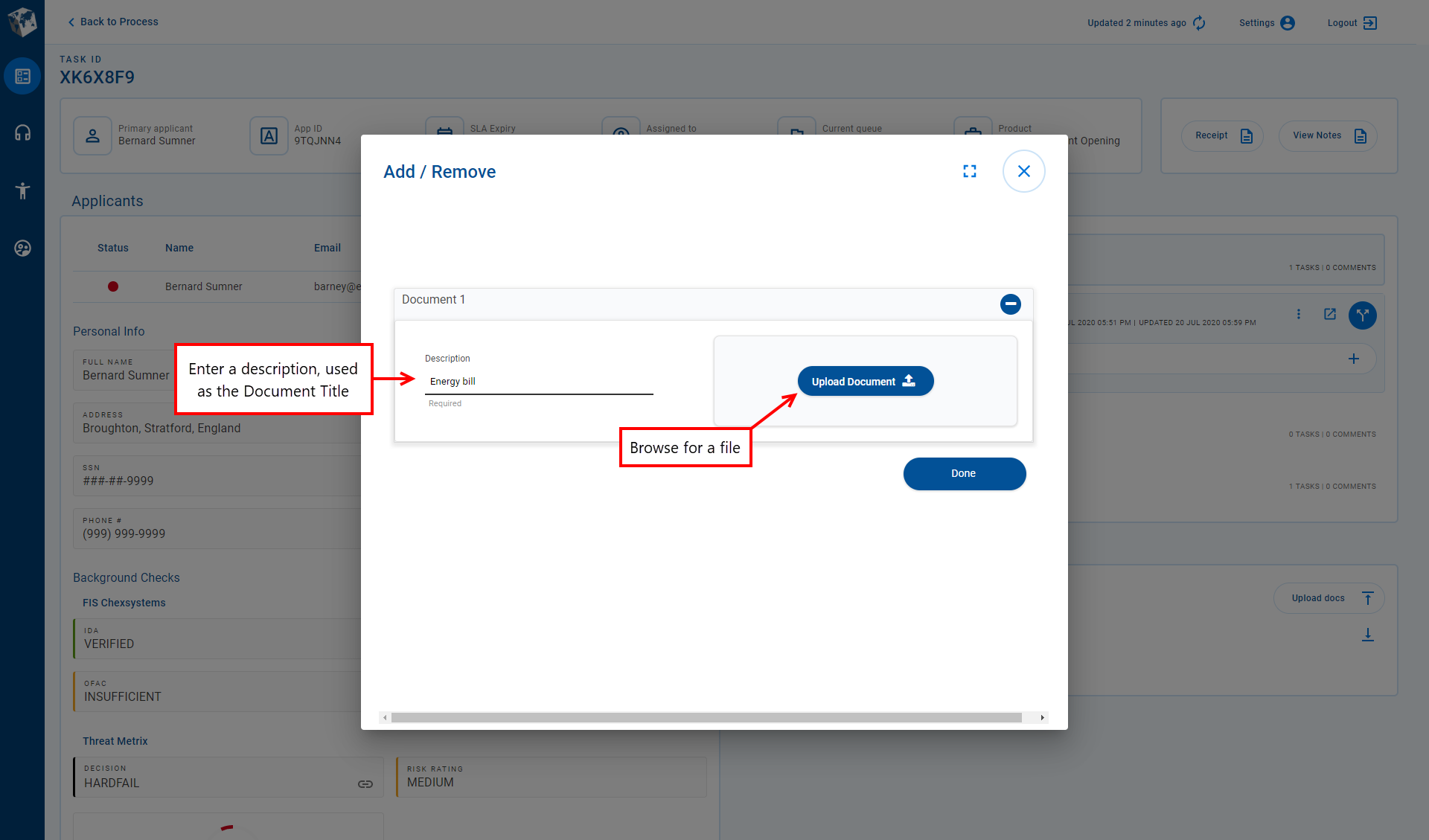
To upload a document on the Details screen:
- Click Upload Docs (Upload Documents in Workspaces 19.05 and earlier).
-
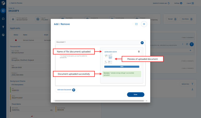
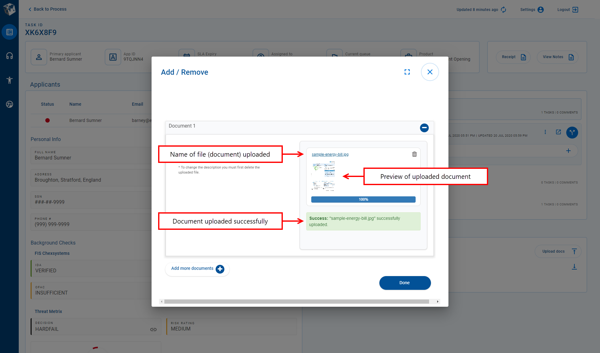
Enter a document description. The Upload Document button becomes enabled.

- Click Upload Document and browse for the document file you want to upload, then select it and close the file browser dialog. The appearance of the file browser dialog and the way it behaves is dependent on your underlying operating system.

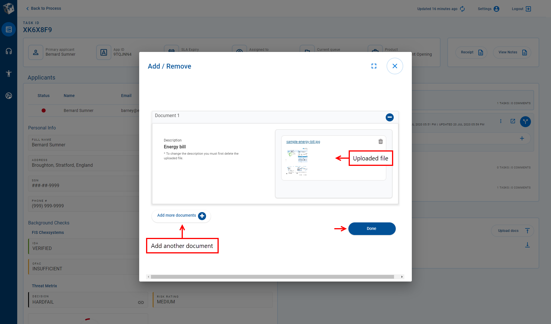
- If you're finished uploading documents, then go to the next step. However, If you want to upload more documents, click Add more documents and repeat from step 2 above.
- Click Done or when you're finished uploading documents.
Manage Application Attachments
Workspaces provides several options that allow you to manage the documents attached to an application. These options are available on the Attached Documents - Add / Remove modal window which you can display by clicking Upload Docs (Upload Documents in Workspaces 19.05 and earlier) on the Details screen.
- Upload multiple documents: Follow the steps above describing how to upload a document, and at step 4 follow the instructions to upload more documents.
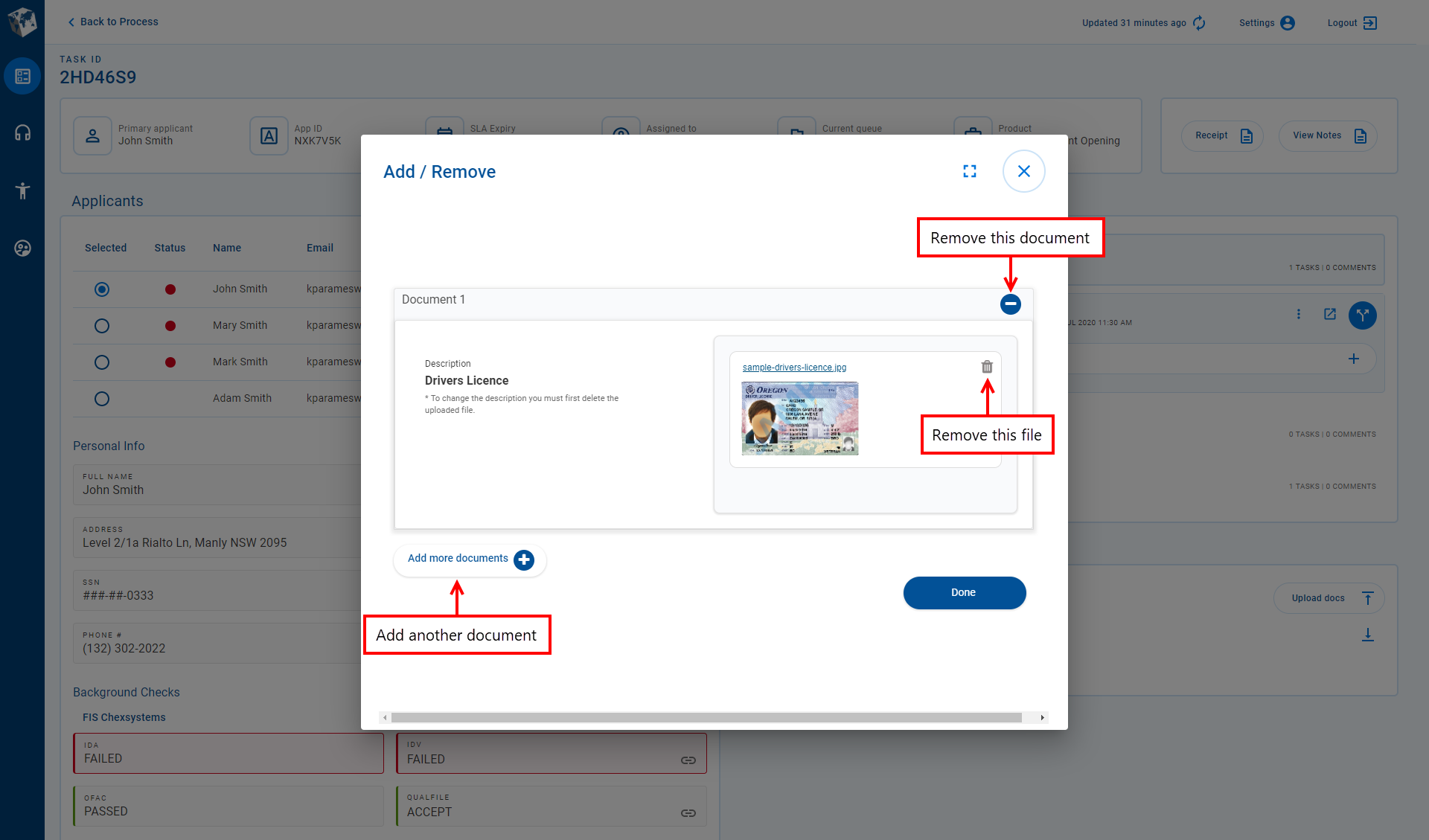
- Upload a different file for an existing document: With the Attached Documents - Add / Remove modal window open, locate the document you want to modify. Click adjacent to the file that is to be replaced, thereby removing the attached file. Now, follow the instructions in Upload a Document above from step 3 to upload a different file and attach it to this document.
- Remove a document: With the Attached Documents - Add / Remove modal window open, locate the document you want to remove and click adjacent to this document.
The following image shows where you can find the various attachment management features.
Upload a Document Example
This example shows how someone who is processing applications can upload an identity document, in this case a drivers license, to an application for an assigned task. It is assumed that you know how to find a task that is assigned to you, or how to find an unassigned task and claim it. This is important because you can only upload documents for tasks that are assigned to you.
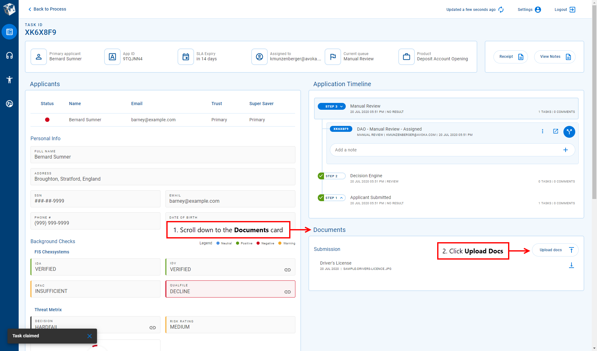
- Login to Workspaces and select the Review space.
- Locate a task assigned to you, or find and claim an unassigned task, then select the task to display the task's details.
- On the Details screen, scroll down to reveal the Documents card in the lower right-hand corner of the screen, then click Upload Docs (Upload Documents in Workspaces 19.05 and earlier) to open the Add / Remove Documents modal window.

- Enter a description for the document that you want to upload. Note that the Upload Document button on the right is disabled until you enter something in the description field.
-
Click Upload Document, then browse to and select the document file you want to upload. A message is displayed briefly confirming that the document has been uploaded successfully.
- Click Done to close the Add / Remove Documents modal window and return to the Details screen.
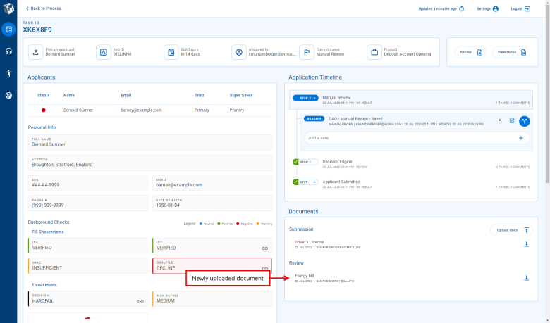
A new document item appears in the Documents card for the document you just uploaded.

Custom content
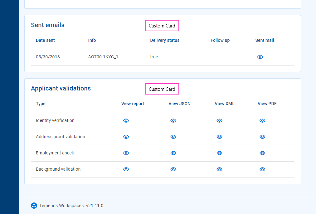
Much of the Workspaces user interface presents various types of content (information and features) in components or layouts specifically designed for each content type. In addition to the standard content types described above, your Journey Workspaces portal may also be configured with additional custom content specific to your organization. While custom content is more commonly available on the Details screen in separate tabs This feature was introduced in the 22.10 release, you may also find it used on the List screen in expansion rows.
Workspaces supports two format options for custom content, designed for two different kinds of data:
- Multi-value data: Content is displayed in a table, with a header row at the top followed by one or more data rows. Each column represents a different kind of content, identified by the column header, while each row relates to a single entity such as an applicant, a background check, or a document. Each individual data item is either a simple text/number display or an icon that links to additional details or functionality. All data items in the same column are of the same type.
- Single-value data: Each data item in a container (such as a tab, card or section) is displayed separately, with a label and value, and an optional icon that links to additional details or functionality.
- Multi-value data
- Single-value data
Custom content presents a read-only view of a predetermined data set. It is configured by a Workspaces developer who defines both the data that is displayed and how it appears. A Workspaces user has no control over the way the data appears, nor can they modify the displayed information.
Several icon types are supported for icon in custom content:
- : Indicates additional details are available to view. Click the icon to display the additional details in a pop-up window.
- : Indicates the additional details are available to download. Click the icon to download the file containing the additional details. This feature was introduced in the 21.11 release
- Any other icon provides access to additional functionality. Click the icon to perform the associated action. This feature was introduced in the 22.10 release
No Data scenario
Sometimes, data may not be available in Workspaces for one or more data items. This could be because the expected data does not exist (for example, has not been collected) or because a technical issue prevents Workspaces from being able to obtain the data. Workspaces indicates that expected data is not available by displaying a dash '-' instead of the data value. The lack of data is reinforced by the use of gray color for UI elements relating to these data items.
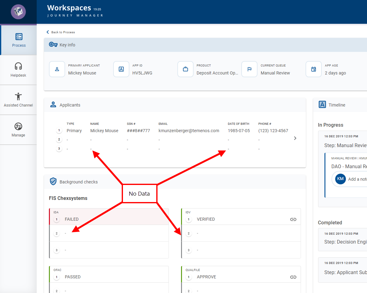
Workspaces can also be configured to hide items with no data, so you may not even see fields or records with no data.