Workspaces UI tour
WorkspacesThis topic relates to Journey Workspaces | Workspaces UserIncludes bank staff, helpdesk, relationship managers, and managers | This feature was introduced in the 18.11 releaseThis feature was updated in the 24.10 release
With a consistent layout and common user interface elements, Journey Workspaces is designed to give you a great user experience right from the start. Let's take a look at some of the common elements that make up the Journey Workspaces user interface (UI).
Each screen is based on a common layout that can be modified as required through configuration. All screens have a header at the top and a footer at the bottom that provide common functionality. The remainder of each screen contains content and features that are specific to the selected space and the screen type (List, Search or Details).
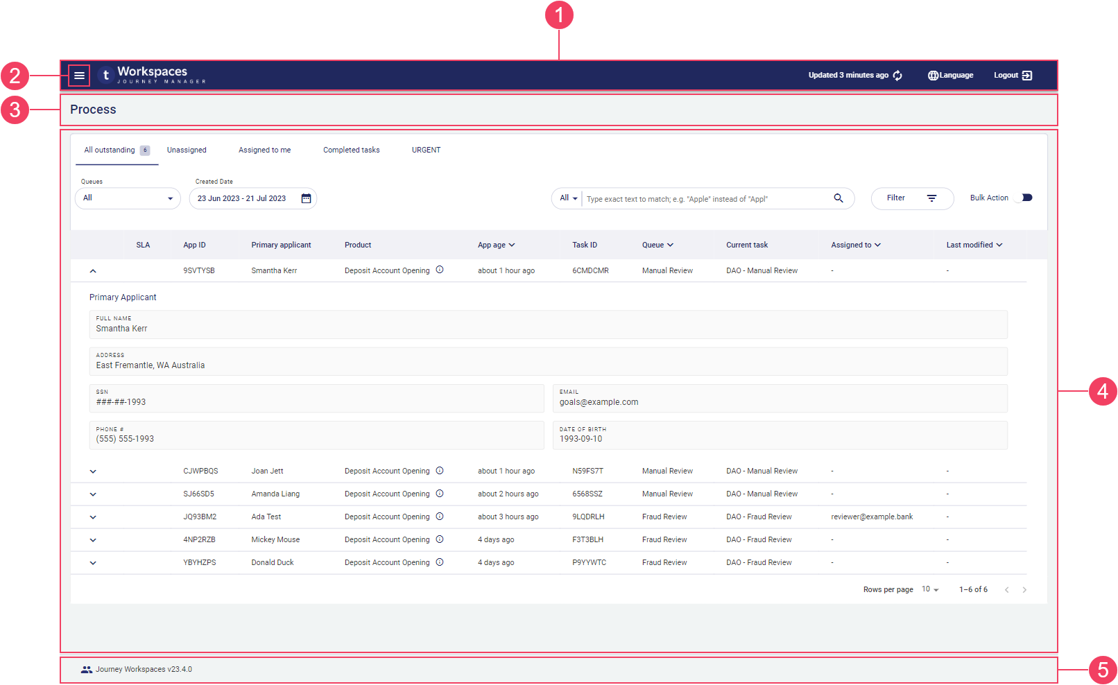
- Screen header
- Screen name
- Content pane
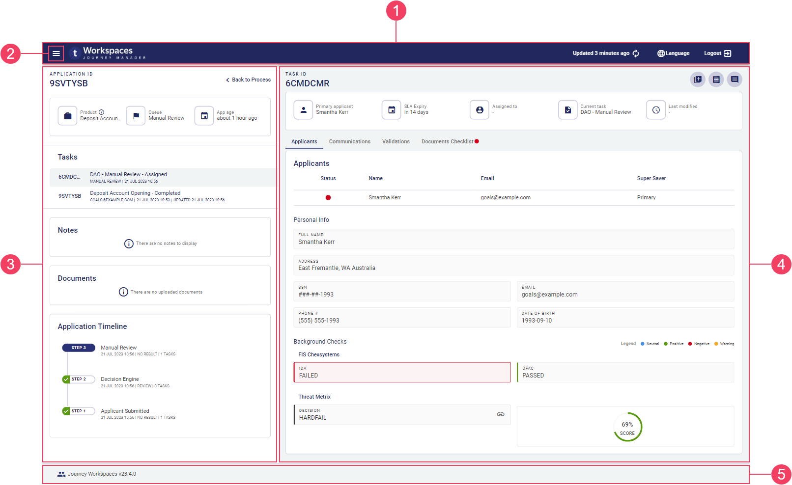
- Screen header
- Application pane
- Task pane
The screen header includes an optional and three on the right: , , and . Beneath the screen header on a List or Search screen is the screen name which corresponds to the name of the selected space. The has no interactive components, simply showing the application name and version which can be useful when seeking product support.
The majority of the screen is occupied by one or more panes containing the content and features that are specific to the selected space and screen type. To learn more, see Screen content.
Branding
Workspaces has been designed to give you a great user experience, with much consideration given to many visual design decisions resulting in a modern user interface (UI) that is beautiful, consistent, and easy to use.
A core element of the UI is color. Workspaces uses a palette of complimentary tones, based on a primary color from which lighter and darker shades are derived. The tones from this palette contribute to a theme which is used in several ways.
- The theme is applied to various components in the Workspaces UI.
- Forms can be branded with the theme. This feature was introduced in the 23.10 release
- A theme can be associated with an organization. This supports white-labeling, say, for sub-brands or products. This feature was introduced in the 23.10 release
Workspaces comes with a default theme based on Temenos branding. However, you can derive a custom theme based on a color from your brand, usually your brand's primary color or something similar. This provides a simple way to make the appearance of your Workspaces portal align with other software in your business. If you want to learn about theme color selection, see API > Workspaces > Guides > Theme color.
The images in this documentation reflect the default theme based on Temenos branding.
Screen header
The screen header is common to all Workspaces screens, displaying generic information and providing access to common features and menus.
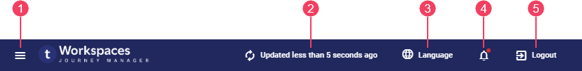
- Screen refresh
- Logout
On the , you can find the following features.
- : Only available if you have access to multiple spaces. Click this to display the showing the list of spaces available to you. This feature was introduced in the 23.04 release
- Screen refresh: When the information displayed on the screen was last refreshed, and an option to refresh it.
- : Select the language used for static text in the Workspaces UI. This feature was introduced in the 21.11 release
- : Click this to display the Notifications panel showing a list of notifications sent to you. This feature was introduced in the 24.04 release
- Logout: End your current Workspaces session securely.
Workspaces 21.11 introduced an automatic session logout after a defined period of inactivity. To learn more about configuring the session timeout period, see Session Timeout.
When you navigate to a Workspaces screen, the information displayed is up-to-date but it can become stale over time. The elapsed time since the screen was last updated is shown in the beside the . If the screen has not been updated recently or you just want to make sure you're looking at the latest information, click to refresh the screen.
The shows all the spaces available to you and lets you move between them. Here, you'll also find details of the logged-in user displayed, and a switch to change your Out of Office status.
The and are only available to you if you have access to multiple spaces.
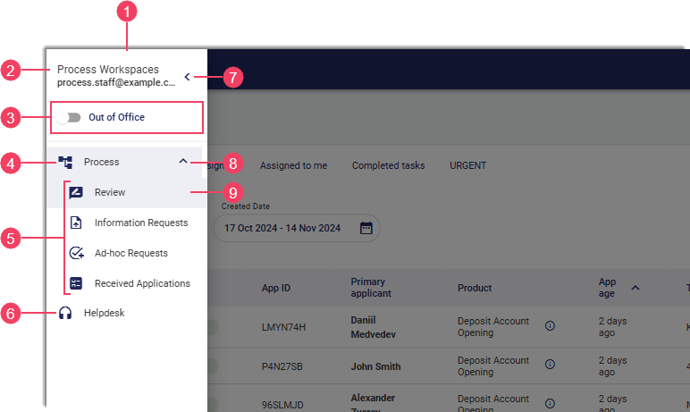
- Logged-in user
- Out of Office switch This feature was introduced in the 24.04 release
- Space group
- Grouped spaces
- Space
- Close
- Expand/Collapse
- Active space
Several related spaces may be grouped together under a space group. Select a space item to switch to that space. For more information about spaces, see Roles and Spaces.
One or more of the following spaces will be available to you depending on how your Workspaces portal is configured and which permissions you have been given.
| Space | Used by (Role) | Description |
|---|---|---|
| Review1 | Processing staff | Offers review capabilities for pending applications that need manual action. |
| Document Requests1 | Processing staff | Offers review capabilities for tasks assigned to customers and which require their action. |
| Helpdesk | Helpdesk staff | Find applications quickly and easily to provide prompt and accurate customer assistance. |
| Assisted Channel | Relationship managers | Kick start the application process on behalf of customers, and monitor application progress. |
| Manage | Managers and supervisors | Provides task management capabilities. |
| Brokers | Authenticated non-bank staff | Allows applicant representatives (such as brokers) to start, monitor, and manage applications through to completion. |
- By default, the Review and Document Requests spaces are grouped together under the Process space group.
Out of Office
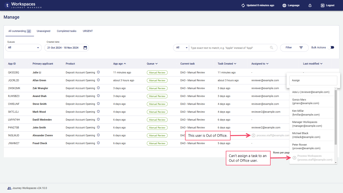
If you're absent from work or otherwise unavailable, you can change your Out of Office status to let others know you're not there. Setting your Out of Office status also helps managers with task assignment:
- When assigning tasks, Out of Office users cannot be selected.
- When viewing the tasks, managers can see on tasks assigned to you that you're unavailable, and then reassign them as necessary.
To change your Out of Office setting, follow these steps.
- Click the to open the .
- Click the Out of Office switch to change your Out of Office status.
- A message is displayed confirming the change to your Out of Office status.
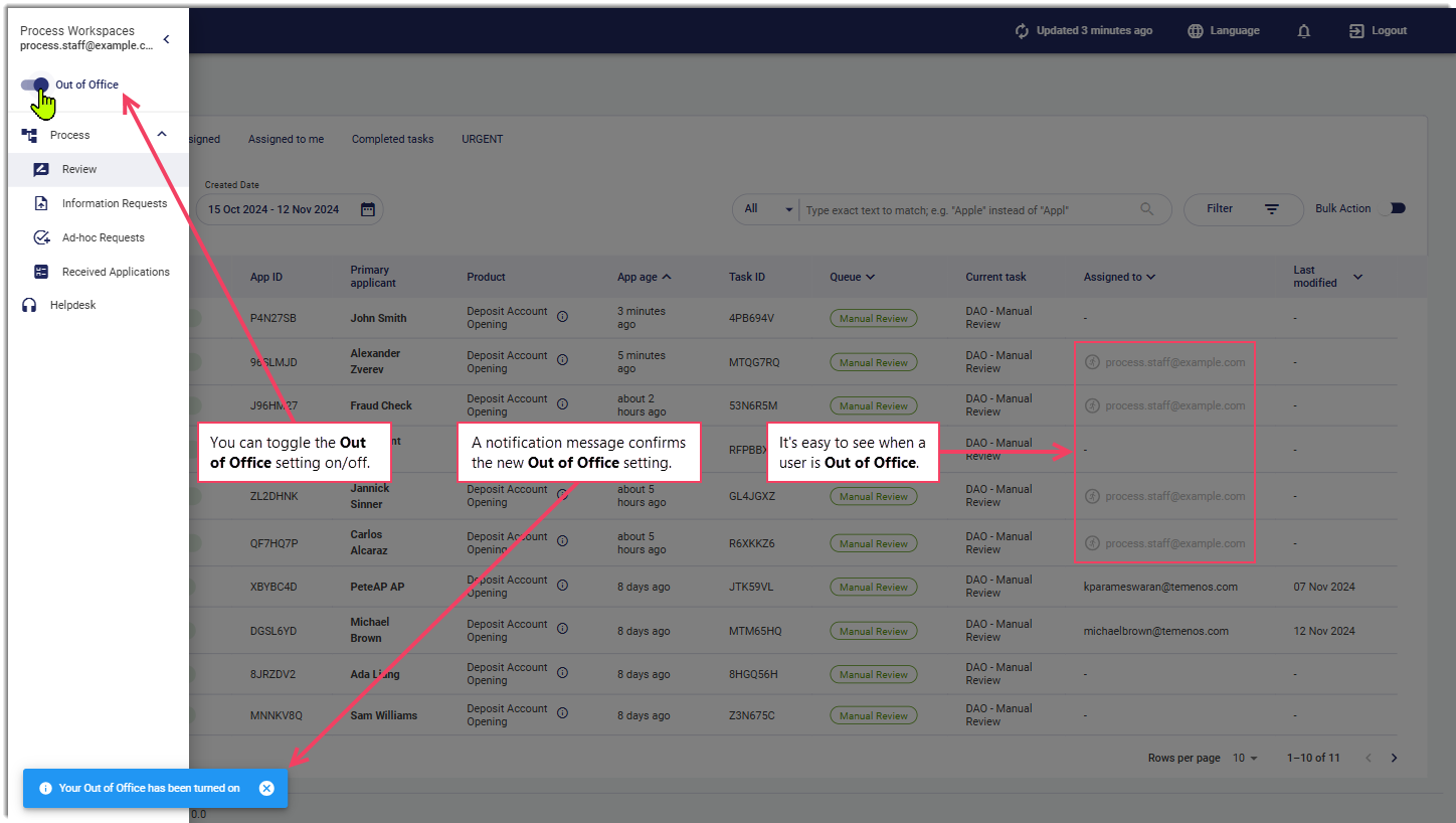
Once you set yourself as Out of Office, anywhere your username appears, it is displayed in a way that distinguishes it from other usernames, grayed out with a icon.
Notifications
It can be important to know when some actions happen so that you can respond to them in a timely fashion. Workspaces sends you a notification whenever any of the following occur:
- A task is assigned to you. This includes tasks assigned as part of a bulk action but excludes claiming a task.
- A comment is added, by an applicant or any authenticated Workspaces user, to a task assigned to you.
Notifications do not appear in real time; rather, they are updated when other data is refreshed.
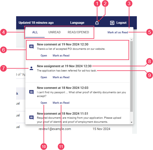
- badge
- Notifications panel
- Notifications tabset
- Mark all as Read
- Notification item
- Notification item
- Notification item title
- Notification item text
- Open
- Mark as Read
Click the to display the Notifications panel, showing the list of notifications you have received. Notifications are not specific to a space; if you have access to multiple spaces, you'll see the same notifications regardless of which space you have selected. By default, notifications remain in this list for 1 week, although this duration is configurable so your experience may vary.
At the top of the panel is a set of tabs that you can use to control which notifications are displayed:
- All: Show all notifications.
- Unread: Show only notifications that you haven't read or opened yet.
- Read/Opened: Show only notifications that you have read or opened.
The read/unread status for each notification is stored locally in your browser. If you login to Workspaces on a different computer or using a different browser, any notifications that you opened or marked as read previously may appear as unread again. Similarly, if you clear your browser's local storage, all your notifications will appear as unread again.
Each notification item includes an icon, a title, and some text which are all dependent on the type of notification.
- Task assignment notifications are identified by this icon and the title starts with
New assignment. - Comment notifications are identified by this icon and the title starts with
New comment.
Below the notification text are two text buttons:
- Open: Open the associated task's Details screen, and mark the notification as read.
- Mark as Read: Mark the notification as read.
A badge  appears on the when you receive a new notification, and remains while you have any unopened/unread notifications.
Screen content
The main part of each screen is occupied by components that either display application- and task-related information, or allow you to interact with a selected application or task. The content and features available are specific to the selected space and screen type.
- A List or Search screen contains an item list and other components that determine which items are displayed and allows you to interact with them. To learn more about List screens, see Understanding the Workspaces List Screen.
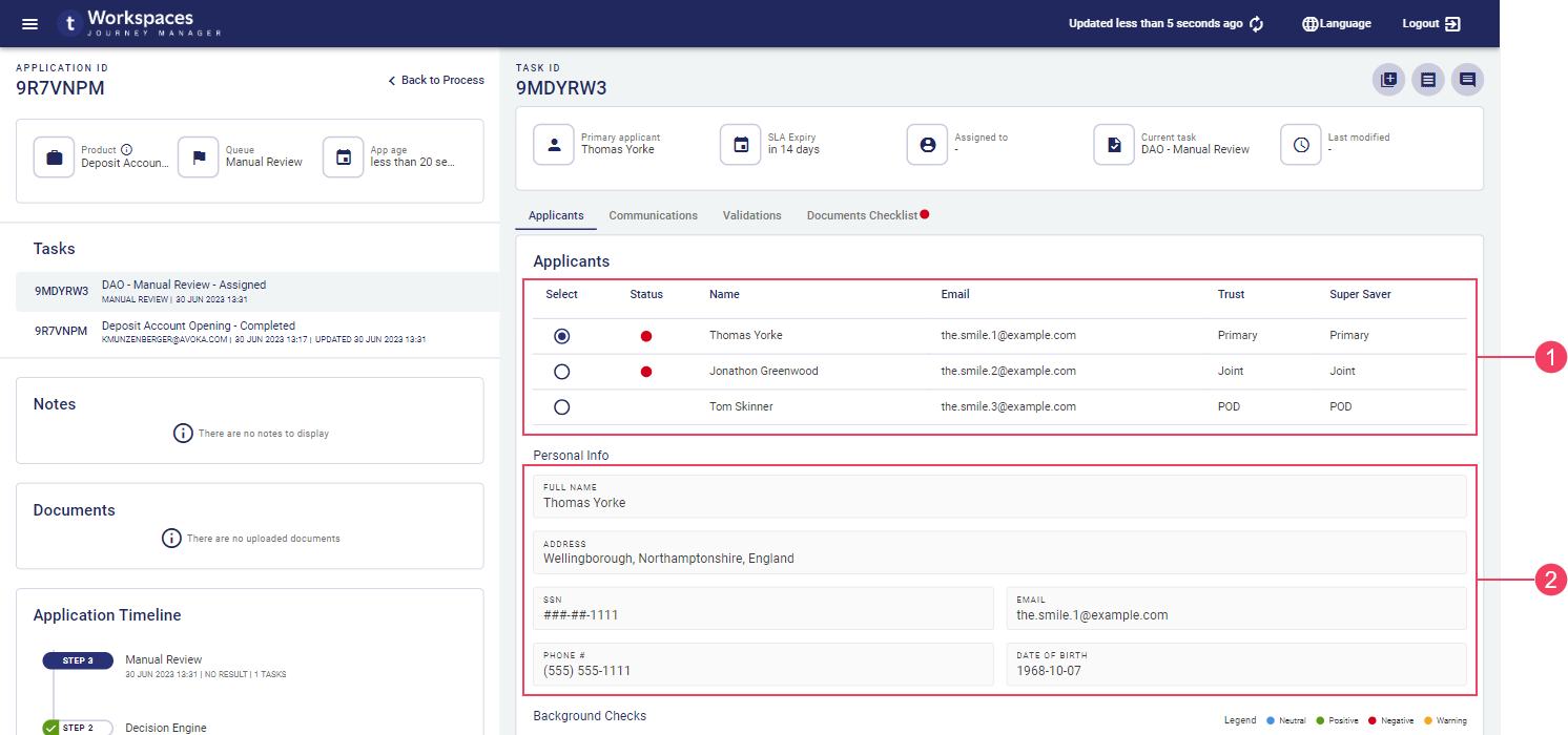
- A Details screen contains an application Application pane on the left and a Task pane on the right. The Application pane presents application details and a task switcher, while the Task pane contains task-related content for a selected task including action and other interactive components. To learn more about the application and task panes, see Application and Task panes.
Field Data Types
Fields display information of various data types including text (name, email address, some IDs), numbers (phone, SSN), and dates. A date may represent either a specific point in time (date of birth) or a duration (application age).
Numbers and dates can be configured to use a variety of formats. For example:
- Phone numbers can be formatted for the current locality or to accommodate internationalization.
- 9-digit Social Security Numbers are commonly displayed using the format "AAA-GG-SSSS".
- Dates representing a point in time can use either absolute ("1 Jan 2022", "today") or relative ("last Wednesday", "6 days ago") formats.
- Dates representing a duration can use either specific ("7 days, 3 hours, 26 minutes") or approximate ("about 7 days", "last week") formats.
Sometimes a value might be too long to fit in the space available for it; in this case, the value is often truncated and an ellipsis ('…') is appended to indicate that you're not looking at the full value. To see the full value, point your cursor at the truncated value and a tool tip is displayed showing the full value.
By default, values in table columns wrap when they are wider than the column. However, sometimes this behavior is undesirable, and it can be overridden for specific columns via configuration.
Custom content
Much of the Workspaces user interface presents various types of content (information and features) in components or layouts specifically designed for each content type. In addition to the standard content types, your Journey Workspaces portal may also be configured with additional custom content specific to your organization. While custom content is more commonly available on the Details screen in separate tabs This feature was introduced in the 22.10 release, you may also find it used on the List screen in expansion rows.
Workspaces supports two format options for custom content, designed for two different kinds of data:
- Multi-value data: Content is displayed in a table, with a header row at the top followed by one or more data rows. Each column represents a different kind of content, identified by the column header, while each row relates to a single entity such as an applicant, a background check, or a document. Each individual data item is either a simple text/number display or an icon that links to additional details or functionality. All data items in the same column are of the same type.
- Single-value data: Each data item in a container (such as a tab, card or section) is displayed separately, with a label and value, and an optional icon that links to additional details or functionality.
- Multi-value data
- Single-value data
Custom content presents a read-only view of a predetermined data set. It is configured by a Workspaces developer who defines both the data that is displayed and how it appears. A Workspaces user has no control over the way the data appears, nor can they modify the displayed information.
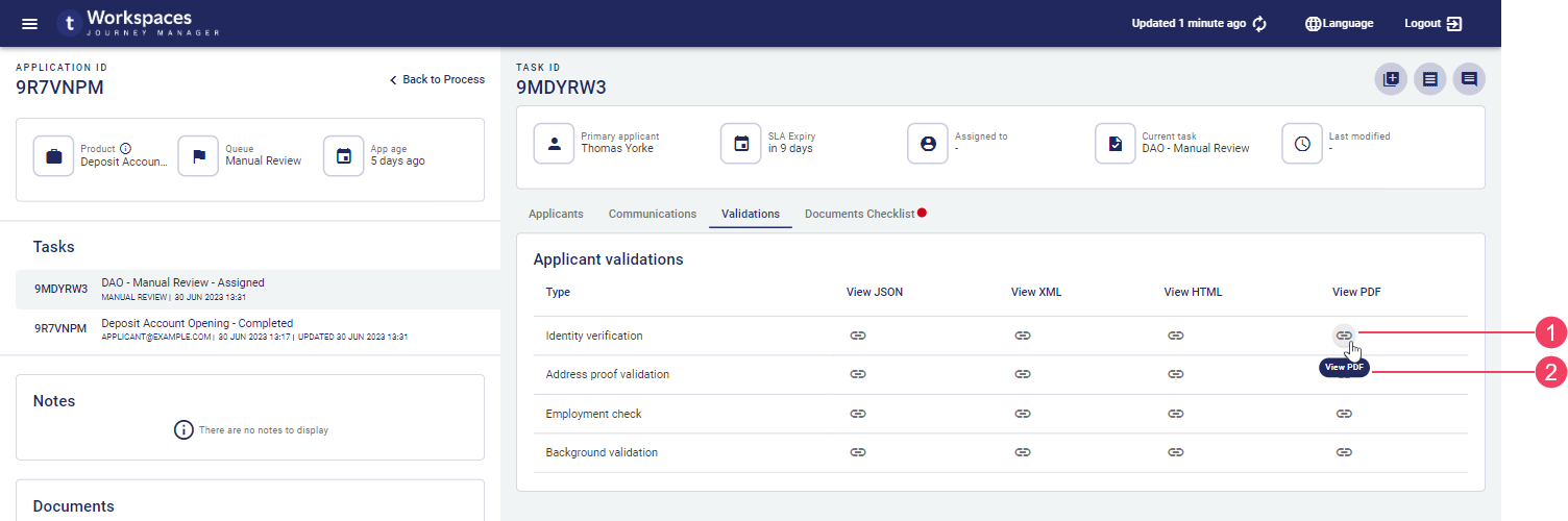
Several icon types are supported for icon in custom content:
- : Indicates additional details are available to view. Click the icon to display the additional details in a pop-up window.
- : Indicates the additional details are available to download. Click the icon to download the file containing the additional details. This feature was introduced in the 21.11 release
- Any other icon provides access to additional functionality. Click the icon to perform the associated action. This feature was introduced in the 22.10 release
An icon is usually accompanied by a tooltip as part of the accessible user interface available to all users. This helps to explain an icon 's purpose, in case the icon is not recognized immediately.
- Icon button
- Accessible tooltip
Modal Windows
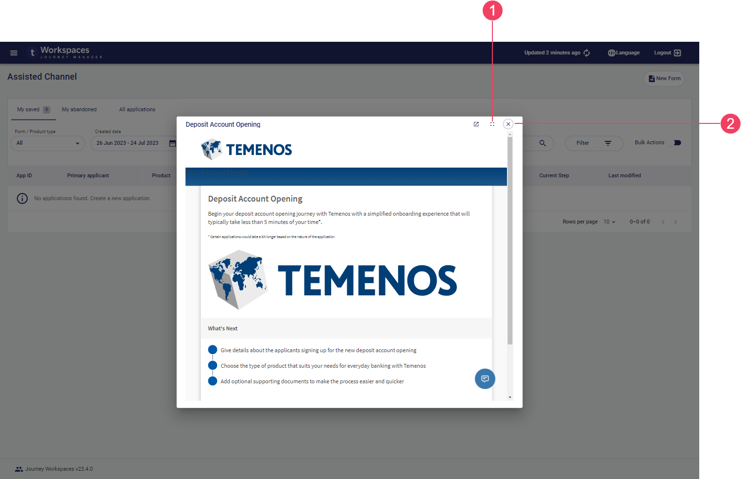
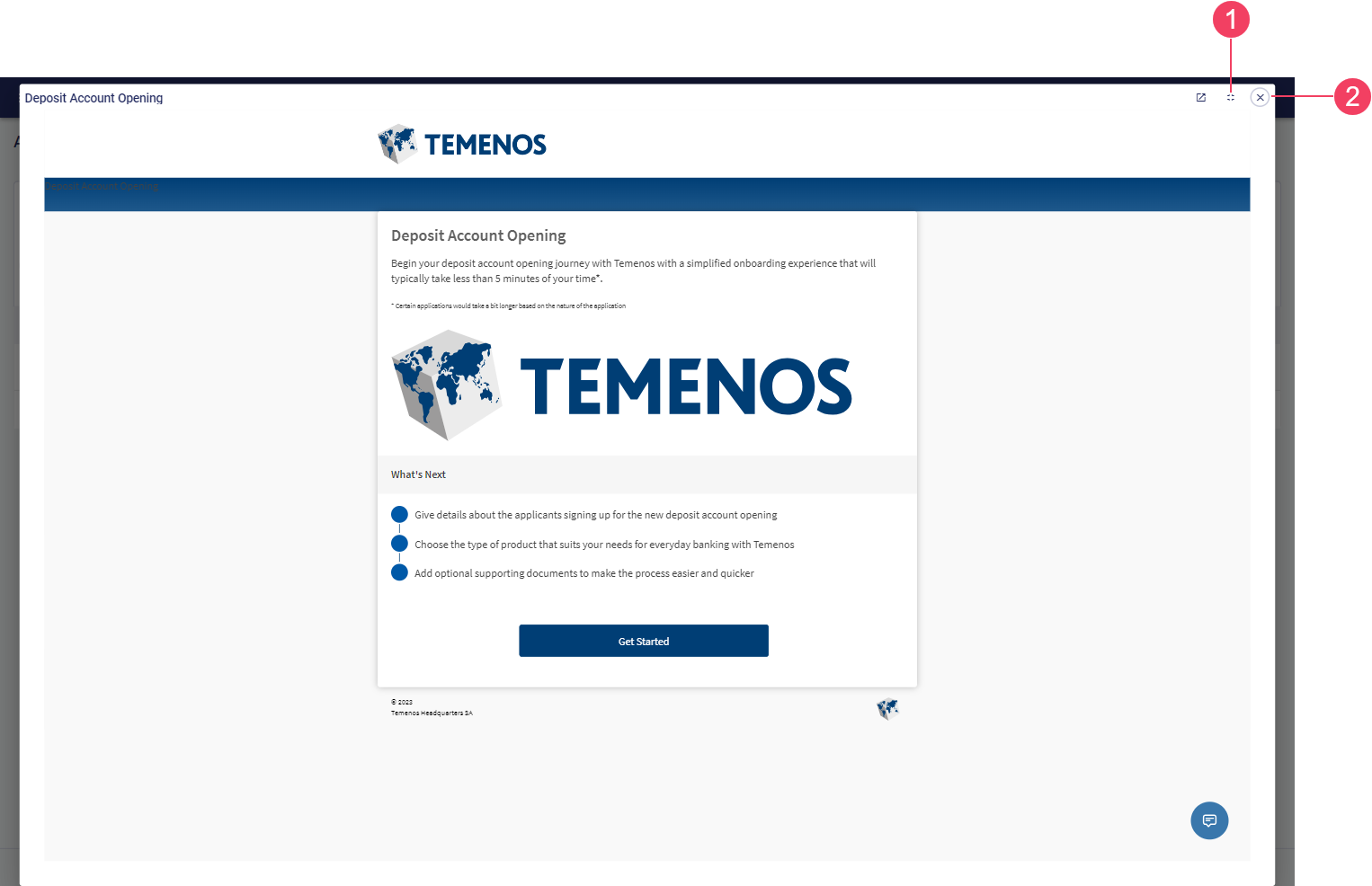
Workspaces has been purposefully designed to make key features and important information available at your fingertips. However, sometimes more screen space is needed, or an action needs more control over how it's used, and in these kinds of circumstances Workspaces uses a modal window.
Examples of how Workspaces uses modal windows include the following.
- View any receipt for any task associated with a selected application.
- Manage the documents attached to an application.
- Start, fill in, and save or submit a new form in the Assisted Channel space.
By default, a modal window opens in the same browser tab where you are using Workspaces, and in a way that prevents you from interacting with the main Workspaces screen behind it. Further, a modal window that contains a form opens in full screen by default. If you need to interact with the Workspaces screen behind a modal window, the modal can be popped out into a separate browser tab, allowing you to close the modal and interact with Workspaces while still being able to view the receipt. This feature was introduced in the 22.10 release
You can interact with the elements on the modal window which may involve data entry, or the window may simply display information in a format that wouldn't be possible or might not present well on the main Workspaces pages.
Use the and icons to control the size of a modal window, or the icon to pop out the modal content into a separate browser tab. When you're finished with a modal, click the icon to close the modal window and return to the Workspaces screen where the modal window was opened. The screen is reloaded to reflect any changes made while the modal window was displayed.
Time Zones in Workspaces
When you're using Workspaces, from time to time you'll encounter dates and times associated with items such as applications and tasks; for example, the date and time when an application was submitted or a note was added. Workspaces captures and stores dates and times using the time zone on the local computer where the action is taking place. Similarly, all dates and times displayed in Workspaces are with respect to the time zone of the user’s local computer. This means that you never need to do time zone conversions; Workspaces always takes care of this for you.
Error screen
Workspaces is designed to handle a variety of predictable situations gracefully. Nevertheless, from time to time something could happen that Workspaces doesn't know how to deal with. In these situations, Workspaces has a handy screen that helps you to understand what went wrong and get the help you need.
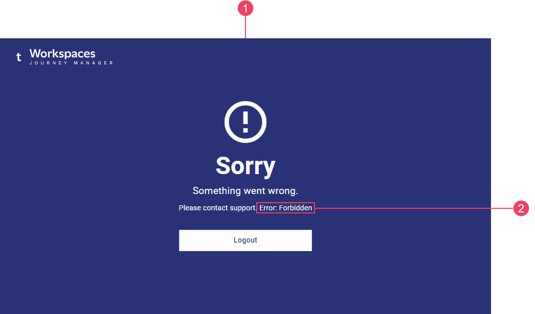
- Error screen
- Error text
The error screen displays information about how to resolve the error you encountered. Usually, this involves contacting your support team and providing some details to aid in troubleshooting your problem. When seeking assistance, include the error text displayed on the error screen in the details you provide to your support team.