Understanding the Workspaces List screen
WorkspacesThis topic relates to Journey Workspaces | Workspaces UserIncludes bank staff, helpdesk, relationship managers, and managers | This feature was introduced in the 18.11 releaseThis feature was updated in the 23.10 release
Some of the text and images below may not match what you see in your Journey Workspaces app. This is because the features described are based on a default Journey Workspaces configuration, and your Workspaces app may be configured differently; for example, with your company's branding, with fields for other information, or with a custom layout. Nevertheless, the features described work the same way in every Workspaces app.
Overview
Each space in a Workspaces portal is configured with a List screen that displays a list of active application or task items, and a set of actions that you can use to work with a selected item. Each List screen is configured with a set of common features that allow you to control which items are displayed in the list, including the following.
- An item list containing a list of tasks or applications.
- Support for optional item list expansion rows presenting additional content. This feature was introduced in the 23.04 release
- A graphical SLA indicator that lets you monitor application progress against an SLA at a glance. This feature was introduced in the 19.11 release
- A global view selector, used to apply a pre-defined set of fields, filters and sort options to the item list.
- A global filter for the selection of a queue (Review and Manage spaces) or a form / product type (Document Requests, Helpdesk and Assisted Channel spaces).
- A Created Date global filter that restricts the items in the item list based on the date they were created.
- Flexible search, filter and sort options that you can use to refine the set of tasks or applications in the item list.
- A Bulk Action mode switch to change between acting on a single task or multiple tasks. This feature was introduced in the 22.10 release
- Paging tools that allow you to browse all of the items matching your selected criteria over multiple item list pages.
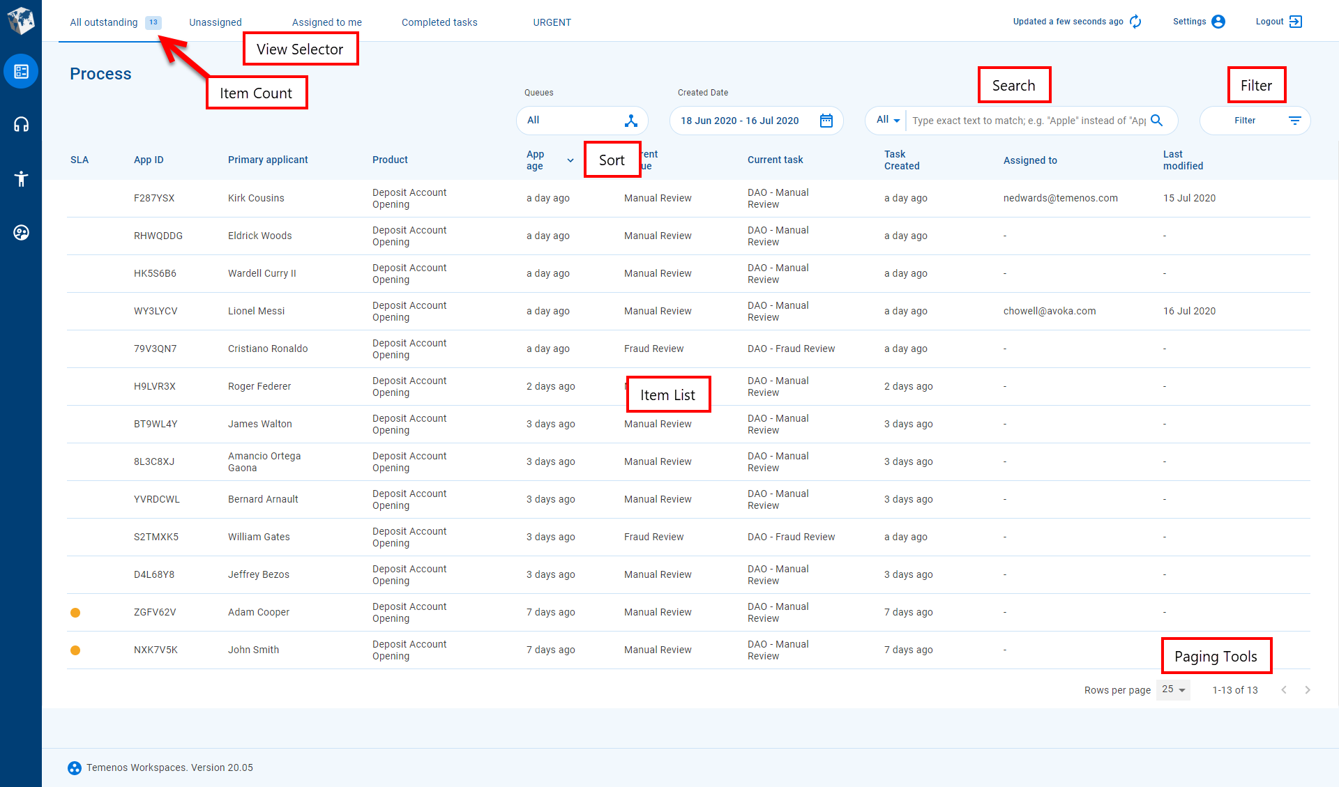
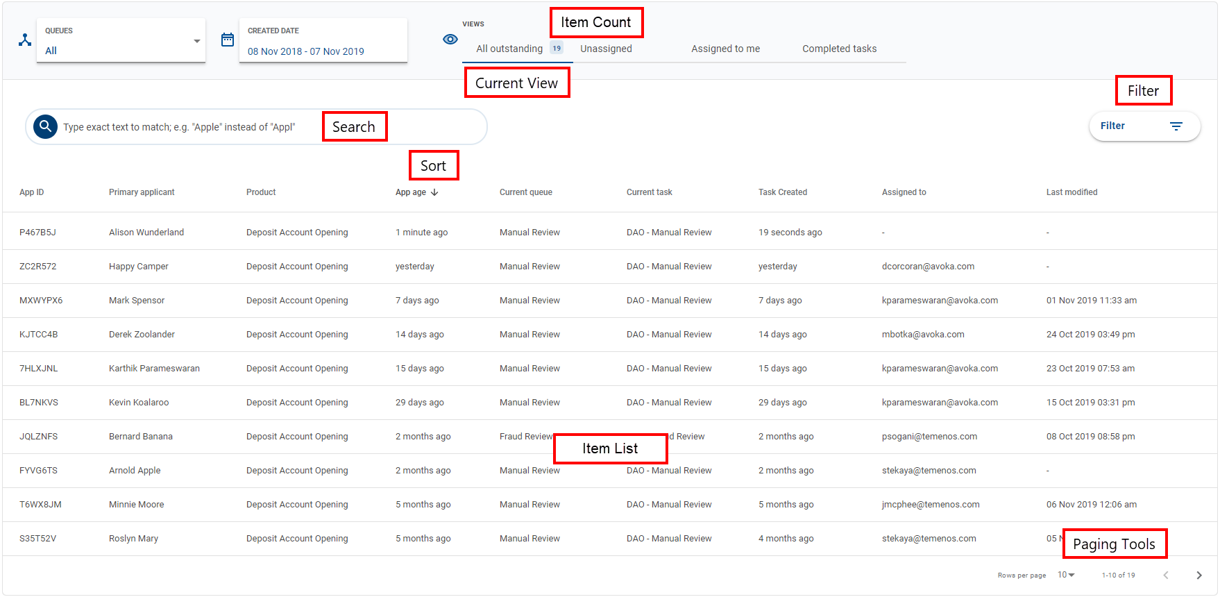
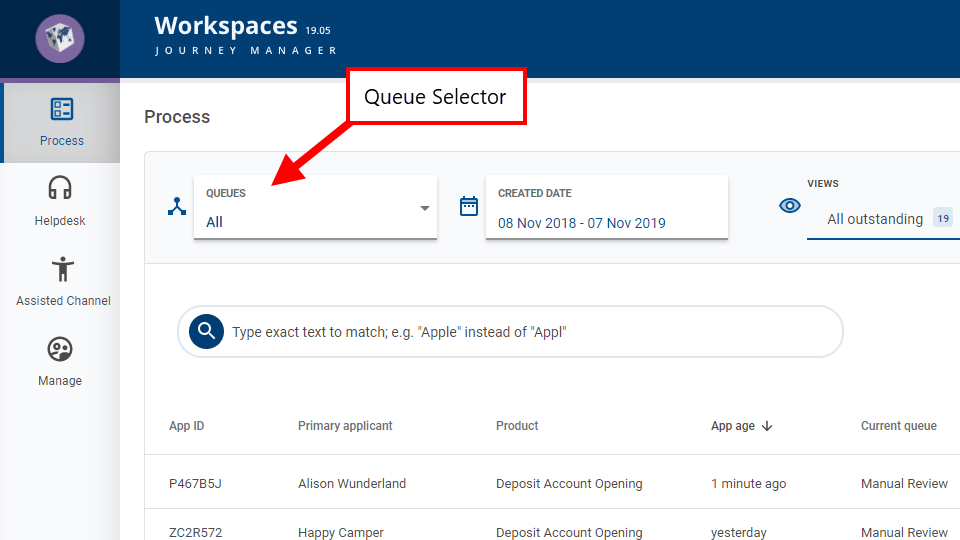
The following image illustrates where you can find the common features on the List screen using the Review space as an example.
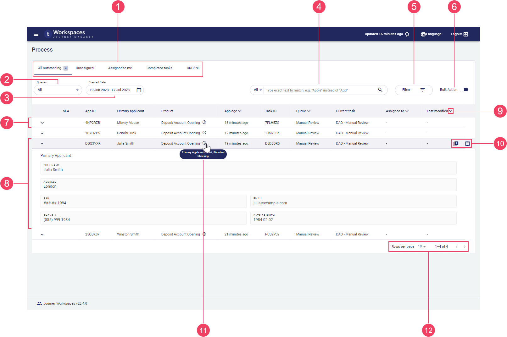
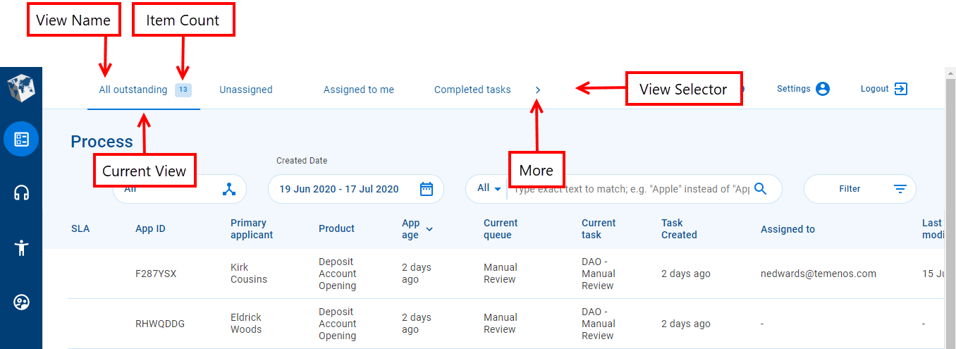
- View selector
- Primary selector (Queue)
- Secondary selector (Created Date)
- Search
- View Filter
- Bulk Action mode switch
- Collapsed item list row
- Expanded item listrow
- Sort
- Action
- Tooltip
- Paging tools
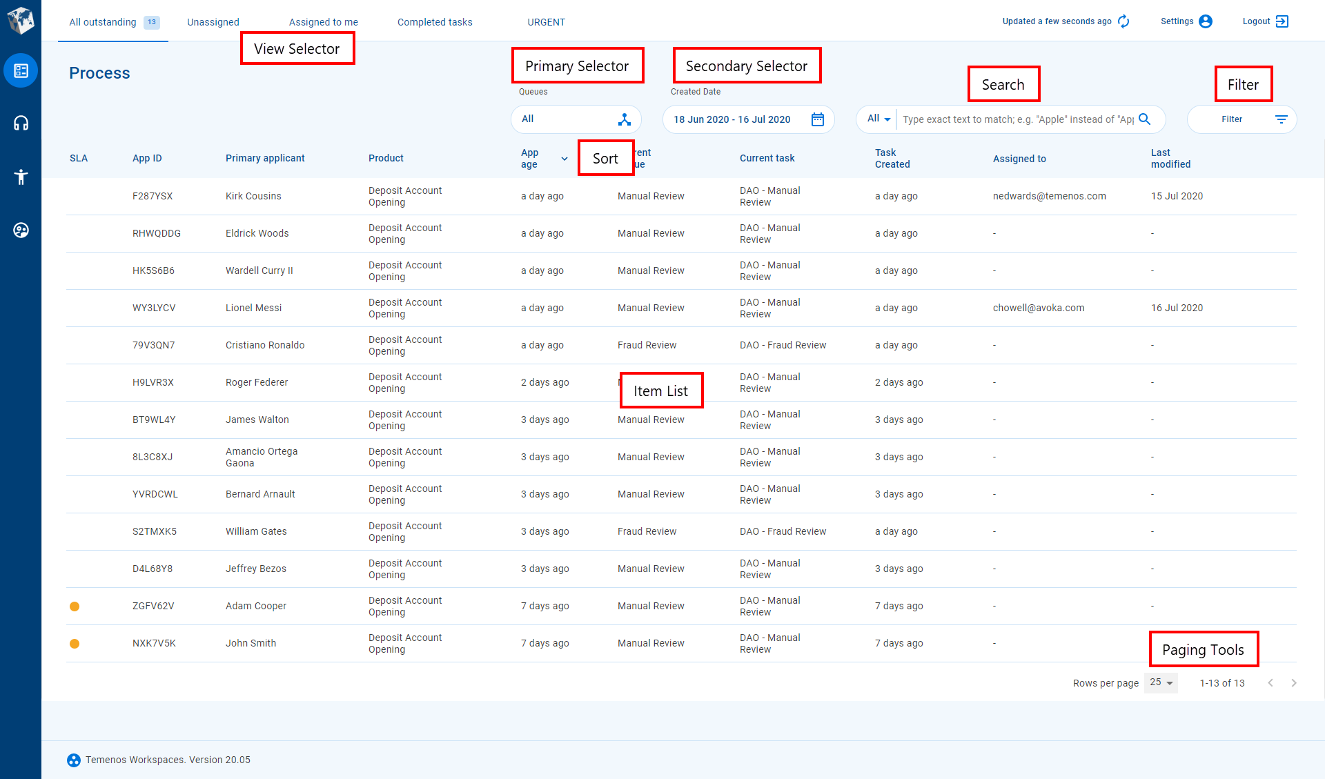
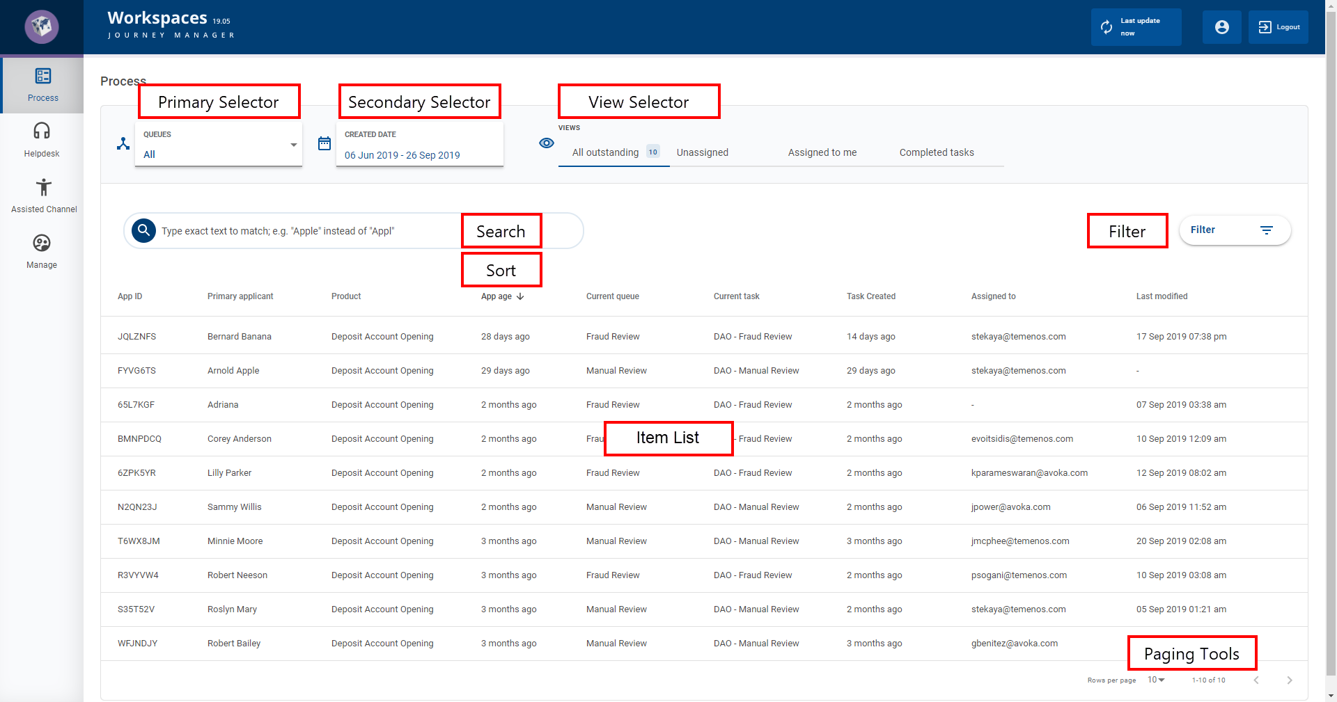
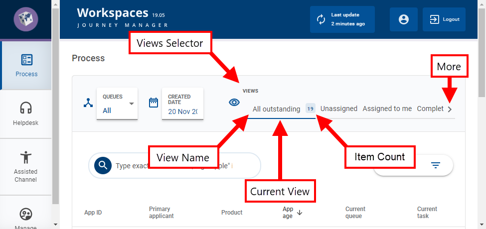
- View selector
- Primary Selector
- Secondary Selector
- Search
- View Filter
- Bulk Action switch
- Item List
- Sort
- Task/Application Item
- Tooltip
- Action Buttons
- Paging Tools
The List screens for the Review and Manage spaces are configured with similar functionality, while those for the Helpdesk and Assisted Channel spaces have some different behavior. The most significant difference is how the item list is populated for each space, but there are other differences such as the SLA column on the Review and Manage spaces.
The main element on the List screen is the item list which displays summary information for a list of tasks or applications in rows and, optionally, additional information for each row when expanded. The selectors at the top of the screen, for the global filters and view, are the main way you control and identify which tasks are displayed in the item list. Up to three global filters may be configured but the default configuration has just two.
- The first global filter shows the name of the active queue (Review and Manage spaces) or form / product type (Helpdesk and Assisted Channel spaces), and lets you select another queue or form / product type so that you can work with other tasks or applications.
- The second global filter, Created Date, lets you hone in on items created in a specific period, and displays the date or date range that is currently selected.
- The View selector shows the name of the current view, and lets you select another view, thereby quickly and easily changing how the item list appears (including different fields or sort order) and which items are displayed.
If you've selected global filters and a view, and you can't see the item you’re looking for, you can further refine the list of items using the filter and sort options. Filtering restricts which items are displayed in the item list, and sorting determines the order items appear in the list. To learn more about these options, see Filter the item list and Sort the item list.
Sometimes, you just need to find a specific task or application quickly, or you can’t see it in the item list using the techniques described above. In these kinds of situations, you can search for the item to find it straight away (or not at all). To learn how to search, see Search for Tasks.
Other times, you might not be sure which task or application you need until you see it, so after using the selectors and filters you want to browse through the item list until you find what you need. Workspacesincludes a set of paging tools that allow you to browse the item list and which also allow you to choose how many items are displayed on a page.
The number of items that satisfy all criteria for selection is shown as the Item Count next to the view name. The global filters, current view, search and filters all contribute to the calculation of the Item Count.
Once you’ve found the task or application that you’re looking for, there are several ways you can interact with it on the List screen.
- Point your cursor at an item to reveal one or more action buttons on the right. Click an action button to perform the corresponding action.
- Expand an item to see additional information about it in the item list. This feature was introduced in the 23.04 release
- Click an item to open it in the Details screen where you can see more information about the application and interact with it further, including to perform actions. To learn more about working with tasks and applications on the Details screen, see The Application Details Screen.
- Switch to the Bulk Action mode to perform an action on multiple tasks at once. To learn about bulk actions, see Bulk actions in Workspaces.
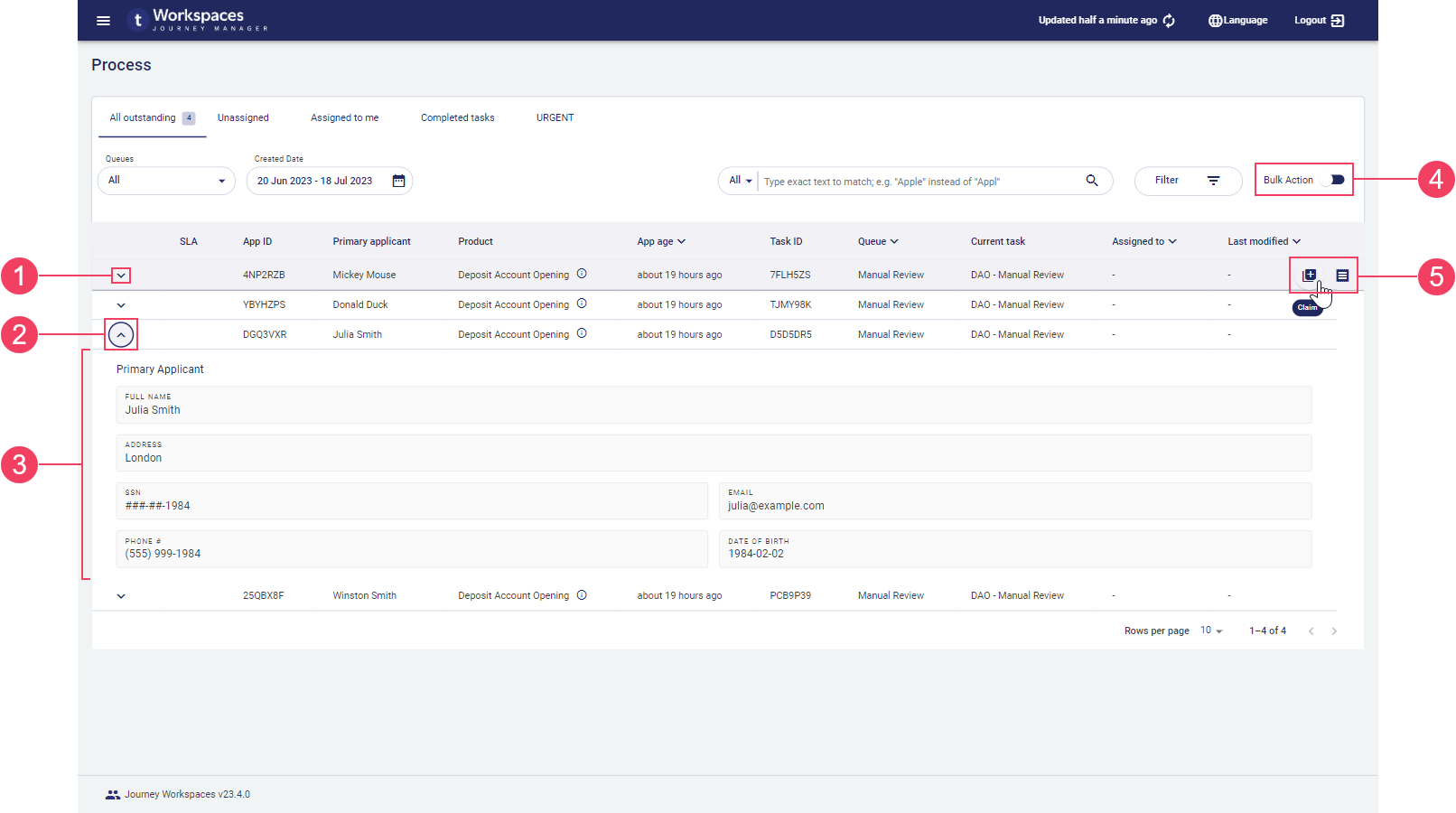
- Expand row
- Collapse row
- Additional information
- Bulk Action mode switch
- Action
The available actions for a task or application item depend on the currently selected space and the item’s current state. The Receipt action is always available for a submitted application and similarly the View Form for saved applications, allowing you to see the information entered by the applicant. To learn about actions including Receipt and View Form, see Workspaces Actions.
Some actions are only available from the Details screen. If an action you're looking for isn't available in the item list, try selecting the item to see if the action is available on the Details screen.
Item list
The main element on the List screen is the item list which displays application and task related information in rows and columns. Each row corresponds to a single task or application, while each column shows a different kind of information to help you identify what you're looking for.
Each item list column shows a single value but this can be limiting for some kinds of information. To improve this situation, additional information can be displayed in a tooltip. When available, a tooltip is indicated by a icon. To view the tooltip, point your mouse at the icon. This feature was introduced in the 22.10 release
As an example, say you have an application type covering multiple optional products and you have a Product column in the item list. If an application includes multiple products, only the first product is displayed in the Product column. In this scenario, a tooltip could be configured to show all products included in the application.
In some spaces, an item list row can be expanded to display even more information about the application or task it represents. Expansion rows are useful because they can present custom content that may include more and different kinds of information than what is shown in the item list columns. Expansion rows are indicated by the and icons at the start of a row. Click a row's icon to expand it. To close an expanded row, click the row's icon. Only one row can be expanded at any time, so if a row is already expanded when you click a row's icon, the previously expanded row is collapsed.
The information displayed in each column and expansion row is configurable, so what you see in your Workspaces portal may differ from the default configuration.
The items displayed in the item list satisfy a set of user-selected criteria starting with selections from the global filters and views, then refined by searching and filtering. Items appear in the item list if they satisfy all of the following conditions:
- Tasks are sourced from the active queue, or applications correspond to the value of the form / product typeglobal filter.
- Items were created within the range of dates covered by the Created Date global filter.
- Items match the filter criteria imposed by the current view.
- Items match any optional search or filter criteria selected by the user.
Note that the last three criteria (Created Date, view, and optional filter/search) are the same for all spaces in the default configuration. This means we can simplify the description of which items appear in the item list by focusing on how the item list is populated initially for each space in the default configuration before applying the common criteria. This leads to the following:
- Review and Manage spaces: The item list is populated with tasks for submitted applications sourced from the active queue, and that satisfy the common criteria.
- Helpdesk space: The item list is empty initially; search for an application ID to populate the item list with saved or submitted applications that match the selected form / product type, and that satisfy the common criteria.
- Assisted Channel space: The item list is populated with saved or submitted applications matching the selected form / product type that were created by or are assigned to the logged-in user, and that satisfy the common criteria.
SLA Indicator
While the SLA Indicator is available in the default configuration of Workspaces, it may not be available in your Workspaces portal or it may appear differently depending upon how your Workspaces portal has been configured.
In the Review and Manage spaces, Workspaces enables you to monitor the progress of each submitted application against a crucial service indicator, such as an SLA, via a graphical SLA indicator in the item list. A text version of the SLA indicator may also be available, showing how application processing is progressing relative to the SLA.
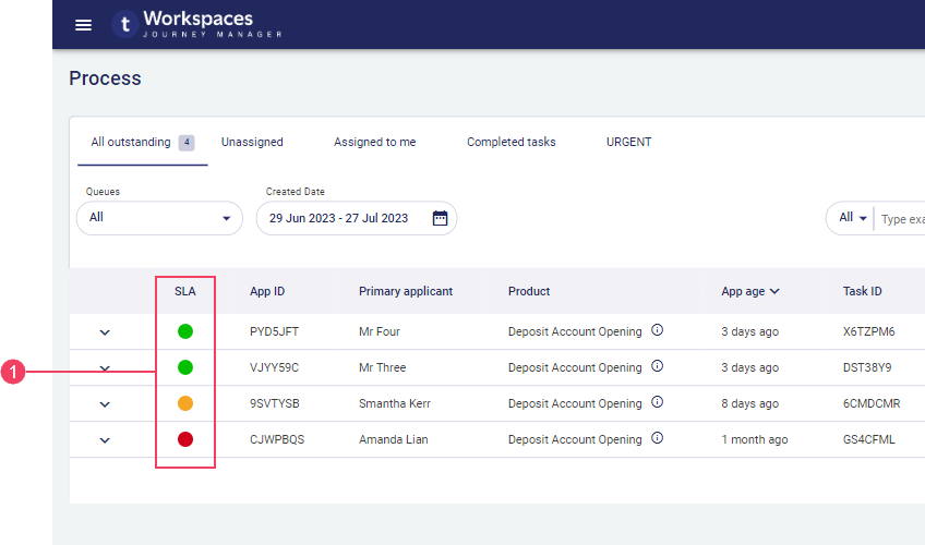
- SLA indicators
The SLA indicator changes color over time as the application is being processed. The colors used and what they mean are specific to your Workspaces portal.
If your SLA requirements are simple, your Workspaces portal may be configured with a basic two-color SLA.
Basic SLA
The basic SLA is based on pre-defined values for the amount of time available to process each application, and when to provide a warning that the SLA is in danger of being breached. To learn more about the basic SLA, see Basic SLA.
The SLA indicator changes color over time as the application is being processed. The colors used by the basic SLA and what they mean are as follows:
- No indicator: The application is being processed in a timely fashion within the terms of the SLA.
 (SLA Warning): An SLA breach is imminent.
 (SLA Alert): The SLA has been breached.
Queue selector
In the Review and Manage spaces, the List screen allows you to interact with tasks from any queue that you can access. The Queues selector identifies which queue is currently used as the source for populating the item list. You can select another queue from the Queues selector if more than one queue is available to you.
The default Workspaces configuration makes the Queues selector available in the Review and Manage spaces only.
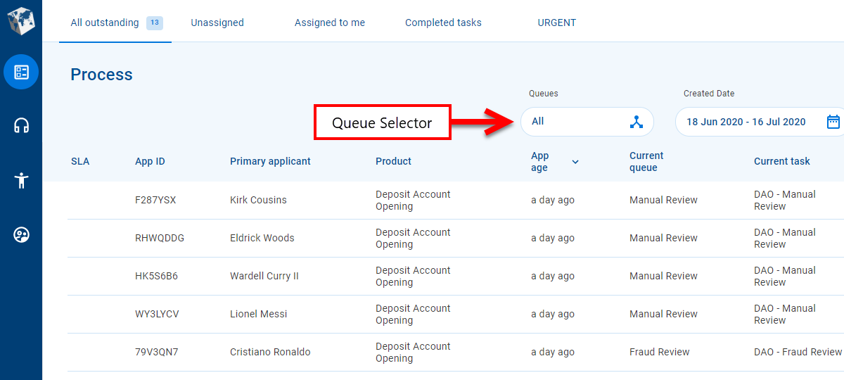
In the Review and Manage spaces, when the List screen is first displayed, a default queue is selected for you and tasks from that queue are displayed in the item list. If no queue is selected, the item list is empty and you need to choose a queue. Thereafter, Workspaces remembers the last queue you chose, and selects it automatically when you open the List screen.
The available queues are listed in the Queues selector’s dropdown list as well as an All item. You can choose any queue from the dropdown list to be the source of tasks for populating the item list. If you choose All, the item list is populated with tasks from all of the queues available to you.
Selecting the All queues item populates the item list with tasks from all of the queues that you can access. There may be tasks on other queues that you cannot access; these tasks are not displayed in the item list when the Allqueues item is selected.
Form / Product Type Selector
As mentioned above, the first global filter applied to the List screen in the Helpdesk and Assisted Channel spaces is for a form / product type. The Form / Product Type selector identifies the currently selected form / product type, and allows you to select another form / product type to apply as a global filter on the item list.
The default Workspaces configuration makes the Form / Product Type selector available in the Helpdesk and Assisted Channel spaces only.
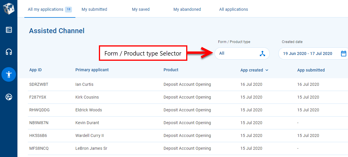
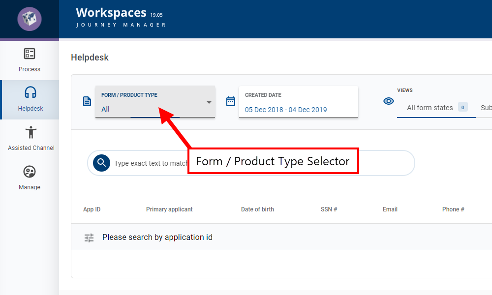
The Form / Product Type selector behaves differently to the Queues selector. Rather than selecting the source of tasks to be displayed in the item list, the Form / Product Type selector restricts the applications displayed by including only those that match the selected form / product type. This has a different affect in each space due to the way the item list is populated in each space.
- In the Helpdesk space, the form / product typeglobal filter is used in conjunction with a search for an application ID to populate the item list with applications that match the selected form / product type.
- In the Assisted Channel space, the form / product typeglobal filter restricts the applications displayed in the item list to just those that were created by or are assigned to the logged-in user and which match the selected form / product type.
When the List screen is first displayed, a default form / product type is selected for you. Thereafter, Workspaces remembers the last form / product type you chose and selects it automatically when you open the List screen again.
The available form / product type values are listed in the Form / Product Type selector's dropdown list as well as an All item. You can choose any form / product type from the dropdown list to be applied to the item list. If you choose All, the item list is populated with applications for all form / product types that you can access.
A form / product type item may represent a form group. When a form group is selected, the specific form associated with each task is displayed in the item list's Product column. This feature was introduced in the 22.10 release
Created Date selector
Another feature on the List screen that helps to reduce the number of items presented to you is the Created Date global filter. You can access this global filter via the Created Date selector which displays the current creation date filter and lets you apply a different creation date filter.
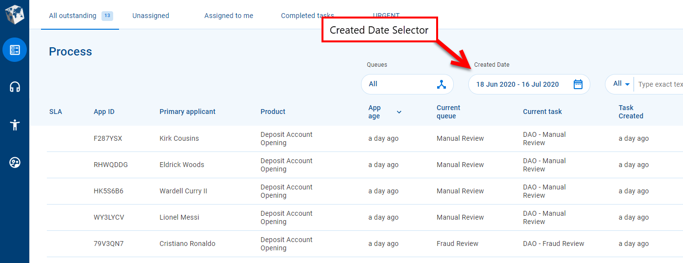
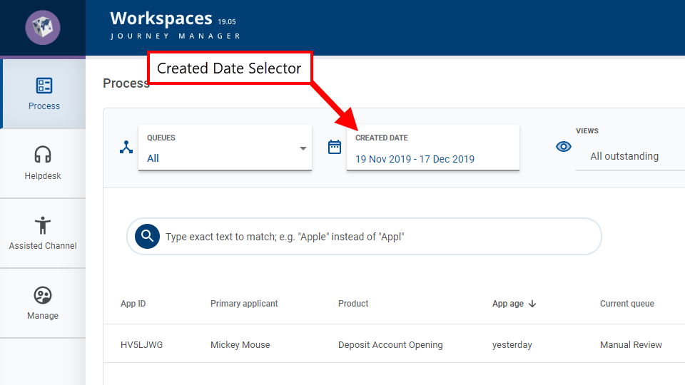
The default creation date filter restricts the tasks or applications displayed in the item list to just those that were created in the last 30 days, including the current date, and this filter is applied the first time you access the List screen. You can select a different creation date filter using the Created Date selector. When you click the Created Date selector, a date picker is displayed allowing you to choose a date or range of dates so that you only see tasks or applications created on the selected dates. To learn more about how to use the date picker, see Topics.
View selector
The View selector provides a convenient way to control which items are displayed in the item list. You can change which items you see by selecting one of the views in the View selector.
A view is a predefined item list configuration including fields, filters, and sort options. When a view is selected, it's configuration is applied to the item list to restrict the items displayed. You can think of a view as a shortcut for applying a set of filter and sort options on top of a defined set of fields.
Each item in the View selector represents a view. Click an item in the View selector to make it the current view and apply its configuration to the item list. Color highlighting and an item count provide a visual indication of which view is selected.
If there's not enough screen space to display all the configured views, left/right scroll buttons will appear to allow you to access all the views. The Scroll Left button appears if the first view item is not entirely visible. Similarly, the Scroll Right icon appears if the last view item is not entirely visible.
Views are configured by a Workspaces developer or administrator. As a Workspaces user, you can’t change the way a view is defined but you can use filter and sort options to refine the items displayed in the item list.
Search, Filter and Sort
As mentioned above, the item list shows task or application items that satisfy the criteria defined by the global filters and the current view. This may result in a large number of items which you might want to further refine. Workspaces includes search, filter and sort options that can help you to focus on the tasks or applications that are important to you right now.
Information in a List screen expansion row cannot by found by searching or filtering.
Search and filter are similar in that both reduce the number of items by matching values and fields. However, there are some key differences between these two features:
- Search looks at every field (column) in the item list (except date fields), whereas filter is targeted at specific fields.
- Search compares the same text to every field, whereas filter allows you to look for a different value in each field.
- Search is supported for text fields only, while filter is supported on all data types including text and dates.
To learn more about the Workspaces options for search, filter and sort, see Topics.
Paging Tools
Sometimes, there are too many items to display all at once on the screen. Paging allows you to see some of the items now then browse the item list one page at a time to see more. Paging tools let you choose the number of items to display on an item listpage, and navigate (forward or backward) through the available pages of items.
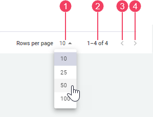
- Rows per page
- Items in list / Total matching items
- Previous Page
- Next Page
The and paging tools let you browse through item listpages to find the items you need. Click these tools to display the previous or next page of items in the item list. The tool is disabled when the first item list page is displayed; similarly, the tool is disabled when the last item list page is displayed.
Rows per page shows the maximum number of items displayed on an item list page. You can select a different page size from the Rows per page dropdown. Selecting a different page size, resets the item list to show the first page again.