Edit Properties
Composer This topic is related to Transact Composer. | Form Builder | v4.3 & Higher This feature is related to v4.3 and higher.
The Edit Properties dialog is the control for every element and field in the
form's structure. It has many parameters, which in turn are grouped into
tabs, sub menus and even sub tabs.
Though the dialog is very powerful, but its settings do not need altering in
most cases. That said, Composer's ability to do scripting and to fine tune
the data model of the form through Edit Properties — and have these debugged
and quickly up and running — is vital for successful form design. The
improved layout of the Edit Properties dialog also facilitates making these
adjustments to the form.
Composer Version 4's redesigned Edit Properties has a number of new
features, including a layout tab for configuring the layout managers of a
block, with a small wireframe for viewing the effects of changes on the
block. Also, for the first time in Composer, you can view a field's
dependencies and triggers.
Invoking the Edit Properties Dialog
Double click on an item in the Structure Panel. The different types of
structural elements have different items in their Edit Properties dialog.
Broadly, here are the different types of elements:
The form itself (at the top of the Structure Panel tree)
Sections (a special kind of container that controls
navigation through the form) Containers and blocks (which can be expanded by clicking
on the "+")
Simple Widgets (which do not expand)
Structure
Version 4's Edit Properties dialog has a new layout for better grouping of
the many settings of the properties for fields and containers on the form.
The dialog now features a row of tabs along its top. Which of these are
visible depends on which of the various structural elements was chosen for
the "Edit Properties" dialog.
Properties Overview Styling Data Model
Layout Assistant (for blocks and containers only) Dependencies
Rules
There are a few special tabs that appear for the Edit Properties dialog for
the form itself at the top of the Structural Panel tree:
Palette (for the form element only at the top of the Structure Panel) Theme
(for the form element only)
Policies (for the form element only) Settings (for the form element only)
Localization (for the form element only)
However the properties displayed in these special tabs can be accessed
elsewhere in the tree, usually in the Nuts and Bolts. There, the properties
appear under the "Properties" tab in the same panels that appear
under these special tabs.
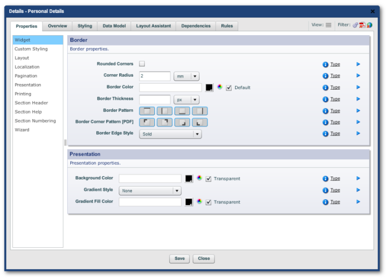
"Properties" and "Rules" have Left Hand menus. Each menu
item displays a different set of panels to its right. Each of these panels
contain their own set of editable properties.
Edit Properties dialog for a tab with a Left Hand menu
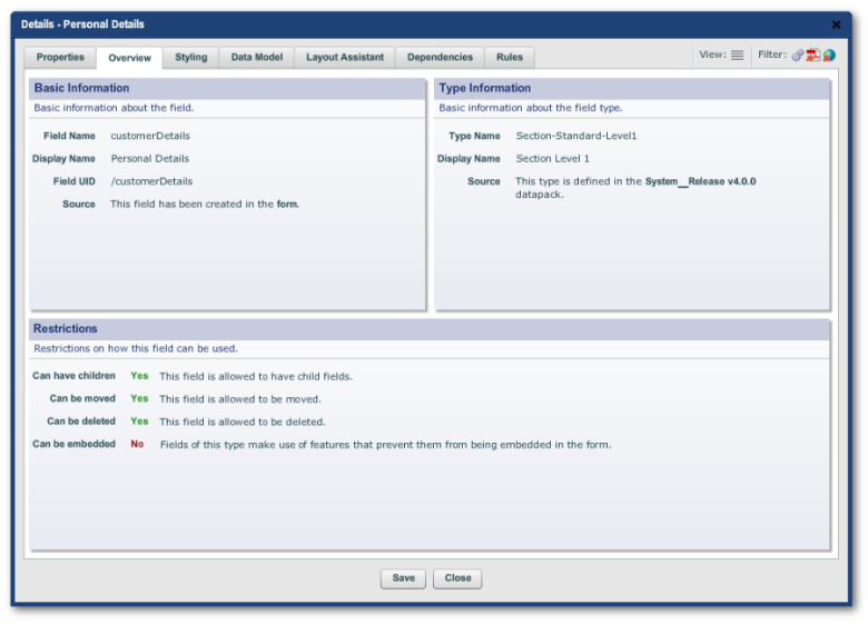
"Overview", "Styling", "Data Model" and
"Dependencies" have just panels containing properties.
Most of these properties are read only. "Data Model" has editable
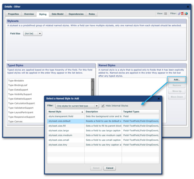
properties. Two of the panels in the "Styling"
tab are editable: "Stylesets" (which gives access to stylesheet
preset options) and "Named Styles" (where you can explicitly
associate stylesheets with the object).
The "Layout Control" tab, which is visible for blocks and sections
only, has its own unique layout, see
Field LayoutControl.
See
ScriptingandDependencies on how to add scripts to the form — which is done through Edit Properties.
Notation Convention Used
In the rest of this guide, we will use the following notation to show where
a property, script or configuration is located in "Edit
Properties":
Tab -> LH Menu item -> Panel ->
Property -> value
So, in the Overview tab shown above, for example:
Overview -> Basic Information -> Field Name -> customerDetails
The Filter and View Buttons
The "Edit Properties" dialog has a similar
dualmodeastheStructurePanel: Standard and Advanced. The cog icon to switch between the two modes is in
the top right-hand corner in the "Filter" mini panel.
"Advanced" displays more properties, LH Menu items and tabs.
The other two icons toggle on or off the display of PDF-only or HTML-only
properties.
The "Hamburger" View icon toggles between the normal Edit
Properties view of tabs, menus and panels and the "Property Grid":
a combined list of all properties listed in alphabetical order . Use the
Property Grid to find a
property if you cannot locate it in any of the panels, or to inspect the raw
and displayed values of properties.
The Properties Tab
The Properties tab for any structural element usually has a LH Menu. The
items displayed, though vary from element to element. The items will be
listed and defined in the
ReferenceSection near the end of this guide.
These LH Menu items are only groupings of property panels (see
The New Dialog topic). The same property panels may also appear elsewhere in the same Edit
Properties dialog for the same element, for example the panels in Properties
-> Layout will also be found at Layout Assistant -> Properties in the
same dialog.
So, the Properties tab's LH Menu usually has many possible entries. The
following is intended to be a broad guide so that you can find your way
around this tab — and, by implication, the rest of the Edit Properties
structure.
Here, we exclude Nuts & Bolts. Indeed, some of the "Nuts &
Bolts" items have Property tabs with empty LH Menus
The following table is a rule of thumb only, and we include it here for
general guidance. Advanced Mode items are so marked.
|
Structural Element Type |
LH Menu Item |
Panels (an indication only) |
|
Form |
Form |
Form Panel (Holds the settings entered in theoriginalwizardwhentheform was created.) |
|
Section |
Widget (Advanced) |
Border |
|
Custom Styling (Advanced) |
HTML Custom Styling (HTML forms only. Background image, its repetition, custom HTML classes) |
|
|
Layout |
Layout Manager Layout Constraints
|
|
|
Localizatio n (Advanced) |
Localization Properties |
|
|
Pagination (Advanced) |
Pagination control (PDF only) |
|
|
Presentatio n (Advanced) |
Presentation (Alignment, Drop Shadow, etc.) |
|
|
Printing (Advanced) |
Printing (PDF only. Printing properties) |
|
|
Section Header |
Header |
|
|
Section Help |
Help |
|
|
Section Number |
Numbering |
|
|
Wizard |
Wizard (does this section belong to the form's wizard navigation scheme) |
|
|
Block |
General |
General (Labels) |
|
Widget (Advanced) |
Border |
|
|
Custom |
HTML Custom Styling (HTML forms only. Background image, its repetition, custom |
|
Structural Element Type |
LH Menu Item |
Panels (an indication only) |
|
Styling (Advanced) |
HTML classes) |
|
|
Layout |
Layout Manager Layout Constraints
|
|
|
Localizatio n (Advanced) |
Localization Properties |
|
|
Pagination (Advanced) |
Pagination control (PDF only) |
|
|
Presentatio n (Advanced) |
Presentation (Alignment, Drop Shadow, etc.) |
|
|
Printing (Advanced) |
Printing (PDF only. Printing Properties) |
|
|
Simple Widget |
Caption |
Caption Content Caption Presentation |
|
Field (Advanced) |
Field Border |
|
|
Widget (Advanced) |
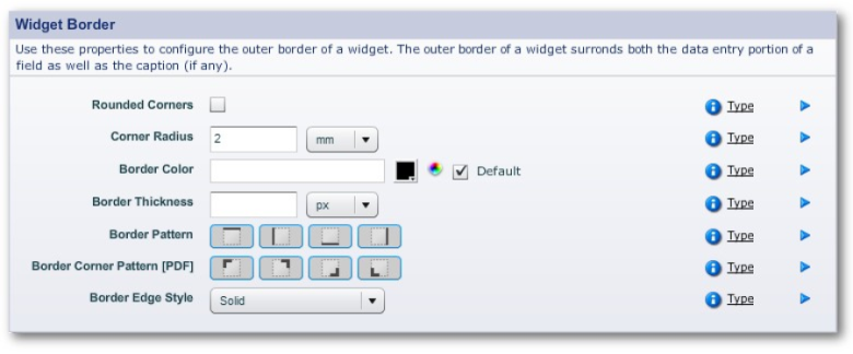
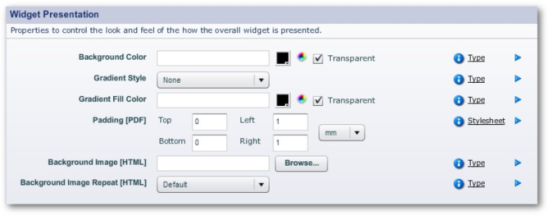
Widget Border Widget Presentation
|
|
|
Accessibilit y |
Accessibility (Tool tip, custom screen reader text, precedence and so forth) |
|
|
Custom Styling (Advanced) |
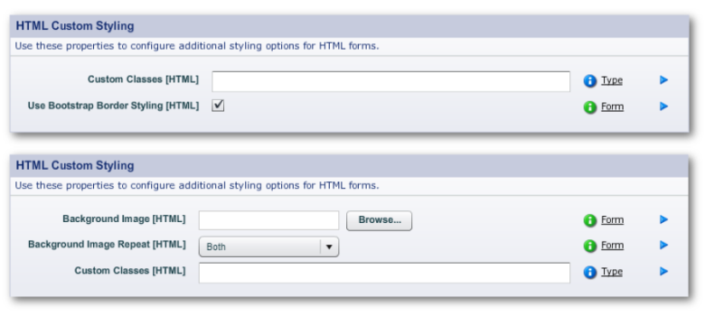
HTML Custom Styling (Custom HTML Classes and whether Boostrap styling applies) PDF Comb Styling |
|
|
Data |
Data (various properties, many of them Advanced Mode only, including display format, etc.) |
|
|
Layout |
Layout Constraints Sizing |
|
|
Localizatio n (Advanced) |
Localization |
|
|
Printing (Advanced) |
Printing (PDF only) |
The Other Tabs
In
TheProperties Tab, we gave 4 types of structural elements in the panel. There are actually 5
main types:
The form itself (at the
top of the structural panel's tree)
Read onlyelements (mainly found in Nuts & Bolts elements)
Sections Blocks
Simple Widgets
The New Dialog lists the range of other tabs. The current topic briefly deals with two
tabs associated with all the elements:
Overview
Styling
Neither has a LH Menu.
|
Tab |
Panels |
Editable? |
Properties |
|
Overview |
Basic Information |
No |
Field Name Display Name
|
|
Type Information |
No |
Type Name Display Name Source |
|
|
Restrictions |
No |
Can have children? ("yes" or "no")
|
|
|
Styling |
Stylesets (qv) |
No |
Lists any stylesets associated with the element |
|
Typed Styles |
No |
Lists stylesheets assigned to the element according to its type. |
|
|
Named Styles |
Yes |
Can explicitly add or remove stylesheets to the element and set the order of precedence. |
Field Layout Control
This topic covers the mechanics of layout. See
here, for a discussion on the aesthetics and design of form layout from. Also
see another discussion on
UsabilityandAccessibility.
Problems with explicit position layouts
When designers build a form using simple tools, they tend to drag a widget
into a specific position on the form
— known as absolute or x-y positioning — then re-position and re-size it
using their mouse. This works for simple forms only, not when dealing with
multiple device types, nor with maintaining existing forms. Explicit
positioning:
Cannot ensure that forms flow correctly on different technologies, for
example on the desktop, tablets or smartphones.
Cannot ensure all fields have the same styling and sizing. Cannot ensure
that all fields line up nicely.
Cannot ensure proper placement on the high resolution devices. Doing this
manually is very time consuming and the results are inconsistent.
Cannot save designers from filling in parameters manually into dialogs. For
example, "all standard text fields are 1.5in wide, a caption of 1.2in,
and placed 0.7in in from the left margin". The designer then needs to
know these magic numbers, and apply them consistently and enter them for
every single field on the form.
Makes a big job out of inserting a new field vertically between two existing
fields.
Cannot automate changing all the fields on the form to have, for example,
all the field captions left or top- aligned, or changing all the fonts or
background colors.
Cannot automate changing the width of the form, or its margins and so forth.
Instead, every field has to be repositioned.
Layout Managers and Hints
For these reasons, Composer automates the detailed layout of fields. All you
do is specify the order of the fields and, optionally, a few extra
"hints" and let Composer do the rest.
Hints may be such things as:
Keep this field on the same line as the previous one
Make this field as wide as possible (within the bounds of the space that it
has available on the page) Spread these two fields across the page, in the
ratio 40% to 60%.
Lay out these 12 fields equally spaced in a 4 column grid
The Layout Panels
The default settings for the Composer layout managers are set in the
template for the form. The following documents how to tweak the layout of elements
on the form when the default positioning of an element needs it.
You make layout adjustment through 3 panels in Edit Properties. They are:
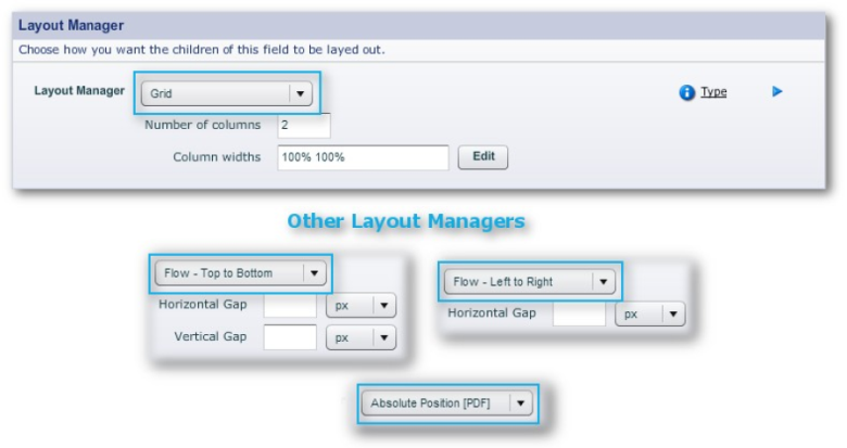
The Layout Manager panel
Layout Constraints
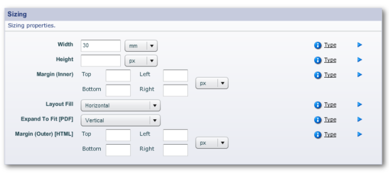
Sizing
You access these panels in "Edit Properties" through
"Properties -> Layout" or in the "Layout Assistant"
tab. (That tab, though, does not contain the "Sizing" panel.)
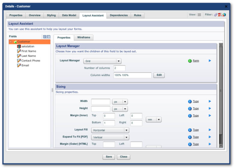
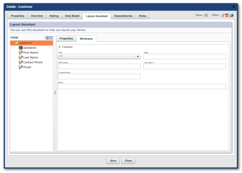
Note the mini Structure Panel (marked "Fields") in the LH Menu of
the tab. And, there is also a mini wireframe available on the RH side of the
tab in which you can test the effect of tweaking the values in the
"Layout Manager" and "Sizing" panels.
The Effect of the Different Layout Managers
Flow — Top to Bottom
A lot of forms are very simple - they just contain a series of fields going
down the page. This is also the best layout for the narrower screens on
mobile devices.
To achieved this type of layout, you can use the Top to Bottom flow. Fields
in a Vertical Flow simply go below each other down the page. The Vertical
Flow is always the default manager on all sections and blocks.
There are a few options or "layout hints" that you can specify
with the Vertical Flow layout manager to achieve higher levels of usability.
These include:
|
Property |
Description |
|
Keep on Same Line |
If "Keep on Same Line" is checked, this field will be kept on the same line as the previous field. You can set this on as many fields as will fit on the line. This technique is mostly used to group related field together, such as First Name and Family Name, or State and Zip Code. |
|
Layout Fill |
If Layout Fill is set to "Horizontal", then this particular field will expand to fit all the available space on the line. This can be used to give your users as much space as possible to fill out longer fields, without having to give your fields explicit widths. If you have multiple fields on the same line with Layout Fill set as "Horizontal", each of them will then share the extra available space equally. |
The Top to Bottom flow does not change the width of any of your fields
(unless you select Layout Fill). Your field width will be:
The "natural" width of the field as defined in your organization
stylesheet; or
The style-set that you associated with this field
whenyoudraggeditintotheform. Typical style-sets include
widths like "Tiny", "Small", "Medium" and
"Large", but this will vary depending on how your organization's
stylesheets have been set up. If you want to change the style set after
you've created the field, you can change it in "Styling -> Stylesets
-> Field Size".
If you select Layout Fill, the layout manager will try to use as much of the
line's space as possible and take into account the size of the screen or
page, margins, borders and gutter areas, space allocated to menus, and the
other fields on the same line.
Note: If you specify too many fields on the same line, this
can create layout problems, particularly on smaller screens. The behavior of
a line with too many fields will depend on the
ResponsiveLayout rules.
Flow — Left to Right
The Top to Bottom Flow is suitable for many simple types of forms; you often
need, however, more fine-grained control over how fields spread out across
the page. This is where the Left to Right Flow layout manager, comes in.
Horizontal Layout allows you to lay out several fields across the page with
very fine-grained control over the size of each field by specifying the
percent width of each field.
Note: While we generally talk about percentages, those
percentages need not to add up to 100: Composer will adjust accordingly.
The beauty of using percentages is: should you need to add another field
onto the same line, move a field, re- size a field, or switch from portrait
to landscape, all the other fields will automatically adjust to accommodate
the changes. Form maintenance then becomes easy. The fields will also retain
their proportions on the range of mobile devices.
Left to Right Flows are always used in conjunction with Top to Bottom. The
Top to Bottom controls each line of fields; and Left to Right within each
line.
Multiple fields per line
The simplest way to get multiple fields on the same line is to use a Top to
Bottom Flow and the "Keep on Same Line" property ("Properties
-> Layout -> Layout Constraints"). This, however, gives you
little control over the sizing of the fields.
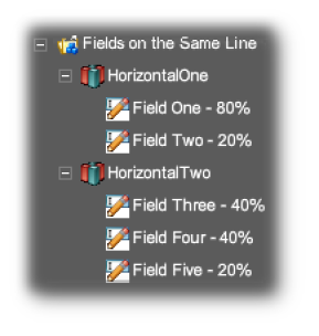
For more control, use a Left to Right flow inside a Top to Bottom to finely
control the widths of each of the fields in the single line. Using even
multiples of a base size will result in fields on subsequent lines being
lined up to each other. This is shown in the screenshot below.
Horizontal Layout
Horizontal Layout in the Hierarchy
Two-column forms
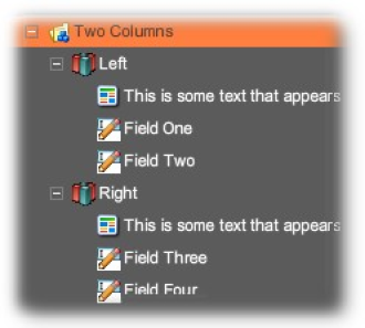
You can create a two column layout by using two blocks laid out within a
horizontal flow layout, with fields inside them laid out horizontally.
This is shown in the screen-shot below:
Two Column Layout
Two Column Layout in the Hierarchy
Note: You can use the Margin property to provide extra
spacing between the two columns, or use another smaller block between the
two.
Grid Layout
Often, you have to lay out a large number of fields and, for an elegant
layout, all these have to align correctly. The Grid layout manager, which is
specified on blocks or sections, can achieve this.
By default, each column in the grid has equal size, but you can also specify
the width of each column by defining a percentage of the space available, or
a fixed size in mm or inches. For example, in a 3 column grid, you may
specify the column widths as "100% 60mm 100%". As in the example,
these percentages need not add up to 100.
Grid layout with 3 radio buttons respectively 100%, 60mm and 100%
Grid layout with 4 columnseach one set to 100%
Grid layout havinga text fieldset to 150%and each checkboxset to 100%
Grids can also be used as part of a hybrid layout. For example, a grid could
contain one or more blocks which in turn could contain widgets, or grids
could be arranged within a vertical or horizontal flow layout.
Each of the objects added inside the grid can specify hints that provide
additional control over how they are laid out.
Go to next line Span
Property editor for the parent block
In the example below, I begin by using as I have 5 checkboxes.
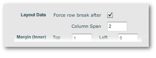
Because 'More than once a week' is such as long caption, I select the 'Force
a row break after' that checkbox and make it "span 2 columns".
Tweaking the element with "Edit Properties -> Layout -> Layout Data"
Result:
Grid layout where 3rdcolumn spans 2columns and the4th column isforced onto thenext line
Tip: Grid layout is particularly useful for laying out
multiple checkboxes and radio buttons. Even if your radio buttons all appear
on one line, it's still advisable to place them in a grid layout. Decide on
a standard grid size for all radio buttons, and always use that grid size
for all radio button groups, regardless of how many radio buttons you have.
If you do this, all your radio buttons in your entire form will all line up
nicely.
Tip: If you have a radio button with a longer than usual
caption, simply set the span to 2 so that it uses up two grid cells.
Grid layout where each of 5 columns set to 100% (Note: the caption on the 4th column)
Property editor for 'More than 2 timesa month'
Grid layout where4th column spans2 columns toprevent caption wrapping
Fillers, Springs and Page Breaks
There are a few special objects in Composer that deal specifically with
laying forms out.
|
Object |
Description |
|
Filler |
A filler is a simple invisible object that simply takes
up space, creating "white-space" in your form.
White-space is generally considered a good thing by form
designers, since it creates visual separation and
grouping between objects, and makes a form easier to
read and complete. You can use a filler to separate two
other objects either vertically or horizontally. For
example, you can put a filler after a heading to create
some space between the heading and the first field.
|
|
Spring |
A spring is exactly what it sounds — it's an object that tries to expand as big as it can. For example, if you want a layout with one field on the left of the page, and another field on the right of the page, simply use two fields in a horizontal layout and place a spring between them. Under the covers, a spring is really just a simple invisible object with its width set to 100%. Springs only work with other objects on a single line. |
|
Page Break |
Page Breaks only apply to page-oriented formats such as PDF. By default, Composer builds forms that just flow down the page. Fields will automatically "roll over" to the next page when there is not enough room on the current page. Usually, this works fine, but occasionally, you may want to explicitly start on a new page. In order to do this, simply drag a Page Break object into the tree, and your form will immediately skip to the next page. |
There are three other properties in Composer that affect page breaks in PDF
forms, in the "Properties -> Pagination -> Pagination
Control" panel:
|
Propert y |
Description |
|
Allow Page Breaks |
Containers such as blocks and sections allow you to
specify whether they should allow page breaks within
themselves or not. If you turn "Allow Page
Breaks" off, then the entire section will always
stay on the same page - if even one field of the section
would flow over to the next page, the entire section
will be moved to the following page. If you turn
"Allow Page Breaks" on, then if one of the
fields in the section exceeds the current page, just
that field and the ones that follow it will move to the
next page. |
|
Force Page Break |
This property is associated with a block, and will force this section or block to start on a new page. This is equivalent to inserting an explicit Page Break object into your form. |
|
Block Keep With Policy |
Choice between: "None", "Previous" or "Next". In other words, do you want to keep this block on the same PDF with the next block or the previous block, or or you don't care either way. |
Field Styling
The form's template sets the style defaults for its fields, and so any
globalchangesshouldbemadetothe template itself. That is an advanced topic, not covered here.
Local changes can affect only a single field or whole containers or
sections. There are 2 types of these changes:
Changes through stylesheets Manual overrides to stylesheets
Manual overrides are easy to understand but are time consuming and as clumsy
as explicit position layouts.
Using Stylesheets
In the
WorkspaceHierarchy, Stylesheets live in
Libraries. Libraries are associated with Projects or the higher levels of the
hierarchy. See
LibraryAdvancedFeatures.
You can also create ad hoc stylesheets (that is, those not
contained in a library) at the
Organizationlevel through the Stylesheet tab. See
Stylesheets for more.
To do either, you need to have the necessary access levels.
Given that you now have suitably modified stylesheets, you can make use of
these through the "Styling" tab of "Edit Properties" of
the element. This tab is available for all elements except the form element
at the top of the Structure Panel tree.
The tabs has 3 panels:
Stylesets
where designers can choose a style from a set of them as defined in the stylesheet, The most commonest example is "Field Size", which often appears in the wizard when a widget is dropped onto a form's Structure Panel.
Typed Styles
a read-only field that displays the style types associated with the field. These types are defined and assigned in the stylesheet. See Stylesheets.
Named Styles.
These 2 kinds of styles are explained in detail later, For now, suffice it
to say that:
typed styles are based on field hierarchy or field function, Their
allocation is automatic and based on the field's place in the form's
structure
Named styles are allocated manually, and their functions are more local,
such as for setting a background color or making a field transparent, and so
on.
Manual Overrides
These should be one-off overrides. (If you find that you are continually
applying manuals throughout the form, you should be changing the template
instead.)
The relevant panels are the "Presentation" and "Border"
panels:
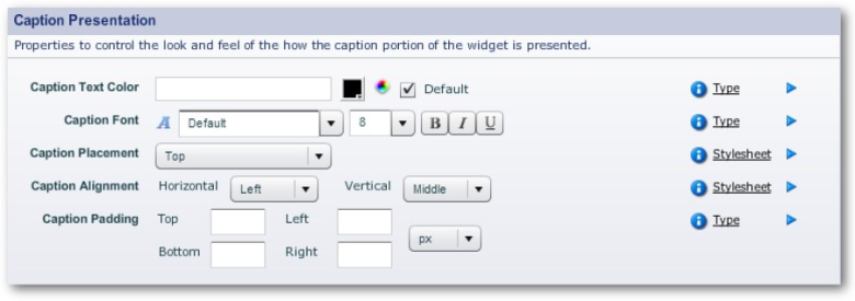
"Properties -> Caption -> Caption Presentation"
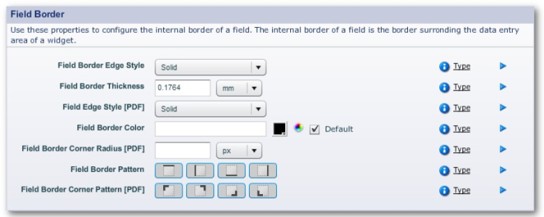
"Properties -> Field -> Field Border" "Properties ->
Field -> Field Presentation" "Properties -> Widget ->
Widget Border" "Properties -> Widget -> Widget
Presentation"
Custom Styling
This technique stands apart from the other styling adjustments.There is a
panel for HTML-only settings, and another for PDF-only comb-fields.
2 sample "HTML Custom Styling" panels
Custom Classes means CSS Classes from a CSS stylesheet (a quite different
entity form a Composer stylesheet) that is not under Composer's environment
or control. One scenario is: the Custom Classes belong to a corporate CSS
stylesheet. If so, adding these CSS classes via this panel can result in
issues at rendering time, and are not an ideal solution.
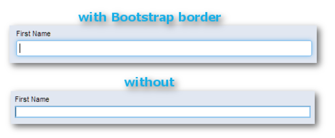
"Bootstrap border styling" refers to Twitter's Bootstrap, a
popular framework for implementing responsive layout behavior. The effect of
having this border styling turned on is rather subtle:
A selected text field in preview
The Background Image parameters use a bitmap image file, .png, .jpg and so
on, as "wallpaper" inside the object. The "Repeat"
dropdown menu can be set to "Default", "Horizontal",
"Vertical", "Both" or "None".
Field Data
Overview
A writable field's data is dealt with in 2 ways in
Composer:
Data properties
which is about the data contents of the field, but considered in isolation from the rest of the form, with the exception of radio buttons that form part of the one group (as they are, after all, just the one data object with several form fields working together)
Data Model
which is how the relationship of the field to the data structures of the
form's outputs
Data Properties
These are contained in "Edit Properties" in "Properties ->
Data". There are a number of panels, depending on the type of field:
Data (always present in writable fields)
Dropdown Data (in addition to the above for a dropdown menu field) Decimal
Options (when the field is a decimal number)
Data Panel
The properties shown in both the Advanced and Standard Modes of the panel
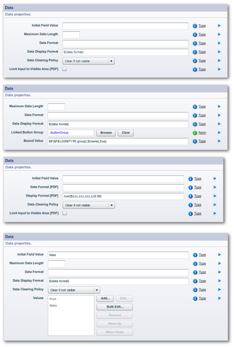
vary with the nature of the field. Here are some typical examples:
Some brief notes on the panel's fields (Advanced Mode):
Initial Field Value
Use this as an ad hoc way of repopulating the field. If you need to
repopulate a number of fields from a database lookup or as a general
configuration of the form, see
hereforanexampleofhowthis is done. Maximum Data Length
This prevents the user from entering more characters into the field. If you
want to do more than merely having the field stop working once the character
limit is reached — such as warnings, in-line messages and other helpful cues
to asssist users to get to submission — please see
Validation.
Data Format
This is the raw data sent from the form and as stored in
Transaction Manager. This property is often specified for PDF (in
XFA data description specification).
The "${data.format}" is explained in
ScriptingandDependencies.
Data Display Format
This can be different from the raw format, especially so with dates. See DataTypes.
Data Clearing Policy
An important factor in Privacy.
Values
Appears with fields that have several states, such as Boolean fields (see
Field Types). These states can be named and given an order of precedence. The
"Blulk Edit" button enables you to import a list of state names
from a text file.
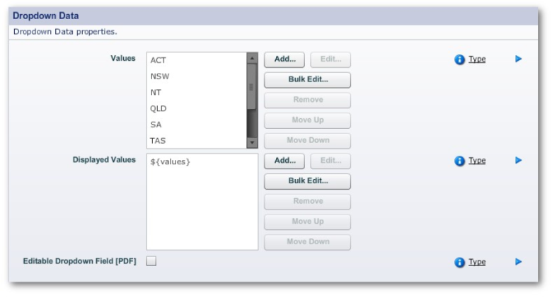
Dropdown Data Panel
You use this panel to edit a dropdown menu field's values and displayed
values. The displayed values appear in the menu on the form. For example,
the form could, say, display "Northern Territories" in the
dropdown; but when users select that value, the form passes the value
"NT" to the TM server. The "${values}" entry means that
all the values equal the displayed values. See
ScriptingandDependencies.
Dropdown Data Panel (Advanced Mode)
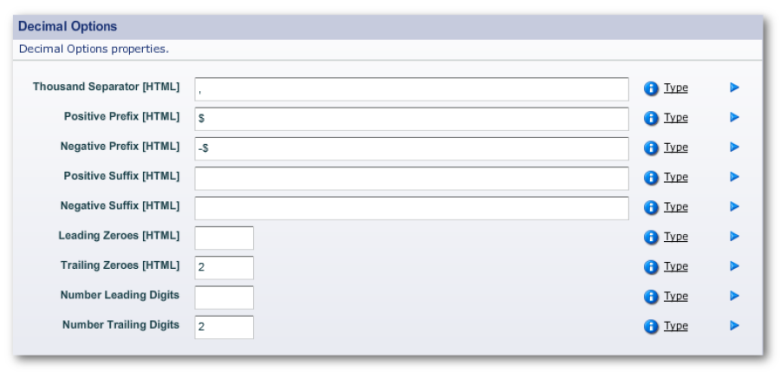
Decimal Options Panel
This panel appears for writable numeric fields and are self-explanatory. In
the example below, the field is a currency field and so the positive and
negative prefixes have a dollar sign.
The two fields for leading and trailing digits have two properties each for
HTML forms and unspecified form
types. The leading and trailing values should be the same for both form
types.
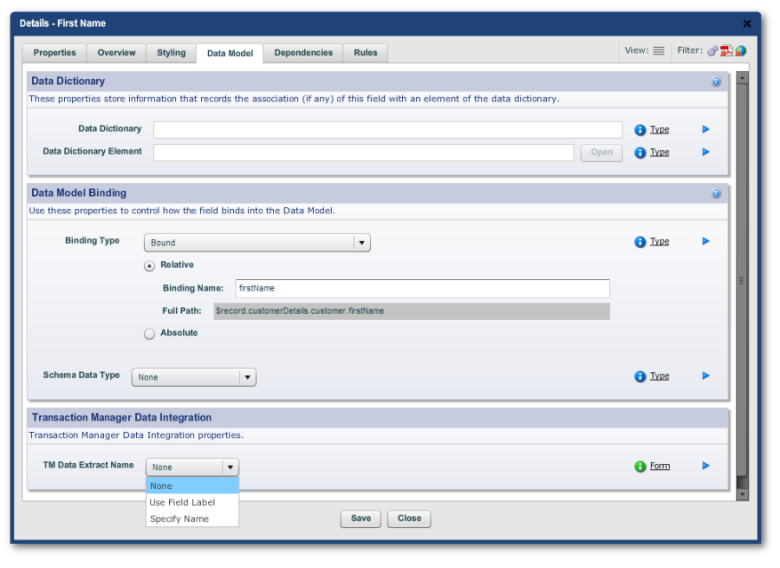
The Data Model Tab
Scripting
Overview of Scripting
A major advantage of using the Avoka Transact environment — rather than
writing your forms from scratch in HTML, Javascript and other scripting
languages and writing the server-side process — is that the bulk of the
form's implementation is taken care of for you.
But this means that you still have enormous scope to specify how the form
behaves and to inject scripts into the form. In this topic, we will discuss
the general principals for scripting.
These are the ways to script in Composer:
- Where available there is a Rule Editor
This performs simple logic operations. This editor is rather limited.
- A point-and-click ScriptEditor window.
This is for Javascript scripts. The editor is far more capable, but requires
a knowledge of Javascript.
- Writing a script yourself in a text editor
The covered in the advanced topic Scripting. These scripts can be complex.
The Composer Scripting Language
In either case, the language used is JavaScript, but with slightly modified
function calls,
documentedhere.
The Rules Tab
Scripts and Rules go in the Rules Tab. This has LH Menu items and depending,
on the nature of the field, can have from none to 7. Here is an example of a
Rules tab with a full LH Menu:
Within each panel there are several types of properties:
"Rule" properties "Policies" "Messages"
"Actions"
and some checkboxes in, for example, "Mandatory" rules
and "Responsive Rulesets" which are exclusive to the Responsive
Rules.
"Rule" Properties
This type of property has a dropdown menu:
Script Based (always available in all "Rules" properties) Rule
Based (available in only some "Rules" properties
Always (available in "Editable Rules" and "Mandatory
Rules") Never (available in "Editable Rules" and
"Mandatory Rules") No Validation (only for "Validation
Rules")
Regular Expression Pattern (only for "Validation Rules") for
pasting in a regular expression for validation Fixed Length (only for
"Validation Rules")
The "...based" items bring up an "Edit..." button, which
takes you to the
ruleseditor or script editor..
"Policies"
These are always dropdown menus and the choices are restricted to only those
that appear in the menus.
The types of policy are:
Editable Policy
i.e. whether the field (or fields) and its children are writable or
read-only
Determines what happens when the field is not editable according to the rule
in the Edibility panel. Options:
-
- Disable and gray out text
- Disable
- Gray out
Editable Clearing Policy
for more, see Privacy.
Visibility Policy
- When hidden exclude from layout
(i.e. the hidden fields disappear entirely)
- When hidden don't exclude from layout (i.e. leave space for the hidden fields)
- When hidden gray out Initial Visibility(Policy){}*seebelow.
- Visible
- Invisible
(i.e. the invisible fields are not excluded from the layout)
- Hidden
(i.e. the invisible fields do not appear and their allocated space in the form does not appear as a blank area)
Validation Policy
(see Validation as there is rather more to this than just the following 2 options)
- Show error dialog
- Not show error dialog
Note: The intent Initial Visibility settings is meant to
speed up the initial rendering of the form. If the form is taking a long
time to render, visibility rules and visibility policies may be the issues.
You can sidestep these by setting the Initial Visibility policy for the
relevant fields so that the form will render first up without having to test
these rules and policies.
Messages
These are text fields, whose contents are displayed when the rule type —
usually "Mandatory" or "Validation"
— fails (though you also have the option of displaying the message if the
rule passes instead).
Actions
These are exclusive to "Click" LH Menu item. The Click panel only
has the "Edit..." button for providing a script. The Rules editor
is not available. The script will run only when the field (either a button
or a link) is clicked on.
Checkboxes
The checkboxes in the Rules tab panels are for simple either-or options,
such as whether the mandatory asterisk will display for mandatory fields.
Responsive Rulesets
These apply only to Responsive Layout settings for the field. See
ResponsiveLayout for more on this.
The Rule Editor
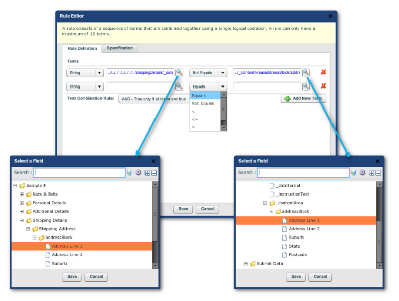
You build up a rule with the Rule Editor a "term" (or line in the
editor) at a time with a maximum of 10 terms. Each term compares 2 fields on
the form, which you select using the two magnifying icons, each of which
brings up a "Select a field" dialog containing a mini Structure
Panel, as shown.
On the left-most column of each term, there is a dropdown in which you
select whether the two fields in the term are strings, numerical or Boolean.
Between the two fields is the relationship between the two:
"Equals", "Not Equals", "<",
"<=", ">" or ">=".
Add more terms as required and then select the relationship between all the
terms. You can only nominate one relationship for all the terms. They
are:
"AND", meaning that the rule is true only if all the terms are
true "OR" where the rule is true only if all the terms are false.
The Specification tab is a text area where, if you
If you know something of Javascript, you can do far more with the Script
Editor.
The Script Editor
Using this editor requires some knowledge of JavaScript. In this section of
the guide, we will only be using very simple sample scripts. The script
editor facilitates integration of your JavaScript code with the fields on
the form.
The script editor can accomplish much more than the Rule Editor;
Calculations such as summing the values of fields together, or
multiplications, averages and so on Write more complex scripts involving
"if" statements, loops and so on
In fact, virtually anything the JavaScript is capable of.
Just to be clear, though the scripting language of Composer is JavaScript
with some minor differences. One of these allows Composer's JavaScript to
use the fields in the form as variables. This makes Composer's scripting
capabilities very powerful indeed.
More ground on this will be covered in
Scripting in the Advanced Topics. For now, we will be content to just demonstrate how
you use the editor to integrate a script into the form.
To make the editor work, you need some working knowledge of JavaScript. We
have already given an example of a total in the footer of a table. That
example is a sum of repeating elements. The following is a simple
multiplication of two non-repeating fields, just to illustrate how scripting
works in Composer on a simple level.
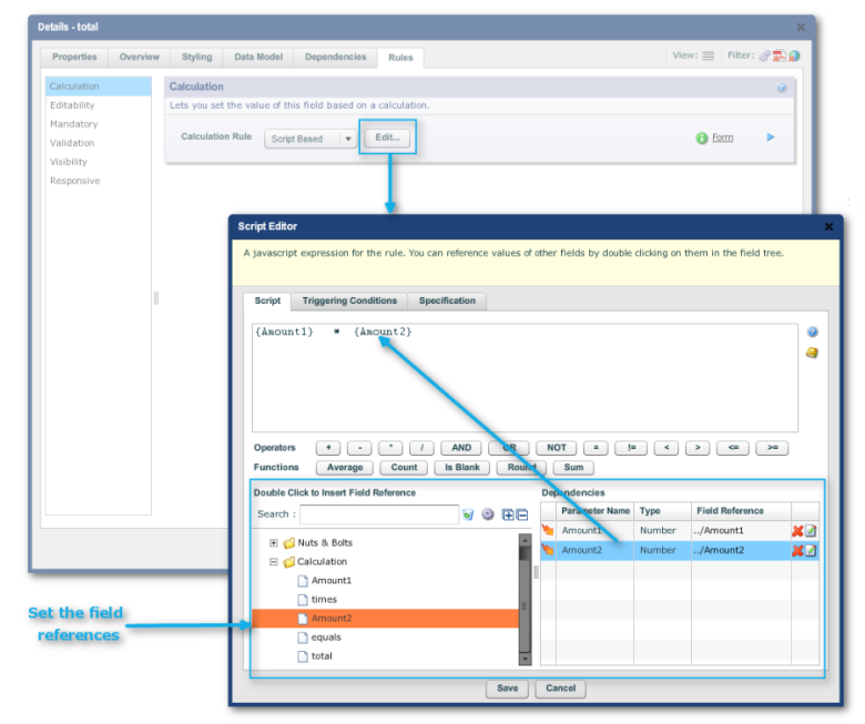
Here is a very simple form where we take the first writable field
"Amount1" (a dollar value currency field) and multiply it by the
second writeable field "Amount2" and display it in
"total" a read-only currency field to the right.
We made a few tweaks to "Amount2" and "total" and the
"times" and "equals" texts to get the layout as shown
below in Edit Properties for each of these fields:
For all, "Properties -> Layout -> Layout Constraints -> Keep
on same line (checked)"
For "total", we made it read-only by "Rules -> Editability
-> Editablity Rule -> Never Editable"
We could have saved ourselves the trouble of changing each widget by
creating a containing block of the 3 widgets and the plain text objects
"times" and "equals" and then setting the Layout
Constraints.
So, to see the calculation in action, we need to preview the form. Here is
what it looks like after inputting a couple of arbitrary values into Amount1
and Amount 2
The JavaScript in the example is only one line, which is the reason the line
doesn't end in a semi-colon (";").
The Specification Tab
If want someone else on your team to do the scripting or work the Rules
Editor, use the Specification tab to describe the behavior you require. That
description will then attach to the field or block.
Dependencies
Overview
When a user loads a form, fills in its various sections, uploads any
attachments and eventually submits it, the form has triggered many events,
which Composer groups into "phases", covered in more detail in
Business Rules and
AdvancedScripting.
Some of these triggers are the dependencies between fields created by
scripting. In the above simple example, the "total" field listens
to "Amount1" and "Amount2" and when "total"
sees that the other 2 now have values, it will calculate and display the
value of the calculation. The user does not have to click on a special
button to get the total, the form does not have to be reloaded, nor does the
user's browser (in this case) have to send anything to the server in this
phase. The calculation happens autonomously.
When a form is complex, though, having very many dependencies can create
performance issues. Composer has many strategies to tune such forms. One of
them is to tune the triggering in the form so that it does not grind to a
halt every time the user changes a value in any of the fields. In Composer
4, for the first time, you can inspect triggers and dependencies on the
form.
When you paste script into the text area of the Script Editor, remember that
you still have to associate the fields on the form, using the same
point-and-click method shown above and setting the field references.
Inspecting Triggers
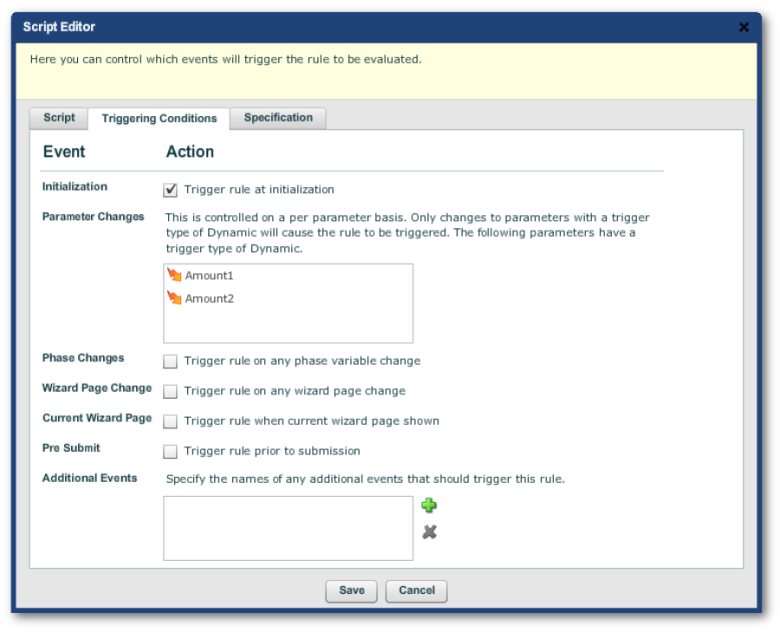
The triggering conditions of the above simple demo script are listed in the
"Triggering Conditions" tab of the Script Editor. We will discuss
the advanced settings of the radio buttons in the lower half of the tab
later in
AdvancedScripting.
Additional events will be covered in the
BusinessRules
widget discussion.
Inspecting Dependencies
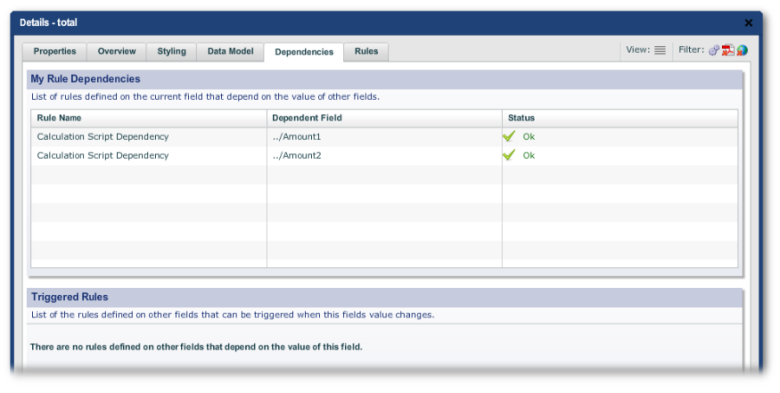
Use "Edit Properties -> Dependencies" to inspect the
dependencies feeding into the script (in the "My Rule
Dependencies: panel) and the outgoingtriggers in the "Triggered Rules" panel.
