Field Types
Composer This topic is related to Transact Composer. | Form Builder | v4.3 & Higher This feature is related to v4.3 and higher.
There are a few field types (or "widgets") that require further
documentation in this manual. They are:
Rich Test Fields Cascading Dropdowns Prepoplated Dropdowns
Rich Text Fields
A Rich Text is a read-only widget that has styling, such as bolding,
italics, fonts, and colors, embeded into the text. Rich Text is often used
for explanatory or legal text in forms; many other fields also support Rich
Text, such as the Labels for all fields and Section Help Text.
You can embed the values of other fields within a Rich Text Field.
This replaces thelegacy widget "FloatingField" which no longer ships in the Palette.
You control the format of the text by embedding "tags" or
"markup" into the text. We will list these below. Tags must be
properly opened and closed as a pair. If the pair is incorrect, the text
will not display correctly. Rich Text may render slightly differently in the
wireframe, PDF and HTML. This is because the underlying implementations on
each platform are not the same. Composer attempts to make the text appear as
close as possible on all platforms — if you discover discrepancies, please
notify us with a sample.
Rich Text Editor
The Rich Text Editor ("Text [Rich}" widget, "Edit Properties
-> Properties tab -> General -> General panel -> provides simple
ways of embedding rich text tags into your text.
Consider the famous quotation:
Ask not what your country can do for you; ask what you can do for
yourcountry.
Instead, use a Country Dropdown List at the top of the form asking for which
country. And then depending on the country choosem, the quotation reads:
Ask not what America can do for you, ask what you can do forAmerica.
or
Ask not what Canada can do for you, ask what you can do forCanada.
And so on.
This is quite straight forward to do.
Create the Country Dropdown (or any other field whose value you want to
appear in the text.) This field can appear anywhere in the form.
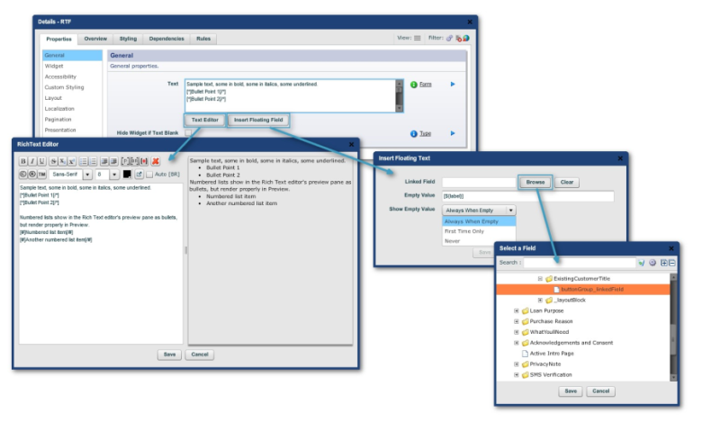
Create a Rich Text field as shown below:
Click on the "Insert Floating Field" button, and point at the
Country Dropdown created earlier.
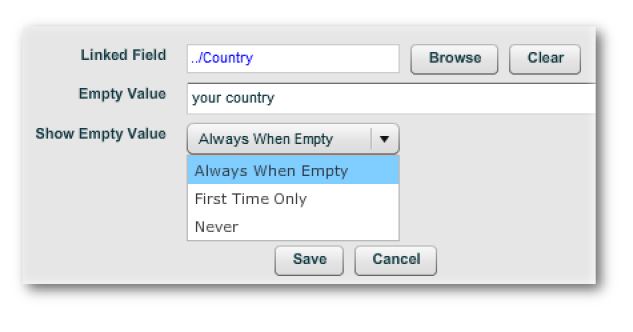
You may also want to update the other two values in the dialog - these
control what is displayed in the Floating Field if the Country Dropdown has
a blank value.
Copy and paste the floating field reference into the two locations, so that
it looks like this:
Ask not what$FLOAT{Country_linkedField} can do foryou, ask what you can do for
$FLOAT{Country_linkedField}.
Test your form. You should get something that looks like this:
Note that Composer has created a hidden Floating field underneath the Rich
Text field. Do not delete this field, as it temporarily stores the value to
be injected into the Rich Text, and is linked to the real value. You can
modify the formatted value of this field if desired.The Rich Text toolbar
icons can be used in two ways:
To apply a tag to an existing piece of text, select the text, and then click
the icon.
If you click the icon when no text is selected, the matching tags will be
placed into your text, with the cursor positioned for you to start typing.
The Auto [BR] checkbox, if selected, will automatically add a
"[BR/]" tag into your text every time you press the Enter key.
Tip: It is strongly recommended not to specify custom
fonts, as these may not render correctly on different systems.
Tag Reference
There are two types of tags, those that affect individual characters within
the text, and those that turn whole paragraphs into list items (either
bullets or numbered items).
Character tags
|
Tag |
Formatting |
Sample |
Result |
|
[i]..[/i] |
Italics |
Hello [i]World[/i] |
Hello World |
|
[b]..[/b] |
Bold |
Hello [b]World[/b] |
Hello World |
|
[u]..[/u] |
Underline |
Hello [u]World[/u] |
Hello World |
|
[x]..[/x] |
Strike Thru |
Hello [x]World[/x] |
Hello World |
|
[sub][/sub] |
Subscript |
Hello [sub]World[/sub] |
Hello world |
|
[sup][/sup] |
Superscript |
Hello [sup]World[/sup] |
Hello world |
|
[colour:#00FF99][/colour] |
Color |
[colour:#ff0000]Red[/ colour] and [color:rgb(0,0,255)]blue[/ color] |
Red and blue |
|
[font:Arial][/font] |
Font type |
My font is [font:Myriad Pro]Myriad Pro[/font] |
Fonts available depend on the fonts available in your destination system, and vary between PDF and HTML. See separate topic on Fonts. |
|
[fontsize:9pt][/fontsize] |
Font size |
My font is so [fontsize:16pt]big[/ fontsize] |
My font is so big. |
|
[link:][/link] |
Link |
[link:[http:// www.avoka.com]Avoka[/ link] |
Avoka
|
|
[copy] [reg] [trade] |
Symbol |
Copyright [copy] 2010 Avoka Technologies. |
Copyright © 2010 Avoka Technologies. |
|
Tag |
Formatting |
Sample |
Result |
|
${options:policy.mandatory
|
Mandatory marker. This is used to insert the mandatory marker (usually a red asterisk, but controlled via your stylesheet) into your help text. |
All fields marked with |
All fields marked with * are mandatory. |
Bullets, Lists and ParagraphTags
Bullets and Lists affect an entire paragraph of text. The bullet character
or numbering style is controlled via the properties and the stylesheet for
your form. Extra levels of indent are controlled via a leading dot.
|
Example |
Sample |
|
[]USA[/]
|
USA
|
|
[#]USA[/#] |
|
|
[#reset] |
Use this tag to reset the numbering list back to 1. The reset take will take effect in the next rich text field. |
|
[p]Use the paragraph tags to wrap around multiple
paragraphs of text. Each paragraph will be spaced from
the each other.[/p] |
Use the paragraph tags to wrap around multiple paragraphs of text. Each paragraph will be spaced from the each other. This is another paragraph |
|
[.p]A paragraph. Notice the spacing[/p] [..p]One level
of indent[/p] |
A paragraph. Notice the spacing One level of indent
|
|
You can break [br/] text onto [br/]multiple lines without any spacing |
You can break text onto
|
Auto-numbering is controlled by Sequences in Nuts & Bolts. This is an
advanced topic, and usually configured for you in your style-sheet.
Paragraphs are optional, but are useful for longer blocks of rich text.
Radio Buttons
Radio buttons in Composer required a lot of documentation. No longer:
Composer 4 now handles them gracefully.
Creating Radio Button Groups Manually
The Widget Palette now contains a "Smart" family of radio button
elements:
Smart Radio Button
Smart Radio Button Group
To create a functioning set of radio buttons, you need the Group widget and
a smart button widget for each of the buttons to be selected. For each smart
button you place on the form, in the wizard dialog, use the Browse button to
point to the Linked Button Group. (If you neglect to do this in the wizard
dialog, you can point to the group in "Edit Properties -> Properties
tab -> Data -> Data panel".)
If you want to pick up the selected value of the button group in, say, an
inserted floating field in a Rich Text Field, always point to the button
group.
Now you can take a whole button set, place them into a simple block and copy
that block to another part of the form. This now works without any fuss.
Mandatory Radio Buttons
It doesn't really make sense to make an individual Radio Button mandatory.
As you can see above, you can make the Button Group mandatory - this means
that the user will have to select one of the buttons in the group. See
MandatoryBlock.
Calculating or Using the value of a Radio Button Group
If you need to calculate the value of a Radio Button Group, you need to
place the calculation on the Button Group, rather than individual buttons.
Please refer to
ScriptingandDependencies.
If you need to use the value of a Radio Button in another rule, you can
either treat individual buttons similarly to a checkbox (and use Is-Selected
in the parameter) or you can refer to the value of the Radio Button Group.
Dropdown Menus
Use the "DropDown List" widget from the Palette.
A Dropdown List has two sets of values in the "Data" tab of the
advanced properties dialog of the widget:
Display Values
This is a list of values that are displayed in the user interface.
Values
This is a list of underlying raw values the field will pass on to TM when a
user selects a display value.
Display Values has a default value of ${values}. This means that by default,
the set of Display Values is identical to the Values. This simplifies using
Dropdown Lists, because you only need one set of lists.
However, sometimes it's useful to have a different display value versus the
underlying value. For example, you may want to display countries in the
Dropdown list using their full names such as Australia, United Kingdom and
France, but store their underlying values using the two letter country
abbreviations such as AU, UK, and FR. In this case, you can simply modify
the values of Display Values.
Note:
The number of Display Values and Values must be identical.
You must delete the ${values} formula if you're going to add explicit
Display Values.
If you use Composer's translation feature, only the Display Values will be
translated. This means that any code that uses the Values will continue to
work without modification.
Internally, the Values and Display Values properties are stored using a pipe
character "|" as a separator. This means that you cannot use pipe
characters in your Values or Display Values.
To access the Display Value in a calculate event, use the following
script:
sfc.getFormattedValue(noderef)
In PDF, a Dropdown list can have a blank value even if "blank" is
not one of the allowed values. (When a Dropdown list is first displayed,
it's value is always blank unless initialized.) In HTML, a Dropdown List is
only allowed to have a blank value if blank is one of the values in the
Values list. In order to achieve compatibility between the two
implementations of Dropdown List, Composer provides a "Automatically
Add
Blank Value [HTML]" property which is checked by default. This has the
added benefit of making the concept of a Mandatory Dropdown List meaningful.
Composer also provides a number of prepopulated dropdown lists. See
PredefinedBlocks. These include: Dropdown List [Countries]: A list of countries from around
the world.
Dropdown List [Genders]: Contains 'Male' and 'Female'.
Dropdown List [States+Codes,United States]: A list of states found in the
United States is displayed in the dropdown list, e.g. Alabama. This is what
the form filler sees. However a corresponding two letter country code e.g.
AL is stored in the underlying data.
Dropdown List [States,Australia]: A list of Australian states.
Dropdown List [States,United States]: A list of states found in the United
States. In this dropdown list, the displayed value and 'stored' value are
identical.
Dropdown List [Yes/No]: Contains 'Yes' and 'No' values.
Cascading Dropdowns
The first step is to define the behaviour of the set of cascading dropdowns
with XML. Here is an example of three orders of cascading dropdowns: os
-> manufacturer -> model.
<root>
<os name="Android" value="Android">
<manufacturer name="HTC" value="HTC">
<model name="One" value="One"/>
<model name="One X" value="One X"/>
</manufacturer>
<manufacturer name="Samsung" value="Samsung">
<model name="Galaxy S3" value="Galaxy S3"/>
<model name="Galaxy Note 3" value="Galaxy Note
3"/>
<model name="Galaxy S4" value="Galaxy S4"/>
<model name="Galaxy Express" value="Galaxy
Express"/>
<model name="Galaxy XCover 2" value="Galaxy XCover
2"/>
<model name="Galaxy Fame" value="Galaxy Fame"/>
</manufacturer>
</os>
<os name="Windows Phone 7" value="Windows Phone
7">
<manufacturer name="Nokia" value="Nokia">
<model name="Lumia" value="Lumia" />
<model name="Lumia 625" value="Lumia 625" />
</manufacturer>
<manufacturer name="Samsung" value="Samsung">
<model name="OMNIA 7" value="OMNIA 7" />
</manufacturer>
</os>
<os name="iOS" value="iOS">
<manufacturer name="Apple" value="Apple">
<model name="iPhone 5" value="iPhone 5"/>
<model name="iPhone 5S" value="iPhone 5S"/>
<model name="iPhone 5C Green" value="iPhone 5C
Green"/>
<model name="iPhone 5C Blue" value="iPhone 5C
Blue"/>
<model name="iPhone 5C Yellow" value="iPhone 5C
Yellow"/>
<model name="iPhone 5C Pink" value="iPhone 5C
Pink"/>
<model name="iPhone 5C White" value="iPhone 5C
White"/>
</manufacturer>
</os>
</root>
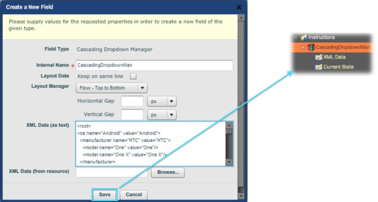
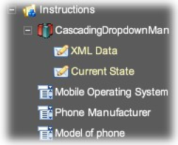
Drop a Cascading Dropdown Manager widget onto a section (here, the default
"Instructions") in the Structure pane. Paste the XML definition
into the XML Data test field.
The Cascading Dropdown Manager predefined block dialog, with the XML pasted into the data textbox. "Save" creates the structure shown.
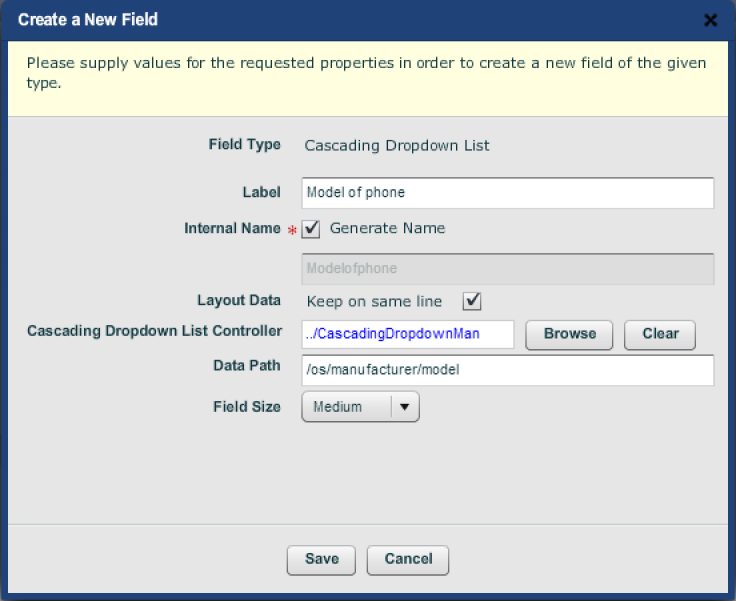
Drop three "Cascading Dropdown List" widgets into the structure,
Here we have put the three widgets onto the section level of the form. Fill
in their dialogs, giving the name (as it will appear on the form), point to
the "Cascading Dropdown Manager Controller" and give the data path
from the root as defined by the XML. Here is the dialog for the last of
these lists:
The dialog for creating the "model" level cascading dropdown list.
For convenience we have kept the lower two list widgets on the same line as
the "os" top order. The final structure looks as follows:
The final structure on the form.
And here is the preview rendition:
Preview of the cascading dropdowns.
Prefilled Dropdown Lists
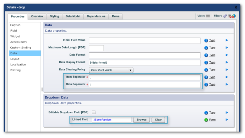
The Populating Dropdown List widget allows a Dropdown Field to be linked
(via the Linked Field property) to a data field (created by dropping
"Widget Palette -> Internal -> DataField" onto the form's
structure. TM is then configured (in TM, "Home Dashboard -> Form
-> Form Data Config link -> Property Prefilled Mapping tab -> Edit
button") to prepopulate the data field with values. The default is for
TM to give the data as a string using the default separators in the Data
Field's Edit Properties:
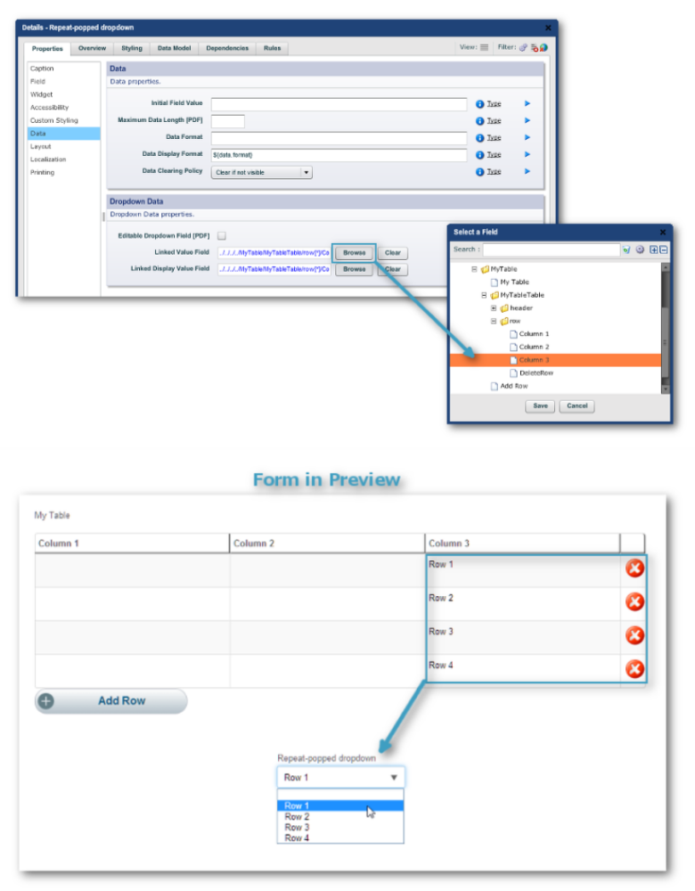
Prefilled Dropdown Lists from Repeatable Areas
The Prepopulating Dropdown List from Repeat widget creates a dropdown menu
where the items are taken from a nominated column of a table or a repeat.
