Validation
Composer This topic is related to Transact Composer. | Form Builder | v4.3 & Higher This feature is related to v4.3 and higher.
Overview
A validation rule verifies the data entered into a form. The simplest and
most common type of validations are single field validations, which validate
the data in a single field. More complex validations use the values of
several different fields.
Note: Validation rules fire only once the user has entered
data into the field. You may want to combine a Validation Rule with a
Mandatory Rule to ensure that the user enters valid data.
Composer provides several types of standard validation types:
Fixed Length
The fixed length rule ensures that the length of the data (ie the number of
characters typed) is exactly the value specified. This is usually useful for
a customer identification number or similar that is a fixed length.
Regular Expression
A regular expression is a sophisticated, industry-standard way of specifying
a validation pattern. An explanation of regular expressions is beyond the
scope of this document, but there are numerous books and web sites that you
can refer to. You can also use search engines to find standard regular
expressions for common types of data. An example of some regular expressions
are:
^[a-zA-Z0-9_-\.]@[a-zA-Z0-9_-\.]\.[a-zA-Z]{2,4}$ - email address
^http\://[a-zA-Z0-9-\.]+\.[a-zA-Z]{2,3}(/\S*)?$ - URL A good resource for
regular expressions is:
{+}http://regexlib.com/+.
Online regular expression editor and evaluator can be found at:
{+}http://gskinner.com/RegExr/+
and
{+}http://+ www.debuggex.com/.
The download from following site can also be helpful:
{+}http://www.weitz.de/regex-coach/+.
Validation Script
You can write a JavaScript function of arbitrary complexity to evaluate the
value entered into any field. In order to write a validation script, you
will need to have some minimal JavaScript knowledge. If you return false,
the validation will fail.
Here is a sample validation script:
var myvalue = sfc.convertToString(sfc.getRawValue(me)); //1 if
(myvalue.length < 3) return false; //2
if (myvalue.match("[0-9]")) return false; //3 return true; //4
Line 1: This is the usual way to obtain the value of the current field. The
"sfc" functions are standard functions that are provided within
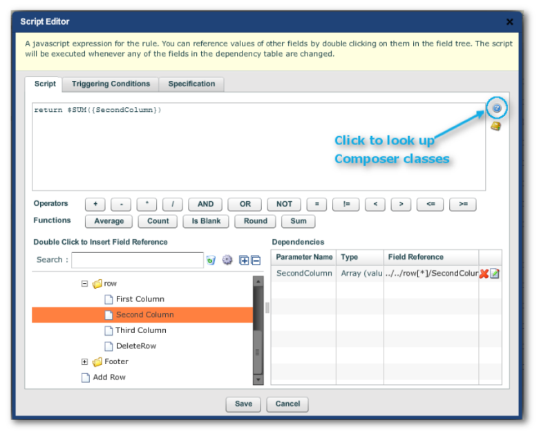
the Composer libraries. For a full listing, click the "?" icon in
the Script editor.
Icon in Script Editor to access Composer classes listing
Line 2: This line uses the JavaScript built-in length operator to test
whether the field contains at least 2 characters. Returning false causes the
validation to fail
Line 3: This line uses a regular expression to test whether there are any
numeric characters in the field. If there are any numeric values, the script
returns false.
Line 4: If none of the preceding lines return a false, then return true.
This will mean that the validation rule passes.
Validation and Hidden fields
Validation rules are always fired, even if the field is invisible, or is
hidden because of some other business rule. This is to enable
"hidden" validation rules that aren't represented as a widget in
the form.
If you have a field that may become hidden, and you want to ensure that the
validation rule on the field doesn't fire when the field is hidden, one way
to ensure this is to set the "When Hiding - Clear Data" policy.
Validation rules don't fire on empty fields.
Note: This is different to the behavior of mandatory
fields. Mandatory fields become non-mandatory when hidden.
Validation Messages
There are 3 types of validation messages:
In the
ErrorBlock of the form. Error blocks do not display on mobile devices.
As a dialog, which displays on the failure of the element's validation.
Users have to "OK" to continue and so
these are rather annoying and intrusive.
Inline validation which is the most convenient of the 3.
All 3 are turned on by default.
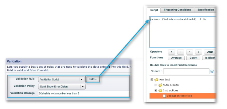
Here is a test field set up to have a trivial validation test. The Error
Dialog is left on. The Inline Validation is left on the default setting for
the form.
Validation settings for a text field
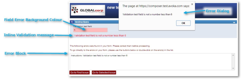
In the Desktop Preview, the form behaves as follows:
Resultant Validation messages on the Desktop
The Error Dialog is intrusive, requiring users to click on the
"OK" button. You can turn it off, but only for each widget
individually, by "Edit Properties -> Rules -> Validation ->
Validation -> Validation Policy -> Don't Show Error Dialog".
The Error Block does not appear on mobile devices.
In Line Validation
Inline Validation is really another instance of Dynamic Data, that is: if a
field's validation test fails, and inline validation is turned on, the
message to the user is displayed without the form page reloading.
The following examples have the Error Dialog turned off for each widget. The
Error Block remains on, though will only be visible for the desktop
previews.
Inline Validation Settings
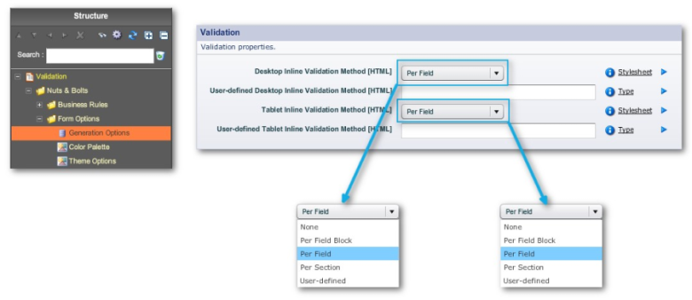
These are found in "Nuts & Bolts -> Form Options ->
Generation Options -> Edit Properties -> Properties -> HTML
Generation -> Validation", as shown below:
Some of the important form-wide HTML Inline Validation options
Inline Validation Example
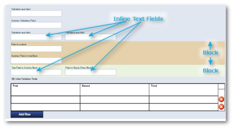
The form used here, though very simple, embodies the various inline
validation behaviors for the desktop and on mobile devices. Its salient
features are:
2 blocks in the first section (delineated by background colors)
Text fields on separate lines or inline (as inline validation behaves
differently for these)
A simple table (to show how inline validation methods behave on the desktop
and in the various modes of mobile devices).
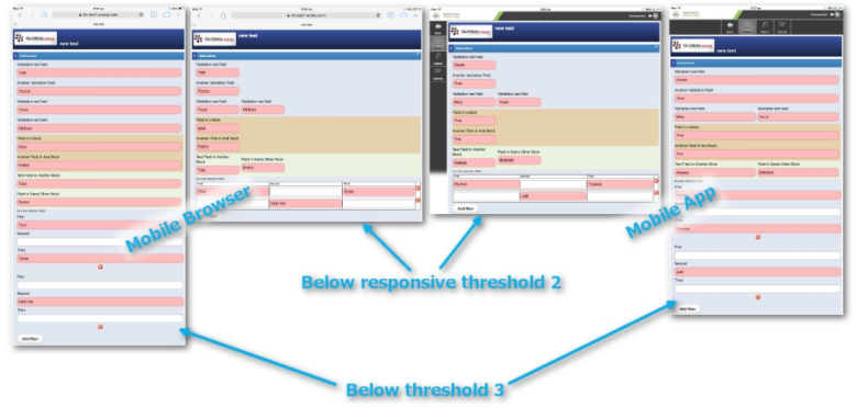
The Responsive Rules are the defaults, so that on an iPad, Landscape is
below Threshold 2; portrait, below Threshold 3.
Wireframe of form used to demonstrate Inline Validation
Desktop Inline Validation Method [HTML]
In all cases, we have turned off the Error Dialog for convenience for each
element at "Edit Properties -> Rules -
> Validation -> Validation -> Validation Rule -> Don't Show
Error Message".
All the fields with data entry are set to fail validation in this demo. The
text of the Inline validation methods are set in each widget at "Edit
Properties -> Rules -> Validation -> Validation Message".
Here are the Preview results for each desktop setting.
None, Desktop
The only messages the user gets is the Error Dialog when turned on at the
widget-level, or the clickable Error Block list.
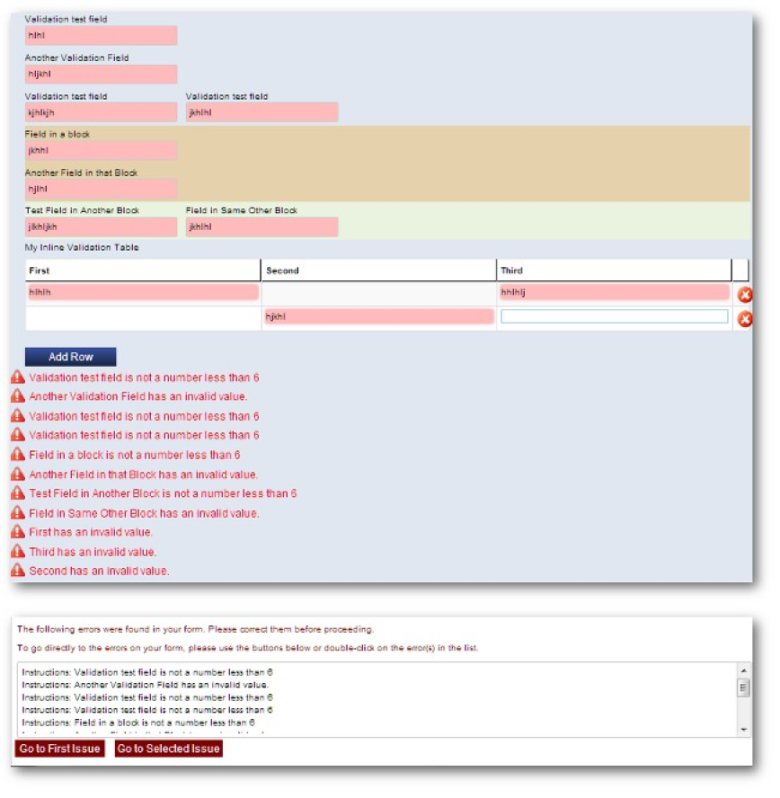
Inline Validation: Desktop, None
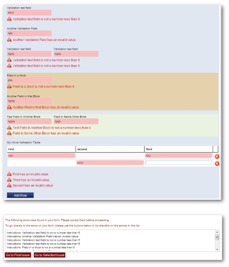
Per Field Block, Desktop
Inline Messages are under each field or line of fields
The same behaviour for fields within blocks (see the two blocks marked out
with background colours in the example below)
Inline messages for elements in tables get listed in a group below the table
but above the standard "Add" button.
Inline Validation: Desktop, Per Field Block
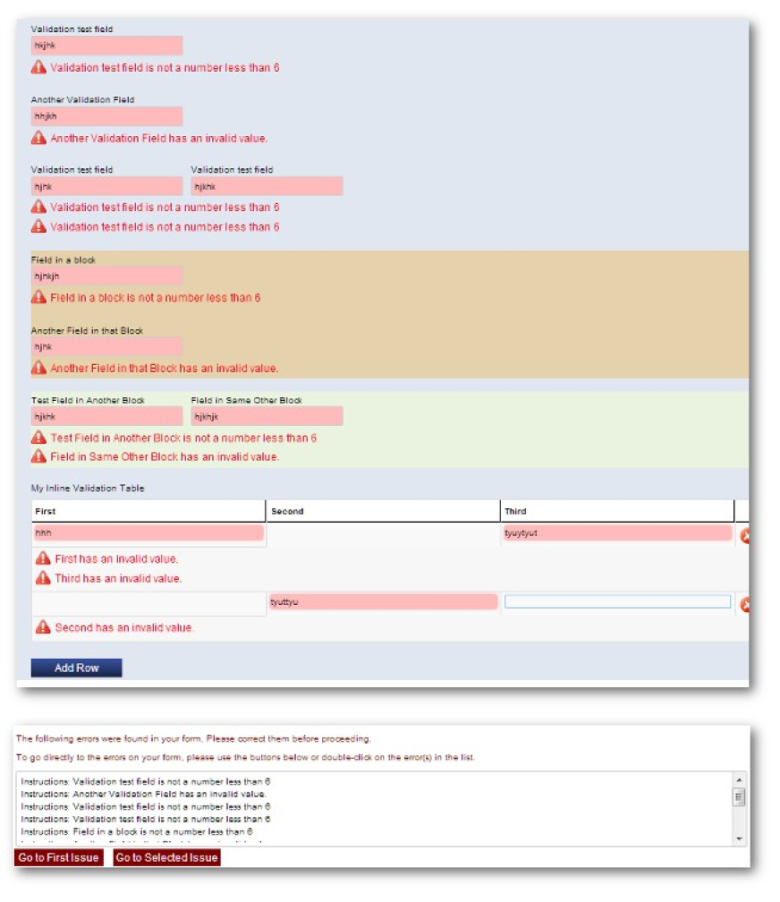
Per Field, Desktop
The same beaviour as the "Per Field" setting, except for
Tables, where the messages for each row come in a group under that row.
Inline Validation: Desktop, Per Field
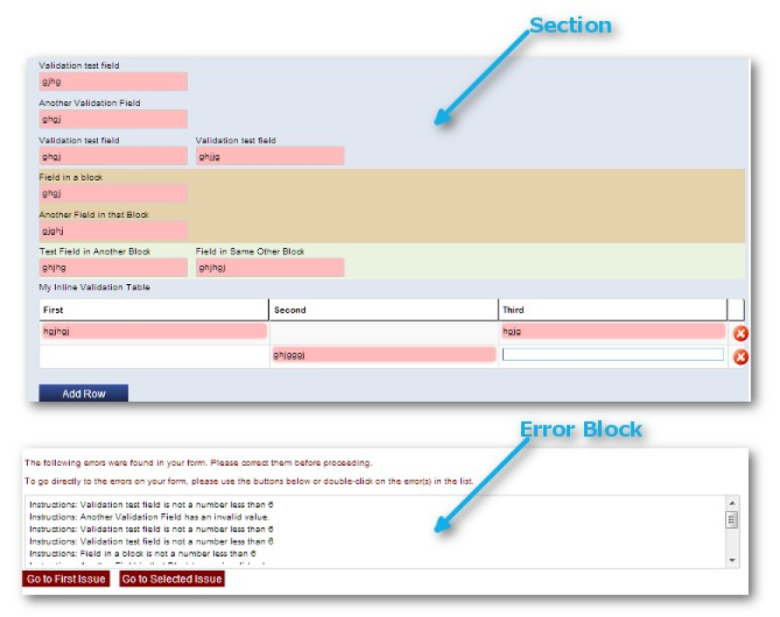
Per Section, Desktop
All the Inline Messages in a section come in a group at the end of each
section.
Inline Validation: Desktop, Per Section
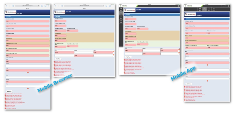
Mobile Inline Validation Method [HTML]
The mobile settings are independent of the desktop settings, and apply
equally to forms accessed through viewing the form either in a mobile
browser or in
thetheMobileApp.
None, Mobile
Mobile: Inline Validation method = None
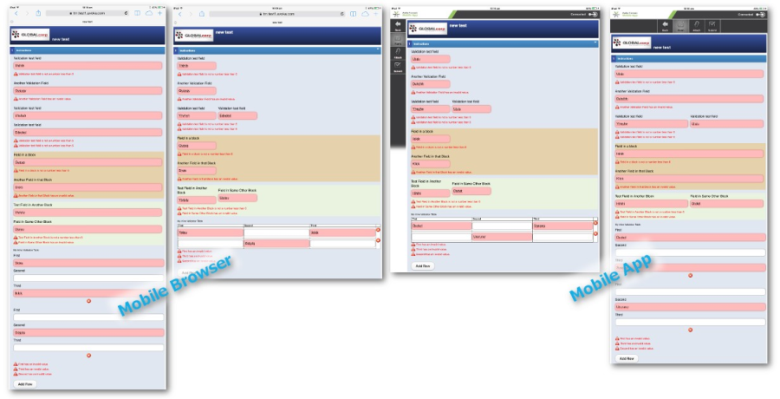
Per Field Block, Mobile
Mobile: Inline Validation method = per FieldBlock
Per Field, Mobile
Mobile: Inline Validation = per Field
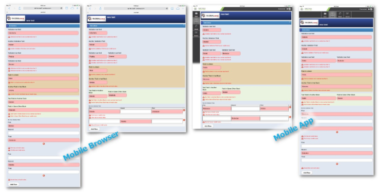
Per Section, Mobile
Mobile: Inline Validation method = perSection
Transact Composer User Guide and ReferenceAdvanced Topics
