Business Rules
Composer This topic is related to Transact Composer. | Form Builder | v4.3 & Higher This feature is related to v4.3 and higher.
The Rules Properties section of this manual describes how you add scripting
and logic to individual widgets. Though some widgets, like blocks, can pass
on their rules to their children, this methodology does not allow rules to
be assigned to several widgets, especially those not related or which do not
share inheritances. What if the widgets are scattered throughout the form
and cannot easily be wrapped by some block in the structure panel without
including other widgets that you do not want to similarly inherit
properties? This problem cannot be solved through "Edit
Properties" individually for all the widgets concerned.
The "Business Rule" and "Mandatory" field types solve
this problem by being central containers for rules and scripts. Other
widgets can now share, for example, a script, by pointing to a business rule
widget in the their "Edit Properties" dialog.
There are three types of Business Rule field types:
GeneralPurpose
These contain the logic that control visibility, editability, data clearing,
event firing, triggers and event listening.
Error
These generate messages and also prevent submission of the form
Warnings
These also generate messages but do not prevent form submission.
Allows you to enforce the activation of at least one checkbox in the block:
leaving all of the boxes unchecked will prevent submission of the form.
You use this to enforce that at leastone of the contained form elements are given values.
These rules widgets are intended for advanced users only, though many of
their features are no harder to implement than editing some of the
properties in the "Rules" tab for each widget. They are a powerful
tool for optimizing response times of complex forms
General Purpose
Configuration Settings
The General Purpose Business Rule widget's Rule tab holds the following:
Visibility Rule
Note the difference between AlwaysVisible, NeverVisible and Script or
Rule Based.
That is: the value of an invisible field being observed by the Business Rule
could be affecting the outcome of the rule because the field has not been
cleared.
See also
ClearingPolicies.
Visibility Policy
Initial Visibility
Visibility Data Clearing Policy
Business Rule
Either "None" or "Script Based"
Additional Event LIsteners
See
here
Business Rule Trigger
Run Always | Run only when visible.
The Relationship Between Nominated Widgets and the Rule
There are two broad ways for a General Purpose Business Rule widget to fire:
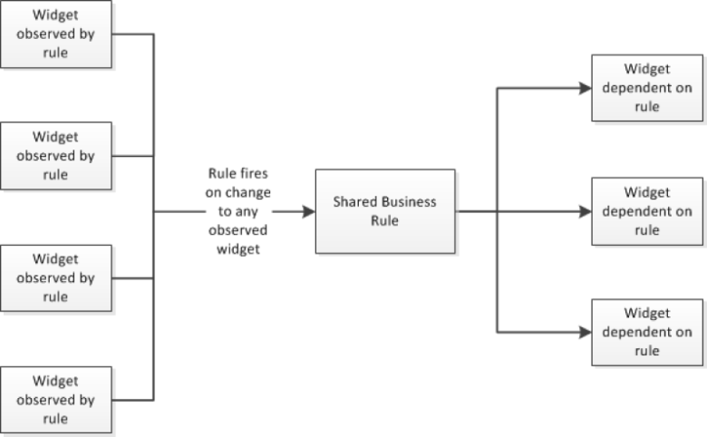
The default
where the rule fires every time one of the nominated widgets changes. In
other words, the rule's listener is forever observing these widgets for
change and will fire every time one of these changes. This can slow the form
down if the scale of all these observed widgets is large enough.
Rule fires on change of any observed widget; as a result, the rule could fire many times and make the form laggy
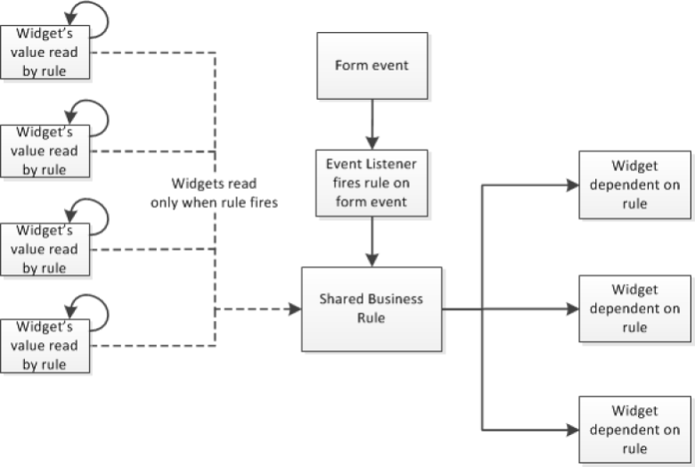
- Additional Event Listeners
Here, the widgets linked to the rule can asynchronously change, but the rule
will only fire when a form-level event is detected by the listener. The form
events are listed, comma separated in the "Additional Event
Listeners" field in the "Data" tab of the Business Rule
widget.
Rule fires less and only on a nominated form event or events; results in a more responsive form.
The above second case results in the Rule widget firing less frequently than
for the first case: every change to any of the observed widgets no longer
results in the rule firing every time.
Standard Composer Events
|
Event |
Description |
|
init |
The first event to which a widget can listen when the form starts. This event sets the initial data-based state. |
|
postInit |
Runs immediately after init. Used to run code when everything is in the initialized state. |
|
change |
The only event that does not call everything listening to it. It will look at the source node and look up the list of fields with a dependency on that field. |
|
phase |
Will fire when any phase value changes. evt.evtData is the name of the changed phase. Its new value is fetched with sfc.getPhaseValue("<phaseName>"), where <phaseName> is the name of the affected phase. |
|
evtValidationV iew |
This event is fired once all current validation updates have been completed and it is ready to update the error lists, etc. |
|
preSubmit |
this event fires immediately before the form is submitted (although there is an issue that preSubmit is not currently fired when using a form in Mobile App but this should be resolved in a future release). |
Error
Error Business Rules will, on error, prevent the user from submitting the
form.
The rule has more settings than the General Purpose business rule
properties. The visibility rules in particular can cause confusion if not
properly understood.
Focus Field Target
The rule fires when the user focus becomes the nominated field and whenever
the value of the field changes. The rule can be set to "Run Only When
Visible" (which is the default setting) or "Run Always". The
nominated field will display the warning background colour while the rule is
in error.
Clearing Policies
See
Privacy on the privacy considerations that dictate data clearing policies. Note the
distinction between
"ClearHiddenDataonSubmit" and
"ClearDataWhenHidden".
The distinction may seem trivial if we consider only the form's data at the
point of user submission. However, when one of form's Business Error Rules
is dependent on a field that happens to be hidden, and that field is causing
the rule to be in error, that hidden field would prevent the user from
submitting the form, even though all the visible data is suitable for
submission.
So, this is the reason for the distinction between "Visibility Data
Clearing Policy" and "Editable Clearing Policy" in the rule's
properties.
Displaying Errors
The default display of form errors is the standard footer of the typical
template. The same structure is also available with the
Error List Predefined Block. The errors are listed in a clickable list; double-clicking on a list item
takes users to the form element needing recitification. You also can write
the explanatory text displayed as well as the error messages themselves. You
therefore have the tools to assist users though the process and, therefore,
minimise the rate of form completion failures.
The Form can display both errors and warnings through the
ErrorandWarningPredefinedBlock. Users can scroll through wither the errors or the warnings using next and
previous links.
The
ErrorSelectionBlock displays both of these blocks, one on top of the other.
The Edit Properties -> Rules tab of the Error Business Rule can also be
set to displaying an error dialog: a popup with the text of the Warning
Message of the Rules tab. The same also can be set for warnings.
The use of these various blocks gives you some flexibility in how you want
problems with the form data to be explained to users and what to do to
remedy these issues.
Warning
These rules behave the same as the Error Business Rules, except that
warnings do not prevent the user from submitting the form. We have already
discussed the display of warnings
above.
Mandatory Checkbox Block
This mandatory block enforces the rule that its containing checkboxes must
have at least one member selected before the form can successfully be
submitted.
Mandatory Block
This mandatory block enforces the rule that its containing members and
groups must have at least one member selected before the form can
successfully be submitted.
There are, however, a subtle differences between using this widget or using
the button assistant and checking the"Mandatory"box in the creation wizard for the assistant:
The Mandatory Block by default leaves all its contained buttons or
checkboxes unchecked or without value. If end users try to submit the form
with all these boxes unselected or unfilled, the error message for the block
is displayed and all the contained elements get red outlines.
Checking the "Mandatory" box of the button assistant wizard means
that at least one of the buttons (the first by default) is selected at form
initialization and there is no way to go to an all-unselected condition.
Several checkbox or buttons blocks can be contained in the mandatory block,
all of them unchecked at initialization, and yet only one button of one
group must be selected before submission and all the other buttons in the
other groups can remain unchecked.

