Form Designer
Composer This topic is related to Transact Composer. | Form Builder | v4.3 & Higher This feature is related to v4.3 and higher.
The Wireframe View
The Wireframe tab of Form Designer is the
heart of Composer. Not only are forms built from elements from the Widget
Palette, but the whole logical structure and interactions of the form are
built up in the designer.
Composer
functions as an agile and capable tool, where complex forms are built and
deployed, on a range of devices, in a matter of days or weeks.
This user guide emphasizes the automated aspects of form construction in the
early pages. Sections below the
Advanced Topics section of the manual deal with more complex functionality. These come
later in the guide to act as a reference and not to interrupt the narrative.
Structure and Preview
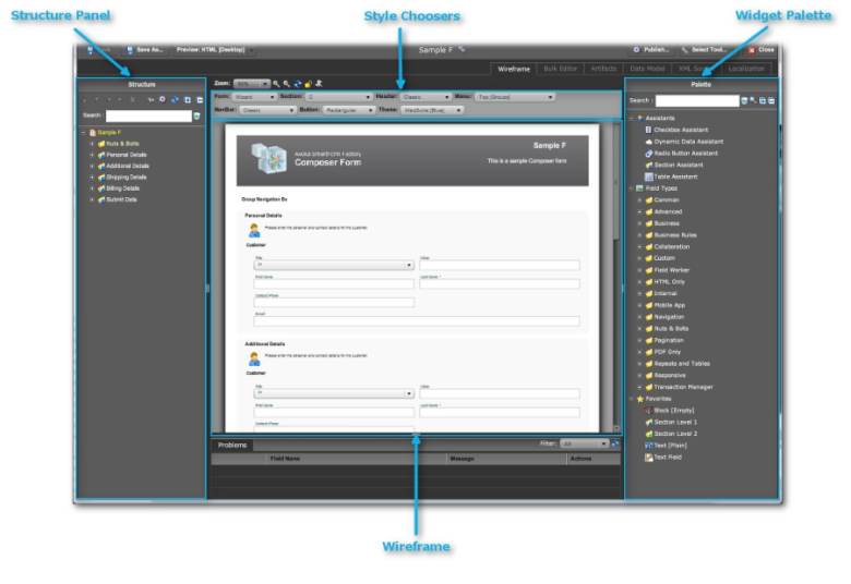
Forms are represented in 2 ways in the designer: the
StructurePanel and the Wireframe (in the central panel of the designer). The Structure
Panel, a collapsible tree structure, is the true representation of the form.
The Wireframe is only a rough guide to how the form will look to the end
user filling it in. (See
Preview and Publishing on how to accurately view how the form looks.)
Dragging and Dropping on the wireframe.
The Wireframe is a representation of the visible elements. Because each
element contains a structure, it is difficult to drop or move elements to
the correct place on the element's structure tree. For this reason we
recommend that widgets are dropped ontothe Structure Panel.
The other tabs ("Bulk Editor", etc.) are more technical, extremely
powerful and not of immediate concern. See
FormDesignerAdvancedFeatures.
Widget Palette
Overview of Widgets
The "widget" is the icon you drag from this palette onto the
form's Structure Panel. (See below.)
The resultant object that appears on the form is called the
"field". Other synonymous terms are: "node", "form
element", "element" and even "widget". We may
deplore the lack of common terminology, but in a technology that is rapidly
evolving, regional and corporate difference in vocabulary are inevitable.
This has happened with browser and internet terminology in general: look at
the various terms employed by different enterprises and teams for what
should be standard topics like
"query strings" (also incorrectly called "parameters"),
"value pairs" (also called "tokens", "attribute-value pairs,
"key-value pairs and so forth).
We will try to be consistent and use "widget" in the Palette and
"field" on the form.
Organization of the Palette
The palette has 3 major classifications:
Assistants
Assists designers to build complex structures through wizard-style dialogs.
Field Types
collections of widgets organized into convenient groupings
Favorites
which you, the designer, can populate with your own choice of widgets
The Field Types contain a mixture of simple widgets — like Text Fields — and
of compound widgets, made up of a set of widgets organized into some sort of
functional structure.
The classification scheme used in Field Types is arbitrary and subject to
change. Please spend a few minutes to look through the these types to get a
bit of a feeling as to what they contain. The "Search" field at
the top of the palette assists you to locate a widget without having to hunt
and peck through the Field Types. Suggestions will appear in the palette as
you type in your search item.
How to Use Widgets to Create Fields on Forms
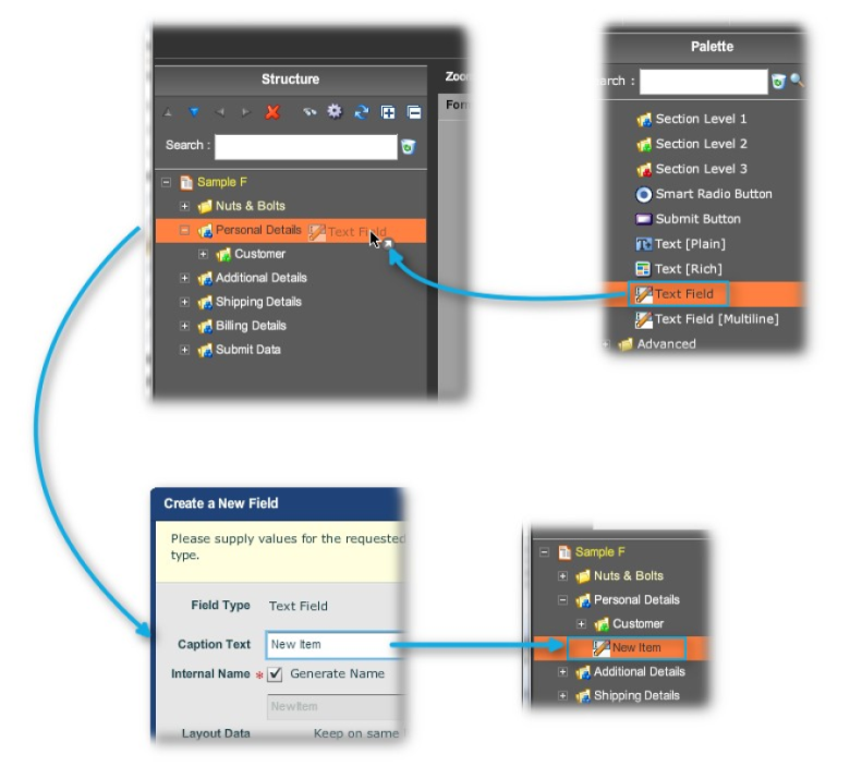
You simply drag and drop a widget into the Structure Panel. You can also
drop widgets into the Wireframe, but Avoka Technologies strongly recommends
that you do not drop widgets onto the Wireframe. The reason for this is: the
form's structure actually has many hidden fields and structural elements
which can only be seen in the Structure Panel
in its Advanced Mode.
Sometimes the new field will appear in the Wireframe; sometimes it
completely disappears. And even when it does appear, all may not be well
internally.
Widget Types
There are, broadly speaking, 4 kinds of widgets. This section of the manual will only touch on these briefly. All the Field Types in the Palette mix the 4 types freely, so there is little point in covering the widget types in much detail. There is some value in mentioning these. In practice, though, you are will not concern yourself as to the type of widget you are about to drag and drop onto the form.
Simple Widgets
These create simple fields like a single checkbox, text field or a date field.
Blocks
Block are containers of multiple fields. Blocks serve 2 main functions:
To group fields together visually in a colored panel, with a common label
and so on To group fields together logically into functional units.
Containers can contain other containers in a hierarchical structure. There
is no practical limit to the levels of nesting supported.
For your convenience, there are a number of
PredefinedBlocks in the palette. They are invaluable for building complex functions on your
forms with little more effort than drag and drop.
Sections
All forms have at least one Section (which is named "Instructions" by default). The content area of the Structure Palette is organized into Sections. Wizard forms display their sections as separate pages. Use the Section widgets to be able to create up to 3 levels of sections.
For More on Widgets
Please see:
FieldTypes
the technical reference to the many types of fields,
Assistants
PredefinedBlocks
Structure Panel
Standard Mode
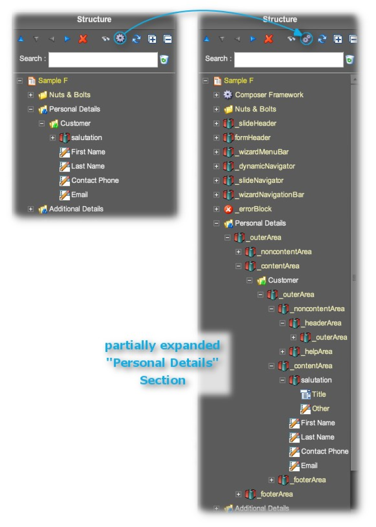
The default mode of the Structure Panel is called the "Standard
Mode". This does not expose the full structure of the form, but does
expose the visible elements and those invisible elements most relevant for
day-to-day work.
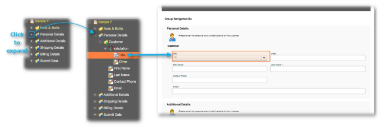
Showing the relationship between the Structure Panel and the Wireframe
The Standard Mode is particularly recommended for when you place new widgets
onto the structure. This is because, in the Standard Mode, you can see
enough of the underlying structure of the form to place the widget correctly
— and not into some invisible and inaccessible part of the underlying
structure — so that the new resulting field on the form works more or less
correctly.
Advanced Mode
Standard Mode vs Advanced
The Advanced Structure exposes all the underlying structure of the form. (You can see this by comparison with the Advanced Mode panel with the XML code in the XMLSourceTab.) Such control is obviously useful to power users of Composer, but this level of control is beyond the scope of this section of the guide.
Nuts & Bolts vs Content
The "Nuts & Bolts" part of the Structure has both read-only
and editable items. Read-only items show the settings for the form made in
Transaction Manager; in their
EditProperties dialog, the Properties tab is blank. Usually the first level items of Nuts
& Bolts are read only and their children are editable.
You alter the settings of the editable items through the
EditProperties dialog. More Nuts & Bolts items are exposed in the
AdvancedMode.
Composer Framework (Advanced Mode Only)
This is a new section of the Composer 4 Structure Panel. This framework exposes the deepest workings of the form, such as the connection with the TransactField App or the HTML generation engine. You should leave this alone except in the rarest or rare circumstances
How to Place a New Field into the Structure
Drag and Drop
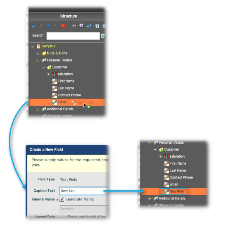
The method is to drag a widget over from the Palette (on the right) and drop it onto an object on the Panel (on the left). Either the widget will
- drop into the object onto a container like a block or section and it takes up its position as the last item in the container
- drop below the object onto a simple field (one that does not expand) and it goes below the field at the same level in the structure
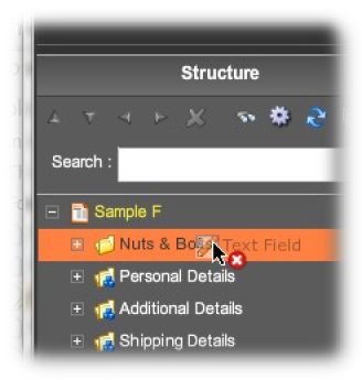
- or refuse to go into the structure when dropped onto an illegal position in the structure.
Note: you can force the widget to behave as
item 2, by holding down the <ctrl> key as you move the widget into the
structure.
Shortcut for Power Users
Select a position in the Structure Panel and, while the position is still highlighted, double click on a widget in the Palette. The new item will go after the still-highlighted field in the structure.
Menu Bar
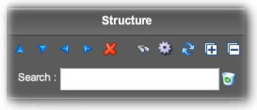
The menu sits at the top of the Structure Panel. Its functions are (from
left to right):
Blue arrows to move a highlighted item in the structure up or down or
promote (left) or demote (right) Delete the item
Search for the item in the Search field below (the recycle bin clears the
search field) Standard vs Advanced Mode
Refresh the panel Expand all Collapse all
Layout
So far, we have shown how to add fields to the structure, but said nothing
on layout: where fields will sit in relation to each other, either
vertically or horizontally, what will be the distance between fields and how
they position on the form.
This omission is deliberate. Layout is dealt with
hereinthis guide and layout is automated in Composer as much as possible.
Why? Wouldn't forms look better if the designer sweats over positioning each
element and nudging fields on the web page to get its position perfect?
Well, the answer is that forms in a web-browser cannot have all their
elements as tightly controlled as with traditional hard-copy forms, as the
web page runs the gamut of the ranks of the many web browsers now in common
use. Also, these forms will be viewed on different devices: on Android
phones and tablets; on iPhones, iPads, iPod Touches, on Windows mobile
devices and desktops, on
desktop monitors of a range of sizes, via mobile apps, via HTML and PDF.
In such a babble of viewing environments, what was painfully adjusted for
one circumstance will look lousy in another. And you cannot dictate which
modern browsers or devices you would prefer your customers not to use. Gone
are the days of wagging the stern finger and stating "Best viewed in
such and such an ancient browser and not the modern one you are using."
If users have migrated over to modern browsers so as to be able to engage in
social media, do not try to stem the tide with your web forms.
So, these considerations dictate that layout is held in reserve for later
discussion. For the present, we encourage you to experiment with widgets in
the Palette, and to see what happens when you drop these onto a form.
