Custom Native Component Development
MaestroThe UI design product. | Form Builder | All versions This feature is related to all versions.
A component in Journey Maestro can be as simple or complex as the Form Builder wants or needs it to be. A Maestro component can be as basic as a one-line snippet of HTMLBounce is when a user views a form but never starts it and simply closes the window immediately or navigates away. code to display a piece of text, or it can be as complex as displaying high fidelity graphics, or communicating with multiple servers.
Before developing any native component for your form, check if you can implement the required functionality using the available components in the Maestro Palette. It is important to consider and understand the use case of a new native component. For example, if it requires a server connection, it will be useless in a form that will be deployed for offline use.
You can develop custom native components using the web-standard resources such as JSON, HTML, CSS, and JavaScript by following the recommended process outlined here.
- Created a new folder to hold all the files necessary for your native component. Name the folder the same as your native component.
- Create a JSON file.
- Create a HTML file.
- Create a JavaScript file.
- Use a jQuery.
- Package and distribute the completed custom native component.
Create a Custom Native Component JSON File
Every custom native component that you develop in Maestro must have a JSONJSON (JavaScript Object Notation) is an open standard file format and data interchange format that uses human-readable text to store and transmit data objects consisting of attribute–value pairs and arrays. file, so your first step is to create a valid JSON file, for example, widget.json and populate it with relevant information about the new native component
JSON is a subset of the JavaScript object literal syntax, so you must surround your JSON property names with double quotation marks “”
A JSON file of this component is shown below:
{
	"label": "Component A",
	"span": {"xs": 12, "sm": 12, "md": 4, "lg": 4},
	"propDefs": {
		"property1": {
			"label": "Property 1",
			"type": "text",
			"defaultValue": "Default",
			"helpText": "Specify a value for the custom property of this component"
		},
		"property2": {
			"label": "Property 2"
		}
	},
	"html": "component.html",
	"js": "component.js",
	"css": "component.css",
	"icon": "component.png"
}
A typical custom native component JSON file can contain the following elements:
| Element | Required | Example | Description |
|---|---|---|---|
|
label |
Yes |
"label": "Component A" |
The text displayed in the Maestro palette for this native component. Note that this is the only required element in a native component's JSON file; for example, |
|
span |
No |
"span": {"xs": 12, "sm": 12, "md": 4, "lg": 4} |
The span value of the native component, which is the number of columns that the native component will take up in the form. The default value is 3. Maximum value is 12. |
|
propDefs |
No |
"propDefs": { "property1": {...}, ...} |
The list of all properties defined for this component. Each property can have its own set of property-value pairs. For more information, see the property table below. |
|
html |
No |
"html": "component.html" |
The name of the native component’s HTML file. The default is component.html. |
|
extraHTML |
No |
|
An additional HTML file or an array of HTML files that are generated in the completed form’s head section. It's useful for adding HTML for popup dialogs and other similar functions. |
|
js |
No |
"js": "component.js" |
The name of the native component’s JavaScript file. No JavaScript file is loaded by default. |
|
css |
No |
"css": "component.css" |
The name of the native component’s CSS file. No CSS file is loaded by default. |
|
icon |
No |
"icon": "dropdown.png" |
The name of the native component’s icon file, for example, a PNG, GIF or JPG image file. The default is a generic icon. |
|
rows |
No |
"icon": "component.png" |
Native components that need to contain other components should have a blank rows collection, which is an array within an array. By default, the component doesn't have rows collection, asit doesn't contain other components. |
|
noData |
No |
|
Set to true for display native components that should not have entries in the form’s output data. |
|
validChildren |
No |
|
An array of component types that can be added to this component type. This prevents adding or moving components of other types into this component, and also creates options in the native component's right-click menu to add the specified component types as children. Set |
|
selections |
No |
|
An object containing selection name-keyed selection arrays, typically one, that if not already there, are added to the form’s selection collection. This allows the component to provide a default selection set to use in a drop-down, radio group, etc. The name of each selection array must not contain any non-alphanumerical characters other than underscores. Underscores are translated as spaces in the property editor window. |
A JSON file can have a number of properties under propDefs, which are a keyed map of custom properties that appears in the Maestro property editor which can be referenced in your native component’s code. The key of each property item within the properties object is the internal name of the custom property. For example, the name you use when referring to the item in your native component's code. This name must be camelCase, for example, StyleGuide.
A property element can contain the following elements:
| Property Element | Required | Example | Description |
|---|---|---|---|
|
label |
Yes |
"label": "Options", |
The display name for the custom property that will be displayed in the Maestro property editor. If omitted or left blank, the default is, “text”. In the above example, the label is, “My Property”. |
|
type |
No |
"type": "text" |
This determines the input type in the Maestro property editor. |
|
value |
No |
"value": "One" |
The value of the property. |
|
defaultValue |
No |
"defaultValue": "Default" |
This is the default value that this property has when this component is first added to a form. The default is null. |
|
helpText |
No |
"helpText": "My Help" |
Any additional information that may be relevant to the Form Designer within the Maestro property editor. No help text link is displayed by default. |
|
linked |
No |
"linked": "true" |
If set to true, updates to the item’s label is also set this property. This only occurs if this property is not currently overridden in the item, or if its value already matches that of the label. |
The custom native component properties have different types.
If this component or widget extends another component and you are setting a property against a property defined on its parent, you can override their values. There are cases where there is a propDef to add properties that the user can set and properties that are setting the values on an inherited type.
{
	"category": "Input Fields",
	"label": "Dropdown",
	"html": "dropdown.html",
	"icon": "dropdown.png",
	"propDefs": {
		"options": {
			"label": "Options",
			"type": "list",
			"value": [
				{
					"label": "One",
					"value": "One"
				},
				{
					"label": "Two",
					"value": "Two"
				},
				{
					"label": "Three",
					"value": "Three"
				}
			],
			"helpText": "The options list for the dropdown"
		},
		"helpText": {
			"label": "Popover Help Text",
			"type": "helpText",
			"category": "Help Text",
			"value": ""
		},
		"icon": {
			"label": "Icon",
			"type": "icon",
			"value": "fa fa-caret-down",
			"helpText": "Select the dropdown icon"
		},
		"addBlankValue": {
			"label": "Add Blank Value",
			"type": "boolean",
			"value": true,
			"helpText": "Check to add a blank value to the dropdown"
		},
		"placeholder": {
			"label": "Placeholder Text",
			"type": "text",
			"category": "Accessibility",
			"value": ""
		}
	},
	"styleTargets": ["wdg-select-icon"],
	"span": {"xs": 12, "sm": 12, "md": 6, "lg": 6},
	"ruleHelpers": [
		{
			"label": "String value...",
			"name": "stringValue",
			"initDialog": true
		}
	]
}
{
	"type": "dropdown",
	"label": "Title",
	"category": "Business Data",
	"properties": {
		"options": [
			{
				"label": "Mr",
				"value": "Mr"
			},
			{
				"label": "Mrs",
				"value": "Mrs"
			},
			{
				"label": "Miss",
				"value": "Miss"
			},
			{
				"label": "Ms",
				"value": "Ms"
			},
			{
				"label": "Other",
				"value": "Other"
			}
		]
	}
}
This is the common case, the first one is the /dropdown/widget.json and the second one is the /dropdown-title/widget.json. The directory name is the type and it contains a widget.json. In the dropdown you have a propDefs for options being declared, but in the dropdown-title you have properties being set for this widget
Create a Custom Native Component HTML File
After you have created the JSON file, widget.json, the next step is to build the native component’s HTML file. Every native component created for use in Maestro needs a HTML file, for example, component-widget.html. This HTML file should define the content that the native component will place in the form’s HTML document. The HTML file should have a single top-level element, usually a div. Within this top-level element, using standard (or custom) tag names and attributes, any valid HTML script can be placed.
A Maestro custom native component can be as simple as a component designed to display a simple piece of text, for example, Hello World. You can use the following process to create a simple Hello World custom native component:
- Create the HTML file
component-widget.html. - Place both the
widget.jsonandcomponent-widget.htmlfiles into a folder namedHello World. - Zip the
Hello Worldfolder as aHello_World.zip. - Use Maestro to deploy the library of components
Hello_World.zipto your form.
<div>Hello, World!</div>
This Hello World native component doesn't do much so it is not very useful. Normally, components are used to capture user input data. To do that, Maestro uses the AngularJSA workflow is progression of steps (tasks, events, interactions) that comprise a work process, involve two or more persons, and create or add value to the organization's activities. In a sequential workflow, each step is dependent on occurrence of the previous step; in a parallel workflow, two or more steps can occur concurrently. JavaScript library to extend basic HTML syntax with two-way data binding. You can use this functionality to make the Hello World native component more useful by adding the code below to the component-widget.html file.
<div>
   Enter your name: <input type="text" ng-model="data[item.id]"/>
   <p>Hello, {{data[item.id]}}!</p>
</div>
This updated version has a text input field whose value is bound to data[item.id] using the ng-model attribute. Whatever value is inputted into data[item.id] will form part of the form’s submission data. In this case, this will be the text that is entered into the input field by the user, for example, a user’s name.
Below the input field, the value of data[item.id] (the text entered into the text field) is displayed in a greeting paragraph, taking advantage of the two-way binding.
Create a Custom Native Component JavaScript File
By now, you have created the component's JSON and the HTML files that capture information, provides feedback and stores a value in the form’s submission data.
So far, we have illustrated that no JavaScript is required to create a native component that can be used in Maestro. However, JavaScript can be used when creating native components for use in Maestro forms. A JavaScript file should be used when the native component needs to define custom behaviors or processes. The JavaScript file needs to conform to a special structure. This structure means that all JavaScript files used to create native components must begin with the basic structure as shown below.
define(["app"], function(app) { /* Your code here */ }The recommended practice for providing a native component with some type of functionality is in the form of AngularJS objects. As described in the AngularJS developer guide and API reference guide (https://docs.angularjs.org/guide), if objects can be filters, directives, controllers or services, they are available to be used in JavaScript files.
The following list provides a brief explanation of filters, directives, controllers and services:
- Filters - Provide value transformation functions (For example text formatting)
- Directives - Enable inspection or manipulation of the DOM (Document Object Model). For example, adding an event handler.
- Controllers – Provide values and functions for binding. For example, managing a complex component data type.
- Services – Provide everything else. For example, integration with a remote server.
You can use the above-mentioned syntax in your native component to convert a text string into an UPPERCASE text string:
define(["app"], function(app) {
	app.ng.filter("upperCase", function() {
		return function(text) {
			return text.toUpperCase();
		};
	});
}
The code in the above image creates a filter called upperCase. The filter function takes a piece of text and returns the UPPERCASE version. This same function could be used in the Hello World native component’s HTML file, component-widget.html, by pushing the data through the filter function. The image below demonstrates how this filter function can be applied to the HTML file of the Hello World native component.
<div component="item">
   Enter your name: <input type="text" ng-model="data[item.id]"/>
   <p>Hello, {{data[item.id] | upperCase}}!</p>
</div>
With the filter applied to the HTML file, the greeting provided to the user when the Hello World native component is loaded, will be shown in uppercase - HELLO, NAME!.
You can also make your own customizable attachments in your form to allow form users to attach various documents. Even though there are several native components, such as the Attachment Field and Attachment Field v2, which you can use out of the box, their functionality may not be enough for your needs. Maestro provides the Transact.makeAddAttachmentFile() method so you can set it on the AangularJS object of the particular widget instance. This is useful when the attachment widget is in a repeat and you can select the attachment name of the file you are uploading. This is especially important when you have security policies configured in Manager with restrictions per the attachment name, so you need to be able to set it dynamically based on user selection in the form
Create a Custom Native Component jQuery File
All Maestro forms include a full jQueryA reference number is a unique identifier assigned to each transaction. library by default, and all element references passed into angular directive link methods are jQuery objects with the full jQuery API available. This makes it possible to use familiar jQuery methods and functions. However, it is recommended that you investigate whether you can use Angular data binding or built-in directives to meet your needs before doing any work on the DOMThe Document Object Model (DOM) is a cross-platform and language-independent application programming interface that treats an HTML, XHTML, or XML document as a tree structure wherein each node is an object representing a part of the document. The objects can be manipulated programmatically and any visible changes occurring as a result may then be reflected in the display of the document..
You can build custom Angular directives for use in your custom native component.
define(["app"], function(app) {
	app.ng.directive("mySpecialDirective", [function() {
		return function($scope, $el, $attr) {
			$el.text("Hello from my special directive");
		};
	}]);
}
If there is some part of your native component that needs to access properties of the Form View item, the JavaScript file should use Angular dependency injection to reference the form service object and call the Form.getItem() method.
define(["app"], function(app) {
	app.ng.directive("mySpecialDirective", ["Form", function() {
		return function($scope, $el, $attr) {
			Form.getItem().then(function(item) {
				$el.text(item.properties.messageSpecifiedByFormDesigner);
			});
		};
	}]);
}
The above example is quite contrived and could be handled in a much simpler way by binding the custom property value in the markup and using no JavaScript at all.
A native component can often specify a custom validation method, which is called before any validation rules are specified by a Form Builder. An example of this is the Date Picker component from the Maestro Palette. You can add a custom validation to the component’s date range properties as shown below.
- Obtain a reference to the View item, as explained above.
- Add a
$validationmethod to the View item. - Add the validation directive attribute
data-av-okto the top-leveldivof your native component’s HTML file.
item.$validation = function(data, value) {
	value = + value;    // Ensure value is a number
	if (value < 5) return "Too low";
	else if (value > 10) return "Too high";
	else return true;
}
This method takes two parameters - the item’s parent data context and its own data value - and returns a validation result - true for valid, false for an error message.
You can apply a similar approach to create a custom mandatory value checker, for example, $hasValue. This method is used to override the normal way of checking whether a value has been entered, if the field is marked as mandatory. Instead of checking if a value is provided, a mandatory field of this type will only pass if the field’s length is greater than 5.
item.$hasValue = function(data, value) {
	return value.length > 5;
}The Attachment Field component uses this method.
Package a Custom Native Component
After you have created all files required by a custom native component, you can package and deploy it following this process:
- Add a library's XML manifest including a library's name and description to the component's directory.
- Zip the content of the directory.
- Use the gulpBusiness Process Modeling Notation (BPMN) is a method of illustrating business processes in the form of a diagram similar to a flowchart. tasks to automatically package and deploy libraries into a Journey Maestro server.
- Import the library into Journey Maestro.
Enforcing Required Configuration Properties
Sometimes, as a component designer, we want to define a component property that is required to be set. Since we don't have a built-in Maestro function to mark a property as "mandatory" field, we can still show a warning message like below directly in Maestro design view to remind the form designer to set this value. "Missing component API Key!" message will disappear as soon as "Google Maps API Key" property has been set.
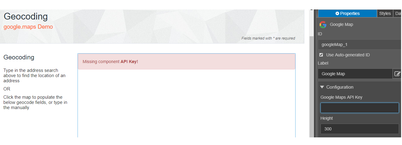
This technique can only be used when you develop a native component. Suppose you have native component called "Google Map" which structure looks like this.
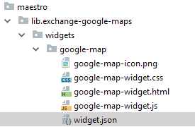
In the widget,json, it defines a property "apiKey", then what you can do is to add a <div> in google-map-widget.html like below
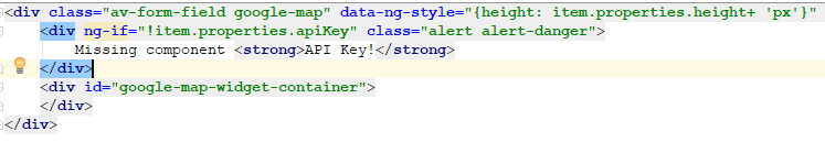
The logic is actually pretty simple. If item.properties.apiKey value is blank, then show this "Missing component API Key" message with "alert alert-danger" class. The <div> will be hidden when form designer set an api key to the property.
Next, learn about the Native Component Development Toolkit.