Attachment Field v2
MaestroThe UI design product. | Form Builder | 22.10 This feature was introduced in 22.10.
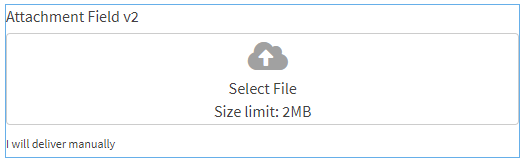
Maestro comes with the Attachment Field v2 component (widget) that allows a form user to upload multiple attachments, such as files and images, which are a part of an onboarding journey and are submitted along with a form. The Attachment Field v2 component extends functionality of the Attachment Field component.
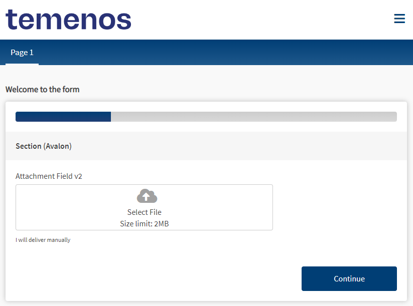
A form with a rendered Attachment Field v2 widget is shown below:
Usage
- Open the Palette pane in the Maestro Editor.
- Locate the Attachment Field v2 component within the Attachments folder.

- Drag the component into the View pane or the Wireframe.
- Configure the component's properties via the Properties pane. For more information, see the Properties section below.
- Configure the component's styles via the Styles pane. For more information, see the Styles section below.
Properties
The Attachment Field v2 component inherits all properties of the Attachment Field component, with the following additional properties:
Leave blank for the original attached file name.
Button text for drag.
Select a location of the drop zone icon from the following options:
- Top
- Side
Fallback error message for translation
Additional Labels
Confirm delete message for translation
Delete attachment button tooltip message for translation
Wait message for translation
Label for cancel upload button for translation
Label for manual attachment button for translation
Tooltip for upload button for translation
Styles
The Attachment Field v2 component inherits all styles of the Attachment Field component, with the following additional styles:
Adjust the width of the attachment button
form[name='form'] {
	.attachment-2-full-width-button {
		.wdg-drop-zone-container {
			width: 100%
		}
	}
}Adjust dropzone hover
@import (reference) "../core-brand-vars/core-brand-vars";

form[name='form'] {
	.attachment-2-dropzone-hover {
	   .wdg-drop-zone-container {
          &:hover > .wdg-choose-file-button {
            //background-color: @av-secondary-contrast;
            background-color: @ux-primary-color;
            color: white;
          }
              &:hover .wdg-drop-zone-icon {
              color: white;
          }
	 }
	}
}
Next, learn about the Countries component.