Date Picker
MaestroThe UI design product. | Form Builder | 21.05 This feature was updated in 21.05.
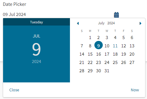
Maestro comes with the Date Picker component, which is an input field widget, that lets form users to type or select a date and time either directly in the text field or in the calendar popup. The Date Picker can display past, present, or future dates. It also supports both left-to-right (LTR) and right-to-left (RTL) languages.
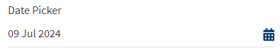
The component looks like this on a rendered form.
Use the Masked Date Input component if you need to enforce a specific date input pattern or hide some input.
Usage
- Open the Palette pane in the Maestro editor.
- Locate the Date Picker component within the Input Fields folder.
- Drag the component into the View pane or the Wireframe.
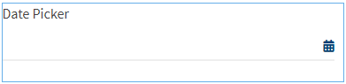
The component in a Wireframe. - Select the Properties pane to configure the component's properties.
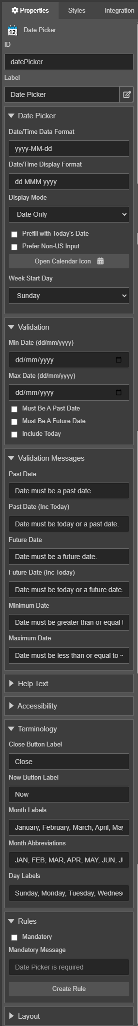


Properties
The following properties are available to the Date Picker component:
Date Picker
- Date/Time Data Format
Text dateFormat- Enter the date and time format that is stored in the underlying XML.
- Date/Time Display Format
Text dateDisplayFormat- Enter the date and time format that will be used to display it to form users.
- It's important that two different date format properties exist, and are referred to separately - a display format (what is visible to the user), and a data format (what's in the submission XML and data object).
- Display Mode
Option displayMode- Select the display mode, which can be one of the following:
Label Value Date Only date Full Mode (Date and Time) full - Prefill with Today's Date
Boolean prefillTodaysDate- Select it to prefill with today's date.
- Prefer Non-US Input
Boolean auDateInput- Select it to use non-US date format.
Note The US date format is m/d/yy or m/d/yyyy.
- Open Calendar Icon
Icon inputIcon- The icon used for the open calendar button. You should check with the Template Designer if you can change this icon, as icons are typically customized in the template.
Validation
- Min Date (dd/mm/yyyy)
Date minDate- Minimum Date allowed. For example, a valid date may be between
01/01/2017(min) to31/12/2017(max). - Max Date (dd/mm/yyyy)
Date maxDate- Maximum Date allowed.
- Must Be A Past Date
Boolean pastDate- Check if the date must be in the past.
- Must Be A Future Date
Boolean futureDate- Check if the date must be in the future.
- Include Today
Boolean includeToday- Check to include today in validation.
Validation Messages
- Past Date
Text pastDateValidationMsg- Enter the past date validation message, which is displayed if the Must Be A Past Date option is selected. The user will receive the message if they do not follow the validation rules. The Form Builder can customize the messages displayed when validation is not met.
- Past Date (Inc Today)
Text pastDateIncTodayValidationMsg- Enter the past date (Inc Today) validation message, which is displayed if the Must Be A Past Date and Include Today options are selected. The user will receive the message if they do not follow the validation rules.
- Future Date
Text futureDateValidationMsg- Enter the future date validation message, which is displayed if the Must Be A Future Date option is selected. The user will receive the message if they do not follow the validation rules.
- Future Date (Inc Today)
Text futureDateIncTodayValidationMsg- Enter the future date (Inc Today) validation message, which is displayed if the Must Be A Future Date and Include Today options are selected. The user will receive the message if they do not follow the validation rules.
Help Text
- Popover Help Text
HelpText helpText
Accessibility
The component's accessibility (a11y) is achieved by allowing a form user to type a date into the input field.
The Date Picker icon does not need to be accessible.
- Placeholder Text
Text placeholder- Provide an explanation how to use Date Picker, for example, specify a date format
MM/dd/yyyythat the date must be entered in and the screen reader will read it out to a form user.
Terminology
- Close Button Label
Text closeBtnLabel- A label for the Close button.
- Now Button Label
Text nowBtnLabel- A label for the Now button.
- Month Labels
Text monthLabels- A comma separated list of month labels from January to December.
- Month Abbreviations
Text monthShortLabels- A comma separated list of month abbreviations from January to December.
- Day Labels
Text dayLabels- A comma separated list of day labels from Sunday to Saturday.
Next, learn about the Autocomplete Field component.