Component Common Properties
MaestroThe UI design product. | Form Builder | 21.05 This feature was updated in 21.05.
A component can have many configurable properties, which you can adjust to control its behavior. Different components have different sets of properties, which you can check here. However, all components have the following common properties:
- Name
- XML Name
- ID
- Label
- Rules
- Layout
Let's take a look at each of these common properties.
Name
Each field also has a name. The name is usually the same as the caption. The field's name is displayed in the Structure tab, as well as at the top of the Properties tab. The name is usually the same as the label. The only time you might be aware of the name is when a field's label is very long. In this case, Maestro will give the field a truncated name. The example of Name is First Name.
XML Name
The XML name is used by Maestro to construct the XML payload for the form. The XML name will be used as the element name for this field in the XML structure. By default the XML Name is calculated from the Name. It has spaces removed, and will capitalize the individual words within the name. This naming convention more closely follows what many people use in XML Schemas. If you use the Data Mapper to bind fields to a seed file, then the XML Name will be updated accordingly. The example of XML Name is FirstName
ID
The ID is a unique identifier for the component. This is an internal name, which is used in calculations. Every widget also has an ID. By default the ID is calculated from the Name. It has spaces and other prohibited JavaScript characters replaced with underscores, and truncated. You can override the default generated value and use your own, more meaningful name. The example of ID is first_name.
You can change the ID as required.
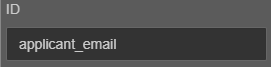
You are strongly recommended to override the default values of both the ID and XML Name of any fields which have a long or non-meaningful labels. This will assist greatly when you are writing calculations or working with the data.
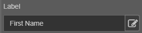
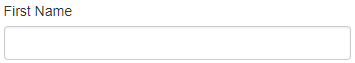
Label
The first property of every component is the Label. It is displayed to the user on the form, but you may choose to leave the label empty. The subsequent properties vary depending on what type of component is selected. The example of Label is First Name.
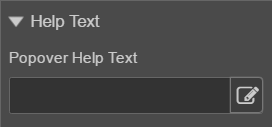
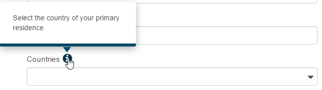
Help Text > Popover Help Text: When you enter text in the Popover Help Text, an information icon will display next to the component. The form user will be able to select the icon or roll their mouse over the icon to display the entered help text.
Some properties, such as help text, labels, and text display, can contain rich text. The Maestro editor comes with the rich test editor which you can use to create rich textual content including various styles and images. The editor has the Icon Picker functionality allowing you to choose an icon for the label. | 21.05 This feature was introduced in 21.05.
Rules
The Rules section is where you can mark components as mandatory and create additional rules such as visibility, validation, calculation, or editability.
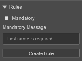
Under the Rules heading, properties are available for affecting the rules assigned to the component:
- Animate Visibility - this option will only be available if a Visibility rule exists on the component.
- Create Rule - open the Create Rule dialog to assign a rule to the component.
Layout
The Layout section is where you can change the position and width of a selected component.
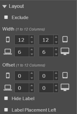
Under the Layout heading, properties are available for affecting the appearance of the component:
- Exclude allows you to remove the component from the form, without deleting it. It removes the component from the form without removing it from the View pane. This is useful for disabling parts of a design without deleting them.
- Width allows you to set the width of the component based on the breakpoints, or screen size of the device used to view a form. It adjusts the number of columns available to a component.
- Offset allows you to set the horizontal position of the component based on the breakpoints of the device used to view a form. It adds empty columns to the left of the component.
- Hide Label allows you to hide the label of the component on the form.
- Label Placement Left moves the label to the left of the selected component. The default position of label components is above the selected component. Label Placement Left
The Properties pane of the Maestro editor allows you to view and edit a component's properties.
Next, learn about component form dependencies.