Component Labels
MaestroThe UI design product. | Form Builder | 21.05 This feature was updated in 21.05.
Maestro requires every component to have a Label property containing a human-readable name used to represent the field, which will give form users an indication of what this UI element is for and what user's input it requires. You can change the labels at any time as needed. However, we recommend choosing easily understandable names at the design time.
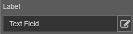
The default value of the label is always the same as the name of the field type - but this is almost always immediately updated by the form designer. The label usually appears at the top or left of a field. In some cases, a field may only have a label, for example, the Text Display field, or it may not have a label. For a more complex element such as a header, the label may be just one of several pieces of text that are contained in the field.
Maestro comes with two types of component's labels:
- Static
- Dynamic
Static Component Label
The static label is the basic unformatted text label, where the formatting is done by the default form styles. Most labels are static labels. You have to configure a static component label in the Properties pane manually and this configuration can’t be changed dynamically, for example with a JavaScript.
To change a static label:
- Open a form in the Maestro editor.
- Select a component in the form and click the Properties pane.
- Change the label name in the field or click Edit to type a longer label's name or include some formatting options using he rich text editor.
- Click Save.

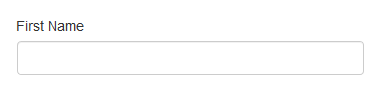
The text within this property appears within the component and is used to identify the data that the applicant needs to enter into the component. For example, this Text Field component has a label of "First Name":
Dynamic Component Label
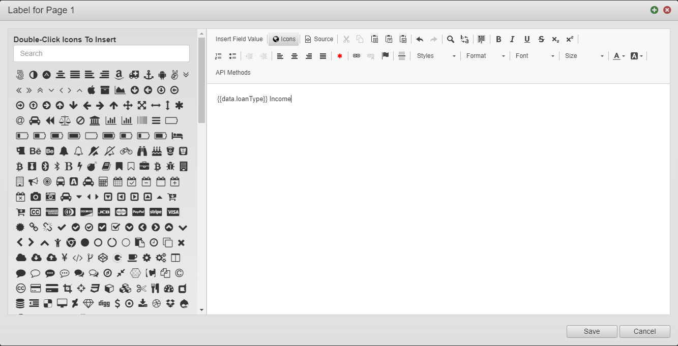
A dynamic component label allows its text to be dynamically changed at any time, often with a JavaScript. However, a form developer can directly apply custom HTML, or AngularJS expressions in the label to derive the text from other fields in the form. If a dynamic label contains a JavaScript expression, it is evaluated as the applicant interacts with a form, so the label can change accordingly.
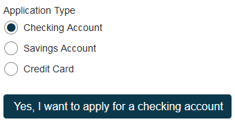
For example, a dynamic label for a Button component might be defined with the following content:
Yes, I want to apply for a {{ data.applicationType }}This label refers to the data of a "applicationType" component. As the data of that component changes, the label of the button changes.
To change a dynamic label:
- Open a form in the Maestro editor.
- Select a component in the form and click the Properties pane.
- Click Edit to access the rich text editor where you can reference other component’s values to make this label name change dynamically.
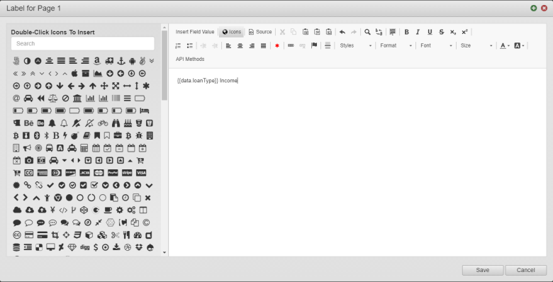
- Click Icons to select an icon using the Icon Picker and insert it into the component. You can use search to find an icon you need. | 21.05 This feature was introduced in 21.05.
- Click Save.
Hide a Label
Most components should have a label. There are, however, times where you might like to hide the label from the applicant.
To hide a label:
- Select a component via the View pane or Wireframe.
-
Inside the Properties pane, expand the Layout properties.

- Enable the Hide Label option.

To show a label, disable the Hide Label option.
Change Label Placement
For the sake of usability, labels should generally be placed above input fields. This is how Maestro's components are configured by default. You can, however, change the placement of a label to the left of an input field. This is typically done on receipts as a way of saving space.
To change the placement of the label:
- Select a component via the View pane or Wireframe.
-
Inside the Properties pane, expand the Layout properties.
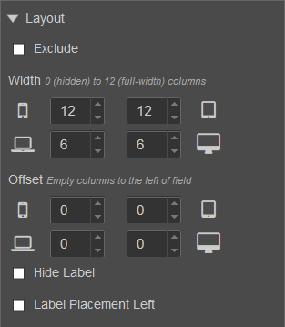
- Enable the Label Placement Left option.

Next, learn about a component layout.