Component Layout
MaestroThe UI design product. | Form Builder | All versions This feature is related to all versions.
Each component has a layout configuration that allows you to arrange it on a design, such as a form, according to device or browser screen sizes.
Maestro allows you to configure the following aspects of the layout.
- The width of each component.
- The location of components relative to each other, for example, a field appears to the side or below a field that precedes it.
- The adjustment of both the component and placement of fields when the overall width of the screen changes.
A good component layout is extremely important for creating a good user journey. A layout can be the difference between a positive or a negative user experience, so it’s crucial to choose the most appropriate component layout for each of your forms.
You can use the following powerful techniques for creating good component layouts:
- The form itself defines three responsive breakpoints, creating four standard screen sizes. Since modern devices come in many sizes, and because devices can also be rotated into either portrait or landscape mode, these standard screen sizes are only roughly indicative of actual devices. However, the four screen sizes equate to: Smart Phone, Tablet, Small Desktop Screen and Large Desktop Screen.
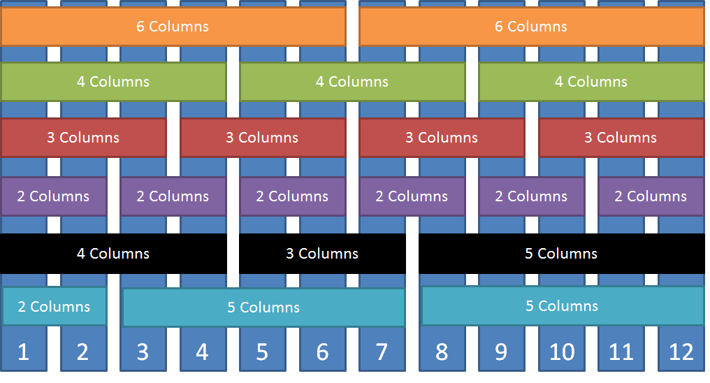
- Each container in the form is broken down into a 12-column grid. 12 is a useful number because it can be divided in half, thirds, quarters, and in other ways, making it flexible but simple. (It's no coincidence that many historical measurement systems use twelve as a base.)
- Each field can be configured to use any number of columns, from 1 to 12. This determines the field's width.
- You can continue placing additional fields to the right of other fields. However, as soon as the total column count of all the fields on a row exceeds 12, that field and any subsequent fields will be moved to the next line.
The layout configuration is shown below.
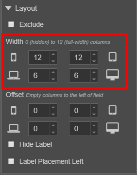
Under the Layout heading, properties are available for affecting the appearance of the component:
- Exclude allows you to remove the component from the form, without deleting it. It removes the component from the form without removing it from the View pane. This is useful for disabling parts of a design without deleting them.
- Width allows you to set the width of the component based on the breakpoints, or screen size of the device used to view a form. It adjusts the number of columns available to a component.
- Offset allows you to set the horizontal position of the component based on the breakpoints of the device used to view a form. It adds empty columns to the left of the component.
- Hide Label allows you to hide the label of the component on the form.
- Label Placement Left moves the label to the left of the selected component. The default position of label components is above the selected component. Label Placement Left
The Properties pane of the Maestro editor allows you to view and edit a component's properties.
In this example, a text field takes up half the available space on larger devices. However, on smaller devices, the user is likely having issues reading the field labels or being able to enter data into the small field areas. Hence the default size on smaller devices is to take up all the space on a row. This is also why the default location of the field’s label is always on the top of the field – this ensures that the label and field don’t spread out too much on narrower devices.
The breakpoints for screen sizes are determined at the template level. These are set to appropriate defaults which usually cover the standard screen sizes that are available in the market today, but your Template Designer may change them if desired.
In our templates, the breakpoint between a small screen and medium is 400 pixels (px), between medium and large is 560px and large to full screen is 780px. This means that any screen size under 400 pixels is considered a small screen, screen sizes between 400px and 560 is medium, 560px to 780px is large and anything over 780 is an extra-large screen.
The screen size will always equate to 12 columns, no matter the actual pixel width. So 400px equals 12 columns, 560px equals 12 columns, and so on. The only thing that changes is the width of the columns. Dividing 12 columns across 560 pixels would mean that the columns are wider than when you divide 12 columns across 400 pixels.
Basically, each row in your form contains 12 columns. When designing a form, you can decide how the 12 columns are divided. To get two equal text fields on one line you would need to change both text fields to 6 columns: 6 + 6 = 12.

If you don’t want them to be equal, you could set one to 7 columns and the other to 5 columns: 7 + 5 = 12.
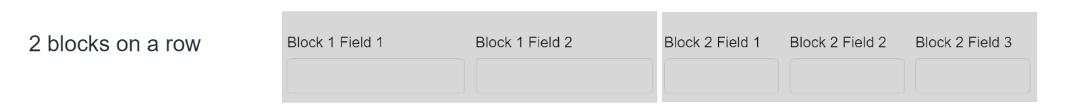
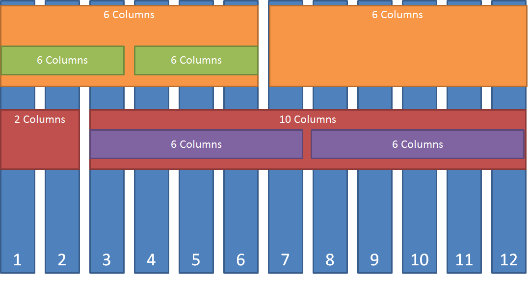
Another possibility with the 12-column grid is to use multiple blocks on a row to give more flexibility.
In the screenshot below, there are two blocks on a row, each block containing components. The blocks are both set to 6 columns wide. The components within the block have their own 12 column grid which allows them to be arranged within the available space of the block. In block one there are two text fields both set to 6 columns wide. In the second block, there are three text fields, all three set to 4 columns wide.
Let's look at several different Journey Maestro component layouts.
Layout 1
Layout 2
Next, learn how to validate a component layout.