Predefined Blocks
Composer This topic is related to Transact Composer. | Form Builder | v4.3 & Higher This feature is related to v4.3 and higher.
Many of the standard Composer widgets are implemented as prefabricated
blocks. You utilize them as you would assistants: drop one into the form's
structure and take advantage of the resulting complex structure that adds
functionality to your form.
These include
various Address blocks, a block to display errors, the standard form header,
Sections, the Signature block, and various blocks for use in Transaction
Manager.
You cannot modify the predefined
blocks in the pallet, only the predefined blocks that you yourself created
in the Pallet. But once a predifined block has been added to the form, you
can modify that instance and that instance alone.
Here is the current range of predefined
blocks generally made available for most organizations in the pallet. You
may not see all of these, due to the
Composer configuration of your Organization.
|
Predefined Block |
Description and Wireframe |
|
|
|
|
Fieldset |
Used to improve accessibility for forms that have a
number of scattered radio buttons, where these do not
fall into one convenient block nor have the one
controller. Poorly structured collections of radio
buttons can confuse screen reading software, making
these forms unuseable for end users reliant on readers.
|
|
Error List Block |
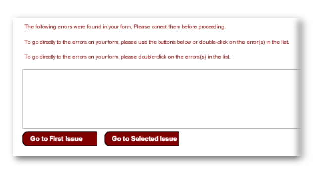
In the event of an error, this block presents a multi-line message to end users (explaining what action they should be taking), a display area to list the errors and two action buttons. |
|
Error Selection Block |
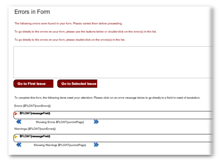
Makes a complicated structure, with an Error List Block above an Error and Warning Block. |
|
|
|
Predefined Block |
Description and Wireframe |
|
Cascading Dropdown Manager |
This block does not place visible objects on the form.
You must put Cascading Dropdown List widgets on the form
which point to the manager.
|
|
Error and Warning Block |
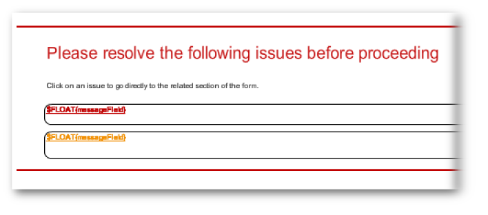
The user can scroll, via left and right navigation buttons, through the warnings and errors. |
|
Form Header |
Block containing the elements that make up the header of
the form's template: the logo and the text of three
levels of headings. (The visibility of of these headings
and other elements depends on the template.)The block
can be dropped into the structure. Normally there is no
need to add an extra heading block to the structure, so
this block is for specialized customization only.
|
|
Predefined Block |
Description and Wireframe |
|
|
|
|
Form Footer |
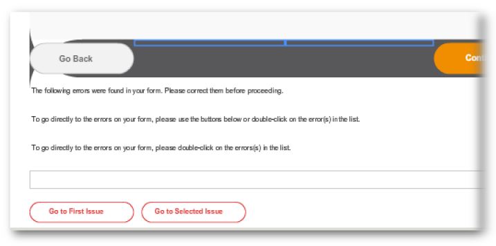
Block with the footer elements of the form, in this
case, an Error List Block.
|
|
|
|
|
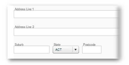
Address [Australia] |
Produces a block with plain text fields "Address Line1", "Addresses Line 2", and an inline of "Suburb", a dropdown for"State" and 4-digit numeric for "Postcode". |
|
Predefined Block |
Description and Wireframe |
|
|
|
|
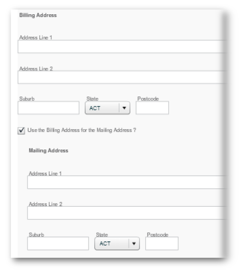
Address [Billing & Mailing] |
Creates an Address [Australia] block and a second block of identical format which becomes writable if the linking checkbox is made inactive. |
|
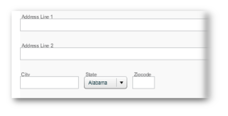
Address [United States] |
Same as the Address block above, except that the "State" dropdown is populated accordingly and the "ZipCode" numeric field accomodates more digits. |
|
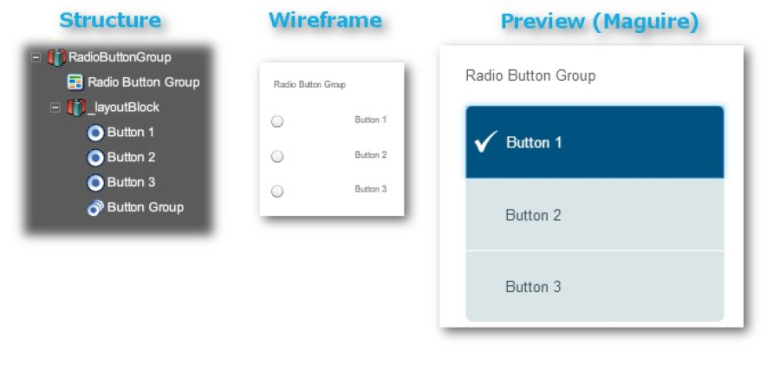
Radio Button Assistant Block |
This structure is created by dropping this assistant block onto the form. Takes care of the manual configuration tasks of the whole structure, as explained here. |
|
Predefined Block |
Description and Wireframe |
||||
|
|
|||||
|
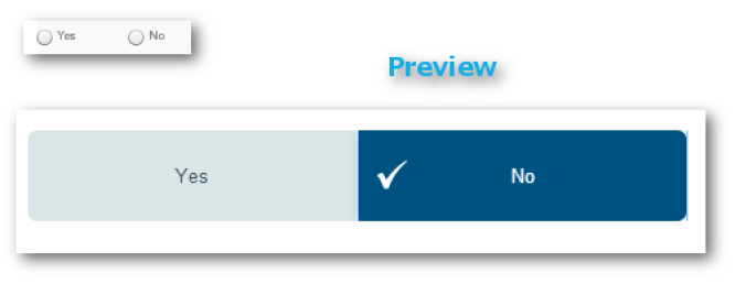
Radio Button List [Yes/No] |
A block of two radio buttons, a "Yes" and a "No". |
||||
|
Radio Button [No/Yes] |
Button order reversed from the above. |
||||
|
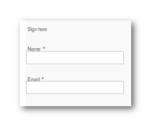
Signature [DocuSign] |
Invokes a Transaction Manager service to provide the
DocuSign signing workflow before delivering the
submission to another TM service.
|
||||
|
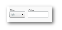
Title Block |
Produces an in-line dropdown ("Mr" |
"Mrs" |
"Miss" |
"Ms" |
"Other") and a text field to specify "Other". |
|
Predefined Block |
Description and Wireframe |
|
|
|
|
|
|
|
Business Rule - Error |
These are invisible on the form, but control the behaviour for the form. See the Business Rules section of this manual. These field types cover several widgets or widget groups, or even the whole form in some behaviours. Some aspects of these resemble the "Rules" tab of the "Edit Properties" dialog of individual widgets, but the rules tab applies only to the one widget. |
|
Business Rule - General Purpose |
|
|
Business Rule - Warning |
|
|
Mandatory Block |
|
|
Mandatory Checkbox Block |
|
|
|
|
|
Please see Collaboration. |
|
|
|
|
|
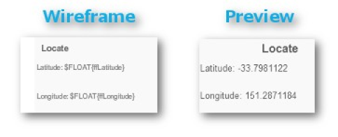
Geolocation Block |
Also works on the desktop.
|
|
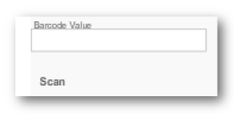
Barcode Block |
Take a picture of a barcode with a mobile device's internal camera using the "Scan" button on the form. The barcode is decoded, and its value populates the field below the camerabutton. |
|
|
|
|
Process Management Field Block |
See the section on FieldTypes. |
|
Smart Attachment Field Block |
Adds a table to a PDF form for the user to upload an attachment. HTML forms handle attachments differently, see Submissions andAttachments. |
|
|
|
|
TM Payment Table |
Creates a display table of payments, including GST (Australia's Goods & Services Tax) and Price. |
|
Predefined Block |
Description and Wireframe |
|
TM Payment Type Selector |
Creates two radio buttons and adds content and logos. (The choices are for Australian conditions,) |
|
TM Reference Data Block |
Creates an Auto-suggest field for some predefined list. |
|
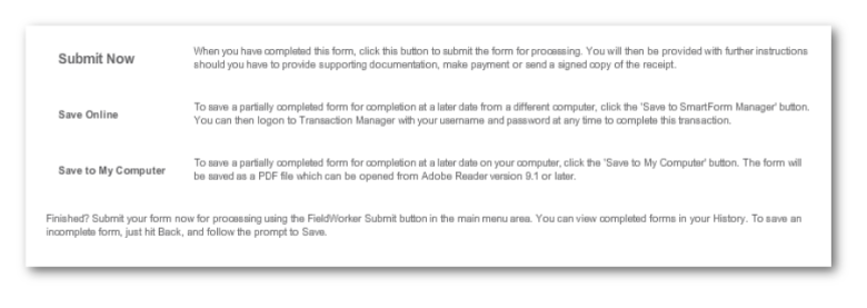
TM Submission Block |
Creates three buttons and associated content for Submitting, saving to TM natively, or saving in PDF locally. |
|
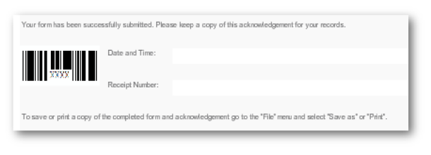
TM Submission Receipt |
Creates a block of two text displays for the receipt and
a receipt barcode graphic.
|
|
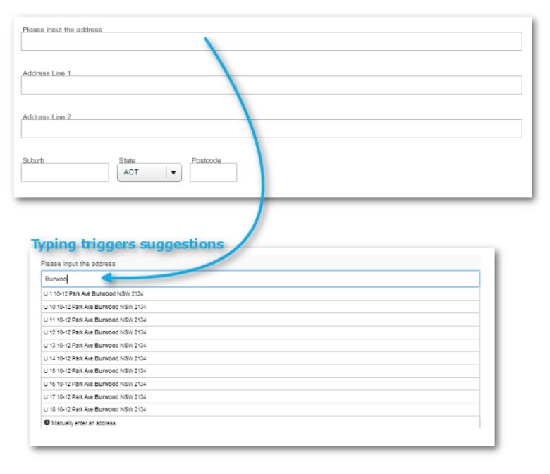
TM Veda Address Lookup Block [Australia] |
Creates a predefined dynamic data block made up of a
trigger field and an address block.
|
|
Predefined Block |
Description and Wireframe |
