The Applicants Space Details Screen
WorkspacesBack office manual processing. | Workspaces Applicants User | 21.11 This feature was introduced in 21.11.
Some of the text and images below may not match what you see in your Applicant portal. This is because the features described are based on a default Applicant portal configuration, and your Applicant portal may be configured differently; for example, with your company's branding or with other fields. Nevertheless, the features described work the same way in every Applicant portal.
Overview
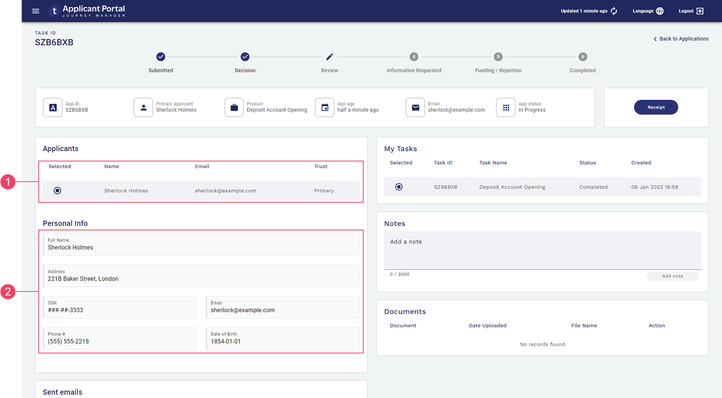
The Applicants space's Details screen is displayed when a user clicks an item on the Search screen. The Details screen shows information about individual item selected on the Search screen, and provides features for you to work with the tasks and application associated with that item. Information is displayed in the context of a selected task, and is reloaded whenever the user selects an item in the task list.
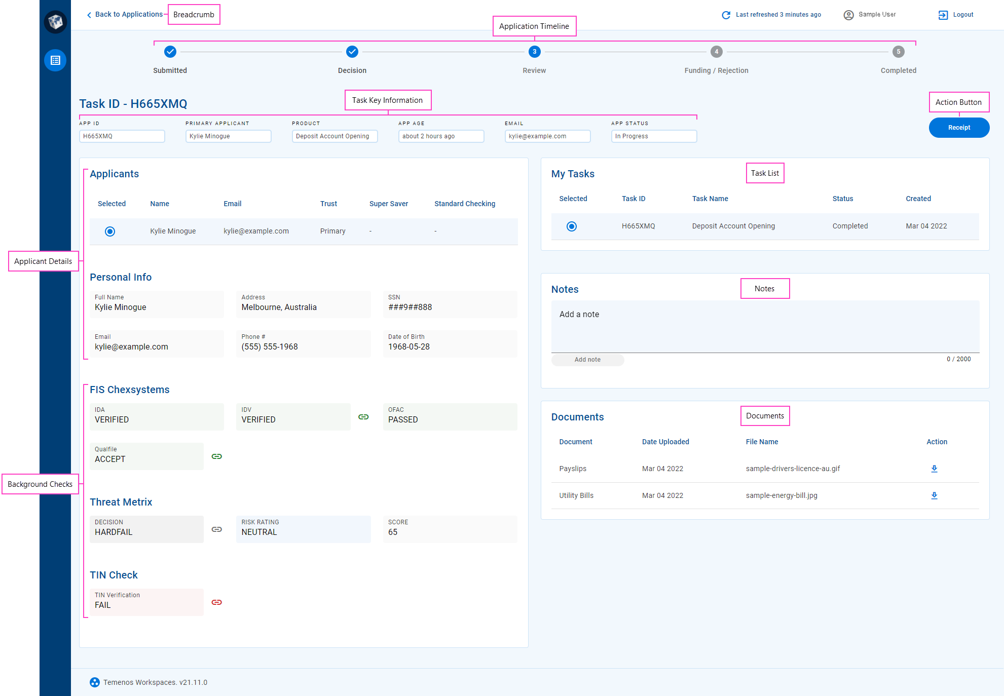
The Details screen in the Applicants space supports many of the standard features of a Workspaces Details screen. It displays comprehensive information about the selected task, and provides access to actions that let the applicant contribute to the application's progression through its life cycle. This includes the following features, each of which is contained in a separate card or card section:
- A simple timeline display of application steps showing the status of each step.
- The list of tasks (My Tasks) yet to be completed from which you can select one to focus on.
- Key information about the selected task.
- A set of standard actions that you can perform in the Applicants space at the current stage of the application's life cycle.
- Applicant details including a list of applicants from which you can select one to view more information about them such as identity and contact details.
- The outcomes of pre-configured background checks which provide an assessment of a selected applicant's suitability.
- A timeline of notes relating to the application.
- Attached documents relating to the application.
- An optional display of custom information; for example, information that is not included in the standard cards, or that is presented differently.
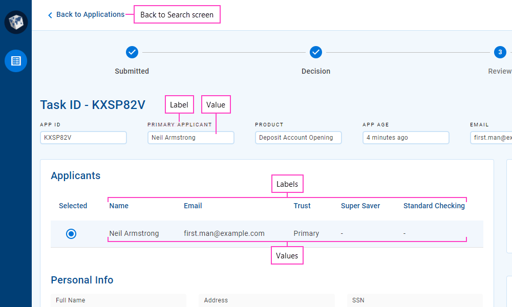
Generally, each information item or data field on the Details screen has a label and a value. The label identifies the specific entity that the field relates to, and the value is the application data corresponding to the label. Sometimes, there may be multiple values for one label; for example, when data is presented in a table.
Fields display information of various data types including text (name, email address, some IDs), numbers (phone, SSN), and dates. A date may represent either a specific point in time (date of birth) or a duration (application age).
Numbers and dates can be configured to use a variety of formats. For example:
- Phone numbers can be formatted for the current locality or to accommodate internationalization.
- 9-digit Social Security Numbers are commonly displayed using the format "AAA-GG-SSSS".
- Dates representing a point in time can use either absolute ("1 Jan 2022", "today") or relative ("last Wednesday", "6 days ago") formats.
- Dates representing a duration can use either specific ("7 days, 3 hours, 26 minutes") or approximate ("about 7 days", "last week") formats.
Sometimes a value might be too long to fit in the space available for it; in this case, the value is often truncated and an ellipsis ('…') is appended to indicate that you're not looking at the full value. To see the full value, point your cursor at the truncated value and a tool tip is displayed showing the full value.
By default, values in table columns wrap when they are wider than the column. However, sometimes this behavior is undesirable, and it can be overridden for specific columns via configuration.
To return to the Search screen, click the Back to ... link at the top of the screen, or click an item in the .
Progress stepper
The progress stepper presents a high-level overview of application progress against significant milestones in the application life cycle. The progress stepper is hidden for saved applications, becoming visible once an application has been submitted.
If you need to see more application processing details, the application timeline shows the exact steps performed.
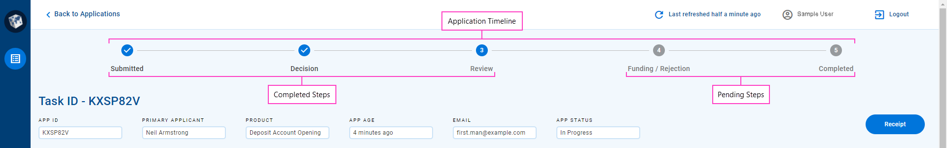
Current, completed and pending steps are differentiated visually, allowing the user to see the progress of submitted applications at a glance. Steps to the left of the current step are shown as completed even if they were skipped, while steps to the right of the current step are shown as pending even if they have been completed. For example, the following screenshot shows an application that is being reviewed for the second time after requested information has been provided. The progress stepper shows the Information Requested step as pending even though it has been completed because it is to the right of the current step, while the application timeline shows all steps the application has been through; in particular, the two Manual Review steps.
The card displays important task information that's handy for Applicants space users to have at their fingertips.
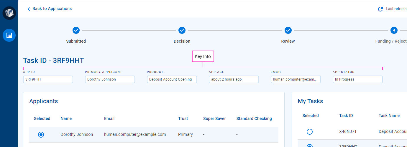
The card includes between four and six items depending on the width of your browser window. The full width layout accommodates six items but as the width of your browser becomes smaller, items are removed progressively until only four items are displayed. Each item has a label and a value.
Each item shows a single value but this can be limiting for some kinds of information. To improve this situation, additional information can be displayed in a tooltip. When available, a tooltip is indicated by a icon. To view the tooltip, point your mouse at the icon. | 22.10 This feature was introduced in 22.10.
As an example, say you have an application type covering multiple optional products and you have a Product item. If an application includes multiple products, only the first product is displayed in the Product item. In this scenario, a tooltip could be configured to show all products included in the application.
The value displayed in the Product item may correspond to a form group. If this is the case, the specific form associated with the task is displayed as the Product. | 22.10 This feature was introduced in 22.10.
Applicant Details
When filling out an application, it's generally necessary to provide personally identifiable information ( PIIPersonally Identifiable Information (PII) is information about an individual that can be used to distinguish or trace an individual‘s identity, such as name, social security number, date and place of birth, mother‘s maiden name, or biometric records; and any other information that is linked to an individual.) for each applicant that uniquely identifies them, and which is often used to perform background checks that are critical in successfully processing the application. In the Applicants space, this information is displayed in the Applicant Details card.
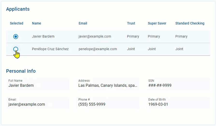
At the top of the card is an Applicants section listing all of the applicants associated with the application. This section displays key applicant-related information for each applicant including their name and email address. Select an applicant from this section to display more information for that applicant in the other sections of this card below the list.
Sections below the Applicants list show information about the selected applicant in a grid layout that improves the user experience when dealing with applications that include multiple applicants. A Personal Info section displays the selected applicant's personal information including their full name, address, email, date of birth, and some country-specific identity information (such as a Social Security Number in USA). This section may be followed by other sections showing more detailed information relating to the selected applicant; for example, a more detailed address, or more details for an associated identity document such as the document type and number as well as when and where it was issued. Additionally, your Applicants space may be configured to include a section displaying the results of identity checks or verifications relating to the selected applicant. To learn more about how these background checks are displayed, see Background Checks.
My Tasks
An item selected on the Search screen may have multiple tasks associated with it that the current user needs to complete. My Tasks displays this list of outstanding tasks and provides a way to navigate between them.
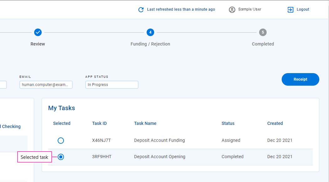
The tasks displayed in this list are ordered by creation date in reverse chronological order. Brief information is shown for each task including the task's ID, name, current status, and when it was created. When the Details screen is displayed, the last (that is, oldest) task in the list is selected automatically. You can select any task from the list to reload this screen with information for that task. The currently selected task is indicated visually in the list.
Notes
Throughout the life cycle of an application, there may be times when an applicant needs to provide additional information to the bank staff processing their application. Both Workspaces and the Applicants space support this kind communication.
In the Applicants space, applicants manage notes in the Notes card (1). To add a note, click the Add a note field (2) and enter your note text (3) then click (4). Your new note appears below the Add a note field (5), and a message is displayed briefly in the bottom left corner confirming your note has been added (6).
A character count is displayed below the Add a note field and updated as you type in your note.
All of the notes for an application entered by the applicant are displayed in a list at the bottom of the Notes card with the newest at the top. The text for each note is accompanied by the date and time it was created and who added it.
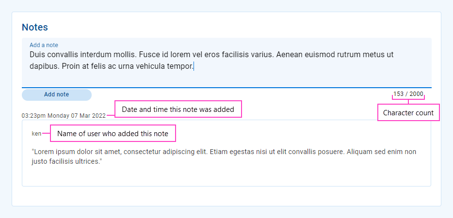
Both Workspaces and the Applicants space allow users to add notes to an application. Any notes added by the applicant appear in the Notes card, and can be viewed by bank staff in Workspaces via the View Notes action. However, notes added by bank staff in Workspaces cannot be viewed in the Applicants space.
My Documents
Applicants are often required to provide third-party evidence, such as a drivers license or an energy bill, which is use to verify the details they entered in their application. These documents are attached to the application, and made available to an Applicants space user in the Documents card.
Each item in the Documents card contains the following elements.
- Document: This identifies the kind of information in the document file, and is assigned automatically when a document is uploaded by the applicant while filling in the application.
- Date uploaded: A timestamp that shows when the document file was uploaded and attached to the application.
- File name: The file name of the document when it was uploaded and attached to the application.
- Download: On the right-hand side of each document item is a icon that you can click to download the document file.
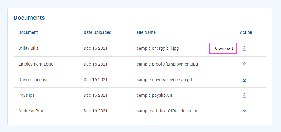
As an Applicants space user, the only document-related action you can perform is to download it. You cannot change the way documents appear on the Documents card, nor can you upload or manage documents attached to an application.
Custom information
Much of the Workspaces user interface presents various types of content (information and features) in components or layouts specifically designed for each content type. In addition to the standard content types described above, your Journey Engage portal may also be configured with additional custom content specific to your organization. While custom content is more commonly available on the Details screen in separate tabs This feature was introduced in the 22.10 release, you may also find it used on the List screen in expansion rows.
Workspaces supports two format options for custom content, designed for two different kinds of data:
- Multi-value data: Content is displayed in a table, with a header row at the top followed by one or more data rows. Each column represents a different kind of content, identified by the column header, while each row relates to a single entity such as an applicant, a background check, or a document. Each individual data item is either a simple text/number display or an icon that links to additional details or functionality. All data items in the same column are of the same type.
- Single-value data: Each data item in a container (such as a tab, card or section) is displayed separately, with a label and value, and an optional icon that links to additional details or functionality.
- Multi-value data
- Single-value data
Custom content presents a read-only view of a predetermined data set. An Applicants space user has no control over the way the data appears, nor can they modify the displayed information.
Several icon types are supported for icon in custom content:
- : Indicates additional details are available to view. Click the icon to display the additional details in a pop-up window.
- : Indicates the additional details are available to download. Click the icon to download the file containing the additional details. This feature was introduced in the 21.11 release
- Any other icon provides access to additional functionality. Click the icon to perform the associated action. This feature was introduced in the 22.10 release
No Data Scenario
Sometimes, data may not be available in the Applicants space for one or more data items. This could be because the expected data does not exist (for example, has not been collected) or because a technical issue prevents the Applicants space from being able to obtain the data. The Applicants space can be configured to indicate that expected data is not available by displaying a dash ‘– ‘ instead of the data value. The lack of data is reinforced by the use of gray color for UI elements relating to these data items.

WorkspacesThe Applicants space can also be configured to hide items with no data, so you may not even see fields or records with no data.
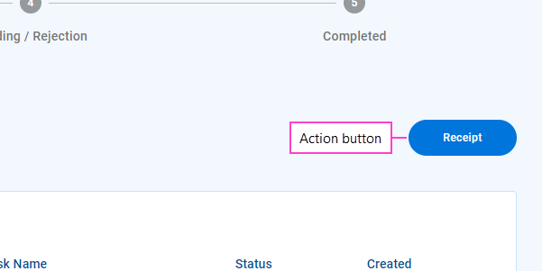
Applicants Space Actions
The Applicants space includes a set of standard actions for working with applications and tasks. However, unlike other Workspaces spaces, the Applicants space functionality cannot be extended using custom actions as these aren't currently supported in the Applicants space.
The standard actions in the Applicants space are:
- New Application: Start a new application in the Applicants space.
- Receipt: See a read-only view of a submitted application.
- Recover: Recover an abandoned or withdrawn application so that the applicant can continue with it. This feature was introduced in the 19.11 release
- Resume: Re-open an application in the same form used to start the application.
- Withdraw: Cancel an application that has been saved but not yet submitted. This feature was introduced in the 19.11 release
With the exception of New Application, all of these actions are available from the Details screen via the Action button to the right of the card.
You can start a new application from the Search screen.
The Action button changes according to how many actions are available.
- One action:The button label is the name of the action, and clicking the button performs the action.
- Multiple actions:The button label is 'Actions', and clicking the button displays a dropdown list containing one item for each available action. Select an item to perform that action.


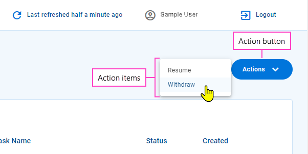
Different actions may be available for each task because the actions that can be performed on a task at any time depend on several factors including the task's current state. For example, the Recover action will be available only for an application that has been abandoned.
The labels and tooltips for the standard action types are configurable, so they may be different in your Applicants space portal to what is shown in this documentation.
Some actions display a brief message in the bottom right corner of the screen confirming that your desired action was successful or notifying you that something went wrong.
Resume an Application
After you start an application, you may find that you don't have all the information you need at hand to complete the application, so you save it for now while you go and find what you need. Once you have all the information for your application, you can resume your saved application to complete it and submit it.
To view the information for an application that has been submitted, use the Receipt action.
When you resume an application, the information previously entered is displayed in the same form that was used to capture that information. While resuming an application and viewing a receipt both show you the application form, these two actions differ in one key way. When you view a receipt, the application form is displayed read-only. However, when you resume an application, you can enter or update information in the application form and then submit it.
Any Personally Identifiable Information (PII) in a recovered application is not available if the data retention period has expired.
For more information about resuming applications, see Resume: Re-open an application form.
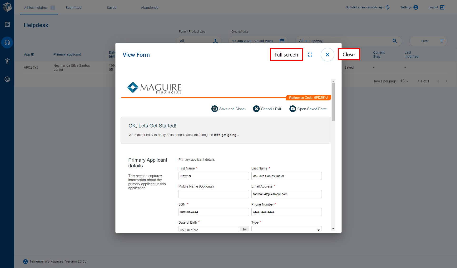
View a Receipt
When you're working on a task or application, you often need to see the information that the applicant has submitted; for example, to inform the decision making process. You can use the Receipt action to view the information for a submitted application.
To view an application that has been saved but not yet submitted, use the View Form action.
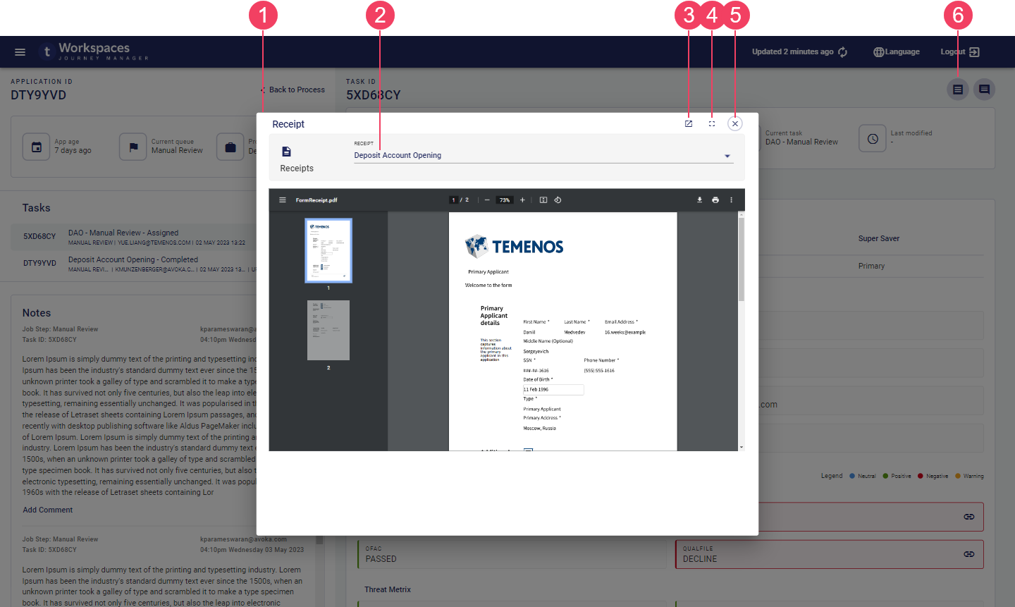
- Receipt modal window
- Receipt selector
- Pop out to new tab
- Expand to full screen
- Close modal window
- Receipt button
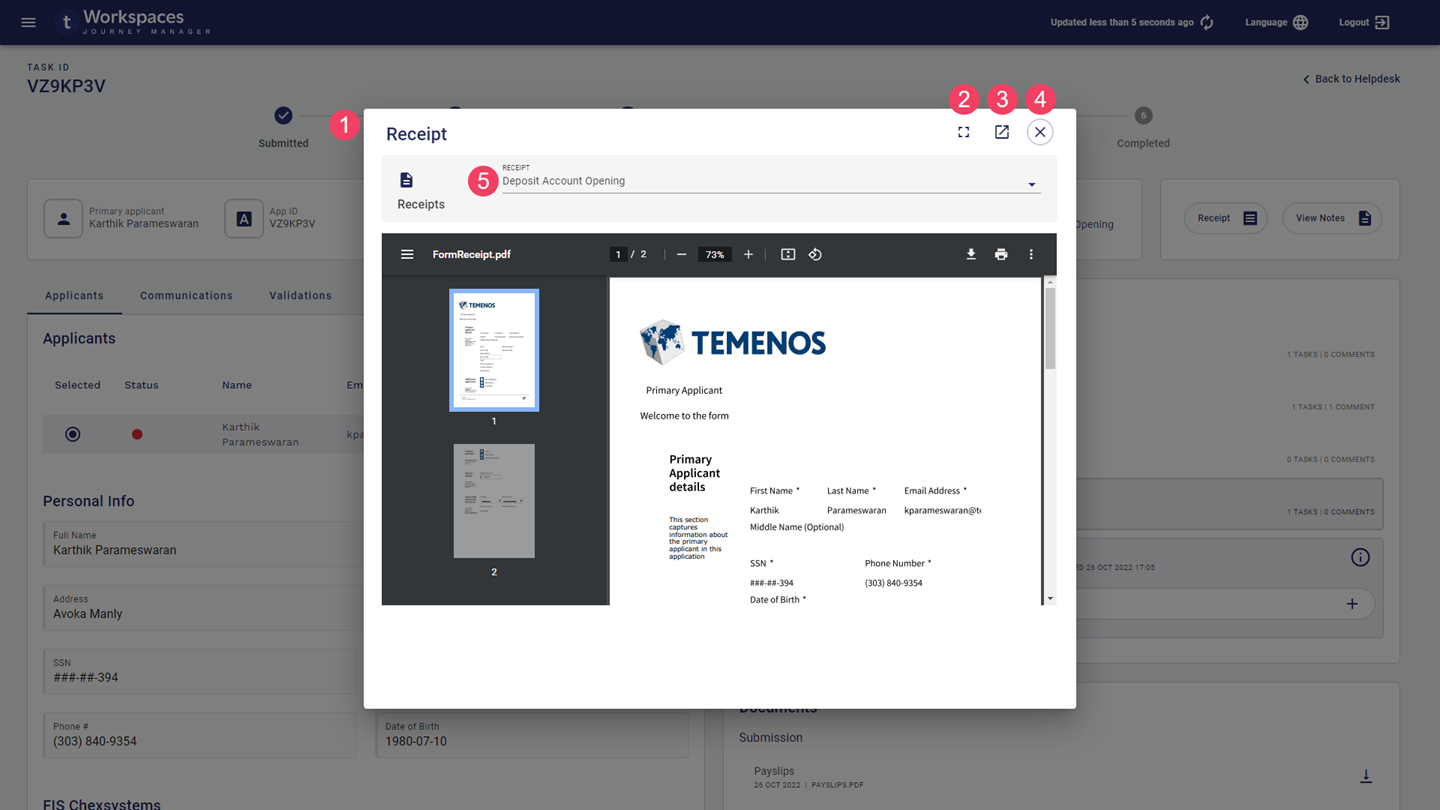
- Modal window
- Expand to full screen
- Pop out to new tab
- Close modal window
- Receipt selector
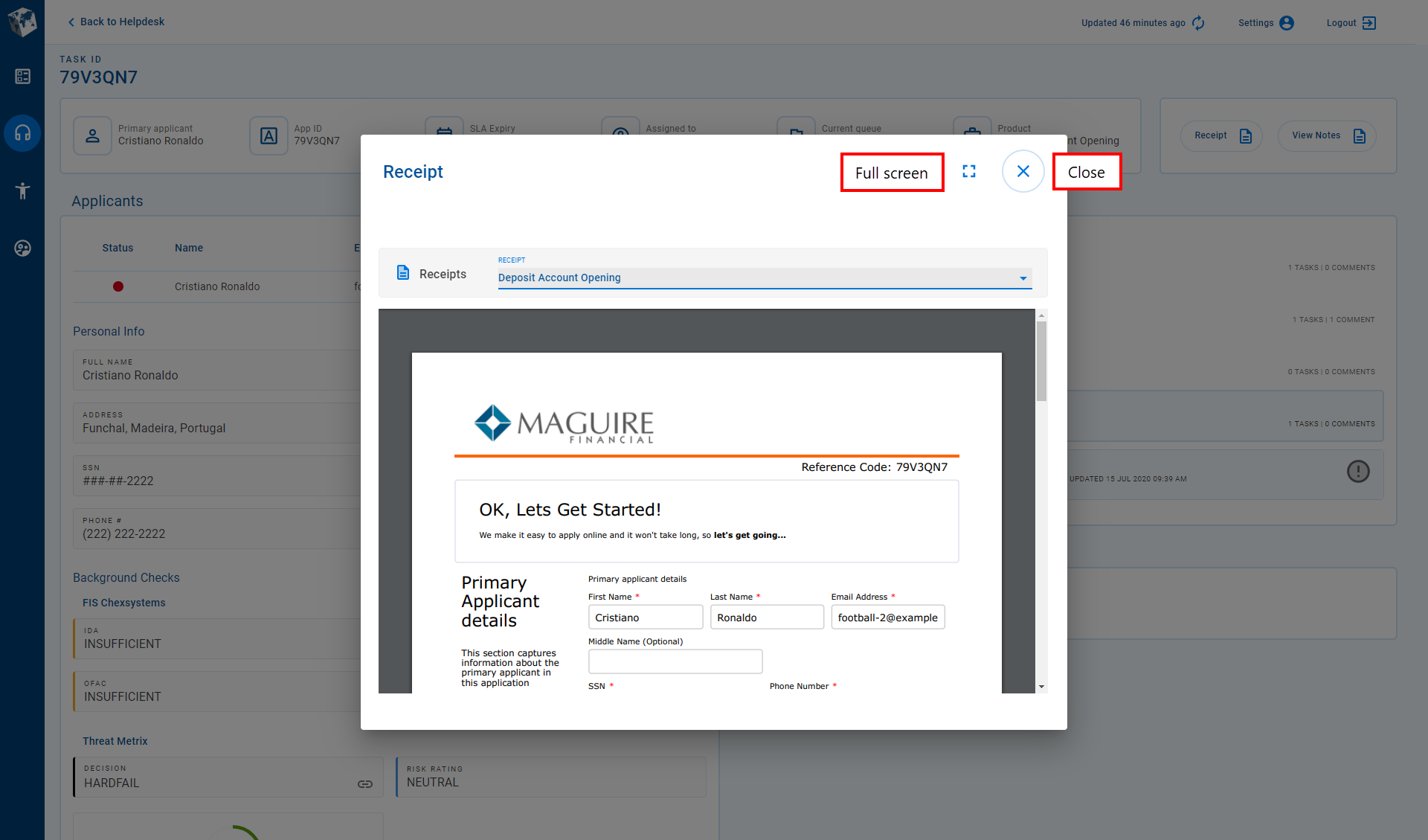
A receipt is a read-only view of information submitted by an applicant or other Workspaces user, and displayed in the same form used to capture that information. You can view a receipt from any space, and for any item (application or task) even if it's not assigned to you. Each task associated with an application may have a receipt. If there are multiple receipts for an application, you can view a specific receipt using the Receipt selector at the top of the modal window. Note that viewing a receipt does not allow you to change the application in any way.
When you select the Receipt action, the receipt for the selected task is displayed unless there isn’t a receipt associated with the task, in which case the most recent receipt is shown by default. However, if you're using Workspaces 22.04 or earlier, the most recent receipt is always displayed by default. | 22.10This feature was updated in 22.10.
For more information about viewing receipts, see Receipt – View a Receipt.
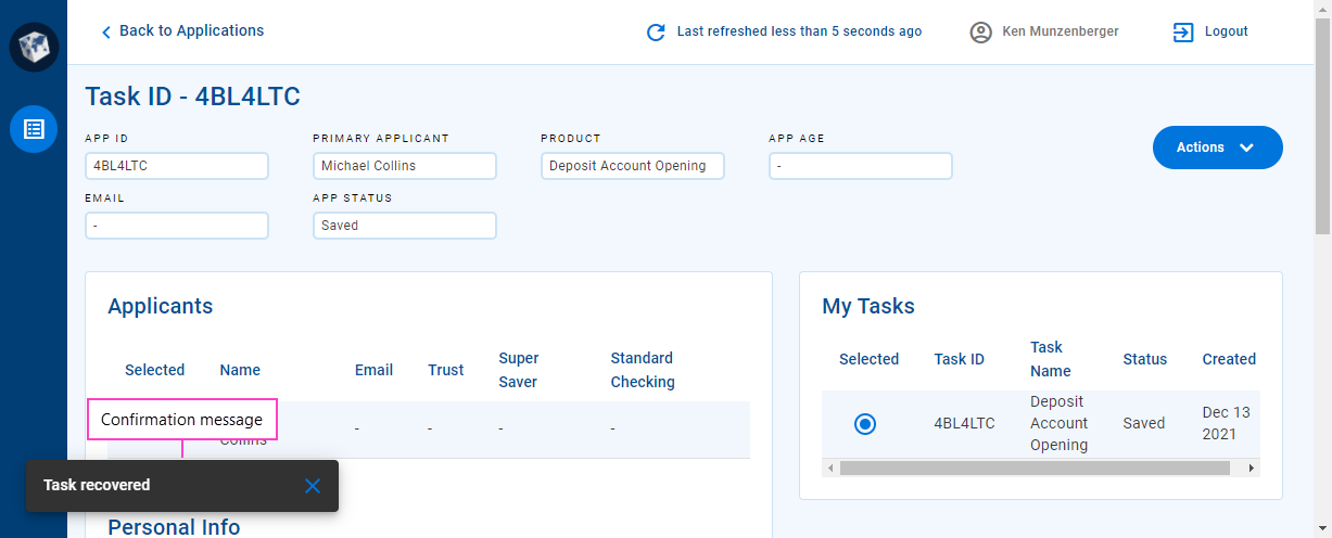
Recover an Application
Let's say you start an application but your browser crashes before you can save or submit it. Maybe you give up on the application for now, and so it becomes abandoned. A short time later, you decide to complete the application after all. Rest assured, you haven't lost all the information you entered because you can recover your application, then complete and submit it.
Any Personally Identifiable Information (PII) in a recovered application is not available if the data retention period has expired.
It's easy to recover an application. Go to the Search screen, locate the application to be recovered, then select it to view its Details screen and recover the application from there.
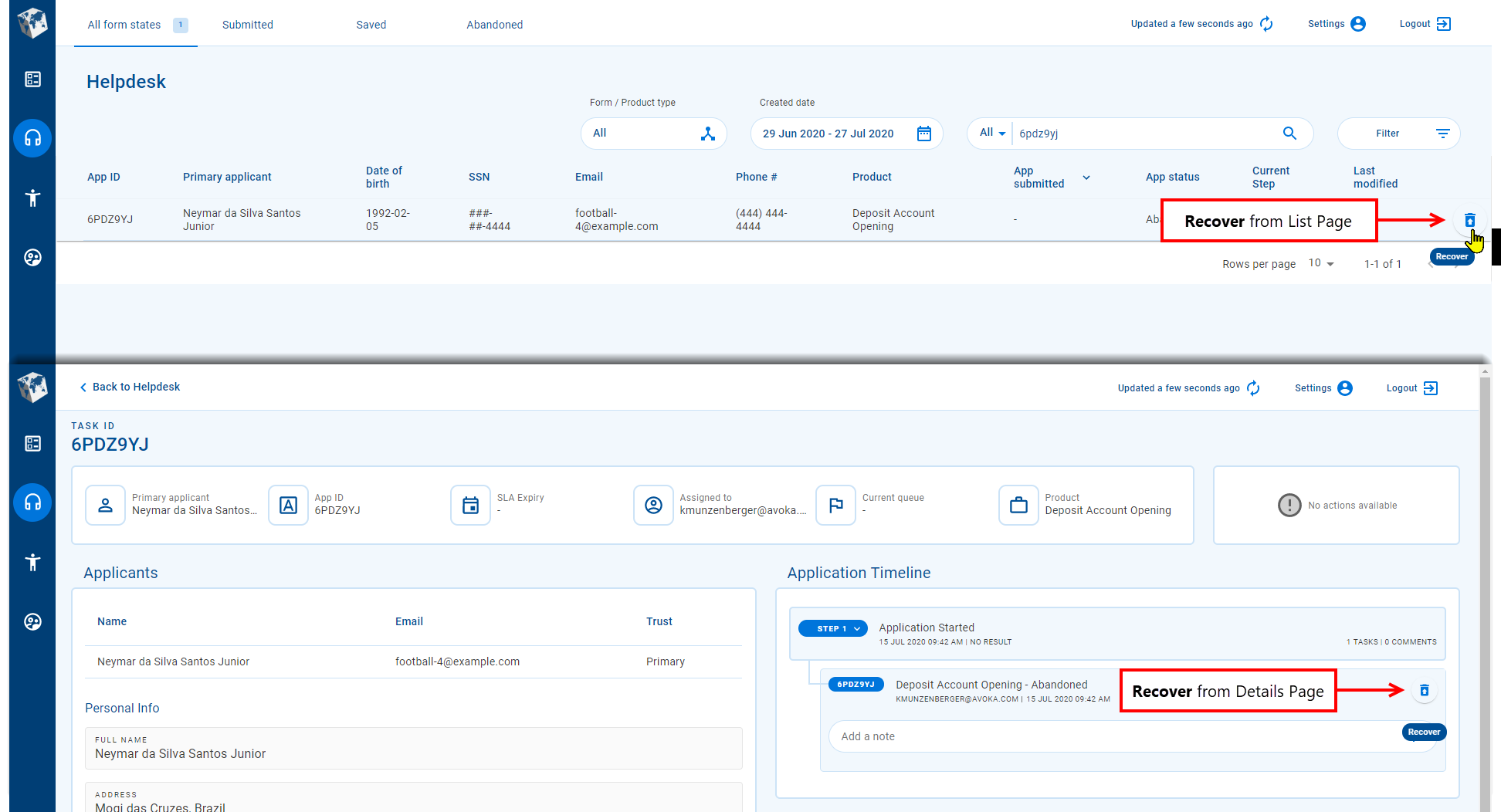
In addition to abandoned applications, an application that has been withdrawn can also be recovered.
For more information about recovering applications, see Recover an abandoned application.
Withdraw an Application
Now, let's say you start an application but, before submitting it, you decide not to proceed with the application after all. You could contact the support helpdesk and ask for the application to be canceled, but you also have the option to withdraw the application yourself.
Just like recovering an application, it's easy to withdraw an application. Go to the Search screen and locate the application to be withdrawn, select it to view its Details screen and withdraw the application from there.
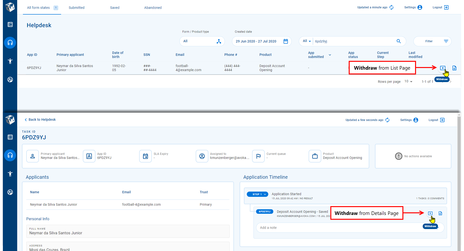
An application that has been withdrawn can subsequently be recovered should you have a change of heart.
For more information about withdrawing applications, see Withdraw an unsubmitted application.