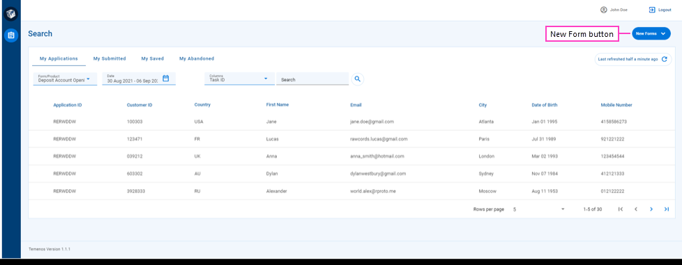
The Applicants Space Search Screen
WorkspacesBack office manual processing. | Workspaces Applicants User | 21.11 This feature was introduced in 21.11.
Some of the text and images below may not match what you see in your Applicant portal. This is because the features described are based on a default Applicant portal configuration, and your Applicant portal may be configured differently; for example, with your company's branding or with other fields. Nevertheless, the features described work the same way in every Applicant portal.
Overview
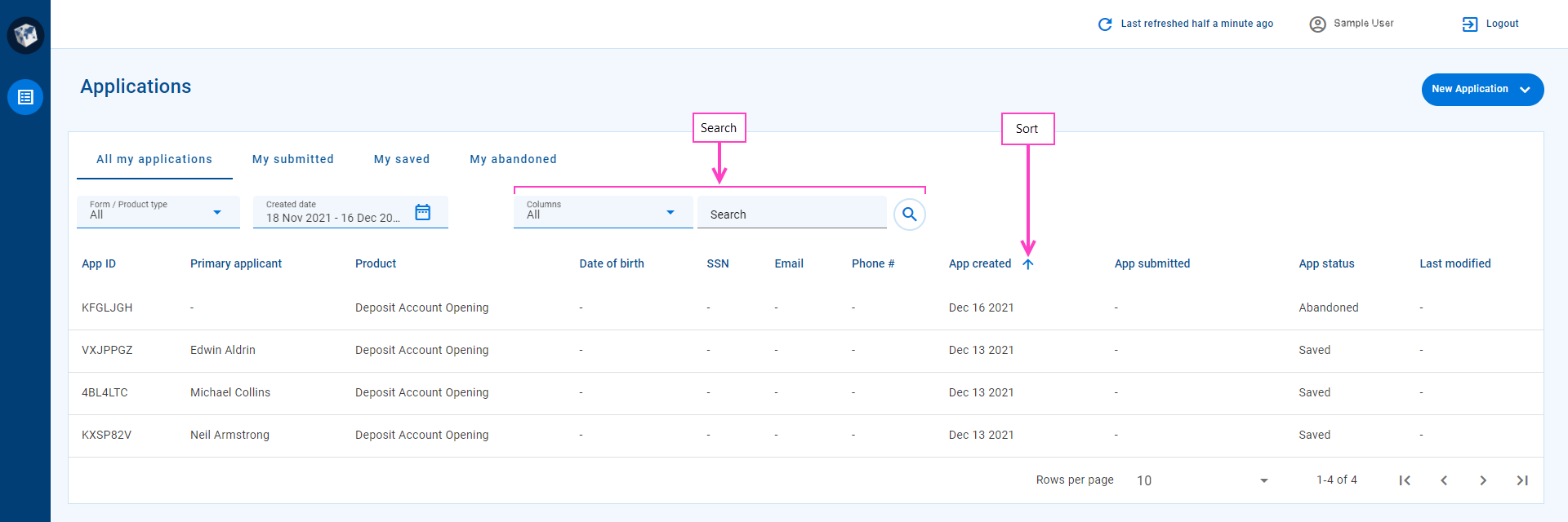
When you select the Applicants space, the first screen you see is the Search screen. This screen provides features that help you find your tasks and applications so that you can do what you need to to keep them progressing towards your desired outcome.
The Search screen includes the following features.
- An option to start a new application without leaving the Applicants space.
- An item list, populated with items matching various criteria, and which may be empty initially.
- A View selector, used to apply a pre-defined set of fields, filters and sort options to the item list.
- A Product selector that restricts the items in the item list to just those matching a selected product.
- A Created date selector that restricts the items in the item list based on the date they were created.
- Flexible search and sort options that you can use to refine the set of items in the item list.
- Paging tools that help you to browse the item list when the number of matching items exceeds the selected page size.
The following image illustrates where you can find these features.

At the top of the Search screen is the which provides common functionality applicable to all Workspaces screens. Below this, the main element on the Search screen is the item list which displays summary information for a list of tasks or applications. The View, Product, and Created date selectors above the item list are the main way you control and identify which items are displayed in the item list.
- The View selector shows the name of the current view, and lets you select another view to quickly and easily change how the item list appears (including different fields or sort order) and which items are displayed.
- The Product selector shows the name of the active product type, and lets you select another product so that you can work with other tasks or applications.
- The Created date selector lets you hone in on items created in a specific period, and displays the date or date range that is currently selected.
If you've selected a view and applied some filters, and you still can't see the item you’re looking for, there are a few more ways you can try to find it.
- Search: When you just want to find a specific item, you can search for it to find it straight away (or not at all). To learn how to search, see Search for a task.
- Sort: You can change how the list of items appears by sorting on a different field.
- Browse: You might not be sure which task or application you need until you see it. In this case, you can browse through the item list until you find what you need. A set of paging tools allows you to choose how many items are displayed in a page and browse the item listpages.
Once you’ve found the item you’re looking for, select it to view more about it on the Details screen where you can interact with it further.
While you can't perform actions on existing tasks from the Search screen, you can start a new application.
Page Header
The is common to all Workspaces screens, displaying generic information and providing access to common features and menus.
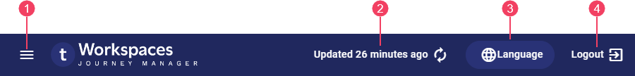
- Screen refresh
- Logout
On the , you may find the following features.
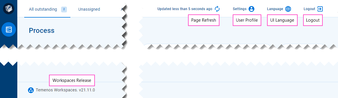
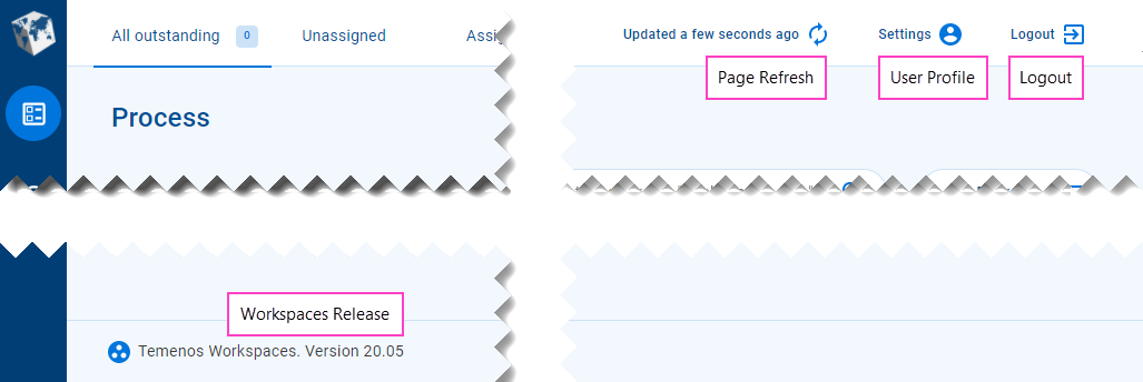
- : Click this to display a menu presenting the available spaces from which you can select one to work in. This feature was introduced in the 23.04 release
- Screen refresh: When the information displayed on the screen was last refreshed, and an option to refresh it.
- : A menu button providing access to options. This feature was removed in the 22.10 release
- : An option to select the language used for static text in the Workspaces UI. This feature was introduced in the 21.11 release
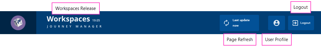
- Logout: An option to log out of your current Workspaces session.
Workspaces 21.11 introduced an automatic session logout after a defined period of inactivity. To learn more about configuring the session timeout period, see Session Timeout.
Workspaces releases prior to 20.05 also display the release version number in the header, while this has moved to the page footer in subsequent releases.
When you navigate to a Workspaces screen, the information displayed is up-to-date but it can become stale over time. The elapsed time since the screen was last updated is shown in the beside the . If the screen has not been updated recently or you just want to make sure you're looking at the latest information, click to refresh the screen.
(22.10 and earlier)
To access the settings, click the User Profile button (1) and select Settings (2). Update your profile settings as required (3) and click Save (4), then close the profile window (5). A message confirming your profile update was successful is displayed in the bottom left corner of the main window (6). You can close the message (7) or wait for it to go away after a few seconds.
Start a New Application
The Applicants space includes a set of standard actions for working with applications and tasks. However, unlike other Workspaces spaces, the Applicants space functionality cannot be extended using custom actions as these aren't currently supported in the Applicants space.
The only action available from the Search screen is New Application which you can use to start a new application. All other actions are available only from the Details screen; to learn more about them, see Applicants Space Actions.
The labels and tooltips for the standard action types are configurable, so they may be different in your Applicants space portal to what is shown in this documentation.
To start a new application, click New Application (1) and select a form type from the list displayed (2). The application form is displayed in a modal window (3). Fill out the application form and save or submit it (4) then close the modal window (5). Your new application will appear at the top of the item list (6).
Item List
The main element on the Search screen is the item list, a tabular display of information relating to tasks or applications. Each row of the item list displays brief details for a single item to help you identify what you're interested in. The type of information displayed in each column is configurable, and this is one of the ways your Applicants space may differ from the default configuration.
The items displayed in the item list satisfy a set of criteria that is determined by selecting a view then, optionally, further refining the list of items by selecting a product and/or a date range, or by searching for specific items. Items appear in the item list if they:
- relate to applications created by you; and
- match the criteria imposed by the current view; and
- (optionally) correspond to the value shown in the Product selector; and
- (optionally) were created on a date matching the date or date range shown in the Created date selector; and
- (optionally) match any optional search criteria applied by the user.
As noted above, you can only see items for applications that you created, whether they be your own applications (as an applicant) or applications you created on behalf of the applicant (for example, as a broker). If there are no matching items, the item list is empty; this will likely be the case the first time you login to the Applicants space.
View Selector
The View selector provides a quick and easy way to apply a view configuration to the item list so that you can focus on a particular set of items.
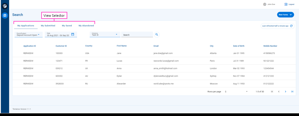
A view is a predefined item list configuration including fields, filters, and sort options. You can think of a view as a shortcut for applying a set of filter and sort options on top of a defined set of fields.
The default Applicants space configuration comes with several predefined views:
- My applications: All applications created by the current user (without any filters or search)
- My submitted: All applications created by the current user that have been submitted
- My saved: All applications created by the current user that have been saved but not yet submitted
- My abandoned: All of the current user's abandoned applications, regardless of how they were abandoned (that is, either as a deliberate action by a Workspaces user, or passively by the system when the data retention period has elapsed)
Each item in the View selector represents a view. Click an item in the View selector to make it the current view. When a view is selected, it's configuration is applied to the item list to restrict the items displayed. A color highlight provides a visual indication of which view is selected.
Usually, all available views will be visible in the View selector. However, if there's not enough screen space to display all the configured views, you can access the views that are not fully visible by pointing at the View selector and rolling your mouse's scroll wheel.
Views are configured by an Workspaces developer or administrator. As an Applicants space user, you can’t change the way a view is defined but you can use filter, search, and sort options to refine the items displayed in the item list.
Product Selector
The Product selector is used in conjunction with other selectors and optional search criteria to populate the item list. The Product selector identifies the type of product currently used for populating the item list. Select a product from the Product selector to display only those items that match the selected product.
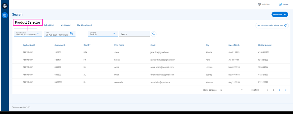
The available products are listed in the Product selector’s dropdown list as well as an All item. You can choose any product from the dropdown list to restrict the items displayed in the item list. If you choose All, the item list is populated with items for all products.
The first time you open the Search screen, the Allproduct item is selected by default, so items matching all products (subject to any active filter or search) are displayed in the item list. Thereafter, Applicants space remembers the last product you chose, and selects it automatically when you open the Search screen.
Created Date Selector
Another Search screen feature that helps to reduce the number of items presented to you is the Created date selector which displays the date or date range currently applied to the time list and lets you apply a different date filter.
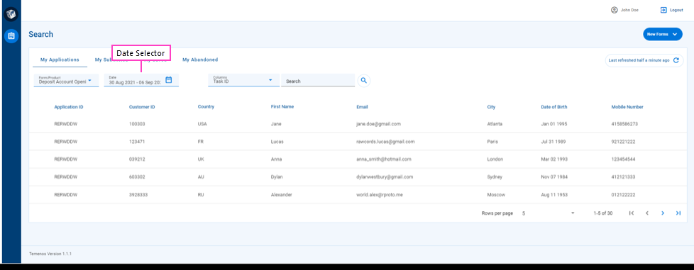
The default date filter restricts the items displayed in the item list to just those that were created in the last four weeks including the current date, and this filter is applied the first time you access the Search screen. You can select a different date filter using the Created date selector.
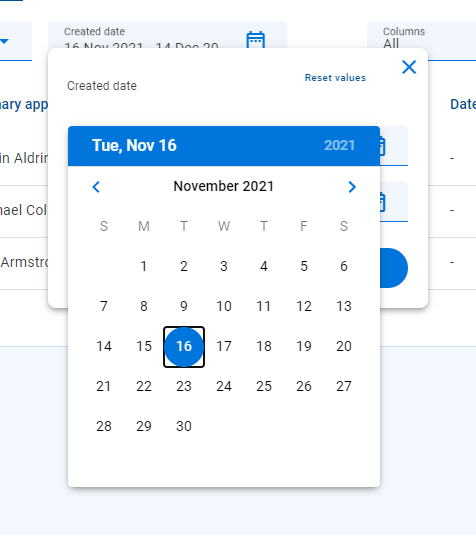
When you click the Created date selector, a date range dialog is displayed. This dialog includes two date fields, From Date and To Date, that together define a date range. To filter on a single date, select the same date for From Date and To Date.
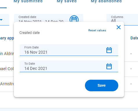
You can enter a date by selecting it from a calendar or typing it in. To discard any dates you've entered and revert back to the original dates when the dialog was displayed, click Reset values. Once you've entered the dates, click Save to apply the date filter. Alternatively, you can click to close the dialog without applying the new date filter while retaining the dates you selected.
Each date field includes a icon; click this icon to display a calendar from which you can select a date. You can click or to browse to and select dates in other months.
Search and Sort
By default, the item list shows items that satisfy the criteria defined by the current view and any selections from the Product and Created date selectors. This may still result in a large number of tasks which you might want to refine further. Searching and sorting can help you to focus on the tasks that are important to you right now.
Search for a Task
If you know which task or application you're looking for and you can't see it in the item list, you can try to search for it. Searching allows you to refine the list of items displayed to show just those relevant to what you are looking for.

Like the Form / Product type and Created date global filters, searching reduces the number of items in the item list by matching specific field (column) values. However, searching differs from the various selectors in a number of ways:
- Searching can target one field or multiple fields, whereas each selector is targeted at a single field.
- When searching on one field, the user can choose which field to target, whereas each selector is targeted at a predetermined field.
- When searching on multiple fields, the same search text is compared against all targeted fields. By contrast, the user needs to select a search value in each selector separately.
- Searching is supported for text fields only, whereas selectors support several different data types including dates.
To search for a task or application, select the search scope from the Columns selector, enter your search text in the Search field, and press Enter or click . The search text is compared against the searchable fields in the search scope, and only matching items are displayed in the item list. If the search scope is All, the search text is compared against all searchable fields.
Searching is case-insensitive, treating uppercase and lowercase characters as the same, and only finds items that match the search text exactly (ignoring letter case). Partial match is not currently supported.
When a search is active, the items displayed in the item list satisfy the current view and filter selections as well as the search criteria. A search remains active until you clear it. Note that simply deleting all of the search text in the box does not clear an active search. To clear a search, click the button.
If you select an item in the item list while a search is active, when you subsequently return from the Details screen to the List screen, the search will still be active. You can tell that the search is still active by the text and the icon in the Search field.
Sort the Item List
Items in the item list are displayed in an order determined by the current sort selection. This is indicated by an icon on the right-hand side of a column name. The icon indicates the item list is sorted by the column values in ascending order, while indicates items are sorted by the column values in descending order.
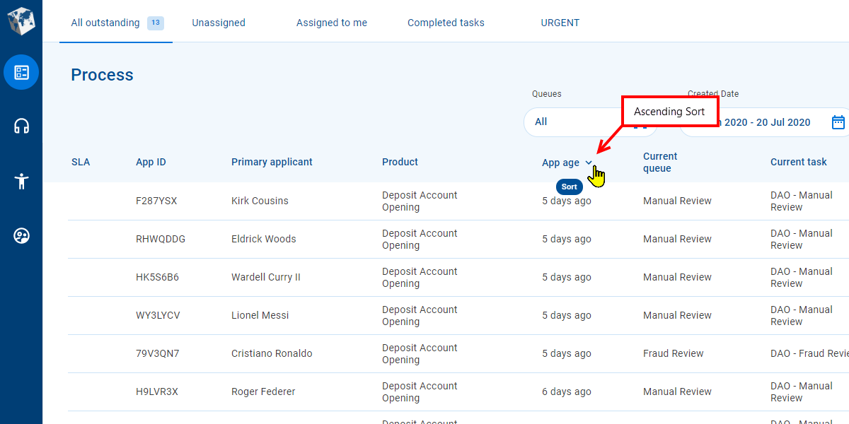
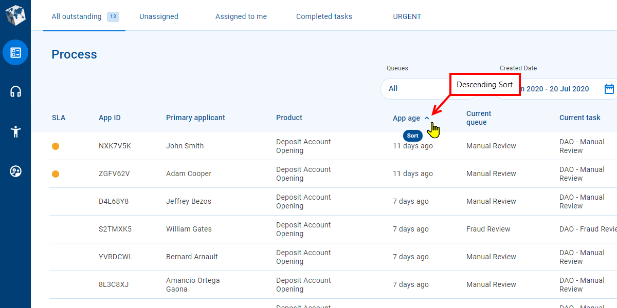
You can determine whether a column is available to use for sorting by pointing your cursor at a column heading. If your cursor changes to the hand pointer and a "Sort" tooltip is displayed, you can sort by the column. To change the sort order, click the column name. If you click the column name for the current sort selection, sorting will alternate between ascending and descending order.
Paging Tools
Sometimes, there are too many items to display all at once on the screen. Paging allows you to see some of the items now then browse the item list one page at a time to see more. Paging tools let you choose the number of items to display on an item listpage, and navigate (forward or backward) through the available pages of items.
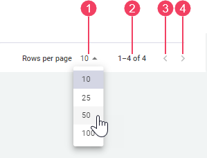
- Rows per page
- Items in list / Total matching items
- Previous Page
- Next Page
The and paging tools let you browse through item listpages to find the items you need. Click these tools to display the previous or next page of items in the item list. The tool is disabled when the first item list page is displayed; similarly, the tool is disabled when the last item list page is displayed.
Rows per page shows the maximum number of items displayed on an item list page. You can select a different page size from the Rows per page dropdown. Selecting a different page size, resets the item list to show the first page again.