Select Language
MaestroThe UI design product. | Form Builder | 22.04 This feature was updated in 22.04.
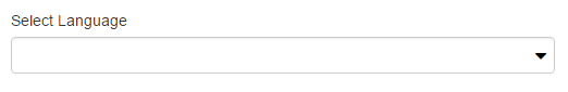
Maestro provides the Select Language component (widget), which allows form users to select a language that they want to use on a form. You must add and configure a language or multiple languages for a form before a user can select them.
This component inherits properties and shared styles from the Dropdown component.
Usage
- Open the Palette pane in the Maestro editor.
- Locate the Select Language component within the User Information folder.
- Drag the component into the View pane or the Wireframe.
- Configure the component's properties via the Properties pane.
- Configure the component's styles via the Styles pane.

Properties
The following properties are available to the Select Language component:
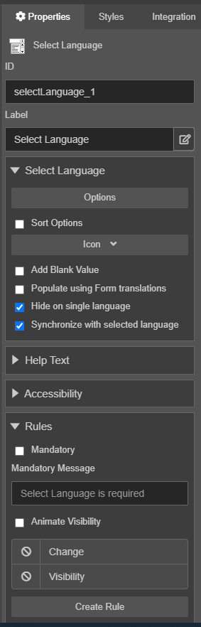
Select Language
- Populate using Form translations
Boolean useFormLanguages- Select the checkbox to populate the dropdown list with the translations configured in the form. This will overwrite the options specified at runtime. The Select Language component does not have to show all of the available languages in the list based on your business requirements.
- Sort Options
Boolean sortOptions- Check to automatically sort options by label.
- Hide on single language
Boolean hideSingleLanguage- Hide this widget when the form has only one language defined.
- Options
List options-
Defines a list of languages in the dropdown. By default, the Options property contains the following values:
Label Value Language name 1 Locale code 1 Language name 2 Locale code 2 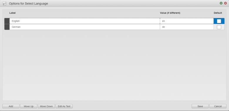
- Update the language details or select the Default checkbox to make a selected language a default one and click Save.
- Click Add to add a new line to the list where you need to add a language name and a locale code.
- Select a language and click Move Up or Move Down to re-order its position in the list of languages.
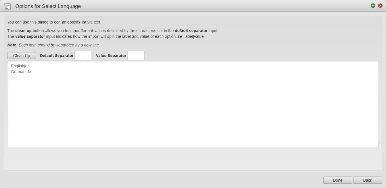
- Click Edit as Text to see the language configuration as a text file. You can change the separators used in the text.

- Sort Options
Boolean sortOptions- Check to automatically sort options by label
- Icon
Icon icon- Select the dropdown icon
- Add Blank Value
Boolean addBlankValue- Check to add a blank value to the dropdown

Styles
The following styles are available to this component:
form[name='form'] {
  .avalon-language-selector {
    width: auto;
    margin-right: 20px;
    .wdg-label {
      display: none;
    }
    .av-select-overlay {
      display: inline-block;
      float: right;
      width: 150px;
      background-color: transparent;
      border: 0;
      border-radius: 0;
      padding: 0;
      min-height: 30px;
      outline: none;
      box-shadow: none;
      cursor: pointer;
    }
    .wdg-input {
      .av-select-value {
        right: 25px;
        padding: 0;
        font-family: @ux-default-font-family;
        font-size: @ux-default-font-size;
        color: @ux-default-font-color;

      }
      .wdg-select-icon {
        padding: 0;
      }
      &:hover, &:focus {
        .av-select-value {
          text-decoration: underline;
        }
      }
    }
  }
}
After you've configured the component, you can preview the form to switch between the available languages to verify it works as expected.
Next, learn about the Attachment Field component.