Maestro Form Accessibility
MaestroThe UI design product. |
Form Builder Platform Developer | 19.11
This feature was updated in 19.11.
Platform Developer | 19.11
This feature was updated in 19.11.
Journey Maestro provides some basic, component-level accessibility (a11y) automatically. For instance, linking a component’s label text with its input field. However, a Maestro Template Designer and Form Builder need to perform the following additional tasks to achieve maximum form's accessibility:
- Use Sequential Page Navigation
- Use Page and Section Headers
- Mark-up Lists
- Add Alternative Text to Images
- Do Not Use Background Images
- Use Fieldsets
- Do Not Use Label Placement Left
- Check Color Contrast
- Do Not Use Placeholder Text
- Do Not Replace Component Labels with Text
- Do Not Disable Anything
- Use Aria Label
- Use Form.showAccessibleAlert
- Use Page Transition Effects
We recommend configuring as much accessibility features in a template as possible.
Let's look at each accessibility configuration in details.
Use Sequential Page Navigation
This policy property defines how validation and navigation operates for the form as a whole. Sequential page navigation is better for accessibility as it provides a simpler experience where users navigate through the form sequentially, one page at a time, and does not allow them to progress until the current page passes validation.
Unconstrained page navigation allows the user to navigate to any page, in any order, which can be confusing particularly on mobile devices, and doesn't perform full form validation until they attempt to submit it from the final page. This can cause a potential problem that will be difficult to correct for multi-page forms.
To configure Sequential Page Navigation, select Form Options > Form - Policies > Validation Mode.
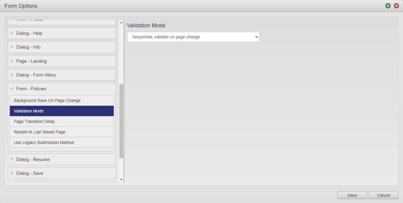
In this example, we use the Avalon template. The Maguire template has a slightly different form option's categories.
Use Page and Section Headers
Headings with correct mark-ups are automatically provided by the page and section headers at levels 1, 2 and 3, so do not create them manually using text display fields.
To configure page's headers, select Page > Properties > Display Text and use the Title Text and Subtitle Text fields.

In this example, the Tell us about you will be rendered as the <h1> element. The Subtitle Text will be rendered as the <h1> element as well.
To configure section's headers, select Section > Properties > Label. Also, use the Additional Text field to specify any extra content for a form user.
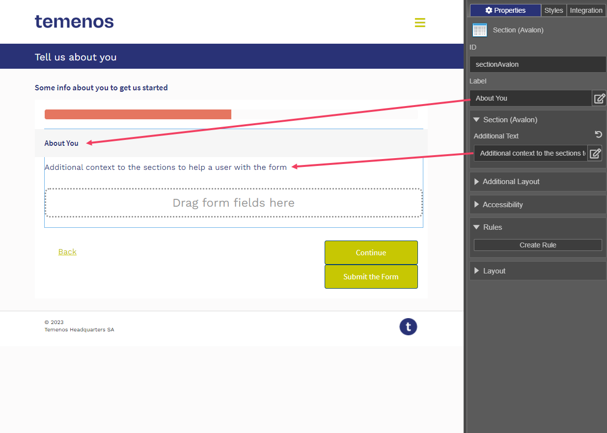
In this example, the About You label will be rendered as the <h3> element, whilst the Additional Text will be rendered as the <div> element.
Mark-up Lists
When creating lists, it is important to ensure that the correct HTML mark-up is used so assistive technologies read the lists out properly. When copying and pasting content from external sources, such as Word Documents, the mark-up is often lost and replaced by characters representing the numbers or bullets in the list. Whilst visually this may look fine, the lack of correct HTML mark-up will prevent screen readers from interpreting the list as an HTML list.
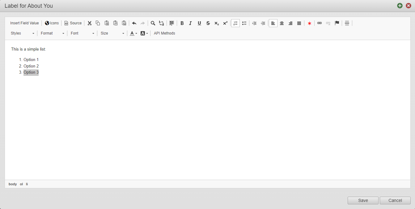
The Maestro editor provides the built-in rich text editor so you can add lists.
To add a list HTML element, select Text Display > Label and click Insert / Remove Numbered List or Insert / Remove Bulleted List as required
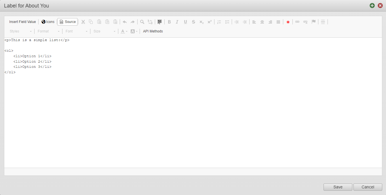
Click Source to review the source code and verify that correct HTML mark-up is used:
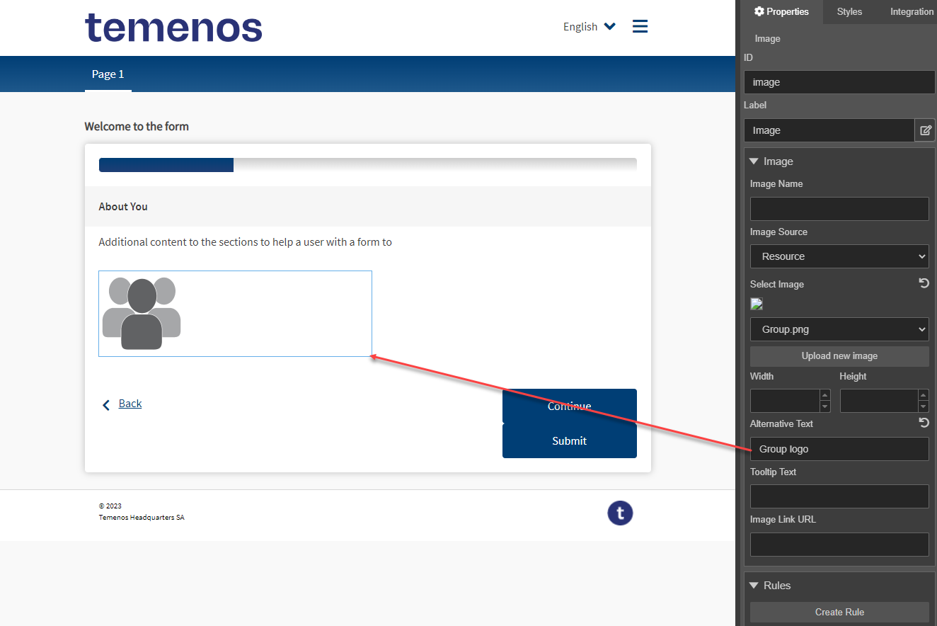
Add Alternative Text to Images
Images can be one of the following:
- Decorative: these images do not convey information to the user and are typically used to make the form more visually attractive by adding visual components, such as separators and textured backgrounds. An image is also considered decorative if it conveys information that is also fully provided by surrounding text. Decorative images should not have alternative texts.
- Informative: these images do convey information to the user that is not provided by surrounding text and should have alternative text that conveys the meaning or content of the image. The alternative text need not be a literal description of the image and should be as succinct as possible.
Usually, it's up to a form developer to decide whether an image should be treated as decorative or informative.
To add an inattentive text to an image, select Image > Properties > Image > Alternative Text
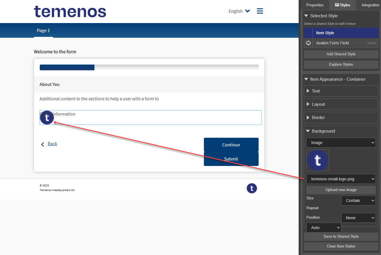
Do Not Use Background Images
Informative images should not be used as a background image as it is not possible to provide them with alternative text and some browsers remove background images when put in high contrast mode. It is fine to use decorative images as a background image.
To set up a background image, select Component > Styles > Background.
Use Fieldsets
Fields that are not stand-alone and only make sense in the context of a group of fields should be contained within a Fieldset component. For instance, when using:
- Multiple Checkbox components, such as contact preferences
- Multiple components, such as telephone region code and number, home address and so on
You should provide a meaningful description of the group in the Label of the Fieldset, which is a legend text and is displayed a heading. The legend text will be used by assistive technologies to inform the user of the context for fields within the fieldset. For instance, tabbing to a checkbox button whilst a screen-reader is running might inform the user that they are currently focused on a checkbox button with caption Email for the fieldset How would you like us to contact you?:
To set up a description, select Fieldset > Properties > Label:
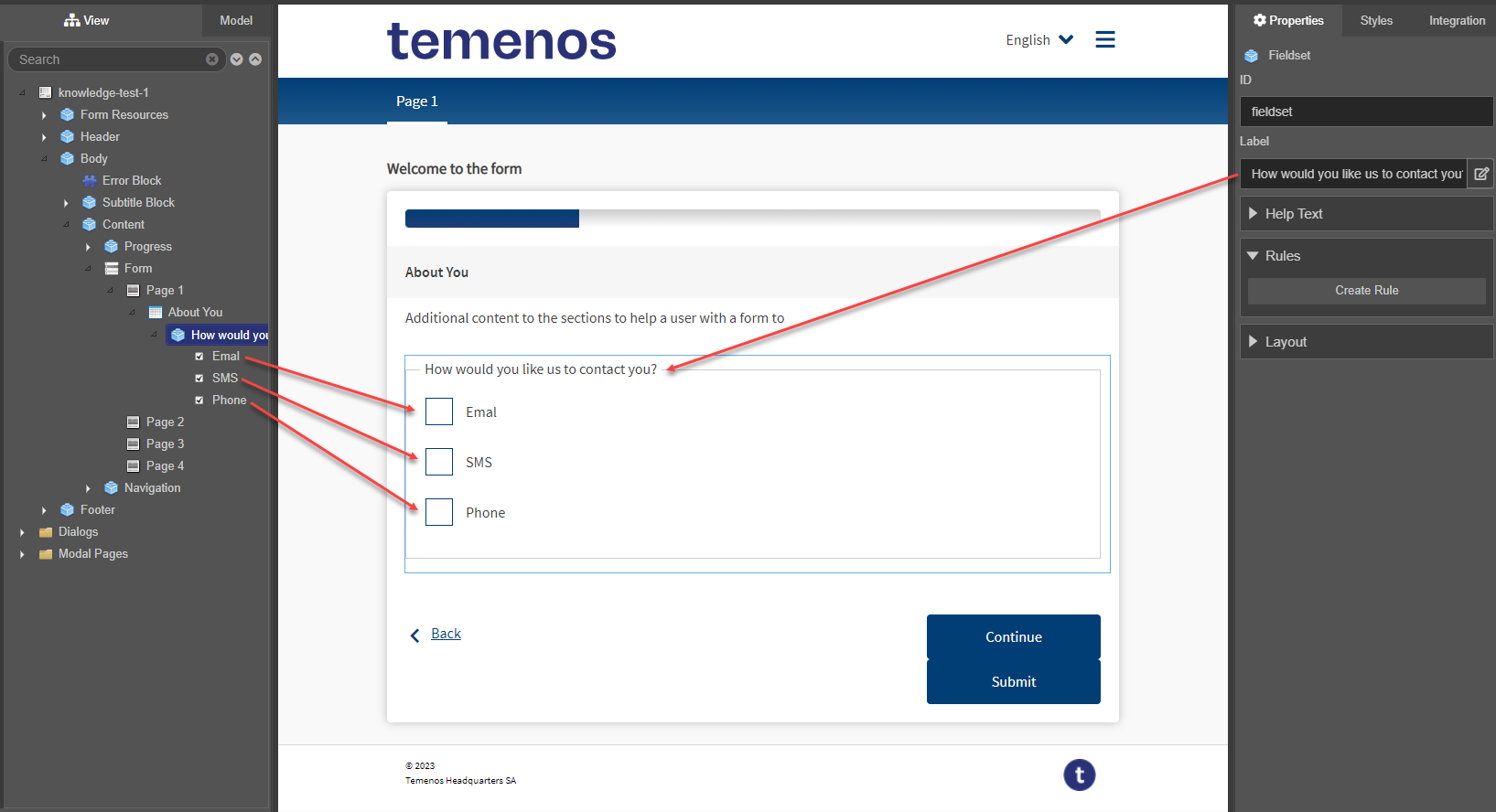
Without the fieldset, the user would only be informed that they are focused on a checkbox button with caption Email which is clearly insufficient. To avoid repetition, the majority of assistive technology will only inform the user of the fieldset legend for the first field focused within the group, regardless of which field that is, namely, not necessarily the first field in the group by position.
The Radio Button Group component already includes fieldset so you don't need to add it.
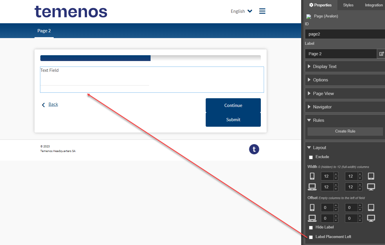
Do Not Use Label Placement Left
For the sake of usability, labels should generally be placed above input fields. This is how Maestro's components are configured by default. You can, however, change the placement of a label to the left of an input field. This is typically done on receipts as a way of saving space. However, you can change label location to the left.
To change label location to the left, select Field > Properties > Layout > Label Placement Left.
Check Color Contrast
Colors used in a form must meet accessibility requirements for contrast of foreground and background objects for partially sighted and color-blind users.
You can check your form using a contrast tool such as TPGi's Color Contrast Analyser.
Do Not Use Placeholder Text
We recommend adding a Label above the field, which is the default in Maestro, because it is best for accessibility as it keeps the caption closest to its field. In particular, this makes it easier for users of magnifier software to locate the field associated with a label without having to move the cursor too far and reduces the chances of finding the wrong field by mistake.
Top placement also provides the best scan line between captions and inputs for fields. A scan line refers to eye movement along a straight line as a sighted user browses a form or searches for a specific field. Other label placement results in additional, unnecessary movement as the sighted user’s eye jumps around between labels and inputs that are less aligned.
To clear the placeholder text, select Field > Properties > Accessibility > Placeholder Text.
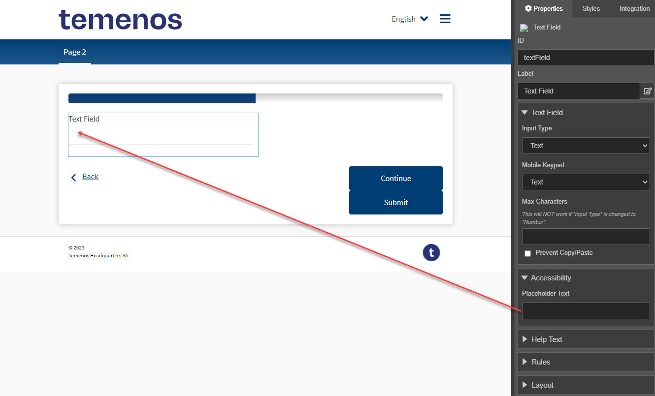
Placeholder text is the light grey text that is displayed in a field until data is entered at which point it is removed.
Placeholder text is not accessibility compliant due to the lack of consistent support in assistive technologies. Some assistive technologies ignore placeholder text entirely. Some always notify the user of the placeholder text regardless of whether there is data in the field or not and makes no differentiation between the placeholder text versus the entered data.
Only a small proportion of assistive technologies do the correct thing in only notifying the user of the placeholder text when it is visible on-screen.
Do Not Replace Component Labels with Text
It can be tempting to hide the built-in field label and create a replacement with a separate text display component in order to achieve a layouts,such as a label, that is wider than its field.
Although, this approach may look identical on-screen to sighted users, this does not provide the browser functionality where selecting a label sets focus to its field.
To resolve the specific case of long labels, it is better for accessibility to use a combination of shortening the label, widening the component and moving non-critical information from the label to a popover tooltip or a message box located close to the component.
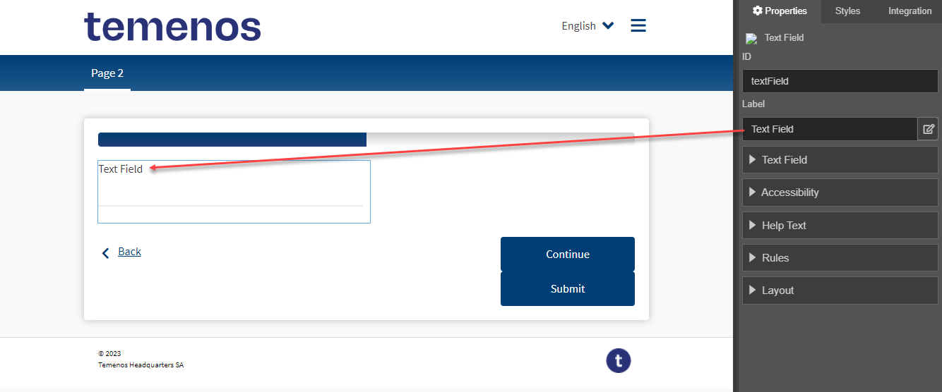
To edit component's label, select Component > Properties > Label.
Do Not Disable Anything
Disabled form content is problematic for accessibility and should be avoided.
Typically, disabled content is visible on-screen for sighted users but not active and visually indicated as disabled with grey-out styling. Disabled content is not discoverable for users of assistive technology which results in a mismatch of information. For instance, in the case of disabling the continue button for a page until certain actions are performed a sighted user can see that the button is disabled and may be able to deduce that they need to perform an action before it will be enabled.
However, a user of assistive technologies will have no knowledge of the existence of the continue button at all which is likely to lead to confusion of what action is expected of them in order to progress.
In this case, it is better for all users to keep the continue button enabled and inform the user what is expected of them with error messaging if they attempt to progress without completing necessary actions.
The other common alternative approach to disabling components is to hide them.
Use Aria Label
The aria-label HTML attribute allows you to provide an accessible name for an element so users of assistive technology will be able to recognize it. You should use aria-label if the element doesn't have a visible name you can reference, for example, aria-label="Submit my form". For more information, see ARIA (Accessible Rich Internet Applications) documentation and ARIA specification.
Most of Maestro's components, for example, Icon Button, Second Level Navigator, and Submit, have the Aria Label property, which you can use to add text description.
To configure aria-label, select Component > Properties > Accessibility >Aria Label:

In this example, we use the Submit component with an empty label and an icon to show on a Submit button. After you publish the form, the aria-label="Submit my form" property is added to the <button> element so assistive technology, such as a screen reader, will interpret it accordingly.
Use Form.showAccessibleAlert
Maestro provides the Form.showAccessibleAlert(message, expanded [, delay]) method to allow a Form Developer to programmatically make assistive technologies, such as screen readers, notify the user of an event that will otherwise not be announced, such as loading progress, or popup content. For more information, see Maestro API Reference.
This is a convenient way to add accessibility support to form applications as well as ensure screen readers will read this content. It's especially applicable to some components, such as Small Dialog or Progress Bar, when displaying dynamic text notifying a form user of a current for status, for example, when loading customer data.
Use Page Transition Effects
Maestro forms are single-page applications, which sometimes make it difficult to see where each page ends and another page begins. Page transitions helps form users understand page demarcations. The Page Controller (Avalon) component allows you to implement a desired transition in a Maestro form using one of the following approaches:
- Fade in & out transition
- The transition happens where the leaving page completely disappears before the new page fades in. This is achieved by the standard CSS that uses the animation of the change in height between two pages, and controlling timing of the change.
- You can edit the existing styles of the Page Controller (Avalon) component: Height Transition, Page Fade Transition, or Page Slide Transition. You can even create your own shared style defining some other animation.
- Scroll to the top of the new page
- The transition happens either during the page transition, or after the transition has finished.
- You need to select an appropriate option from the Scroll Timing dropdown list of the Page Controller (Avalon) component's properties.
Next, learn about rule templates and rule helpers in a form.