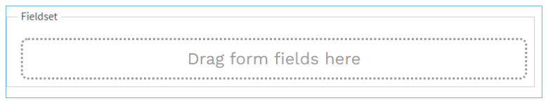
Fieldset
MaestroThe UI design product. | Form Builder | All versions This feature is related to all versions.
Maestro comes with the Fieldset component, which is a container component, allowing you to group several fields together. This is especially useful when fields are not stand-alone and only make sense in the context of a group. For example, you should use the Fieldset component to group a credit card details, such as a name of a card holder, credit card number and expiry date, or multiple checkbox components, such as contact preferences.
Some components, for example, the Address, Date of Birth Dropdown, and Time, already have their fields grouped according to required functionality, so there is no need to place them into a Fieldset. If you do so, you only create some confusion about the hierarchy of the components. This also may prevent some assistive technologiesAssistive Technology is an umbrella term that includes assistive, adaptive, and rehabilitative devices for people with disabilities while also including the process used in selecting, locating, and using them., such as screen-readers, to correctly interpret the content of the form.
The Field is not just for aesthetic purposes, but also helps users with assistive technologies to navigate through the form.
We recommend using this component to increase the accessibility of a form.
Usage
- Open the Palette pane in the Maestro Editor.
- Locate the Fieldset component within the Containers folder.
- Drag the component into the View pane or the Wireframe.
- Configure the component's properties via the Properties pane.
Properties
The following properties are available to the Fieldset component:
Help Text
Provide a meaningful description of this container identifying a group of fields. The label text (legend text) can be used by assistive technologies to inform the user of the context for fields within the Fieldset.
Provide a popover help text
Select Hide Label to suppress the label text, and use this component for grouping only.
Select Label Placement Left to align the label to the left. The label is aligned above the fields by default, which is best for accessibility as it keeps the caption closest to its field. In particular, this makes it easier for users of magnifier software to locate the field associated with a label without having to move the cursor too far and reduces the chances of finding the wrong field by mistake.
For more information, see Maestro form accessibility.
Next, learn about the Block component.