Icon Picker
MaestroThe UI design product. | Form Builder | 22.04 This feature was updated in 22.04.
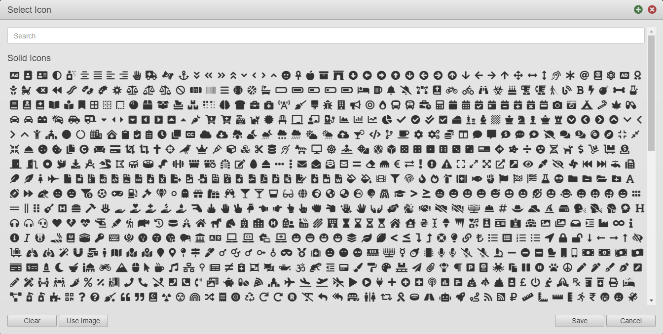
The Maestro editor comes with the Icon Picker allowing you to choose an icon from the pre-defined collection of icons, which is shipped with each release of Maestro. We use web font icons. For more information, see Font Awesome documentation.
You can also use the rich text editor to set an icon for a component.
To select an icon using the Icon Picker:
- Open a form or a template in the Maestro editor and click the Design tab.
- Select a component and switch to the Properties tab.
- Click the item's property, which allows you to specify an icon, to open the Icon Picker. For example, the Collapsed Icon property of the Section (Avalon) component opens up the Icon Picker.
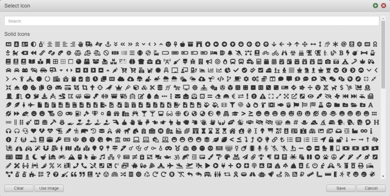
The icons are grouped by the following categories:
- Solid Icons: They are faster to recognize unless their cues are subtle and not noticeable enough.
- Regular Icons:
- Brand Icons: They are specific to various company brands. For more information, see Font Awesome documentation.
- Type a full or partial name of an icon you are looking for in the Search bar to filter the icon list.
- Select an icon you need from the list or filtered list and click Save to inset the icon into the property.
- Click Clear to undo your selection or click Cancel to discard your changes.
- Click Use Image to see the instructions on how to use an image in the property. These instructions are explained below.
Use Image
In some cases, you may need to decide whether to use icons or images. There are the following differences you may want to consider while making such a decision:
- Icons are included in the core Maestro libraries by default
- Icons have simple HTML markup, so using a different font family to display the icon - the font family only needs to be loaded once and the entire icon set is available in the form
- Images need to be provided separately and loaded into the page individually
To use an image in a property:
- Open a form or a template in the Maestro editor and click the Design tab.
- Select a component and switch to the Styles tab.
- Select a styling target, for example, Container.
- Expand Items Appearance - Container
- Expand Background and select Image from the dropdown list.
- Choose an available image from the dropdown list or click Upload new image to choose your background image.
Note Images you see in the dropdown list are these inside one of the libraries available to the project - either core, or any other organization or project-level libraries that have been added to your project.
- Style the image as required.
- Click Save to save your changes.
Next, learn about Properties pane.