Timeline View
Journey Analytics The behavioural analytics tool. | Analytics User | Latest Version Latest version 23.04.0 cloud hosted.
The Journey Analytics Timeline View displays analytics for transactions that started within the selected scope:
- Analyse completion rates and split by device type, browser, application and more.
- Review the median time taken for applicants to complete a transaction.
- Examine the number of transactions in a bar chart based on Transaction Statuses.
- Measure performance over time against the industry Benchmarks.
To display the Timeline View:
- Select Timeline from the Navigation Panel.
- Select the application and time period to analyze.
- The Timeline View displays.
- If required, modify the chart content:
- Select the Metric Tab you want to analyze
- 'Change the Aggregation and Split By options.
Timeline View components
The Timeline View contains the following components:
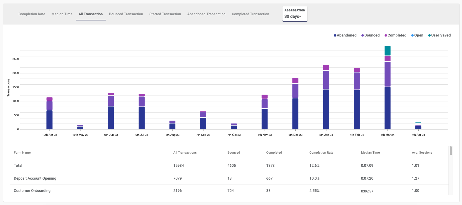
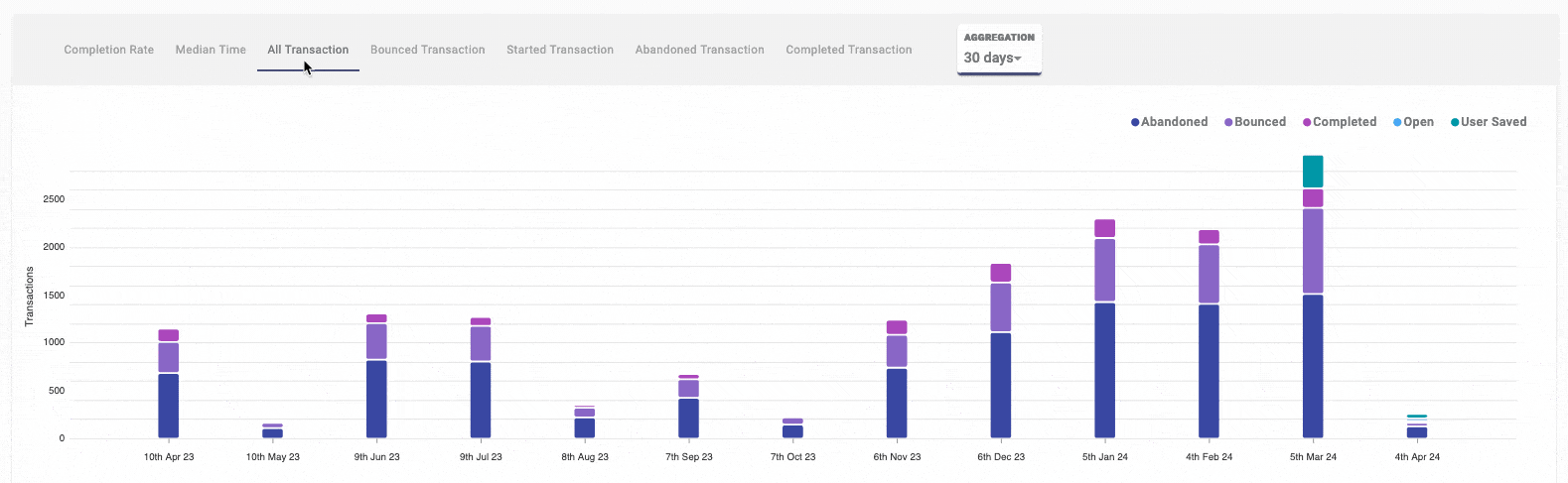
Timeline Chart
The Timeline chart contains the following features:
- Metric Tabs to select the metric that you want to analyze.
- Aggregation options to set the blocks of time the chart will be broken up by.
- Split By options to segment the bars in the chart based on the applicants' browser, device, application version, or operating system.
- Benchmarks to measure your applicants experience against the industry standard.
Metric Tabs
In the top of the chart, using the tabs, you can select the metric to show in the chart. Use the table to understand the available metrics:
| Metric | Description |
|---|---|
| Completion Rate | Displays the completion rate of the transactions during the selected time period. |
| Median Time | Displays the median time taken to complete a transaction during the selected time period. |
| All Transaction | Overview of all transactions during the selected time period, split by Transaction Status. |
| Bounced Transaction | Number of transactions bounced, where the transaction opened and closed without user interactions with form fields. |
| Started Transaction | Number of transactions where users interacted with form fields (excluding simple button clicks). |
| Abandoned Transaction | Number of transactions with a start event but not completed; users never return to finish application. |
| Completed Transaction | Number of successfully completed transactions. |
Aggregation options
The Timeline View allows you to set the time span aggregation for the chart to show. By default, aggregation is set based on the selected time period. However, users have the flexibility to customize how the aggregation appears in the chart.
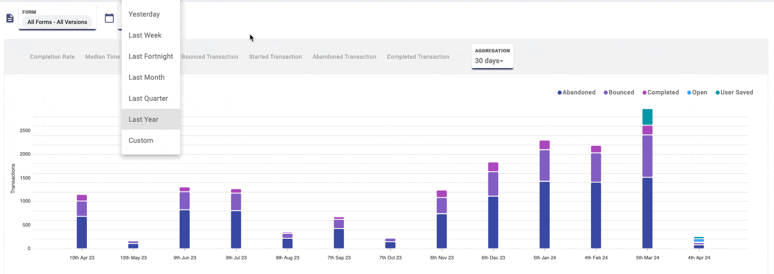
The available aggregation options depend on the selected period. For shorter periods, shorter aggregation intervals are available. For longer spans, longer aggregation intervals are available. Use the table to refer to the available aggregation options for selected periods.
| Selected Period | Aggregation Options |
|---|---|
| Today | 15m, 30m, 1h, 4h |
| Yesterday | 15m, 30m, 1h, 4h |
| Last Week | 4h, 1d |
| Last Fortnight | 4h, 1d |
| Last Month | 1d, 1w, 2w |
| Last Quarter | 1d, 1w, 2w, 30d |
| Last Year | 1w, 2w, 30d, 90d, 180d |
| Custom | Variable depending on Time Frame Selection |
Split By options
The Split By options allow you to dissect each bar in the chart, revealing detailed information about applicants. View details based on applicants' browser, device, application version, or operating system.
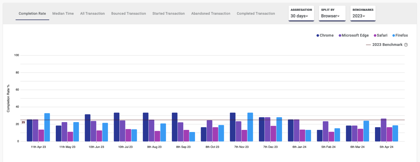
When you choose an option, predefined classifications are applied to segment the bars. For each Split By option, classifications include:
| Split By | Classes available |
|---|---|
| Browser | Chrome, Firefox, Safari, Internet Explorer, Microsoft Edge |
| Device Type | Mobile Phone, Tablet, Desktop |
| Form Name | This option splits the results by application name. |
| Operating System | Android, iOS, Windows, MacOS X, Linux |
| Space | Selected Space from the Global Filters |
Benchmarks
Within the chart, Journey Analytics Benchmarks are represented by a horizontal line and are based on trusted industry data from real applicants. Benchmarks empower you to measure your applicants' experience against the industry standard. Benchmarks in Timeline View are available for the following metric tabs:
- Completion Rate: Aim for a completion rate higher than the benchmark.
- Median Time: Strive for a median time lower than the benchmark.
Journey Analytics Benchmarks are released annually and are based on the previous year's data. Use the benchmarks as a goal to improve your applicants' experience and to measure your performance against the industry standard over time.
Timeline Summary Table
Below the chart, the summary table displays a detailed overview of transaction statistics for the selected scope.
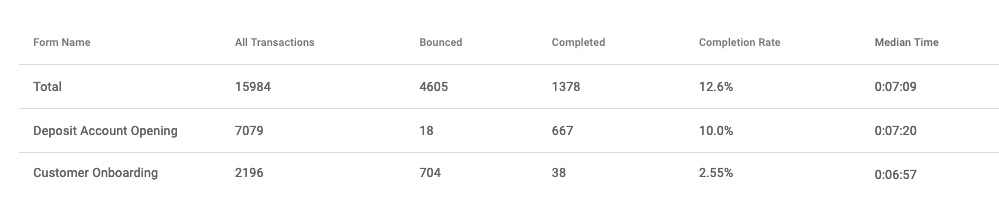
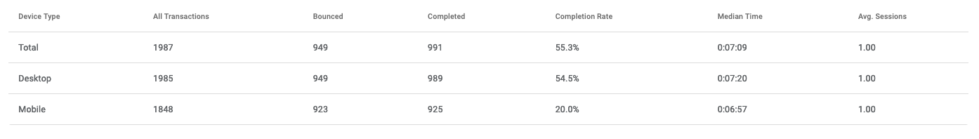
By default, each row in the table represents a selected form as well as a Total row that aggregates all rows in the table. If you set a custom Split By option, then the rows will be based on your selection.
Columns in the table show details about the transactions for each form:
- Form Name: The name of forms with transaction in scope
- All Transactions: The total number of transactions for each form
- Bounced: The number of transactions where the transaction opened and closed without any user interactions with the form fields.
- Completed: The number of successfully completed transactions.
- Completion Rate: The percentage of transactions that were successfully completed.
- Median Time: The median time taken to complete a transaction.
- Average Session: The average number of sessions required per completed transaction (user revisits to complete).
Next Steps...
Learn about Dropoff View and how users interact with sections of an application.