Validate Message Layouts
MaestroThe UI design product. | Form Builder | All versions This feature is related to all versions.
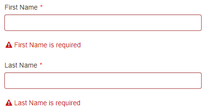
If a user tries to submit a form with invalid fields, such as empty mandatory fields, an error message will appear beneath each field:
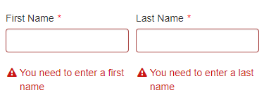
But if two or more fields are side-by-side, the error messages will appear in a list beneath both fields:
Some people find this behavior surprising as it doesn't show the clearest possible relationship between the error message and the invalid field. They would prefer the error messages to appear beneath the fields:
The above style isn't the default approach because, if you have longer error messages or if there are more than a couple of fields in a single row, the error messages can appear crowded:
But there are arguments in favor of this style. It's just one of those details where there isn't a completely correct answer, so the standard behavior has to be settled on. Just because error messages don't always appear beneath their fields by default though, doesn't mean it isn't possible. It does, however, require a few extra steps.
To force error messages to appear beneath their fields:
- Right-click a component in the Navigator pane.
- Click Wrap in Block.
- Repeat the above steps for all relevant components.
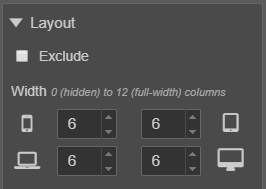
- Adjust the Layout properties for the Block components so they can fit in the same row.
- Drag and drop the Block components into the same row.
If, for example, you have a couple of Text Field components, you should end up with a component hierarchy that looks like this:
Based on these changes, the text fields will be side-by-side, and because they're wrapped in Block components, any error messages will appear within the blocks. The blocks force the error messages to appear directly beneath the relevant field:
Fixing Vertical Alignment
By solving the first problem, we've created another one. To see what's wrong, enter valid data into one of the fields and submit the form. You'll see that the error message beneath the invalid field breaks the alignment with the valid field:
Fortunately, the solution is simple:
- Inside the Maestro Editor, select a Block component.
- Open the Styles pane on the right side of the screen.
- Open the Item Appearance > Layout panel.
- Set the Vertical Alignment dropdown to Top.
- Repeat this process for all other Block elements.
After re-building the form, the alignment issue should be fixed.
Next, learn about component versions.


