Workspaces UI tour (22.10 and earlier)
WorkspacesThis topic relates to Journey Workspaces | Workspaces UserIncludes bank staff, helpdesk, relationship managers, and managers | This feature was introduced in the 18.11 releaseThis feature was updated in the 22.10 release
With a consistent layout and common user interface elements, Journey Workspaces is designed to give you a great user experience right from the start. Let's take a look at some of the common elements that make up the Journey Workspaces user interface (UI).
Each screen is based on a common layout that can be modified as required through configuration. All screens have a header and screen title at the top, a on the left, and a footer at the bottom that provide common functionality. The remainder of each screen contains content and features that are specific to the selected space and the screen type (List, Search or Details).
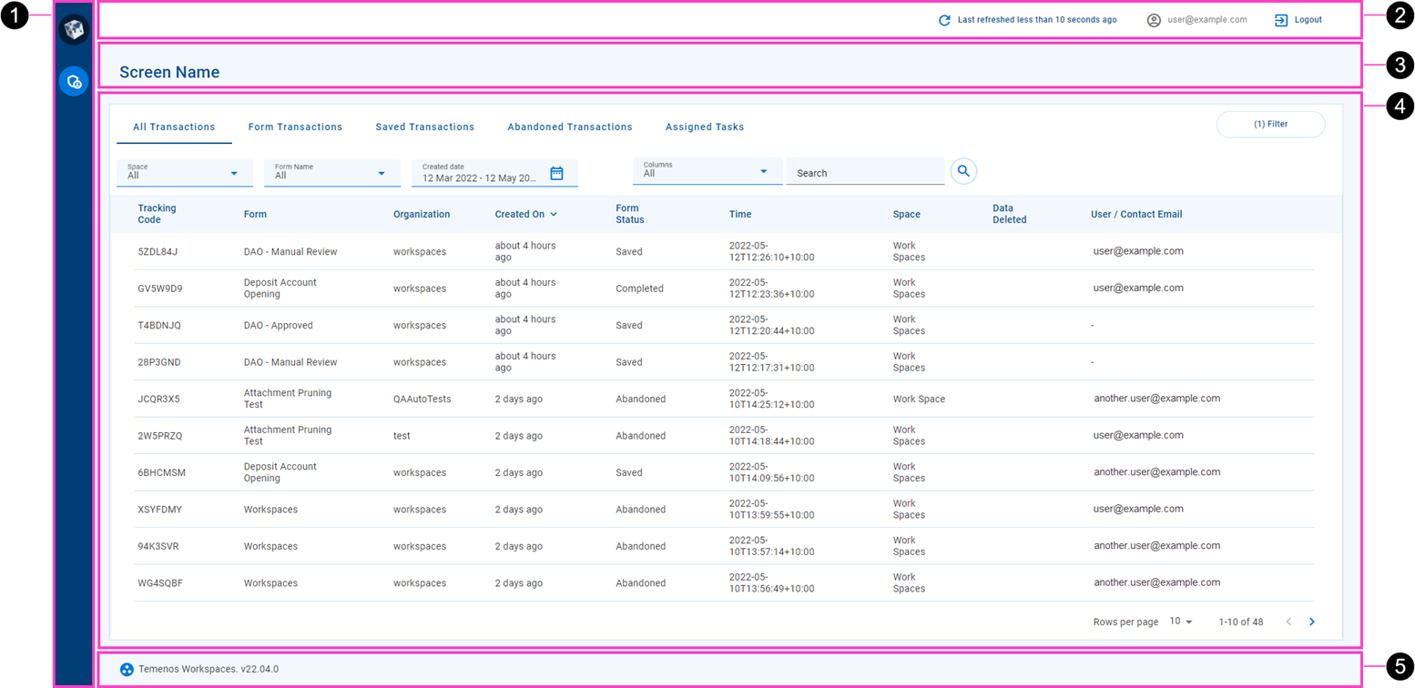
- (): The lets you select a space to work in. For example, select the Helpdesk item to switch to the Helpdesk space.
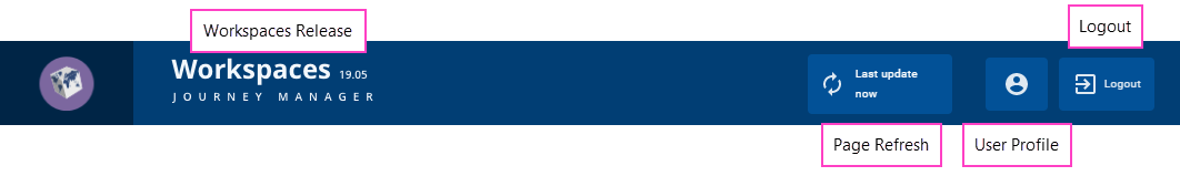
- Screen header: The screen header displays when the content pane was last refreshed and includes an option to refresh it. The name of the logged in user is also displayed, and there's an option to logout.
- Screen name: The screen name changes depending upon the screen currently displayed. For a List screen, the screen name is the same as the name of the selected space. For a Details screen, the screen name corresponds to an item selected on a List screen.
- Content pane: The majority of each screen displays content specific to the screen type (List or Details).
- : At the bottom of the screen is the which displays the application name and version.
Select a space
The identifies all the spaces available to you, and provides a way for you to move between them. Several related spaces may be grouped together under a space group. Select a space item to switch to that space.
One or more of the following spaces are available to you depending on how your Workspaces portal is configured and which permissions you have been given.
| Space | Used by (Role) | Description |
|---|---|---|
| Process | Processing staff | Offers review capabilities for pending applications that need manual action. |
| Helpdesk | Helpdesk staff | Find applications quickly and easily to provide prompt and accurate customer assistance. |
| Assisted Channel | Relationship managers | Kick start the application process on behalf of customers, and monitor application progress. |
| Manage | Managers and supervisors | Provides task management capabilities. |
- By default, the Review and Document Requests spaces are grouped together under the Process space group.
For more information about spaces, see Roles and Spaces.
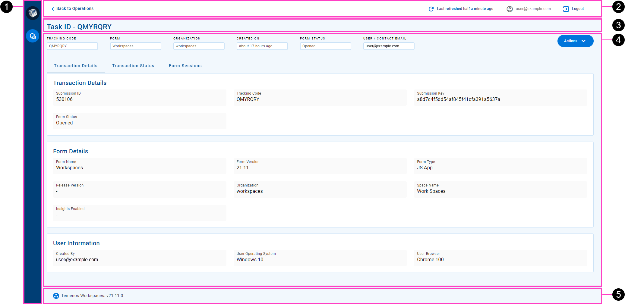
Screen header
The screen header is common to all Workspacesscreens, displaying generic information and providing access to common features and menus.
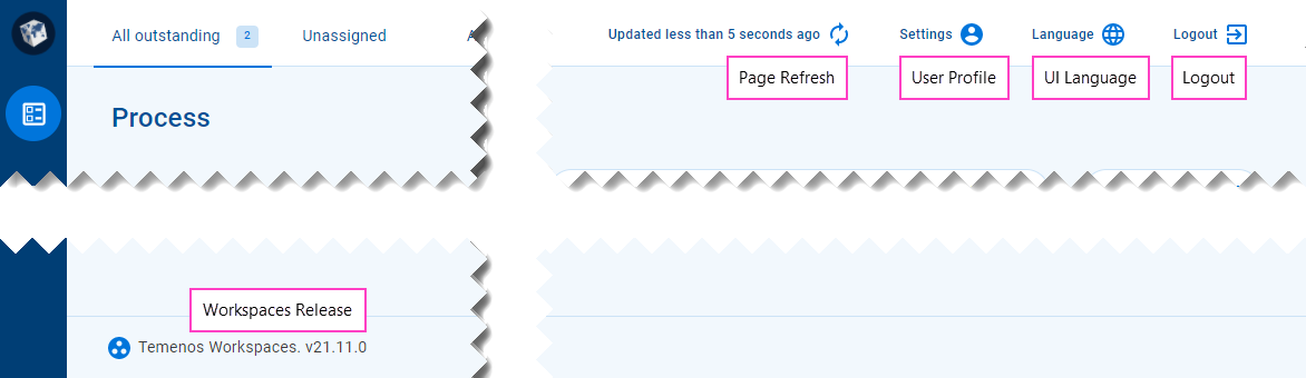
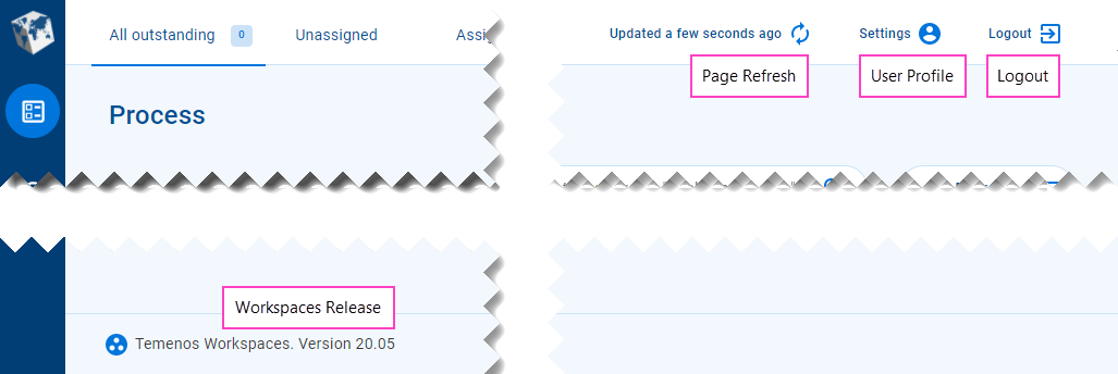
On the , you can find the following features.
- Page refresh: When the information displayed on the screen was last refreshed, and an option to refresh it.
- : A menu button providing access to options. This feature was removed in the 22.10 release
- : Select the language used for static text in the Workspaces UI. This feature was introduced in the 21.11 release
- Logout: End your current Workspaces session securely.
Workspaces 21.11 introduced an automatic session logout after a defined period of inactivity. To learn more about configuring the session timeout period, see Session Timeout.
Workspaces releases prior to 20.05 display the release version number in the header, while this has moved to the page footer in subsequent releases.
When you navigate to a Workspaces screen, the information displayed is up-to-date but it can become stale over time. The elapsed time since the screen was last updated is shown in the beside the . If the screen has not been updated recently or you just want to make sure you're looking at the latest information, click to refresh the screen.
To access the settings, click the User Profile button (1) and select Settings (2). Update your profile settings as required (3) and click Save (4), then close the profile window (5). A message confirming your profile update was successful is displayed in the bottom left corner of the main window (6). You can close the message (7) or wait for it to go away after a few seconds.
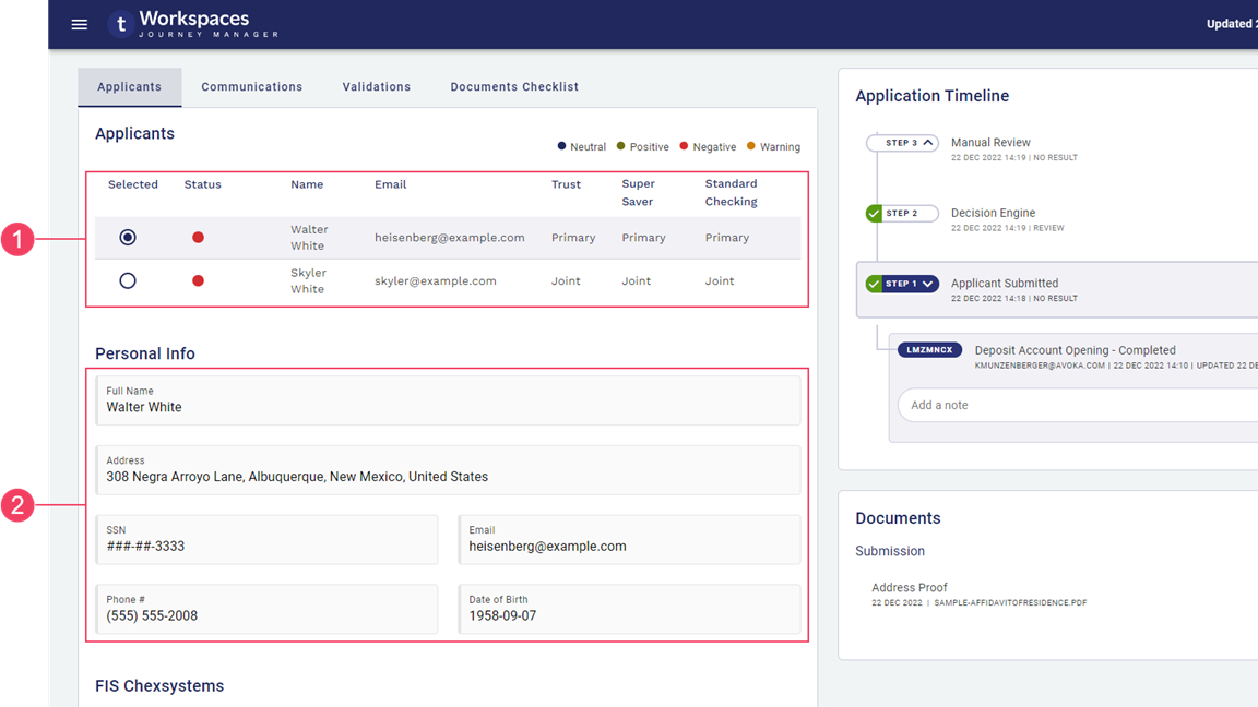
Content pane
The main part of each screen is occupied by components that either display application- and task-related information, or allow you to interact with a selected application or task. The content and features available are specific to the selected space and screen type.
- A List or Search screen contains an item list and other components that determine which items are displayed and allows you to interact with them. To learn more about List screens, see Understanding the Workspaces List Screen.
- A Details screen contains components that display application and task information and provide features for you to complete the tasks. To learn more about the Details screen, see The Application Details Screen (22.10 and earlier).
Field Data Types
Fields display information of various data types including text (name, email address, some IDs), numbers (phone, SSN), and dates. A date may represent either a specific point in time (date of birth) or a duration (application age).
Numbers and dates can be configured to use a variety of formats. For example:
- Phone numbers can be formatted for the current locality or to accommodate internationalization.
- 9-digit Social Security Numbers are commonly displayed using the format "AAA-GG-SSSS".
- Dates representing a point in time can use either absolute ("1 Jan 2022", "today") or relative ("last Wednesday", "6 days ago") formats.
- Dates representing a duration can use either specific ("7 days, 3 hours, 26 minutes") or approximate ("about 7 days", "last week") formats.
Sometimes a value might be too long to fit in the space available for it; in this case, the value is often truncated and an ellipsis ('…') is appended to indicate that you're not looking at the full value. To see the full value, point your cursor at the truncated value and a tool tip is displayed showing the full value.
By default, values in table columns wrap when they are wider than the column. However, sometimes this behavior is undesirable, and it can be overridden for specific columns via configuration.
Custom content
Much of the Workspaces user interface presents various types of content (information and features) in components or layouts specifically designed for each content type. In addition to the standard content types, your Journey Workspaces portal may also be configured with additional custom content specific to your organization. While custom content is more commonly available on the Details screen in separate tabs This feature was introduced in the 22.10 release, you may also find it used on the List screen in expansion rows.
Workspaces supports two format options for custom content, designed for two different kinds of data:
- Multi-value data: Content is displayed in a table, with a header row at the top followed by one or more data rows. Each column represents a different kind of content, identified by the column header, while each row relates to a single entity such as an applicant, a background check, or a document. Each individual data item is either a simple text/number display or an icon that links to additional details or functionality. All data items in the same column are of the same type.
- Single-value data: Each data item in a container (such as a tab, card or section) is displayed separately, with a label and value, and an optional icon that links to additional details or functionality.
- Multi-value data
- Single-value data
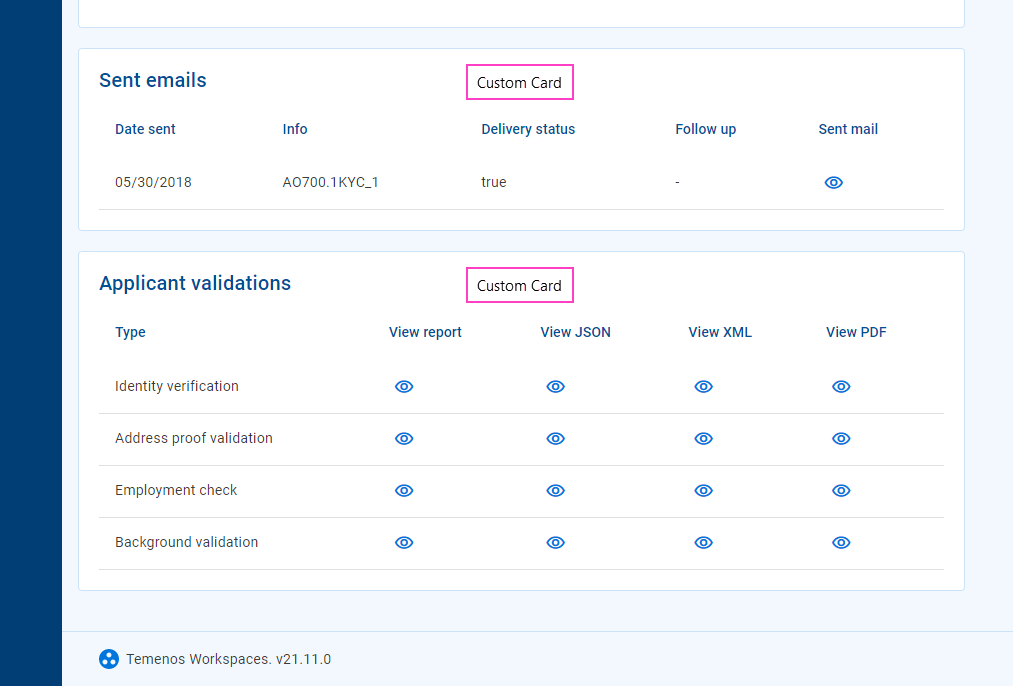
Custom content presents a read-only view of a predetermined data set. It is configured by a Workspaces developer who defines both the data that is displayed and how it appears. A Workspaces user has no control over the way the data appears, nor can they modify the displayed information.
Several icon types are supported for icon in custom content:
- : Indicates additional details are available to view. Click the icon to display the additional details in a pop-up window.
- : Indicates the additional details are available to download. Click the icon to download the file containing the additional details. This feature was introduced in the 21.11 release
- Any other icon provides access to additional functionality. Click the icon to perform the associated action. This feature was introduced in the 22.10 release
Modal Windows
Workspaces has been purposefully designed to make key features and important information available at your fingertips. However, sometimes more screen space is needed, or an action needs more control over how it's used, and in these kinds of circumstances Workspaces uses a modal window.
Examples of how Workspaces uses modal windows include the following.
- View any receipt for any task associated with a selected application.
- Manage the documents attached to an application.
- Start, fill in, and save or submit a new form in the Assisted Channel space.
By default, a modal window opens in the same browser tab where you are using Workspaces, and in a way that prevents you from interacting with the main Workspaces screen behind it. However, a modal window can be popped out into a separate browser tab, allowing you to close the modal and interact with Workspaces while still being able to view the receipt. This feature was introduced in the 22.10 release
You can interact with the elements on the modal window which may involve data entry, or the window may simply display information in a format that wouldn't be possible or might not present well on the main Workspaces pages.
Use the and icons to control the size of a modal window, or the icon to pop out the modal content into a separate browser tab. When you're finished with a modal, click the icon to close the modal window and return to the Workspaces screen where the modal window was opened. The screen is reloaded to reflect any changes made while the modal window was displayed.
Time Zones in Workspaces
When you're using Workspaces, from time to time you'll encounter dates and times associated with items such as applications and tasks; for example, the date and time when an application was submitted or a note was added. Workspaces captures and stores dates and times using the time zone on the local computer where the action is taking place. Similarly, all dates and times displayed in Workspaces are with respect to the time zone of the user’s local computer. This means that you never need to do time zone conversions; Workspaces always takes care of this for you.