Configurable Text Input
MaestroThe UI design product. | Form Builder | 24.04 This feature was introduced in 24.04
Maestro comes with the Configurable Text Input component, which is an input field component similar to Text Field, but with 2 additional key features allowing you to:
- Format the user's input
- Hide the user's input
The features are implemented with the 3rd party library iMask.js allowing a great degree of customization for broad range of business requirements, for example, hiding text for passwords and credit card numbers and so on.
Let's look at the features in more detail.
- Format the user's input
- This refers to automatically applying a display format to the user's entered data, such as adding spaces, dashes, currency symbols to display the text in a recognizable format. Format characters can be applied while the user is typing, or after the user leaves the field, as shown below.
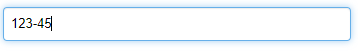
Formatting during typing 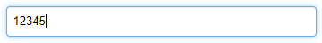
Not Formatting during typing 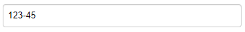
Formatting applied after losing focus - Formatting also refers to defining which character sets are allowed at various positions in the input, as well as minimum and maximum lengths. For example, a specific character may only accept a number, or a letter, or anything.
- Character set restrictions are applied as the user is typing, regardless of whether the display format (spaces, dashes etc) is being added during typing.
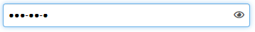
- Hide the user's text
- Sensitive data can be entered by the user, but hidden from view - each character is replaced by a pre-defined display character - (●) by default.
- Hidden data will still be formatted according to the field's formatting configuration, as shown below:
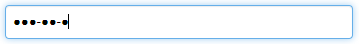
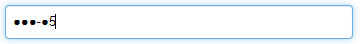
- The most recently typed character will be visible for a short time before being hidden, as shown below:
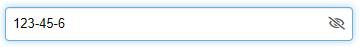
- The field can be configured to include a "reveal" button to allow the user to "un-hide" the text, and observe what's been entered. If enabled, the reveal button appears when text has been entered, and the mouse is hovered over the field.


Before you start using the component, it's important to understand the key Concepts and terminology.
Input Pattern
Formatting of the user's text is defined by a string of characters called the "Input Pattern", or just pattern. The pattern is a direct mapping of the expected characters in the user's input text.
In other words, every character in the input pattern defines what is expected in the same position of the user's input text - a 3-character long pattern will define an input field that only accepts 3 typed characters from the user.
Defining a pattern requires an understanding of the following rules:
Wildcards
Three types of wildcards exist in the pattern definition:
a - Any alphabetic character *any non-numeric and non-symbolic Unicode characters0 - Any numeric character (0 - 9)* - Any character (alphanumeric or symbols)Each wildcard defines the set of acceptable characters that will be accepted in that position of the input text.
It is important to remember that using one of these wildcards in the Input Pattern is only defining a single character in the input text, so a pattern must have at least one, and almost always multiple wildcards. Unless using Advanced Mode, leaving the Input Pattern blank is effectively defining a field that will accept nothing as a valid character, making the field inoperable.
Let's look at a wildcard example - 00a. This pattern defines an input that will accept two numbers followed by a letter. A user will be allowed to enter any text that satisfies this pattern, for example, 12a, 99B, 05ö.
As the user types, each entered character is automatically accepted or rejected based on the pattern.
For example, with the same 00a pattern definition, attempting to type a D as the first character will have no effect - only a number will be accepted for the first two characters. Similarly, typing a third number after the first two, for example, 123, will also do nothing - in this case, only a letter will be accepted.
Fixed Characters
Any other characters in the pattern definition that are not one of the three wildcards (0, a or *) are considered 'fixed' formatting characters.
A form user may choose to explicitly type the fixed character, but even if they don't it will be inserted into the text automatically.
Fixed characters are not prescriptive - they are not mandating that only the fixed character will be accepted in that position. Rather, the way to look at a fixed character is as a prefix to the following character in the pattern.
Let's look at a fixed characters example - "000-000". This pattern defines a 6-digit number, with a fixed hyphen in the middle - this is the format of an Australian bank branch identifier (or BSB number).
With this pattern, not only will the user inputs of 123456 and 123-456 be considered the same, but after the initial 123, the next keypress will produce a hyphen, no matter what key it is.
To give an example, all of the following inputs will result in 123-456 being visible in the input:
123456
123-456
123 456
123.456
123_456
123$456
123a456
Letters and numbers (other than 0 and a) can also be used as fixed characters.
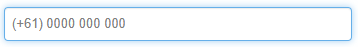
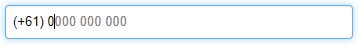
The pattern (+61) 0000 000 000 will always start the displayed text with the string: (+61) even if the user does not type those characters.
To use one of the wildcard characters (0, a or *) in a fixed manner, it can be escaped using a backslash.
The previous example can be improved more by fixing the initial 04 that all Australian mobile phone numbers must have: (+61) \0400 000 000. With this pattern, it will not be possible to enter a number that does not begin with (+61) 04.
Interaction with Maestro
The Input pattern has two direct interactions with the Maestro framework: validation and data model
Validation
By default, the Input Pattern is the default validation mechanism - the entered text must directly match the input pattern, and by default, every character in the pattern is mandatory. This means that a pattern such as aaaaaaaa creates an input field that will be considered valid if and only if an 8-character alphabetic value is entered. Less than 8 characters will not be valid.
To make a character or set of characters optional, surround them in square brackets [].
Let's look at a few examples:
- aaaaaaaa
- Exactly 8 letters must be provided for the text to be valid.
- aaaa[aaaa]
- Anything between 4 and 8 letters is valid.
- *[*******]
- The field will accept any string with a maximum length of 8.
Data Model
The actual data saved in Maestro's data model (and ultimately the submission XML data), is by default all of the typed characters that are not fixed, or in other words, just the wildcard characters from the Input Pattern. This means that with the pattern 00-00-00, and a user entry of 33-44-55, the corresponding data value will be 334455.
To include fixed characters are in the data model's value, surround them with curly braces {}.
Consider the following example patterns, which when used with the same typed input text 98765432, will all display the exact same format to the user, but will provide different values in the submission data and data model:
| Pattern | Displays as | Data value |
|---|---|---|
(\03) 0000-0000
|
(03) 9876-5432
|
98765432
|
(\03) 0000{-}0000
|
(03) 9876-5432
|
9876-5432
|
({\03}) 0000-0000
|
(03) 9876-5432
|
0398765432
|
{(\03) }0000{-}0000
|
(03) 9876-5432
|
(03) 9876-5432
|
When the data has been updated outside of the input field (by setting the data value directly in a rule script, or through data prefill), then on display of the component, the value will be massaged into the correct format - both the display and the data formats.
In the third example above, if the component with input pattern ({\03}) 0000-0000 is initially set (through pre-fill) with a value of 9876432 then when the field is displayed, the following will be set:
- Display text in visible field:
(03) 9876-5432 - Data value:
0398765432
However, that this only happens if the field is displayed - if it resides in a section or page of the form that is never shown due to visibility rules, then the data value will remain as 98765432.
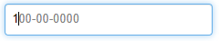
Pattern placeholder
When a masked input field has been configured to format the text as the user types, an additional option is available to display a Pattern placeholder for the user. This appears for the user in the form of "ghost" (slightly greyed, and non-editable) text in the input field itself, that is overwritten as actual text is typed into the field.
The pattern placeholder will display as the field is being edited, but can optionally also display on mouse hover.
The actual text shown in the placeholder is a version of the input pattern, without any {} markers, and with optional content removed. Any 'a' wildcards are converted to the uppercase 'A', and '*' wildcards are displayed with a hash '#' symbol:
Let's look at a few examples:
| Pattern | Pattern placeholder |
|---|---|
aaa-000**
|
AAA-000##
|
0000[0000]
|
0000
|
({\03}) {9}000-0000
|
(03) 9000-0000
|
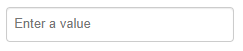
As with all Maestro input fields, a "Placeholder Text" property exists on the Masked Text Input for accessibility purposes (to provide context to screen readers), and which can also display placeholder text in the field.
In the event that both the pattern placeholder is required, and the Accessibility placeholder text has been defined, the field behaves as follows:
- When the field is empty (no data entered yet), the Accessibility placeholder text displays, even under mouse hover.
- The moment any text is present in the input field, the Accessibility placeholder disappears, and the pattern placeholder is displayed instead - when the field has focus (while the user enters text), and if configured, when the mouse is hovered.


Styling
By default, the Configurable Text Input component's appearance should be identical to the Text Field widget, with the same styling according to the template or form it's placed in. Font, focus and error styles should match the Text Field widget.
Translations and Runtime Branding
The Input Pattern of the Configurable Text Input component is translatable, allowing the field format to be different according to the chosen locale. This also allows the pattern to be changed by the runtime branding functionality, creating an opportunity to change the field format dynamically for different brands in a white-labelled form.
The field will automatically be validated against the pattern, but as usual the validation can be customized by adding a validation rule. When adding a custom validation rule, a Is Masked Input Valid rule helper is available in the right-click context menu that will utilize the same default validation logic, returning true or false. This can then be used to provide a custom message, and even to make the error message translatable. A few examples are shown below.
Form.validateMaskedInput (
  item.properties.pattern,
  Form.fireRule("getConfig", item, data),
  value
) || "This is a custom message"
For a translatable error message, it will look like this.
Form.validateMaskedInput (
   item.properties.pattern,
   Form.fireRule("getConfig", item, data),
   value
) || "~T~validationmessage~T~This is a custom message"
The next example demonstrates how to change the pattern property of a Configurable Text Input component's field with the runtimeBrandedField ID:
{
    "translation": {
      values: {
        "runtimeBrandedField.properties.pattern": value
      }
    }
  }
);
This JavaScript code sets the pattern property to value, which is one of the auto-inserted parameters for a change rule on a dropdown component, so it'll set the pattern of theConfigurable Text Input to what has been selected in the dropdown.
You can also configure alternate templated brands with different masking options for design-time branding. This can only be observed in the Form Design.
Let's look at component properties and how to use them.
Usage
- Open the Palette pane in the Maestro editor.
- Locate the Configurable Text Input component within the Input Fields folder.
- Drag the component into the View pane or the Wireframe.
- Configure the component's properties via the Properties pane.

Properties
The following properties are available to the Configurable Text Input component:
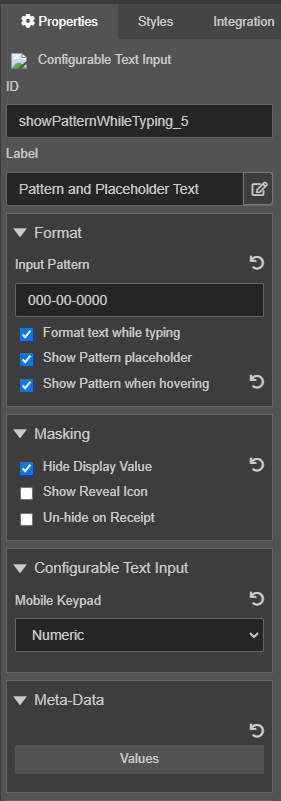
Format
Configurable options for the format of the entered text, and when/how to show a placeholder pattern.
- Input Pattern
String Option inputPattern- Specify the input pattern in the Input Pattern field, for example,
000-00-0000, which is used for formatting and validating text. - This pattern uses the following conventions:
a- Alphabetic character0- Numeric character*- Any characterAdditional patterns:
[]- Optional contents{}- Fixed contents - Format text while typing
Boolean- Select to auto-format the input text while the user is typing, so any formatting defined by the pattern (spaces, hyphens etc) will be added as the user types.
- If unchecked, the text will be free text while typing, but will be formatted when the field loses focus.
- Returning to the field will remove all formatting while the user edits the text.
- Show Pattern placeholder
Boolean- Select to display the pattern as placeholder text inside the field, as the user types. This will replace the regular placeholder text once text has been entered.
- Only available if Format text while typing is selected.
- By default, alphabetic characters use the uppercase
Acharacter as a placeholder, numeric characters use a zero0. - The pattern only appears when the field has focus.
- If the field is also configured with the Placeholder text (in the Accessibility properties), then this placeholder text will take priority, as long as the field is empty. In other words, by default, the placeholder text will show, but as soon as the user starts typing into the field, it will be replaced with the pattern as a dynamic placeholder.
- Show Pattern when hovering
Boolean- Select to the pattern when the user hovers the mouse pointer over the field.
- Only available if Show Pattern placeholder is selected.
- If the field is empty, and has Placeholder Text configured in the Accessibility properties, then this placeholder text will be displayed when hovering. However, if the field is partially completed, then hovering over it will display the pattern.
Masking
The entered text can be hidden from view by replacing each character with a 'mask'. The option to allow the user to 'unmask' or view the text is configurable.
- Hide Display Value
Boolean- Select to make each typed character (not including formatting placeholders such as spaces, hyphens etc) replaced by a password-style (●) character.
- The typed character will be briefly visible when first entered, to allow the user to see that they've typed the correct character.
- Show Reveal Icon
Boolean- Select to display an 'eye' button () to the field that allows the user to toggle visibility of the entered text on or off.
- Only available if Hide Display Value is selected.
- The setting will remain as long as the field is visible - that is, navigating back or forward in the form, and then returning to the page will hide the entered text again.
- Un-hide on Receipt
Boolean- Select to show the raw text; otherwise the value is hidden in the PDF receipt so it is not visible to the user.
- Only available if Hide Display Value is selected.
- The submitted XML data will always contain the entered text.
Configurable Text Input
- Mobile Keypad
Option mobileKeypad- Select a mobile keypad type for mobile devices from the Mobile Keypad dropdown list, which can be one of the following:
Label Value Text text Numeric number Email email Telephone tel
Meta Data
You use Meta Data to create the two-way binding between the field and the data model. This allows you to define custom properties - meta-data - that will be available at runtime. Each property is defined as a key-value pair, and can contain non-string values. You edit these properties directly in the Key-Value editor as a JSON file.
The full set of meta-data is available at runtime through the item: Form.items[item_id].properties.metaData.
- Value
- Click Value to add key / value pairs in the Key-Value editor.
Rules
The Configurable Text Input component has the Advanced Configuration rule allowing more control over the functionality that the default behavior provides. You can edit masking options using the JSON format. For more information, see iMask API.
Click Create Rule and select Advanced Configuration to open the Rule editor. where you can update the configuration.
Advanced Mode
The Configurable Text Input component is backed by the 3rd party library iMask.js so using the Input Pattern is the simplest way to make use of the extensive library functionality, and it is the default usage for this widget. However, iMask provides a much more powerful set of functionality that would be useful for many Maestro users.
To allow access to the wider suite of functions, the Configurable Text Input component has a custom rule - Advanced Configuration. By default, this rule does not need to be implemented, but it may be accessed using the standard Create Rule option in the Properties panel, see above.
When first added, the rule is pre-configured with the default configuration required for the field to obey the Input Pattern property (and thus behave identically to when there was no Advanced Configuration rule defined), however the user is free to change the configuration as required.
The configuration must be set to a single JavaScript object, representing a valid iMask configuration.
If the configuration uses any of iMask's pattern types that do not extend the MaskedPattern, the Pattern placeholder can't be displayed in the input field.
Let's look at a few simple examples provided below:
- Regular Expression based pattern
- A number between
1and5digits long that must start with any number between1and6.{ mask: /^[1-6]\d{0,4}$/ }
- Number Range
- Any number between
500and10000.{ mask: Number, min: 500, max: 10000 } - To automatically limit any pre-defined value (set directly in a rule, or prefilled) to the range, use a format function:
{ mask: Number, min: 500, max: 10000, format: function(num) { return Math.min(num, this.max).toLocaleString('en-US', { useGrouping: false, maximumFractionDigits: 20 }) } } - Partial Masking
- A credit card field where only the last 4 digits are visible.
{ mask: 'XXXX XXXX XXXX 0000', definitions: { X: { mask: '0', displayChar: '●', placeholderChar: '0' }, 0: { mask: '0', placeholderChar: '0' } } } - Alternative 'hide' character
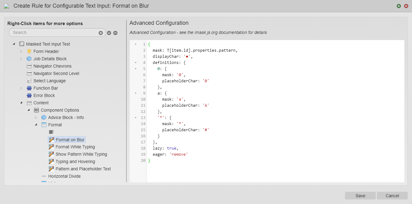
- To use '*' instead of the default '●' for hiding user data (but still utilize the Input Pattern property).
{ mask: T[item.id].properties.pattern, displayChar: '*', definitions: { 0: { mask: '0', placeholderChar: '0' }, a: { mask: 'a', placeholderChar: 'A' }, '*': { mask: '*', placeholderChar: '#' } }, lazy: true, eager: 'remove' } - Custom Pattern placeholder
- An Australian Bank BSB number, where the pattern placeholder is
123-456instead of the default000-000.{ mask: '123-456', definitions: { 1: { mask: '0', placeholderChar: '1' }, 2: { mask: '0', placeholderChar: '2' }, 3: { mask: '0', placeholderChar: '3' }, 4: { mask: '0', placeholderChar: '4' }, 5: { mask: '0', placeholderChar: '5' }, 6: { mask: '0', placeholderChar: '6' } }, lazy: true, eager: 'remove' } - Dynamic Masking (Very advanced)
- An alternative credit card field, where the format changes according to the type of card - determined by the numbers being entered.
- Note that the mask is defined as an array of potential matching masks, and the 'dispatch' function is responsible for identifying the correct match. In the example below, the dispatch function is also updating a data field with the determined Card Type, in order to provide a visual representation of the detected type.
{
  mask: [
    {
      mask: '0000 0000 00000',
      brand: 'Visa',
      match: val => val.indexOf('4') === 0 && val.length <= 13
    },
    {
      mask: '0000 0000 0000 0000',
      brand: 'Visa',
      match: val => val.indexOf('4') === 0 && val.length > 13
    },
    {
      mask: '0000 0000 0000 0000',
      brand: 'Mastercard',
      match: val => val.indexOf('5') === 0
    },
    {
      mask: '0000 000000 00000',
      brand: 'AmEx',
      match: val => val === "3" || val.indexOf('34') === 0 || val.indexOf('37') === 0
    },
    {
      mask: '0000 0000 0000 0000',
      brand: 'Discover',
      match: val => val.indexOf('6') === 0
    },
    {
      mask: '0000 00000 00000',
      brand: 'Diners Club / Carte Blanche',
      match: val => val.indexOf('30') === 0 || val.indexOf('36') === 0 || val.indexOf('38') === 0
    },
    {
      mask: '0000000000000[000]',
      brand: 'Unknown',
      match: val => true
    }
  ],
  dispatch: (appended, dynamicMasked) => {
    const number = (dynamicMasked.value + appended).replace(/\D/g,'');

    let mask = dynamicMasked.compiledMasks.find(m => m.match(number)),
        cardType = (mask && mask.brand) || "",
        $scope = Util.findElementFromItem(item, data).scope();

    if (!$scope.$$phase) {
      $scope.$apply(() => {
        data.cardType = cardType;
      });
    } else data.cardType = cardType;

    return mask;
  },
  lazy: true,
  eager: 'remove'
}


We recommend checking out the iMask.js website, which contains more examples.
Next, learn about the Currency Field component.