Timeline View
Journey Analytics The behavioural analytics tool. | Analytics User | Latest Version Latest version 23.04.0 cloud hosted.
The Journey Analytics Timeline View displays the following data for transactions that started within the selected scope:
- Overview of all transactions in a bar chart.
- The number of transactions that were bounced, started, abandoned or completed.
- The median time taken for each transaction to be completed.
To display the Timeline View:
- Select Timeline from the Navigation Panel.
- Select the application and time period to analyze.
- Select the timeline metric tab you want to analyze.
- The Timeline View displays.
Timeline View options
The Timeline View contains the following options:
- Metric Tabs to select the metric that you want to analyze.
- Aggregation dropdown to set the blocks of time the chart will be broken up by.
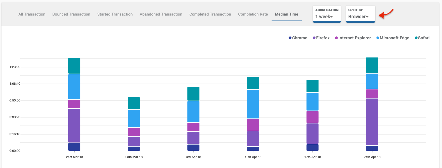
- Split By dropdown for you to split the results based on a browser, device, application version, operating system or space (not applicable for All Transaction).
Metric
| Metric | Description |
|---|---|
|
All Transaction |
Displays an overview of all transactions that occurred during the selected time period using a bar chart. |
|
Bounced Transaction |
Displays the number of transactions that were bounced during the selected time period. Bounced transactions occur when an application is opened but closed before generating a start transaction event (ie. before the user clicks or enters any input into a field). |
|
Started Transaction |
Displays the number of transactions started during the selected time period. A transaction start event occurs when at least one text/number field is typed-in or at least one checkbox/drop down is clicked by the user. |
|
Abandoned Transaction |
Displays the number of transactions that were abandoned during the selected time period. Abandoned transactions occur when a transaction has one start event but the application is closed before it is completed and the user never returns to complete the transaction. |
|
Completed Transaction |
Displays the number of transactions that were completed during the selected time period. Transaction may have started but this metric represents when a user completes all mandatory fields and clicks submit. |
|
Completion Rate |
Displays the completion rate of the transactions during the selected time period. |
|
Median Time |
Displays the median time taken to be completed by each transaction during the selected time period. |
Aggregation
The Timeline View allows you to set the aggregation. The aggregation will break the graph up into blocks of either minutes, hours, days or weeks. For example, if your set time period is Last Month, you then have the choice to aggregate the data by days, weeks or fortnightly. For each Scope Selector time period, there are several aggregations available for you to choose from. See the aggregation options available below.'
| Time Period | Aggregation options |
|---|---|
|
Today |
15 minutes, 30 minutes, 1 hour, 4 hours |
|
Yesterday |
15 minutes, 30 minutes, 1 hour, 4 hours |
|
Last Week |
4 hours, 1 day |
|
Last Fortnight |
4 hours, 1 day |
|
Last Month |
1 day, 1 week, 2 weeks |
|
Last Quarter |
1 day, 1 week, 2 weeks, 30 days |
|
Last Year |
1 week, 2 weeks, 30 days, 90 days, 180 days |
|
Custom |
Variable depending on Time Frame Selection |
The Aggregation that you select will depend on the time frame you are analyzing. For instance, it makes sense to aggregate a 1-day period by 15-minute time periods, but for a period of 1 year, an Aggregated By value of 30 days (1 month) makes more sense.
Split By
The Split By dropdown allows you to split the results based on a browser, device, application version, operating system or space (not applicable for All Transaction).
Classes available
| Split By | Classes available |
|---|---|
|
Browser |
Chrome, Firefox, Safari, Internet Explorer, Microsoft Edge |
|
Device Type |
Mobile Phone, Tablet, Desktop |
|
Application |
This option splits the results by application (Form) and version. |
|
Operating System |
Android, iOS, Windows, MacOS X, Linux |
|
Space |
Selected Space from the Global Filters |
Timeline View components
The Timeline View contains the following data visualization components:
- Timeline Chart
- Timeline Table
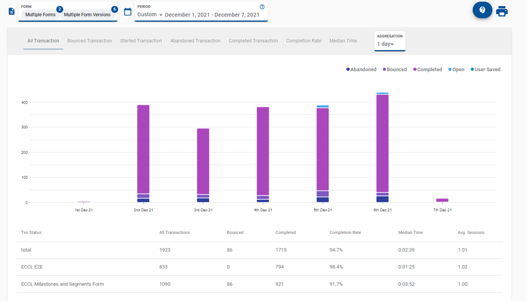
Timeline Chart
![]()
The Timeline chart plots the selected metric against the selected time period. Alongside the chart is a legend that indicates what each of the colors represents.
Timeline Table
![]()
The Timeline Table displays an overview of transaction statistics for the selected application/s. Each row of the table represents one application.
The following statistics are presented in the Timeline Table:
- All Transactions started
- All Bounced Transactions
- Transactions Completed
- Transaction Completion Rates
- Median Times
- Average Sessions
Next Steps...
Learn about Dropoff View and how users interact with sections of an application.