Dashboard View
Journey Analytics The behavioural analytics tool. | Analytics User | Latest Version Latest version 23.04.0 cloud hosted.
The Journey Analytics Dashboard View displays an overview of transactions associated with the selected applications for a specific time period.
To display the Dashboard View:
- Select Dashboard from the Navigation Panel.
- Select the application and time period to analyze.
- The Dashboard View displays.
The Dashboard view provides access to a range of analytics, organized into the following categories:
- Completed Statistics
- Field Statistics
- Device Distribution
- Activity Statistics
Completed Statistics
The Completed Statistics tile reflects completion statistics for the transactions associated with the selected applications for the selected time period.
Completed Statistics are divided into three areas:
- Completed Txns:
- Completion Rate
- Completion History Chart
Completed Txns
The Completed Txns represents the total number of completed transactions for all selected applications.
A transaction is said to be complete when a user opens an application and hits the Submit button after completing all of the required fields in the application.
A comparison to the previous time period is also displayed. For example, if the current time period is set to 2 weeks, completion will be compared to the previous 2 weeks.
The delta arrow shows whether the number of completed transactions has increased (▲) or decreased (▼) compared to the previous time period. In the above screenshot, 3,320 transactions were completed which was 1,510 more transactions were completed than in the previous time period.
If the completion rate has not increased or decreased compared to the previous time period, the comparison will display 0.0 with a dot or horizontal arrow instead.
Completion Rate
The Completion Rate measures the percentage of transactions that were successfully submitted during the selected time period. This metric is calculated by comparing the total number of transactions that were submitted, with the total number of transactions (excluding bounced), during the set time period.
For example, in the screenshot above, a completion rate of 92.6% has been reached over the selected time period.
Similarly to the Completed Txns, under the Completion Rate is a comparison to the previous time period. In the above example, an increase of 2.74% compared to the previous time period occurred.
Completion History Chart
This bar chart shows the volume of completed transactions for the selected scope.
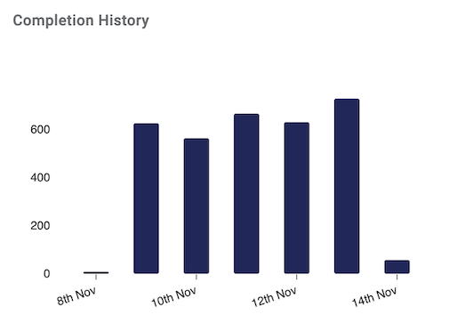
The screenshot example shows:
- Overall volume of completed transactions for each day of the week (due to period set to Last Week)
- Day with the most transactions completed was 13th Nov.
- Day with the least transactions completed was 8th Nov.
- Completed trasactions peaked for this time period at almost 800 transactions per day.
To ensure a proper chart is displayed, dates are dynamically aggregated based on the duration of the selected period. Let's look closer at how this works using examples. If you select a period duration that is:
- longer than one year, dates are aggregated into one quarter (3 months) chunks.
- shorter than one year and longer than one quarter, dates are aggregated into one month (30 days) chunks.
- shorter than one quarter and longer than four weeks, dates are aggregated into one week chunks.
- shorter than four weeks and longer than one week, dates are aggregated into one day chunks.
- shorter than one week and longer than one day, dates are aggregated into four hour chunks.
- shorter than one day, dates are aggregated into 2 hour chunks.
How to use the Completed Statistics
The Completed Statistics can be used to:
- Provide you with an overview of transaction completions over a select period of time.
- Determine the completion statistics of transactions associated with select applications.
- Perform a comparison of completed transactions for select applications against an equal period of time in the past.
Field Statistics
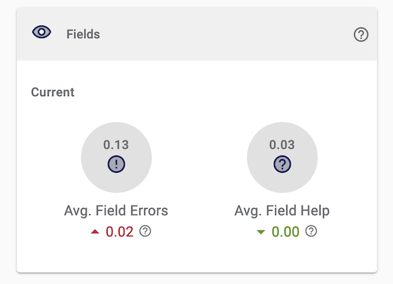
The Field Statistics tile shows the error rate for all fields in an application. It highlights two statistics:
- Average Field Errors
- Average Field Help
Avg Field Errors
The Average Field Errors section shows the average number of field validation errors per transaction. Validation errors occur when field rules are violated.
Some scenarios where an error message will be generated and displayed:
- Failing to fill out a mandatory field.
- Entering text into a numerical field.
- Entering a postal address in an unacceptable format.
In the screenshot above, the Avg Field Errors rate is 0.13%, meaning that users face field errors once in every 769 transactions (1 / (0.13 / 100)). The up arrow (▲) below the Avg Field Errors rate indicates that the Avg Field Errors rate has increased by 0.02% as compared to the previous time period.
Avg Field Help
Applications can be built to contain help icons that display instructions when selected. The Avg Field Help rate shows the average number of times users request help per transaction for a set time.
In the screenshot above, the Avg Field Help rate is 0.03%, meaning that users only click the field help icon once in every 3,333 transactions (1 / (0.03 / 100)). The green down arrow (▼) indicates that the Avg Field Help rate has decreased but only slightly, less than 0.01% (or only thousandths of a percent), as compared to the previous time period.
Device Distribution
The Device Distribution tile shows the percentage of devices used to open applications and changes in usage compared to the previous period.
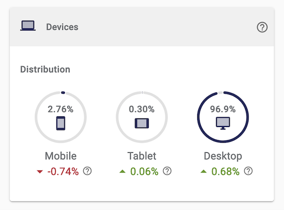
In the Device Distribution screenshot above:
- For this period and selected applications, 2.76% of transactions are on mobile.
- Mobile usage decreased by 0.74% this period as compared to the prior period.
- Only 0.30% of transactions are using tablet devices though we had a slight increase (0.06%) this period.
- Most users, 96.9%, perform transactions using a desktop device.
- This period, Desktop devices were slightly more popular since we can see an increase in distribution of 0.68%.
The following are several of the benefits of the Device Distribution tile:
- Helps to understand the proportion of devices being used for your selected applications.
- Illustrates which devices are popular with application users.
- Highlights a change in the use of these devices relative to the previous time period.
- Helps to identify highly used devices of an application, this information may be used to optimize your application for this particular device type.
Activity Statistics
The Activity Statistics are divided into three areas:
- Median Duration: displays the median time taken for a transaction to be completed (submitted).
- Average Sessions: the average number of sessions used to complete transactions.
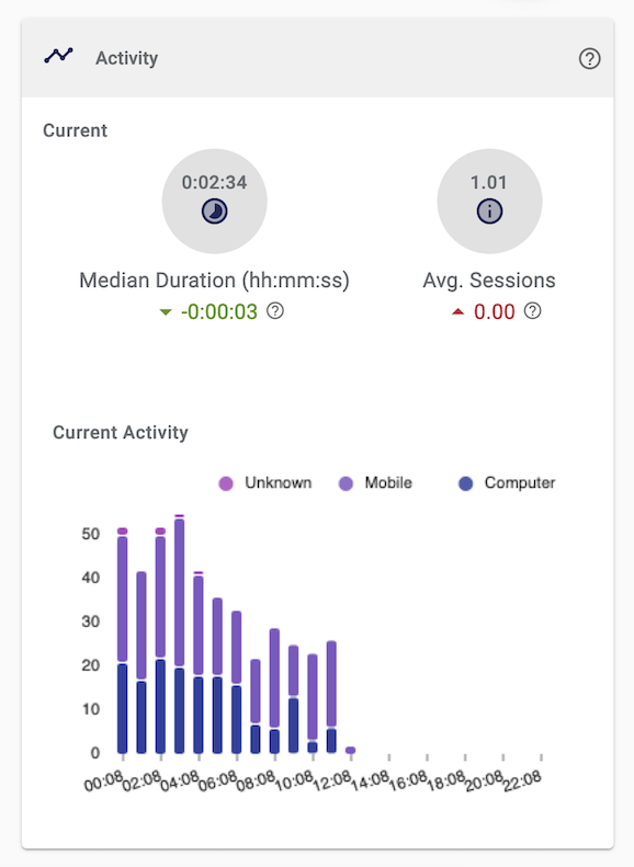
- Current Activity Chart: a bar graph for the number of sessions generated during the last 24-hours
Median Duration
The Median Duration section shows the median time for a transaction to be completed. It's calculated from the total time taken by each completed transaction for selected applications. It gives an idea of the middle amount of time taken by users to complete a transaction.
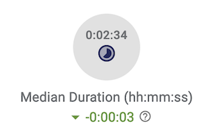
Similarly to other Dashboard stats, Activity Statistics also indicate if an increase or decrease has occurred this period compared to the previous period.
For example, the Activity Statistics screenshot above shows a median duration time of 0:02:34 (2 minutes and 34 seconds), with the current period seeing a slight decrease of 0:00:03 (3 seconds) compared to the previous time period.
Average Sessions
The Average Sessions section of Activity Statistics displays the average number of sessions taken by a user to complete a transaction. In other words, this section answers the question, what is the average number of times that a user will attempt to complete the application (a single transaction)?
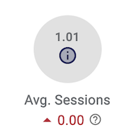
When a user starts a supported application, it may take them more than one session to submit the application and complete the transaction.
For example, the screenshot above displays an average session of 1.01, meaning that for every 101 transactions, only 1 requires multiple sessions for the user to complete. This average is an increase from the previous set time frame but a very small increase of less than 0.01%.
Current Activity
The Current Activity bar graph shows the number of sessions generated during the last 24-hours, regardless of the transactions being completed. This bar graph shows separate segments for sessions generated on mobile, desktop or tablet devices.
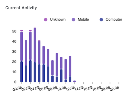
Current Activity stats are great for providing you with a quick overview of the activity occurring so far today.
How to use the Activity Statistics
Activity Statistics can be used to:
- Display the middle amount of time it takes for a transaction to be completed, where all mandatory fields are entered and the Submit button is clicked.
- Display the average number of times it takes users to complete a transaction.
Activity Statistics show you if users are taking an irregular number of sessions to complete a transaction. If an application is taking users an irregular number of sessions, then this may be a case of the selected application being too long or not clear enough.
Next Steps...
Learn about Timeline View.