Text Field Component
MaestroThe UI design product. | Form Builder | All versions This feature is related to all versions.
Maestro provides the Text Field component which allows you to create a text field in a form.
For large amounts of text, you should use the Multiline Text Area component.
To configure the Text Field component on a form:
- Open a Maestro form.
- Click the Palette tab and expand Input Fields.
- Select Text Field and drag and drop it on the form.
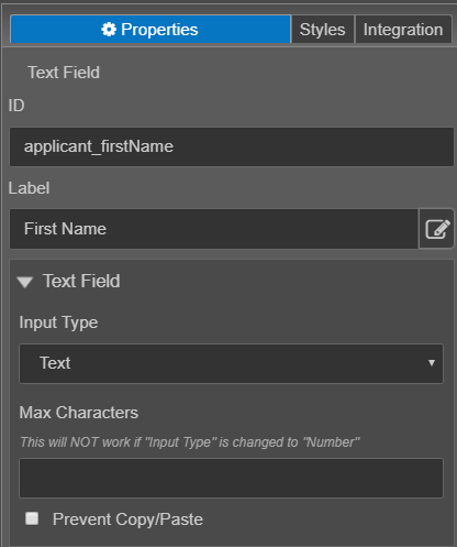
- Click the Properties tab and find the Text Field section.
- ID is the underlying Maestro name of the selected component.
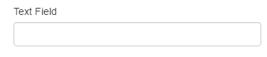
- Label displays the name to the user on the form. In the above example, the label is First Name.
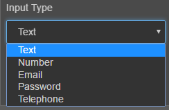
- Input Type is specific to text related components. By default, when you drag a text field component on to a form, the input type defaults to Text. If you were to drag an email address component on to the form, the Email input type would be selected. Though you can change the input type, it is recommended that you change the component rather than the input type. For example, if you inserted a text field, but decide that you want an email address, you should delete the text field and add the email address component. The specific components have other pre-defined properties that are useful for Form Builders. For example, the email address component has a validation rule already created, whereas a text field, even if the input type is set to email, does not. The following input type are supported:
- Text - The Text input type should be used for text-based input. For more information on input fields, see https://www.w3schools.com/html/html_form_input_types.asp.
- Number is the input field used for numeric input (0-9). For example, if you want a user to enter their age, use a text field and set it as a number input type.
- Email is the input type used for text fields that should contain an e-mail address. If you select the email type for a component that is not created for email input, for example, a text field, the entered input will not be validated to ensure the user entered a valid email address. You can add a validation rule to the text field component, however, using the email address component (which already has the rule created) is much easier.
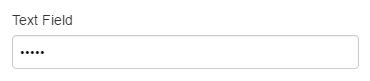
- Password is the input type used mask any characters entered into the component. The screenshot below displays the masked characters.
- Telephone - The Telephone input type is used for fields that should contain a telephone number. Similar to email addresses, you should use the specific phone number component, rather than changing the input type. The phone number component will contain the validation rule to ensure that the user is entering a valid phone number. You can add a validation rule to the text field component, however, using the phone number component (which already has the rule created) is much easier.
- Max Characters - This property allows you to set the maximum number of characters that the user can enter into the field. Letters, numbers, special characters and spaces are each counted towards the maximum number of characters.
- Prevent Copy/Paste - Select this option to prevent this text field from being copied to or pasted from the clipboard.
- Click Save.
- Click Build and Render Form to see how this rule is displayed when the form is built and rendered.
Though these options are available for selection, it is recommended that when possible you use a component tailored to suit the needs of the data that will be collected by the field. For example, if want to collect an email address from a user, use the Email Address component from the Maestro Palette.