Section Component
MaestroThe UI design product. | Form Builder | All versions This feature is related to all versions.
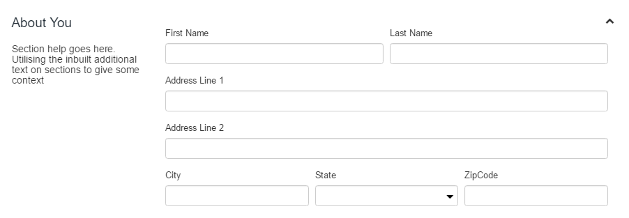
Maestro provides the Section component that allows you to break up a long page with many fields into logical sections. A Section has a section header and an optional explanatory text, plus it may have additional features, which allow uses to change the default layout, collapse, or and expand it.
To configure the Section component on a form:
- Open a Maestro form.
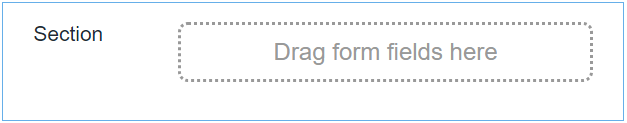
- Click the Palette tab and expand Containers.
- Select Section and drag it onto the form.
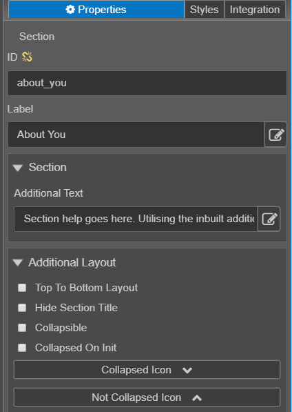
- Click the Properties tab and find the Section section.
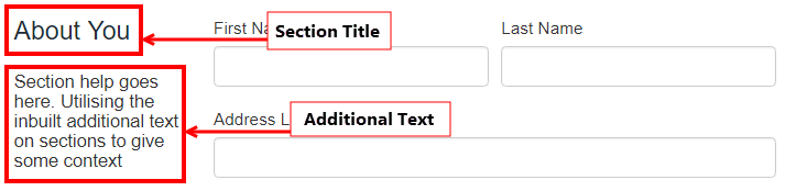
- Section Label displays at the top of the section on the form. The screenshot below shows section details:
- Additional Text displays below the header within the section.
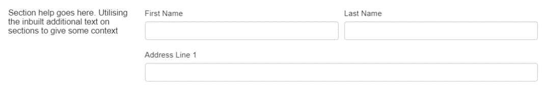
- Select Top To Bottom Layout to change the layout of the section so that the header and additional text display above the components, rather than to the left.
- Select Hide Section Title to hide the section title so that it isn't displayed on the form. The screenshot below shows a section with Hide Section Title enabled:
- Select Collapsible to enable a user to collapse and expand the section on the form. The screenshot below shows a section with Collapsible enabled:
- Select Collapsed On Init to make the section collapsed when first displayed. The user can expand and collapse the section as shown below:
- Click Save.
- Click Build and Render Form to see how this rule is displayed when the form is built and rendered.

Next, learn about the Select Language component.