Create a New Form Exercise v5.1
PlatformApplicable to all products in Temenos Journey Manager. | Form Builder | All versions This feature is related to v5.1 and higher.
This exercise will allow you to practice your skills for creating new forms in Maestro. During this exercise, you will create a new form and add components.
Do your best to follow the provided information and complete each step.
If you get stuck, you can always re-watch any of the online training modules. This is a good way to refresh your form building skills. You’ll also find Extra Help at the end of this exercise, which contains additional information to help you complete the exercise.
You can find a sample of the completed exercise form in the Maestro Exercise Project: Maestro Training Exercises > Create New Form Finish. If you have not already imported the Maestro Exercise Project please visit Exercise Setup - Importing the Maestro Exercise Files for more information.
Step 1: Create a New Form
Create a new form using the details provided below.
- In the Navigator Panel, expand the Organization.
- Expand the Project.
- Select Forms.
- Click Create Form.
- Enter the following details for your new form:
- Name: Create New Form_[Your initials]
- New Version: 1.0-develop
- Description: This form is to practice creating new forms and adding components.
- Template: Exercise Template
- Click Create.
(should be pre-populated if Default Initial Version has been setup in Project Details)
Step 2: Add Components to Page One
On Page One, you will find an empty Section. You can add (drag) components into this area. Use the image below as a guide for what you need to add.

You can Preview your form at any time to see how the components look and work.
the components marked as mandatory (*) and with the information icon (i).
When adding components, it may be helpful to display the Palette and Structure panel together. Click the Side-by-Side button in the top left corner of the Editor window.
Remember: to use predefined components, rather than recreating your own. You can use Search in the Palette panel to find the required components, for example, the ‘Title’ component, which contains all the common titles (Mr, Mrs. etc.). The default options can be updated as required and is much easier than building a dropdown from scratch.
Use this for the Email Address Help Text: We use your email to send confirmation of the information you've provided.
Click Save on the toolbar.
Step 3: Add Components to Page Two
On Page Two, you can add (drag) components into the available section. Use the image below as a guide for what you need to add.
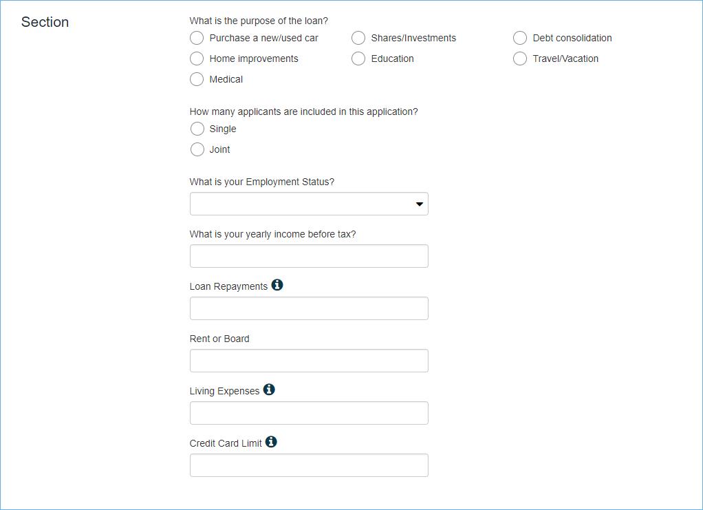
Some components have the information icon (i) next to the label.
Use the following entries for the What is the purpose of the loan radio buttons:
- Purchase a new/used car
- Shares/Investments
- Debt consolidation
- Home improvements
- Education
- Travel/Vacation
- Medical
Use the following entries for the How many applicants are included in this application? radio buttons:
- Single
- Joint
Use the following entries for the What is your Employment Status? dropdown:
- Employed
- Self-Employed
- Unemployed
Use the following details for the Help Text:
- Loan Repayments: Please include any mortgage repayments, personal loans or car loans.
- Living Expenses: Consider how much you spend on bills, groceries, transport and entertainment, etc.
- Credit Card Limit: Please include the total limit of all your credit cards.
Use the following for the expense questions:
- What is your Employment Status?
- What is your yearly income before tax?
- Loan Repayments
- Rent or Board
- Living Expenses
- Credit Card Limit
Step 4: Save the Form
Click Save on the toolbar to save all the changes to your form.
Extra Help
Need some extra help?
Use the information below to assist you in completing the exercise steps.
Component Properties
You can use the Properties panel to change the following settings:
- Component Label
- Add Help Text
- Set Component as Mandatory
- Radio Button Arrangement
- Radio Button Options
- Dropdown Options
The Properties panel displays the settings for the selected component.
For example, properties for the First Name(s) Text Field are displayed below.

At the top, you can change the component label.
Popover Help Text is where you add the help text, which displays the information icon next to the component label.
The Mandatory option is under Rules. Select this to mark a component as mandatory. This will automatically add the red asterisk next to the label.
Radio Button and Dropdown Options
Use the Properties panel to customize the options available for Radio Button Group and Dropdown.


Click the Options button to open a new window, where you can add or edit the radio buttons or dropdown options.
Arrangement of Radio Button Options
You can change the appearance of the radio buttons, so they’re stacked vertically or displayed in a horizontal grid.
To change the appearance, select the required Arrangement.
