Slider
MaestroThe UI design product. | Form Builder | 21.05 This feature was updated in 21.05.
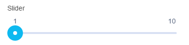
Maestro comes with the Slider component (widget) that allows users to view and select a value or range of values from the range along a bar.
This component supports both left-to-right (LTR) and right-to-left (RTL) languages. For LTR languages, the smallest value appears on the far left end of the track and the largest value is on the far right. For RTL languages this orientation is reversed.
Usage
- Open the Palette pane in the Maestro Editor.
- Locate the Slider component within the Input Fields folder.
- Drag the component into the View pane or the Wireframe.
- Configure the component's properties via the Properties pane.
Properties
The following properties are available to the Slider component:
Configuration
The minimum value of the slider.
The maximum value of the slider.
The interval of the slider's value increment.
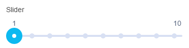
Shows tick marks at predetermined values, without their actual values, that the user can move the slider to. The predetermined values are calculated usingStep Value.
Shows tick marks with their predetermined values that the user can move the slider to. The predetermined values are calculated using Step Value.
Adds this text to the value label as a prefix.
This value can be translated to different languages including right-to-left languages. | 21.05 This feature was introduced in 21.05.
Adds this text to the value label as a suffix.
This value can be translated to different languages including right-to-left languages. | 21.05 This feature was introduced in 21.05.
Adds a space between the prefix and the value label, and between the suffix and the value label.
Range Slider
Shows the second thumb to allow the user to view and specify the range of values.
The minimum value of the range slider.
The maximum value of the range slider.
Help Text
Shows a popover help text to provide some contextual help to the user. You can use the Maestro rich text editor to create the help text using various formatting and styles.
Next, learn about the Multiline Text Area component.