Repeat
MaestroThe UI design product. | Form Builder | All versions This feature is related to all versions.
Maestro provides the Repeat component (widget), which is a container for other components, such as text fields and labels, that allows a form user to add the whole repeating component multiple times to a form, by clicking a Repeat Add Button. This is especially handy when adding another customer's name or address field to a form.
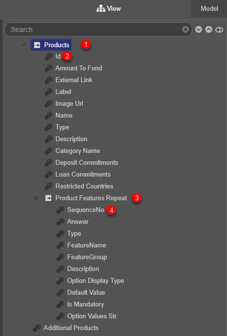
Repeats are handy for creating data structures using Data Field components, so you can organize application-specific data but have no visual representation in a form. A typical example is shown below:

- Parent repeat component
- Data field of the parent repeat
- Child repeat component
- Data field of the child repeat
Usage
- Open the Palette pane in the Maestro Editor.
- Locate the Repeat component within the Repeats folder.
- Drag the component into the View pane or the Wireframe.
- Configure the component's properties via the Properties pane.
Properties
The following properties are available to the Repeat component:
Can be used on multiple references, such as add and delete buttons
Enter the initial number of items in repeat
Enter the minimum number of items allowed in repeat
Enter the maximum number of items allowed in repeat. Set to 0 for unrestricted
Transfers the focus to the first field in new instance
Transfers the focus to the previous instance
Link the delete button which will get focused to when deleted. For example, data.repeatDeleteButton.
Link the add button which will get focused to when deleted if no instances remain. For example, data.repeatAddButton.
Button Options
Used on Add button
Check to show the add button.
Used on Add button
Check to hide the add item button when item max is reached
Check to hide the delete item button when item min is reached
Next, learn about the Repeating Block Template component.