Radio Button Group Component
MaestroThe UI design product. | Form Builder | All versions This feature is related to all versions.
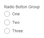
Maestro provides the Radio Button Group component that allows you to add a group of radio buttons to a form.
To configure the Radio Button Group component on a form:
- Open a Maestro form.
- Click the Palette tab and expand Input Fields.
- Select Radio Button Group and drag and drop it on the form.
- Click the Properties tab and find the Radio Button Group section.
- Options - allows you to enter each radio button option: radio button label, value and default. Each option added will be a radio button that the user can select. It displays the Options for Radio Button Group window. This is where you enter the options available to the user.
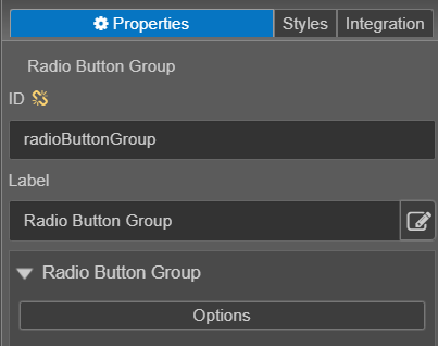
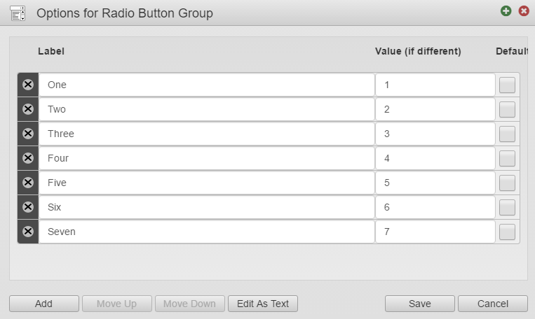
- Label - displays on the form next to the radio button.
- Value (if different) - Used for data collection and in scripts or rules based on the user's selection.
- Default - Select the check next to the option you want to be selected by default. If there is not a default selection, leave the checkboxes unchecked.
- Add - This button will add options to the radio button group. Once you add an option you will need to complete the Label, Value (optional) and Default (optional).
- Move Up / Move Down - to rearrange the radio button group options. Select the option you want to rearrange then click the Move Up or Move Down button.
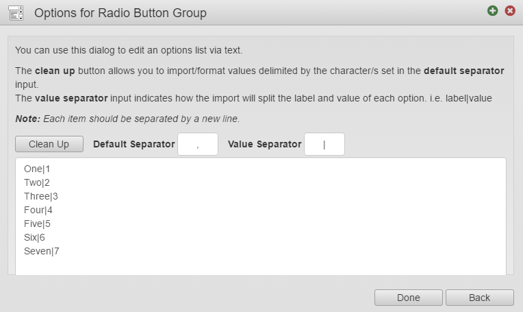
- Edit As Text – allows to view and edit the radio button options in a text editor window as shown below. Using this view, allows you to copy text from an external source, such as an Excel spreadsheet, and paste it in here.
- You can select which Default Separator and Value Separator to use from the following options: One|1, Two|2, Three|3, etc. or each option can display on a separate line. This is summarized in the table below:
| Item | Default Separator | Values on Separate Lines |
|---|---|---|
|
With a Value |
|
|
|
Without a Value |
|
|


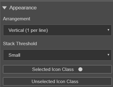
- Click the Properties tab and find the Appearance section.
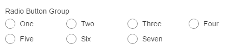
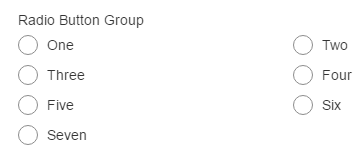
- Click Arrangement to select how the radio button options are displayed on the form.
- Stack Threshold -
- Selected Icon Class -
- Unselected Icon Class –
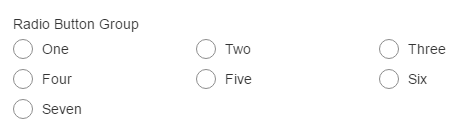
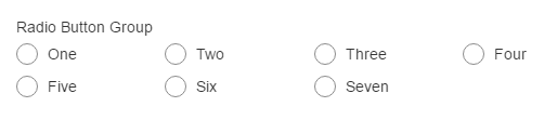
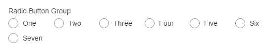
- Appearance of the Arrangement Options is summarized in the table below:
- Click Save.
- Click Build and Render Form to see how this rule is displayed when the form is built and rendered.
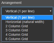
| Item | Arrangement |
|---|---|
|
Vertical (1 per line) |
|
|
Horizontal (natural width) |
|
|
2 Column Grid |
|
|
3 Column Grid |
|
|
4 Column Grid |
|
|
6 Column Grid |
|
Use the Tab key to iterate through the component and press Space key to select a radio button you want. Use the Left, Right, Up, and Down arrow keys to change the selection.