Image Component
MaestroThe UI design product. | Form Builder | All versions This feature is related to all versions.
Maestro provides the Image component that allows you to insert an image into a form.
To configure the Image component on a form:
- Open a Maestro form.
- Click the Palette tab and expand Display Fields.
- Select Image and drag and drop it on the form.
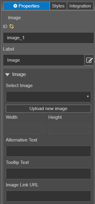
- Click the Properties tab and find the Image properties.
- Use the Select Image dropdown list to select from images currently available in the library. You can see images from libraries available to this form, such as the project or organization library.
- Click Upload new image to upload a new image that is not already in the library. You should always check the available images in the dropdown prior to uploading your own image.
- Use Width and Height to resize the image you can enter the width and height that you want the image to be.
- Alternative Text - The text entered is used for accessibility, particularly people with vision difficulties. There are two types of images, decorative and informative. Decorative images include separator lines or arrows for buttons. These types of images should not contain alternative text, therefore you can leave the option blank. Informative images include images such as logos or banners. These types of images should always contain alternative text that represents the image displayed.
- Tooltip Text - The text entered will display on devices, with a mouse, when the mouse hovers over the image.
- Image Link URL - If a URL is entered, a new browser tab opens linking to the Image Link URL when the user clicks the image.
- Click Save.
- Click Build and Render Form to see how this rule is displayed when the form is built and rendered.