In this onboarding article, part 8 of 10, we look at designing for mobile first then scaling up.
Our data shows that smartphones have become the #1 device used by consumers to apply for bank accounts and credit cards (Desktop is still dominant for business banking and products like Mortgages…but for how long?).
Furthermore, we see higher completion rates on smartphones when compared to completion rates on desktop (when the bank has invested in a mobile/touch-friendly experience).
Finally, ask any designer and they’ll tell you it’s easier to start a mobile design and scale up rather than start with a design focused on a larger screen and cram things onto a smaller screen. There’s a great 6 part tutorial on the concepts of mobile first design (Lesson 3) and scaling up (Lesson 4) here: https://trydesignlab.com/responsive-web-design/lessons/ and as the course author Patrick Wong (https:// trydesignlab.com/Patrick/) that elegantly explains it.
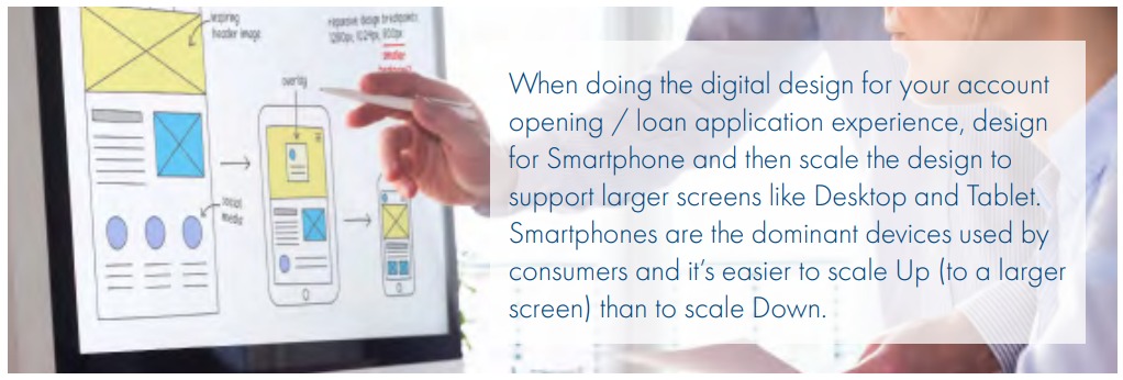

There are some specific ideas you should consider when designing an bank product application experience for a mobile device and they include (but not limited to):
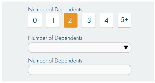
Minimize keyboard use
The example here shows 3 ways of collecting the required information – number of dependents. The Toggle Button is the easiest to interact with on a touch screen device – a single tap completes the required information.
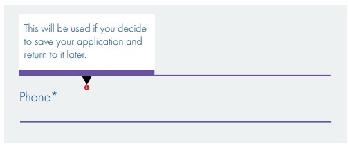
Tooltips don’t work on touch devices
Do not display important information on tooltips as hover is not supported on touch devices. Use information icons and if the information is critical, show it 100% of the time.
Use a single column layout
Avoid the potential confusion of different paths through the fields on a form by adopting a single column layout.
Use adaptive design to eliminate content
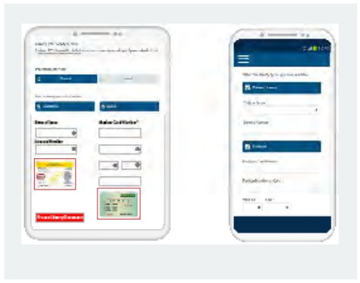
Smartphones have smaller screens, so adaptive design can be used to change what’s displayed on a smaller screen. Sometimes instead of shrinking something to fit, it is better to remove it. For example – “helper” images like the sample ID document images shown here are better removed from the smartphone form factor through adaptive design.
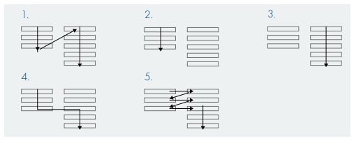
Position labels above fields
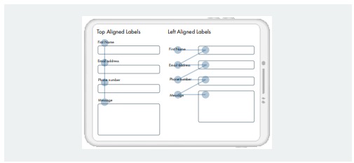
The image below shows the simpler navigation of the eye when processing an application form with labels positioned above fields as opposed to on the left.
These are just some of the design principles we recommend for smartphone devices that apply equally well to larger screens. And as mentioned at the start of the article – it’s easier to design for a small screen and scale up, rather than trying to cram a large screen design onto a smaller screen.
In Part 9, we look at focusing on design simplicity, not fancy UX widgets.
