Part 6: All things were not created equal … and that applies to the questions on an application for a bank product.
A typical bank application form will have 20 to 60 fields of information to be completed. And very often, they’re laid out on the application form with little consideration as to what’s going to be easiest for the consumer to complete. In many cases, the digital application for a bank account is a reflection of the screens of the core banking system. And the core banking system was designed around bankers, not consumers.
So, what is the right order for fields on an application form for a banking product?
We recommend a 3 step process as follows:
- Capture a Lead So – as you’ll remember from previous posts (Two paths to purchase for two different products” AND “Nurture leads”), we advocate generating a lead at the earliest appropriate point in the customer journey – so get Name, Email and Phone early.
- Use Prefill If your customer journey offers prefill services (Photo ID Capture, Account Aggregation/Open Banking, Mobile Carrier Prefill), do this early to maximize the amount that’s prefilled and show the customer there’s light at the end of the tunnel! (See “Steer customers to the path of least resistance.)
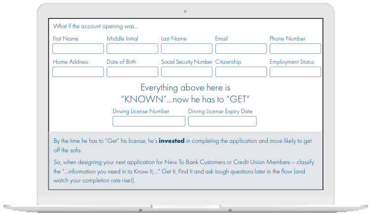
- Classify information into “Know it / Get it / Find it and ask tough questions last.” Look at all the remaining fields of information on the application form (Address, Date of Birth, Employment Details, SSN, ID Document, Answers to AML Questions, etc.) and classify it in to information people.
- Know – Things they intrinsically know like their Date of Birth, Email Address, etc.
- Need to Get – Information that most people don’t know-by-heart and must get, but they know exactly where it is like details of their Driving License.
- Need to Find – Information that customers have to think “where is that…?”
Where possible, ask for the information in that order. Know, Get, Find.

The problem with this design was that he has only entered Name and Date of Birth before being asked to “Get” something. He wasn’t invested…so he abandoned. Later realizing this was a design flaw in his new emplowwyers account opening experience.

In Part 7 we remind readers that details like headings, disclosures, and fonts can be important.
