In this 2nd onboarding article, we look at putting the Apply button on the home page to improve the completion rate of your application.
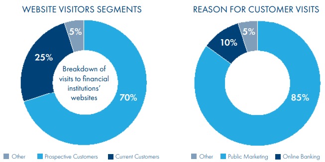
Approximately 25% of visitors to a new bank website are “Prospective Customers” (source: Extractable, The Financial Brand).
And in the world of comparison websites like bankrate.com and comparethemarket.com – a lot of those prospective customers are coming to the bank’s website ready to apply for a specific product.


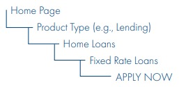
And in many cases, the bank is running a particular campaign at a time (Low Rate Mortgage, Rewards Credit Card, High Interest Savings Account etc.). So many of the prospective customers will be enquiring about or wanting to apply for that currently promoted product. And sophisticated banks with digital marketing capabilities will recognize repeat visitors or visitors that have seen a digital ad (through cookies) and change the banner ad to reference what they feel confident the customer will be interested in. But, so often the Apply button will be buried several levels down on the website.

Add the Apply Now button on your Home Page
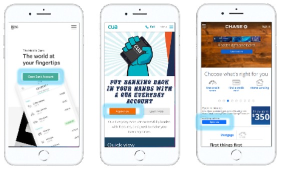
Smarter banks realize that they should put the Apply Now button on the Home Page or at most 1 level down – making it easy for people to find the product they want to apply for and begin the process.
Here are some examples from a range of institutions:

And this aligns with the strategy of the best “sales” company in the world – Amazon.
When you’re looking at an item on amazon.com, the “Add to cart” and ”Buy Now” buttons are clearly visible. And when you go to your Shopping Cart, there’s a “Place your order” button at the top and bottom of the screen and as you scroll through a long shopping cart, the button follows you down the screen. YOU NEVER HAVE TO LOOK FOR IT! Amazon have made shopping easy. Do the same for your bank.
In Part 3, we'll look at reiterating the features of the product.
