Documentation Website Restructure
As part of the Knowledge Team's continuous improvement process, we have updated the Documentation website in an effort to create an even better user experience for you. Read on for a brief overview of these changes.
Restructure by Product
The focal point of this upgrade is improving upon the existing product centric layout. By focusing on specific Journey products users will be able to locate useful information quicker and easier than ever before.
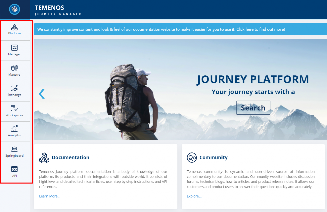
The icon bar on the left side of the screen (see image below) displays all of the Journey Products so that users can quickly move to the product they are interested in.

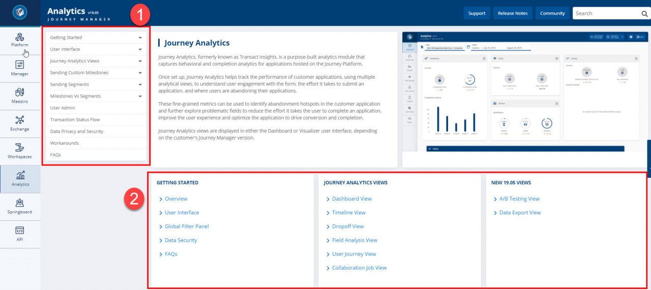
From here, users can then service their needs by using a Table of Contents drop down (see image below item 1) to visit topic driven documentation, or use the quick links from the product landing pages (see image below item 2).

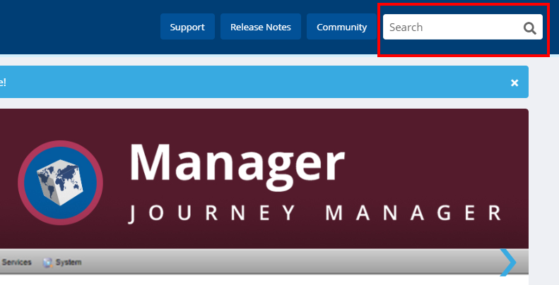
The search bar can still be found at the top of each page so that users can perform a unique search at any time during their visit to help find what they are looking for.

Links to the new Support landing page, the Release Notes and the Community are retained on every page.
VirtualTour
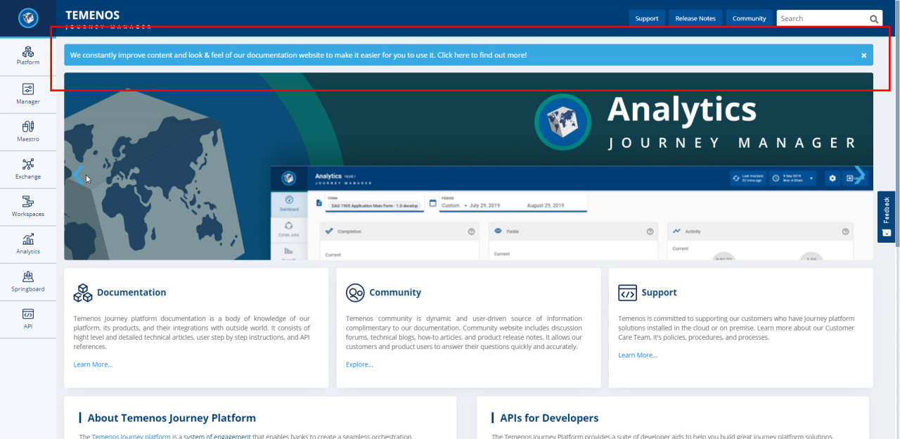
We’ve created a virtual tour to help you get used to these changes. Tap the banner at the top of the home page and follow the virtual tour prompts to learn all about the new Journey platform Documentation website.

When you subscribe to our announcements, we will send you an e-mail when there are new updates on the site so you won't miss them.

