Part 2 of 10: Re-iterate the features of the product

At the beginning of the application experience (immediately after the customer has clicked Apply), re-iterate the key features of the product in question OR the offer they’re responding to. This will ensure they feel confident they’re applying for the right product and motivate them to commence and complete.
There’s a reason Amazon and other ecommerce companies show images of products when you go to check-out … with physical goods, being able to see them reinforces the impulse to buy (plus, they want to make sure you’ve put the right thing in the shopping cart).
Well the same is true of banking products. We don’t have a shopping cart, but we do have an Apply process. And very often, the Apply process is identical for similar products – product groups like Checking/Current Accounts, Savings Accounts, Credit Cards may all have identical application processes within that product group. But I may be applying for a particular account or card and it’s important that I know I’m completing the right application.
And the value of reminding the customer that they’re applying for the right product holds true just like it does in ecommerce.
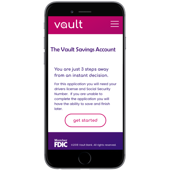 Imagine a scenario whereby you’ve spent 10 minutes comparing Savings Accounts on a bank website and you’ve selected the one with the following key features:
- No minimum balance
- No monthly account keeping charges
- 5% interest rate
You click Apply Now and you see this screen…
Is that the right Savings Account? Sure it’s “a” savings account…but is it the one I researched with those features I’m interested in?
By simply re-iterating those key features, we can reassure the applicant they’re in the right place.
Even worse, imagine you’ve targeted a new customer with a great offer through digital marketing. As is common in the US at the time of writing this piece, banks are offering cash bonuses from $200 to $500 just for customers to open a checking account and meet some minimum deposit requirements. So customers are seeing adds like this:

A nice targeted ad in facebook with a compelling offer…but when they click Apply Now, they see an application for a bank account alright, but no reference to the $500 that motivated them to click!
Are you in the right place?
Is this the right product?
Are you going to get $500???
Don’t assume customers know it’s the right application form…remind them why they clicked Apply Now. Pass in context from your marketing and let them know they’re on their way to that product they just selected.
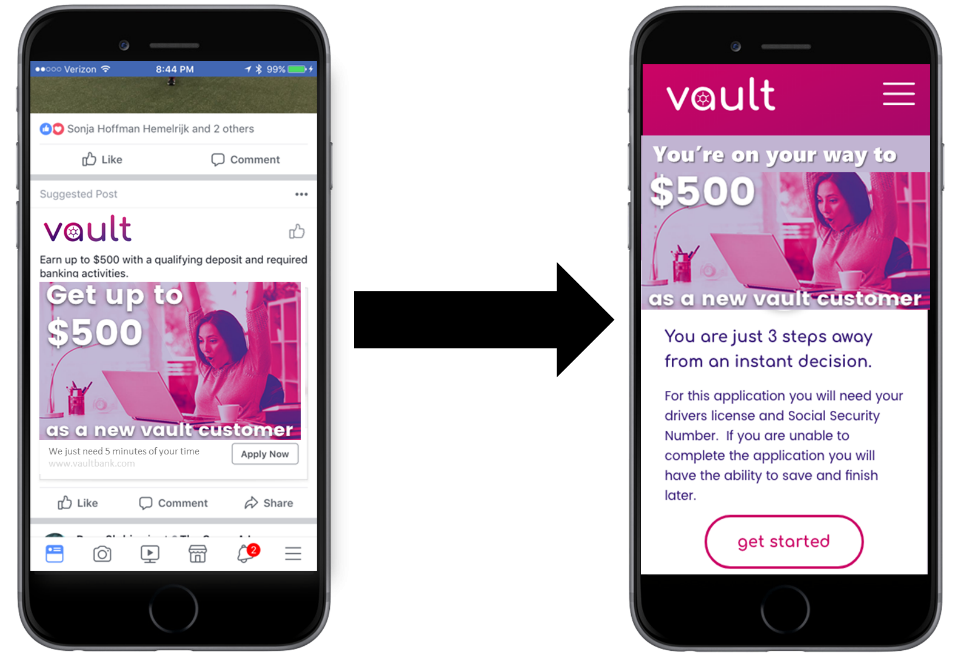
How much more compelling would that experience be if it looked more like this…
A subtle but powerful change.
In Part 3 of this series we will look at the value of generating and nurturing leads from incomplete applications.
![]()
When you subscribe to our announcements, we will send you an e-mail when there are new updates on the site so you won't miss them.