Part 5 of 10: Steer customers to the path of least resistance
You may have features in the customer experience that can make customer acquisition easier for the customer (Photo ID Capture, Online Account Aggregation etc). Steer customers to using these options by promoting the benefit and making them clearly visible – it’s a win-win.
To open a bank account or originate a loan, there’s information you need – some of it for Risk reasons, some of it for Compliance reasons. Regardless of the reason, you need that information.
Providing that information takes time – typing it in is reasonably slow and whilst each individual field isn’t an issue, in aggregate it can take 5 to 30 minutes to complete an application, depending on the product. And your customers have other things they’d mush rather do with that time.
So we’ve seen banks invest in building experiences that can streamline the application process for consumers with capabilities like:
- Photo ID capture and prefill
- Prefilling information from a mobile/cell carrier
- Prefilling information from an existing banking partner through account aggregation or open banking APIs
- etc
However, when these experiences aren’t positioned appropriately with customers, they’re often ignored or simply missed. The benefits (to the consumer!) of using these services should be promoted to encourage customers to leverage these services. It will save them time AND it will help you get more completed applications for accounts, cards, loans.
For example, with photo ID capture…
| Benefit to the consumer | Benefit to the bank |
|---|---|
| Prefilll’s about 11 fields (Name, Address, DOB, License Details) | Faster completion = Higher completion rate |
| Improves chances of approval due to higher quality information capture (reduced typing errors and better matching to government databases) | Reduced fraud due to the presence of a photo ID document used to prefill. |
But very often the expedited process is presented along with the option of just typing information in. And in fact, it’s often missed! Therefore, the customer just starts typing information in, which takes time, and then they abandon due to fatigue, or they get distracted because it’s taking too long, and so on.
Lets look at an example.
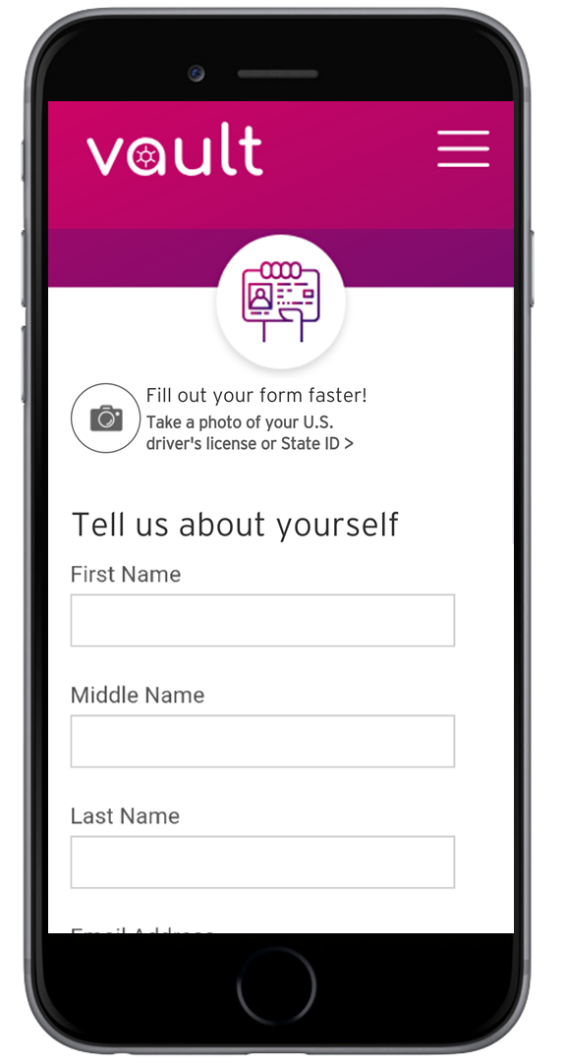
 Did you even see the option to Prefill the form with a photo of a driving license?
Is it obvious that the circle icon with a camera is a button to invoke the camera on the phone?
In practice, the experience likely results in people simply typing their information in and not invoking the camera functionality. When a consumer clicks “Apply Now” they expect to complete a form. They are on auto-pilot to an extent and they start looking for fields to enter First Name, Last Name, etc.
And you can see those fields on this application form (image at right) under the subtle option to take a photo of a license. So when a customer sees this screen, they click in to “First Name” and start typing. And that’s what happened with a similar experience in production. They missed the option to prefill or simply didn’t see enough value in “Fill out your form faster”.
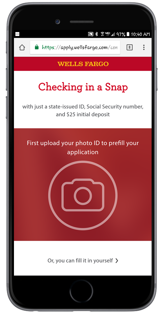
 Compare that to this experience from US banking giant Wells Fargo.
On a mobile device, the entire screen is taken up with a big red button to engage the camera. You can’t miss it. You simply have to click “Or you can fill it in yourself” as an option to get to the fields.
Still, even in this design we’d recommend highlighting the benefit to the consumer beyond “Checking in a Snap”. In this design we’d advocate some specific benefit metrics like
This will save you about 2 minutes
AND
Improve the likelihood of instant approval.
So, when you’re designing an experience that incorporates options that will streamline the application process for the consumer:
- Make it easy for them to choose the easiest path (like the Wells Fargo design at left)
- Clearly articulate the benefit to the consumer of taking the easiest path.
When you subscribe to our announcements, we will send you an e-mail when there are new updates on the site so you won't miss them.

