Part 7 of 10: Sweat the Details Like Headings, Disclosures and Fonts

There are a great many things we can all learn from the world’s largest company (at the time of writing), Apple. Not least of all is the tech giant’s attention to detail. Apple has become synonymous with “good design” and banks and credit unions are striving for a similar Apple-like elegance in their digital experiences.
Fonts
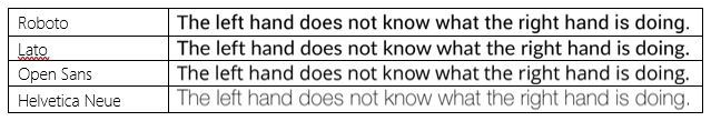
And it can start with things as simple as web fonts (unfortunately Apple in 2018 uses a proprietary font called San Francisco – so better to look at open web fonts for good typography). The current trend in the market is towards clean and light fonts. Common easily accessible web fonts include:
Case
Once you’ve selected your font, please resist the urge to put text in ALL CAPITALS. Simply put, it’s harder to read text in upper case. Proper Case or Sentence Case (as we’re using in this article) is easier to read. Sure, I can read WORD, word, Word, woRd – but its more natural to read text in sentence case.
So when presenting headings, labels, instructions – you’ll find customers process that text in sentence case more easily than upper case. Don’t believe me…take a look at the Apple website and you’ll see that the vast majority (with limited exceptions like the Apple WATCH and MUSIC names) is presented in sentence case. Including menus, headings and links.
Disclosures
 An important aspect of onboarding a new customer (especially after the finance industries challenges of 2007/2008) is the appropriate presentation of Disclosures – the terms and conditions associated with a product(s) such as Fees, Product Use, Legal Disclaimers, Privacy Policies, and so on.
Most would argue that customers don’t read these disclosures – and in general, I would agree. Especially if they are large documents. But the financial crisis has been trying to encourage / force banks and other financial institutions to extract the key points from lengthy documents (20 – 80 pages is not uncommon) and ensure those “key points” are clearly communicated and understood by consumers.
Unfortunately, those “key points” are critical text and therefore generally prepared by staff in the Legal & Compliance teams at the institution. And often written in language that requires a legal person to understand the text. And if a customer doesn’t understand something or is uncomfortable – they will abandon, rather than continuing.
Consider the following example:
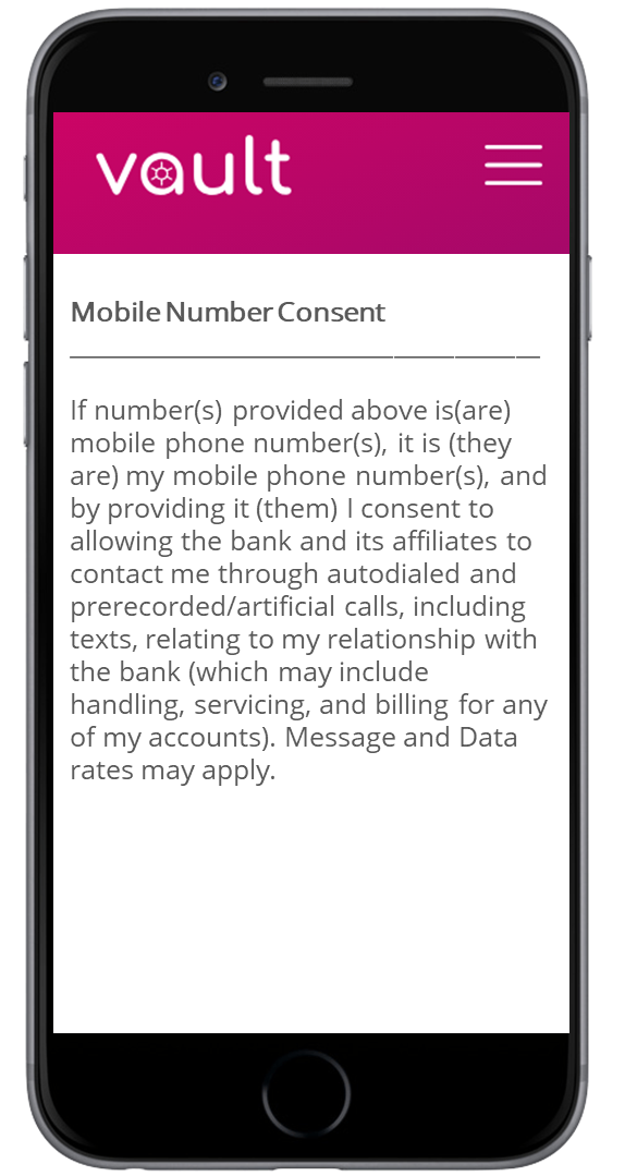
In the US, banks are required do obtain consent from consumers to send text messages to a mobile / cell phone or if they want to use pre-recorded auto-dialed messages.
Now, these messages are important – they may be a notification of potential fraud on an account. And imagine a situation where a bank’s database has been compromised and 1,000,000 customers are impacted by potential fraud. But the bank only has 200 people in the call center (more than enough for normal operations). If the 200 people were to work 24 hours a day calling 1,000,000 customers – it would take 208 days to contact everyone. Whereas an automated communication method would allow this to happen in minutes.
The bank in question knew this…but didn’t do a good job of articulating that to prospective customers. And presented a mobile phone disclosure similar to the one shown in the adjacent screen.
5% of all the bank’s abandonment occurred on this disclosure. It was an expensive piece of text.
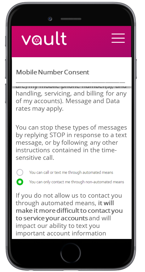 However, a similar disclosure (with cleaner text) could be presented along with the ability to easily opt-out as shown here.
And if the customer chooses to opt out, the bank could notify them of the potential issues that may arise if the bank cannot contact the customer through automated means – basically, sell the benefit of automation to those that need to be sold on the idea.
The screen shot here shows the original text scrolling off the screen with some additional context for the consumer explaining that they can STOP these messages at any time and providing a radio button to opt out during the application with an explanation of the impact of opting out.
The customer experience is still far from perfect in this example, but giving the customer control and choice are hugely important.
So, when designing your all-new Apple-esque onboarding experience – don’t just assume customers will read and accept what you put in front of them. Ensure the content could be understood by a 5th grader and can’t be interpreted negatively or you will lose customers.
When you subscribe to our announcements, we will send you an e-mail when there are new updates on the site so you won't miss them.